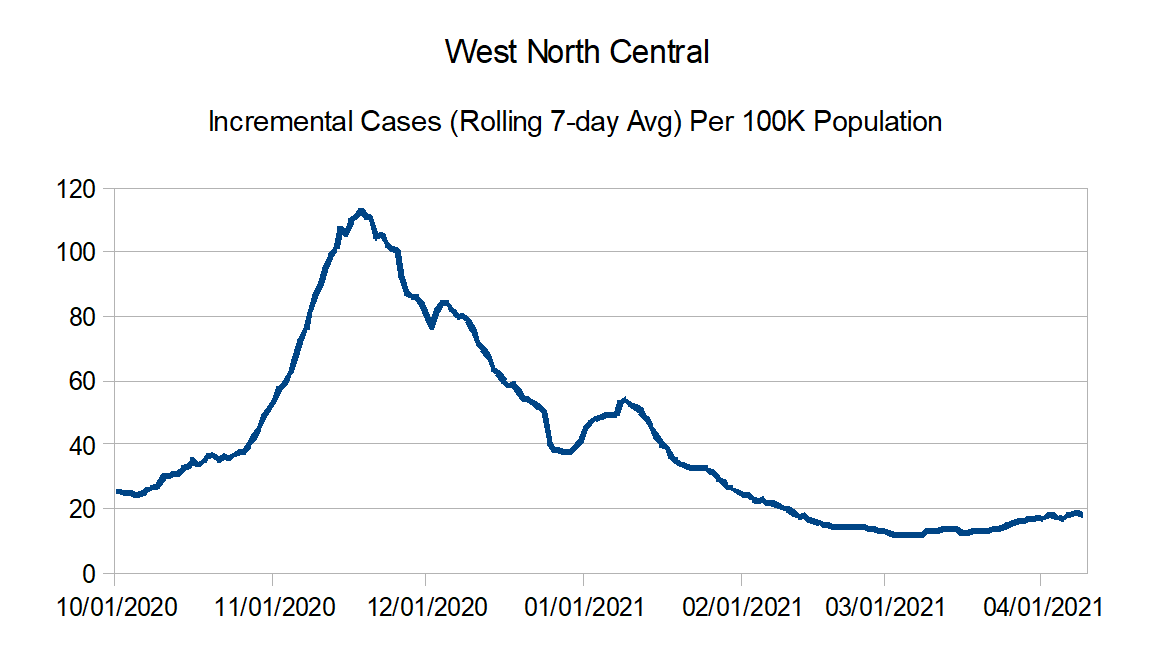
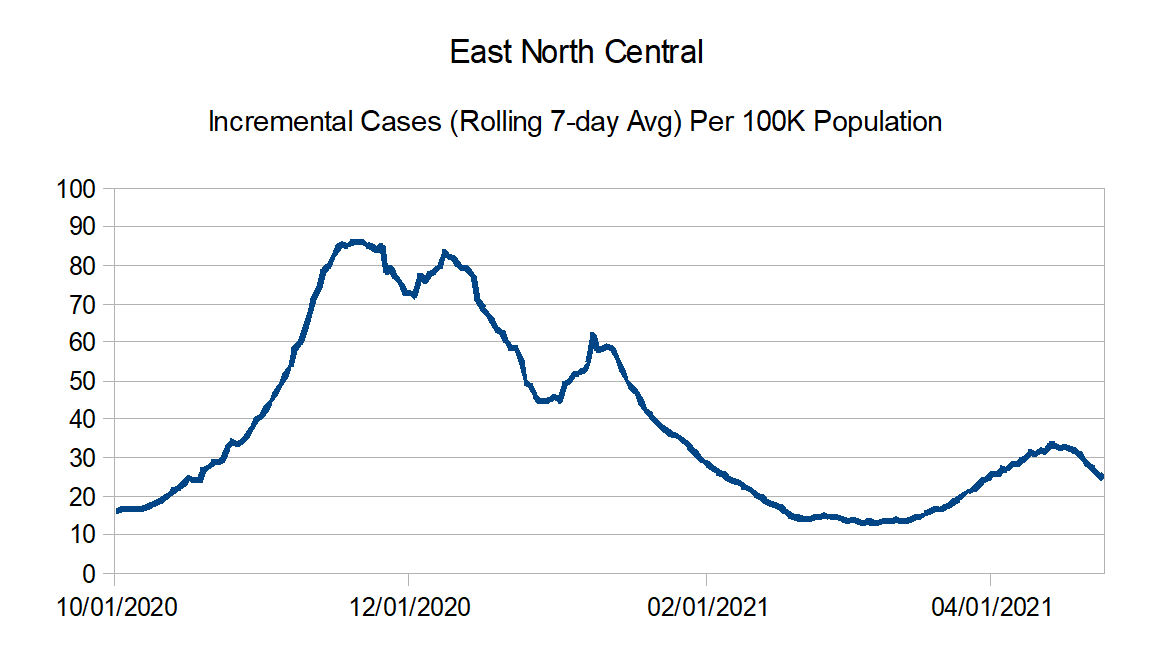
Time to update the graphs again. This time I did make an adjustment for cases as Missouri found and removed 11,000 duplicate case reports on April 17th after fixing a system issue.
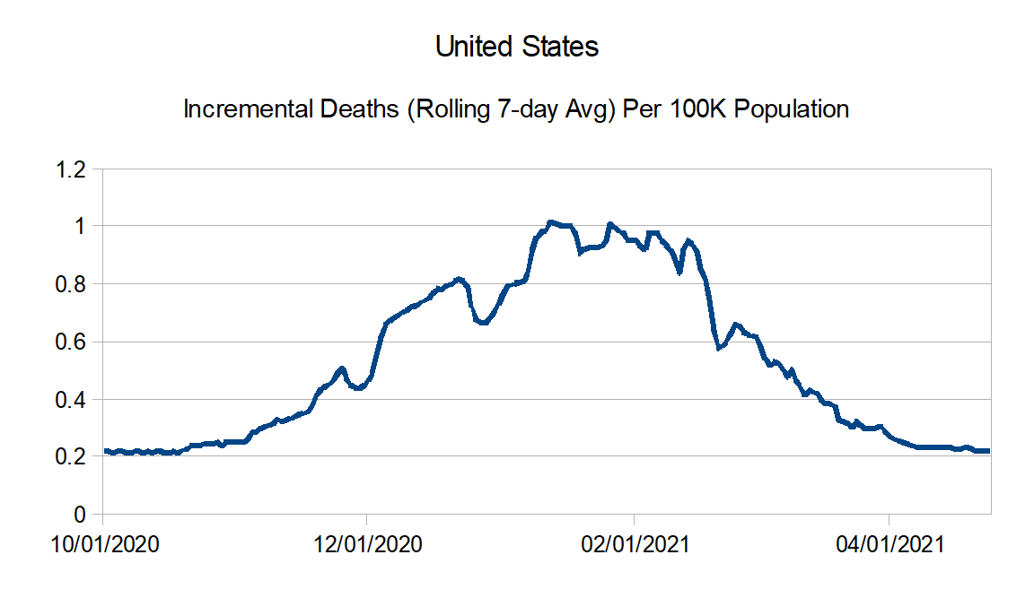
Looks like generally speaking numbers still continue to hold steady to slowly declining for both the reported cases and reported deaths.
Data Source – New York Times github
Data Info – New York Times data info
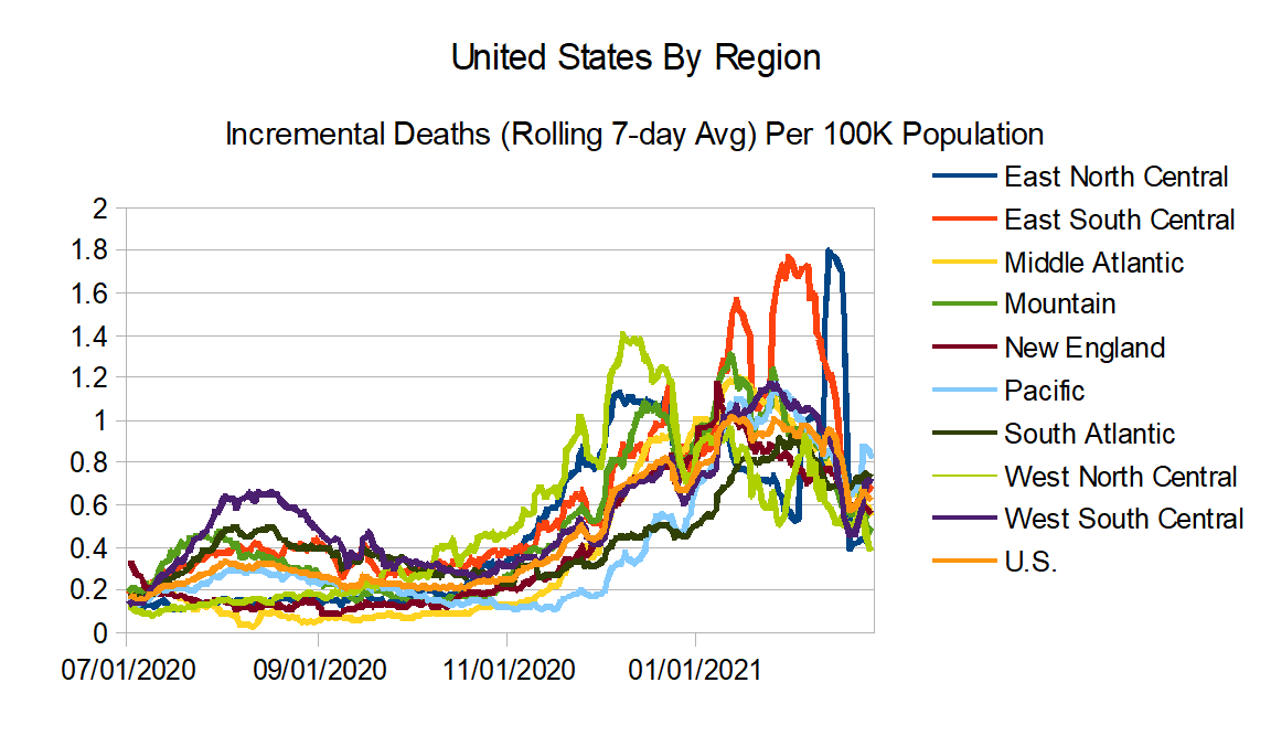
Regions:
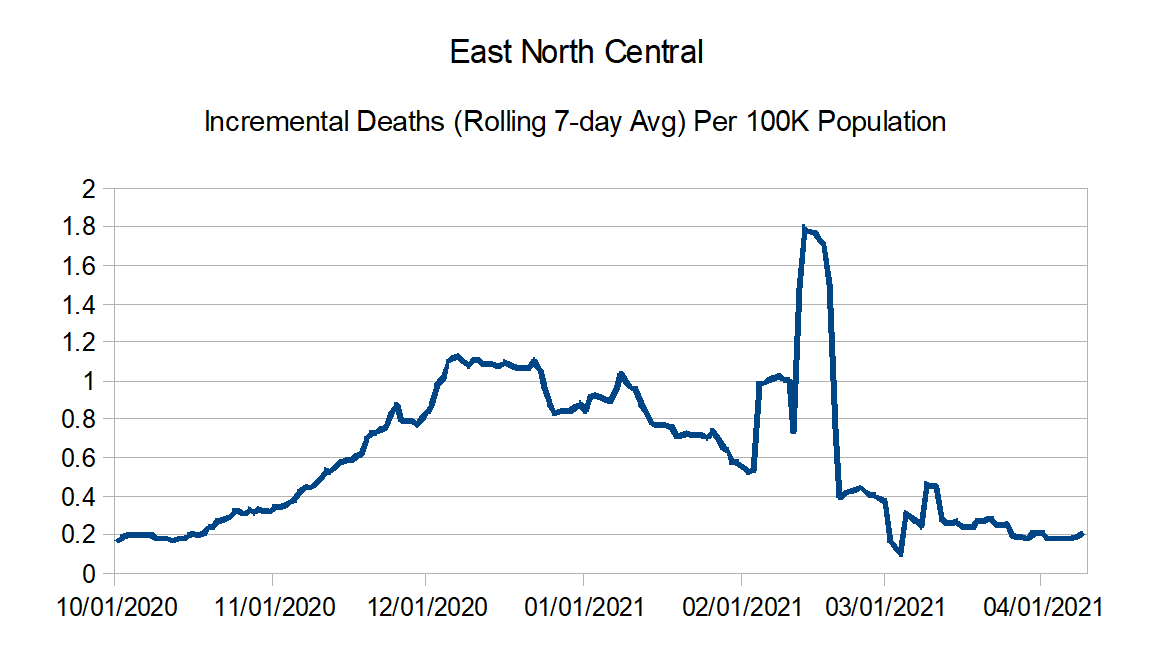
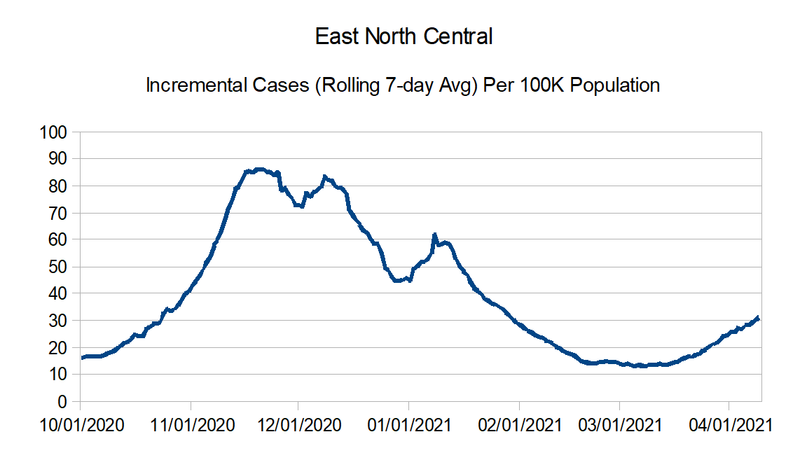
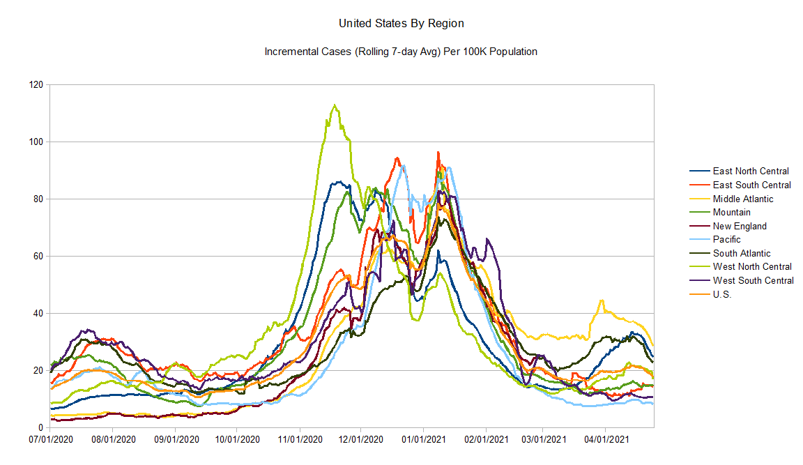
East North Central: Illinois, Indiana, Michigan, Ohio, and Wisconsin
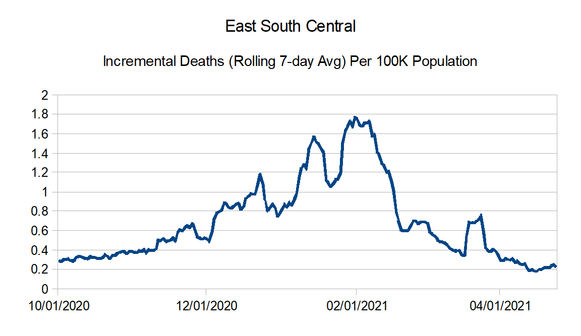
East South Central: Alabama, Kentucky, Mississippi, and Tennessee
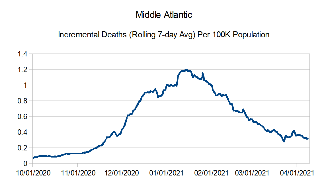
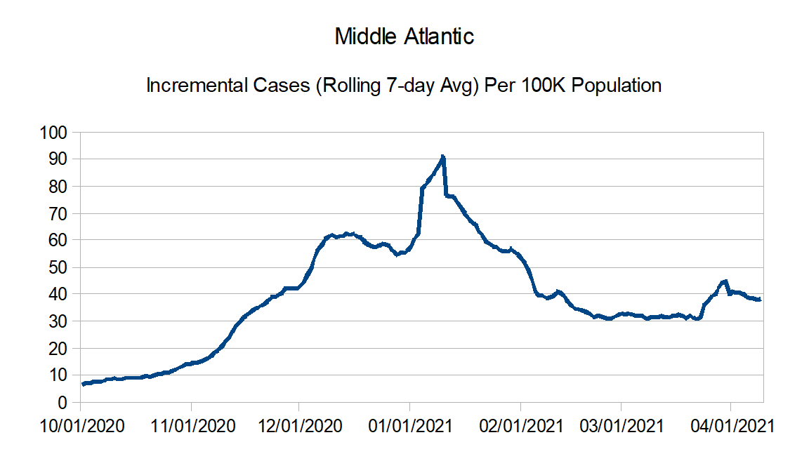
Middle Atlantic: Delaware, New Jersey, New York, and Pennsylvania
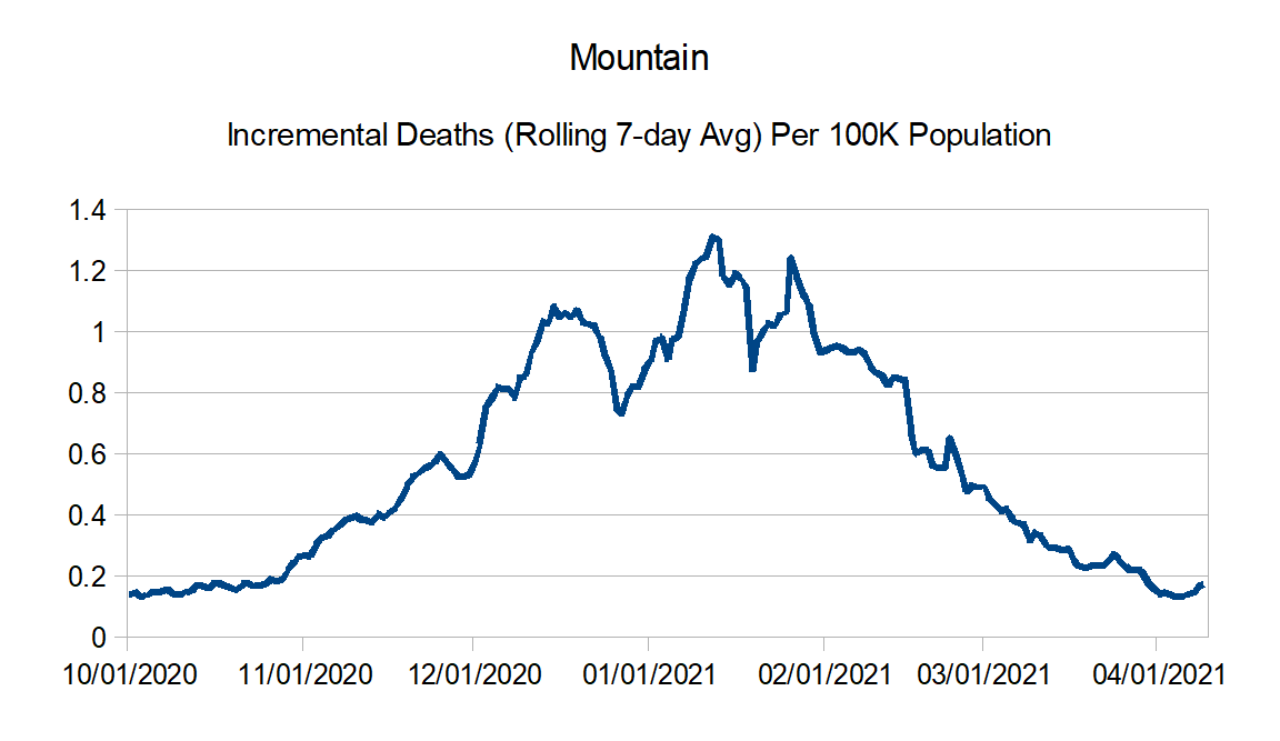
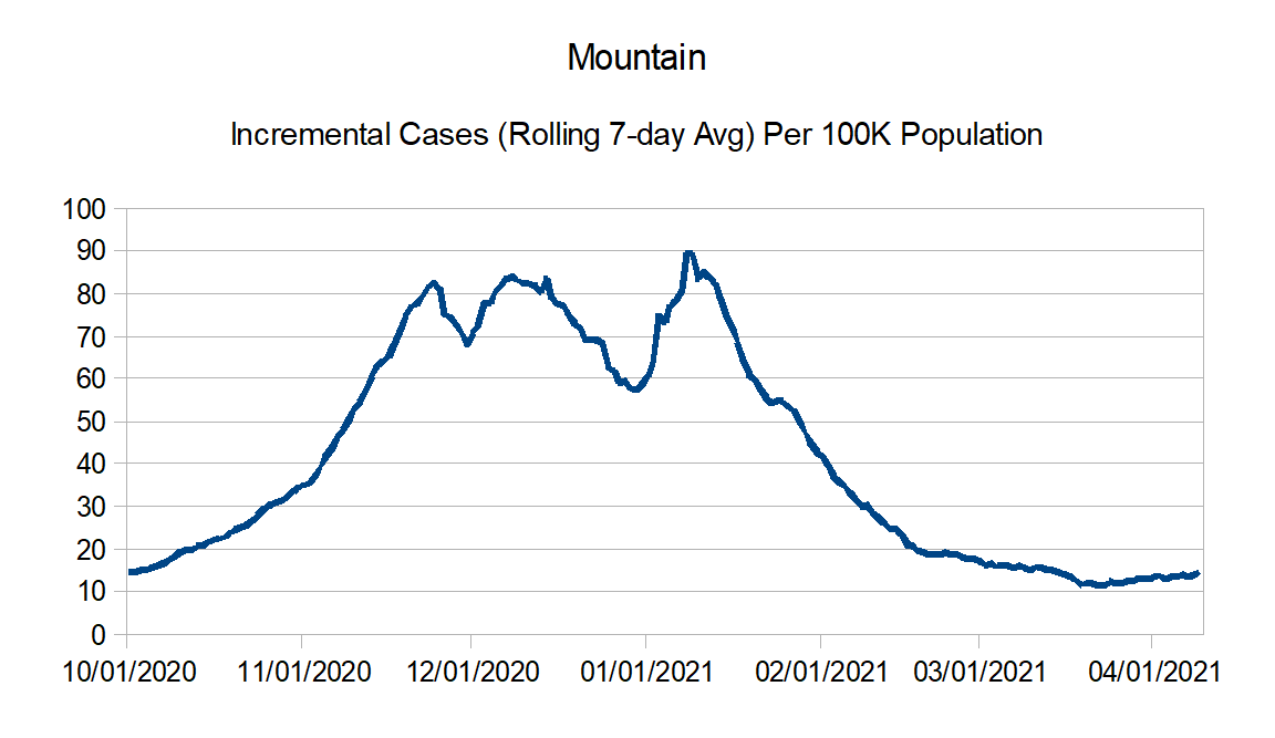
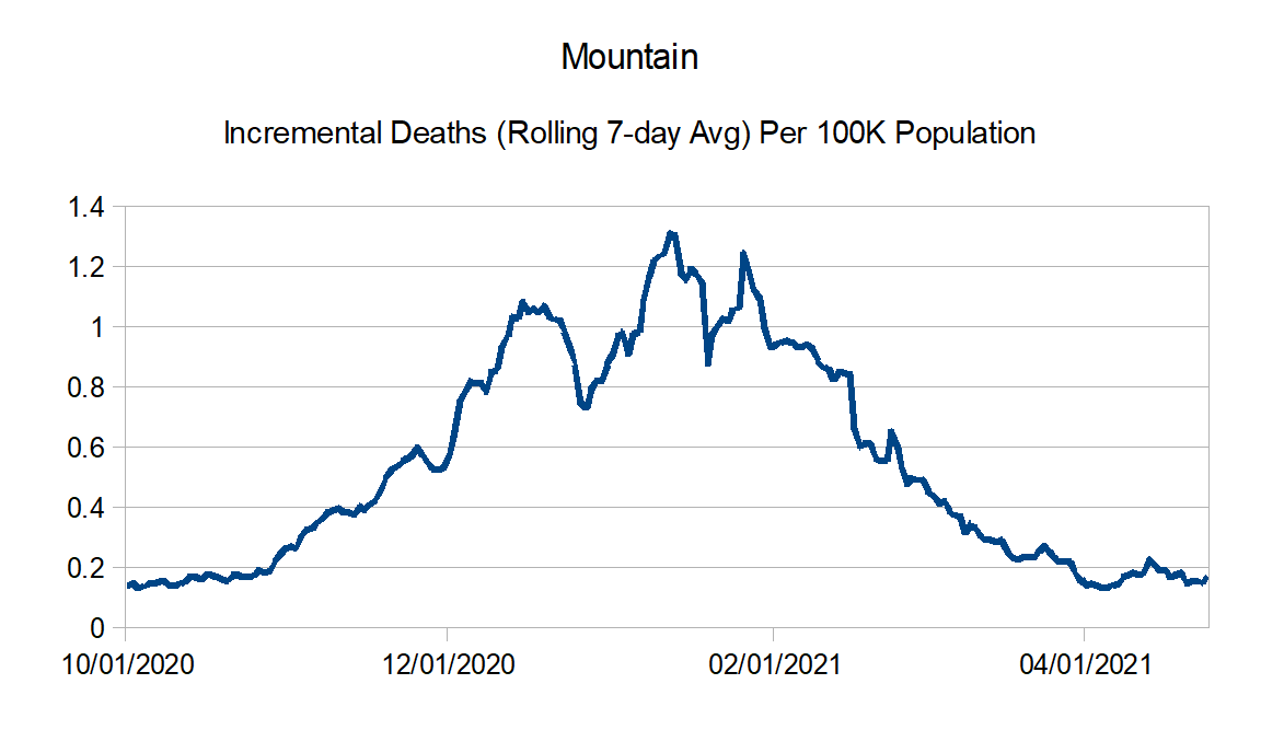
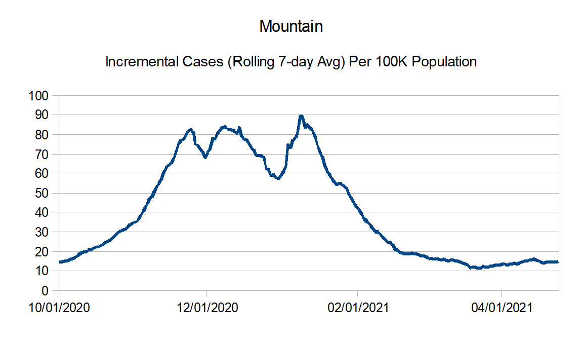
Mountain: Arizona, Colorado, Idaho, Montana, Nevada, New Mexico, Utah, and Wyoming
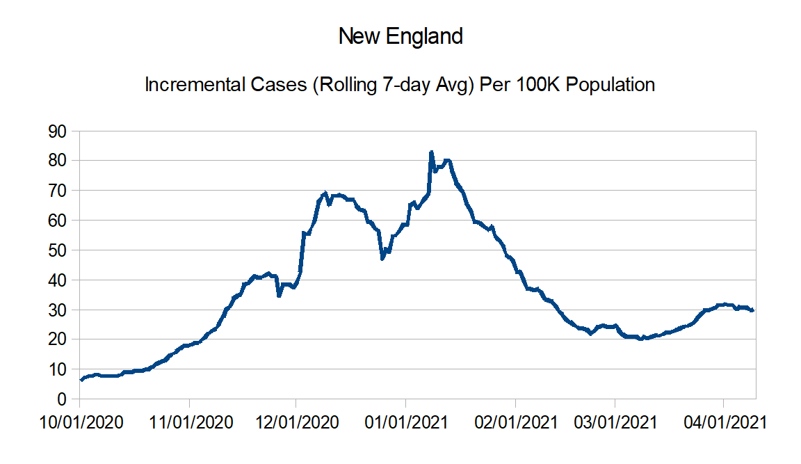
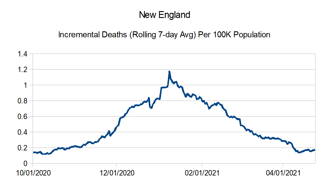
New England: Connecticut, Maine, Massachusetts, New Hampshire, Rhode Island, and Vermont
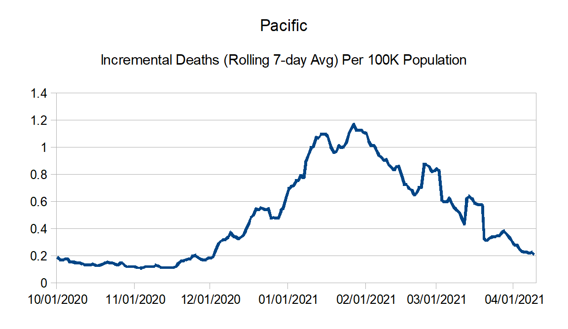
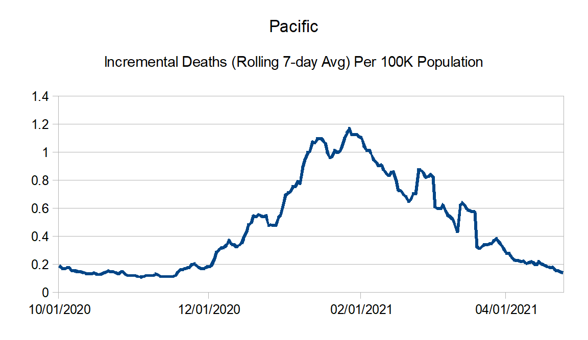
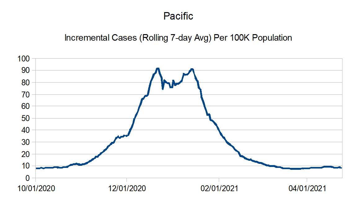
Pacific: Alaska, California, Hawaii, Oregon, and Washington
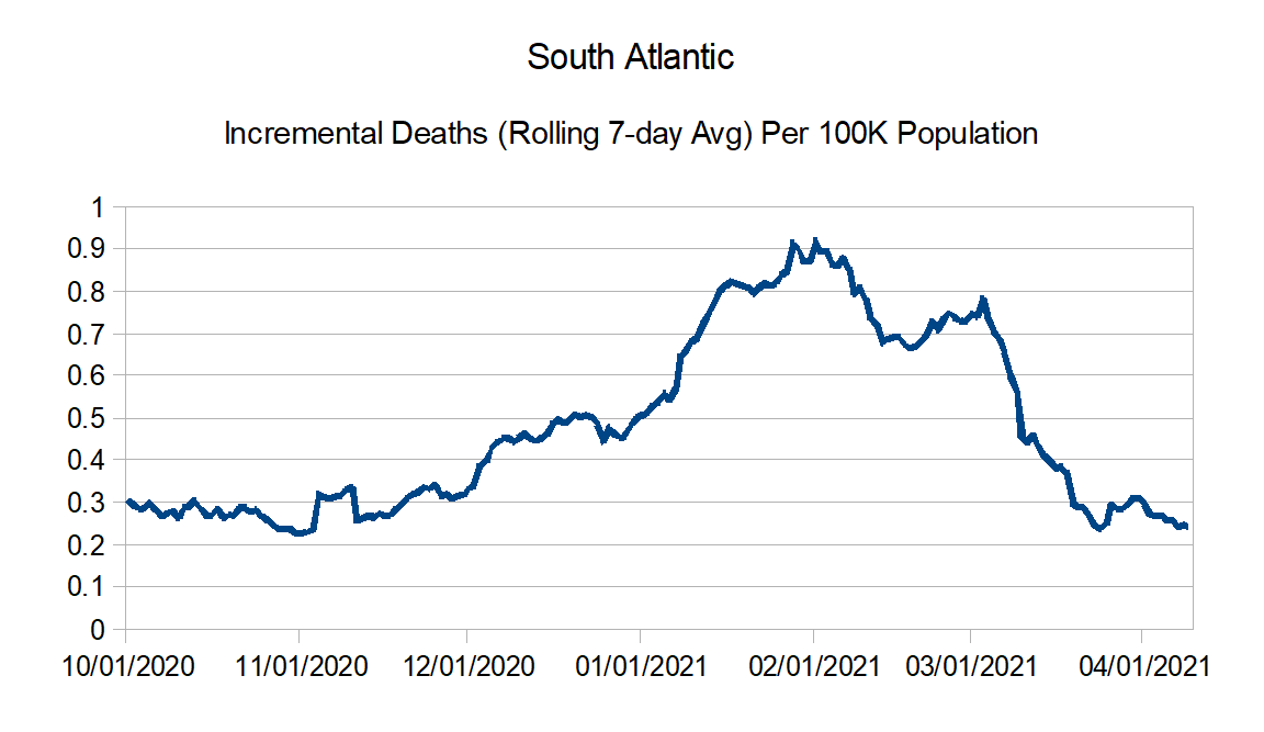
South Atlantic: Florida, Georgia, Maryland, North Carolina, South Carolina, Virginia, West Virginia, District of Columbia, Puerto Rico, Northern Mariana Islands, and Virgin Islands
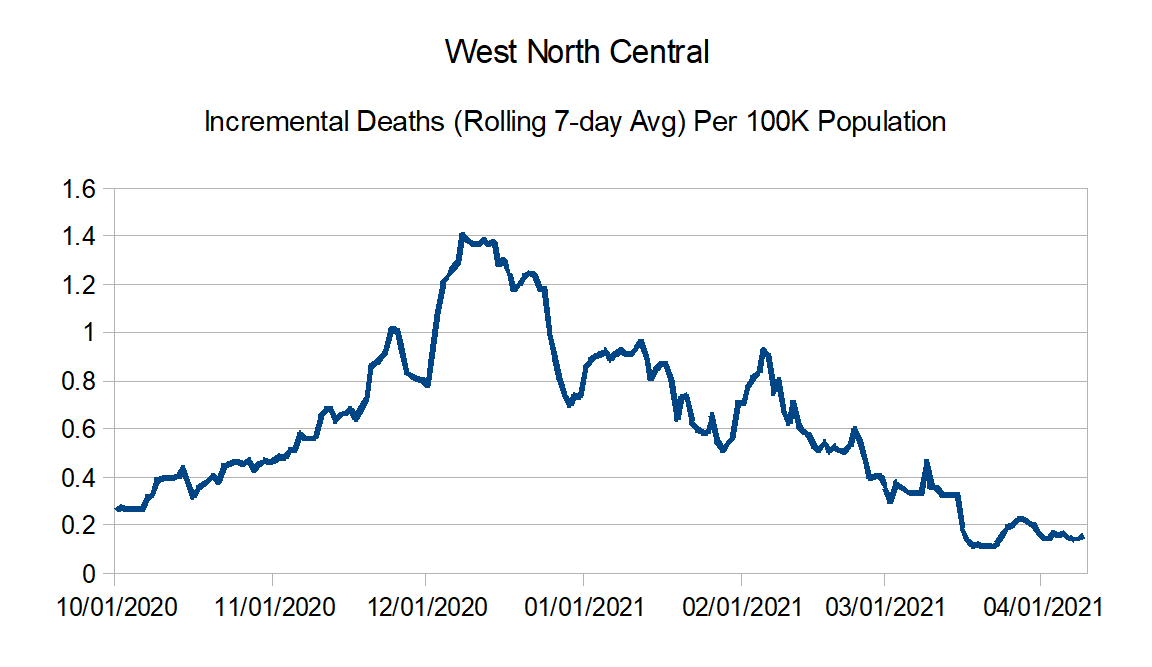
West North Central: Iowa, Kansas, Minnesota, Missouri, Nebraska, North Dakota, and South Dakota
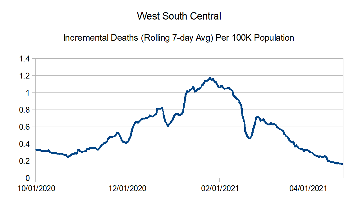
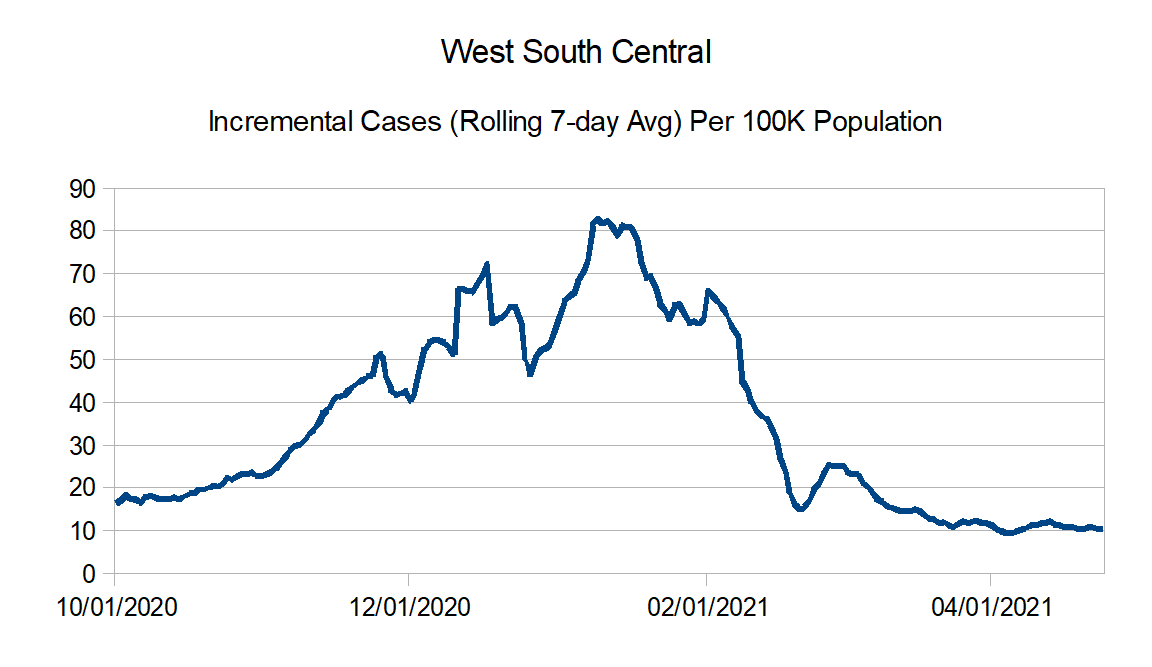
West South Central: Arkansas, Louisiana, Oklahoma, and Texas
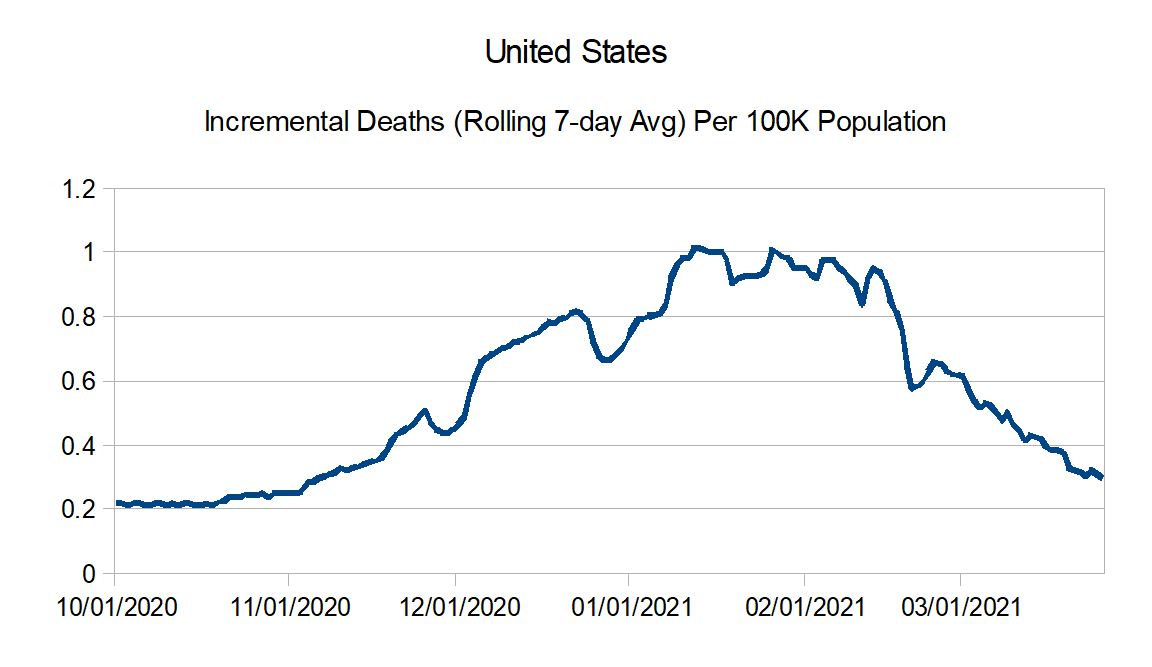
United States Graphs:

Regional Charts:


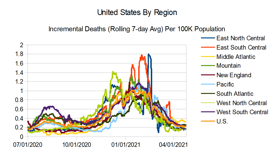
And finally the regional comparison routes:
Next update in a couple of weeks.