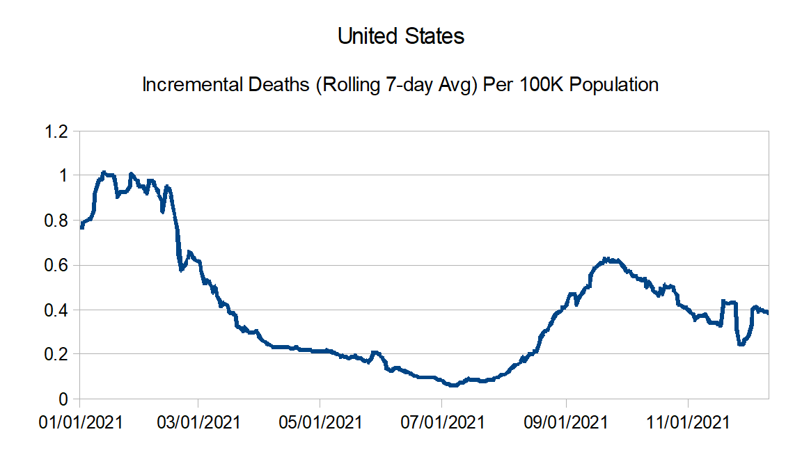
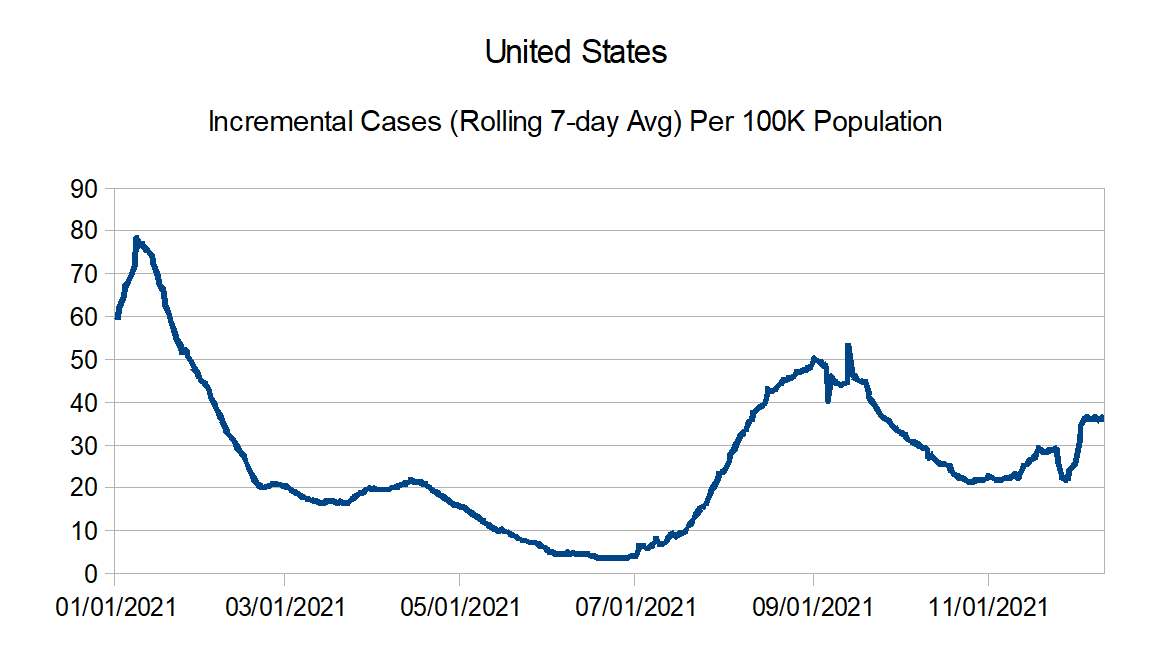
Before I show the updated graphs, a couple of notes. First, even with all the news surrounding the Omicron variant, Delta is certainly still the dominant strain in the United States. Second, it is too early to tell what the impacts of Omicron will be. It almost certainly is more infectious. But the relative virulence is not yet known. It does seem while the vaccines may not be as effective in preventing absolute infection, it still provides solid protection against severe disease.
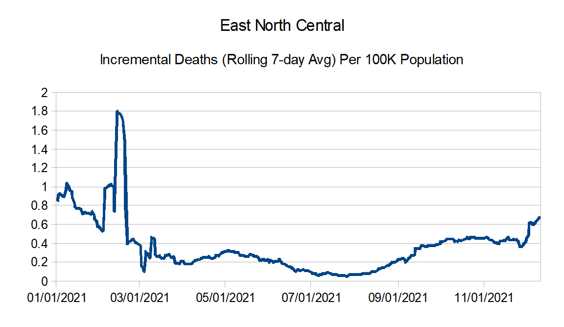
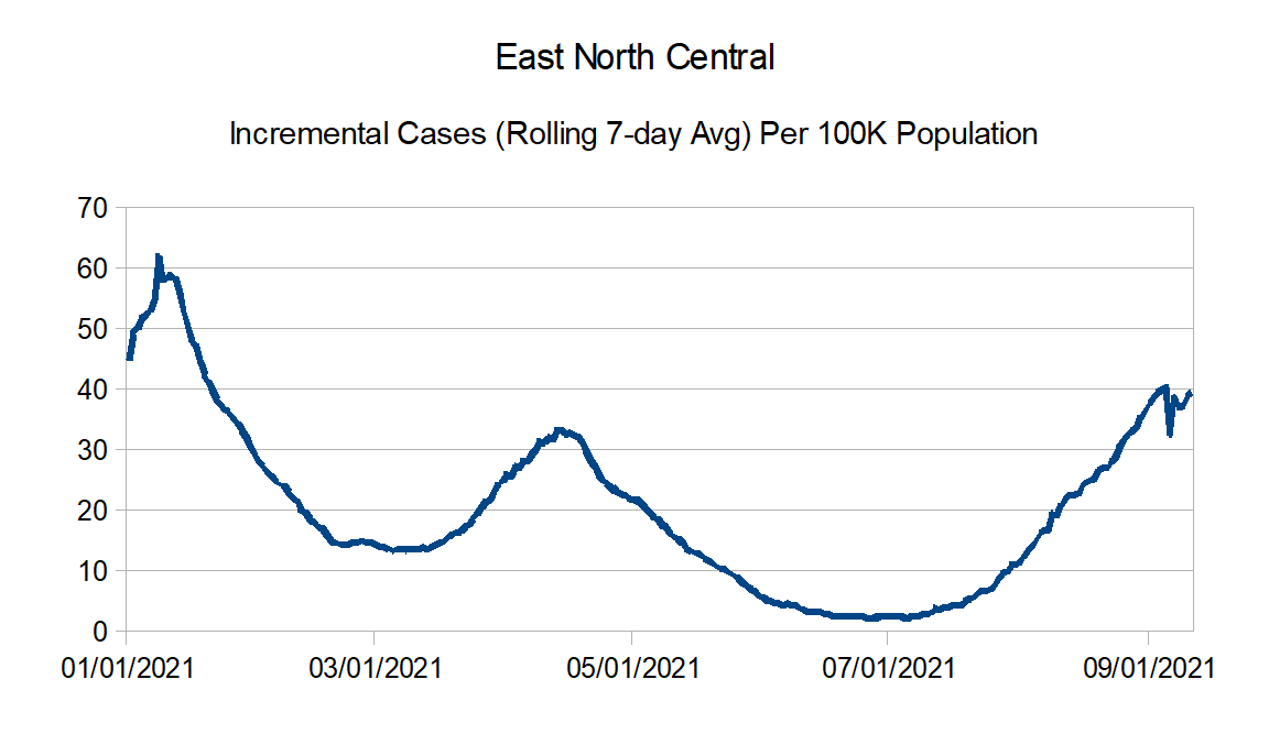
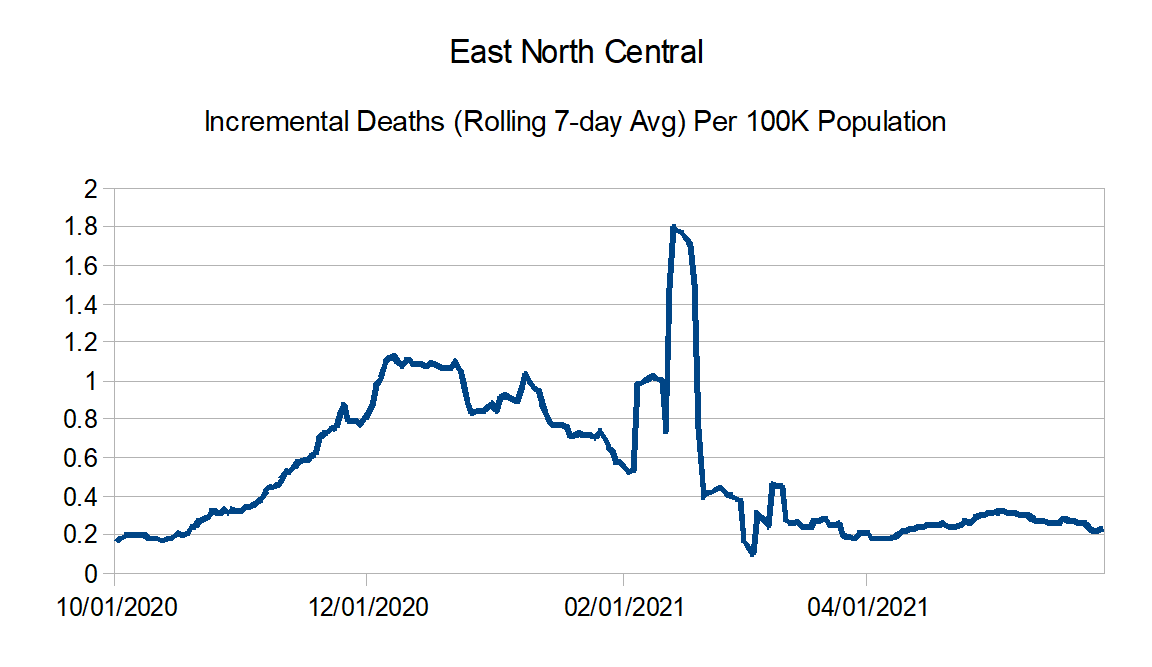
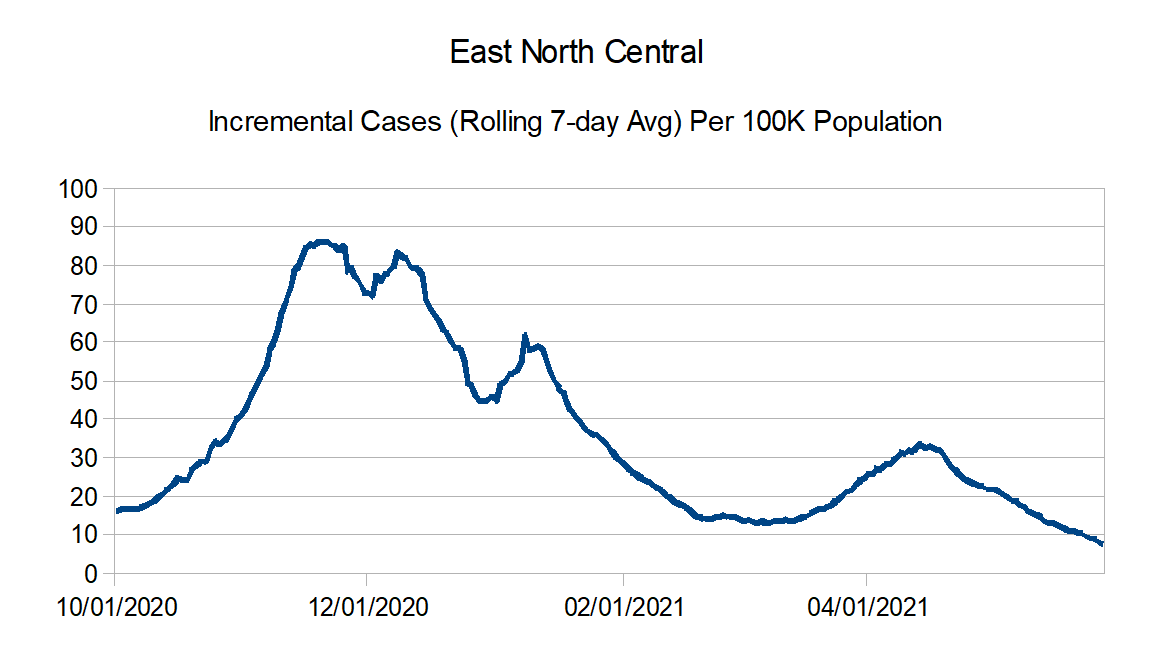
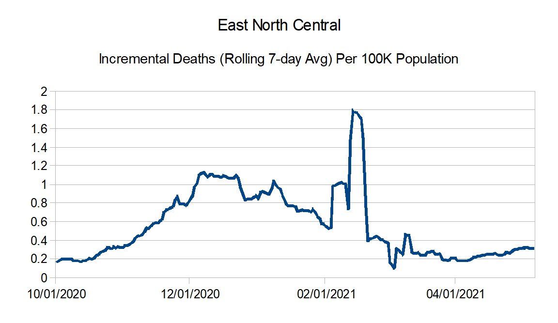
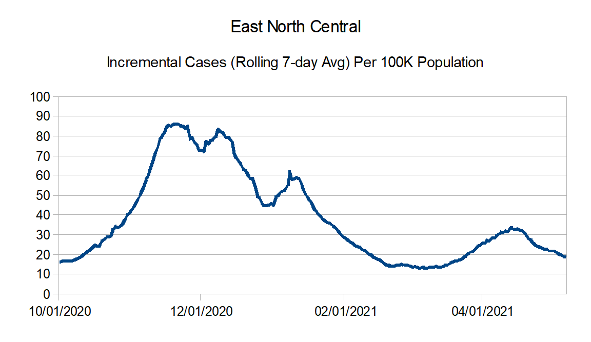
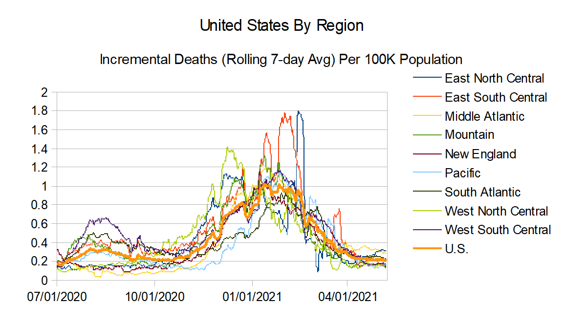
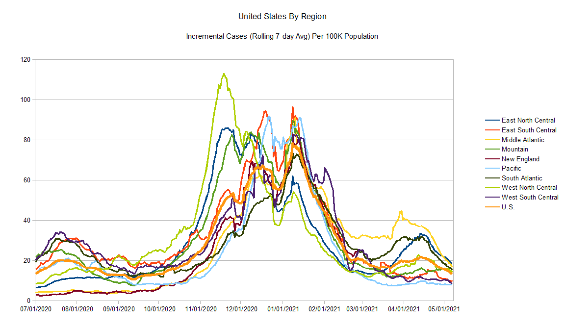
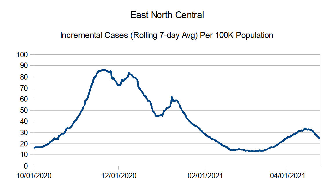
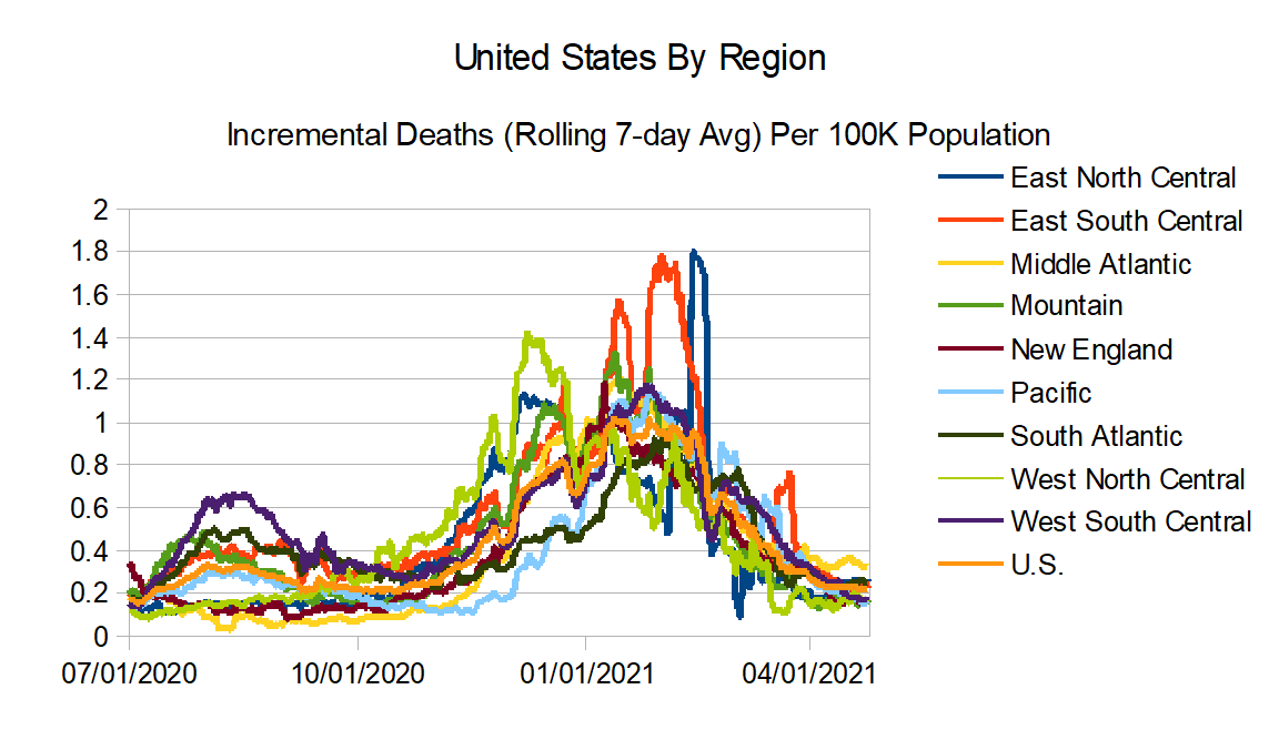
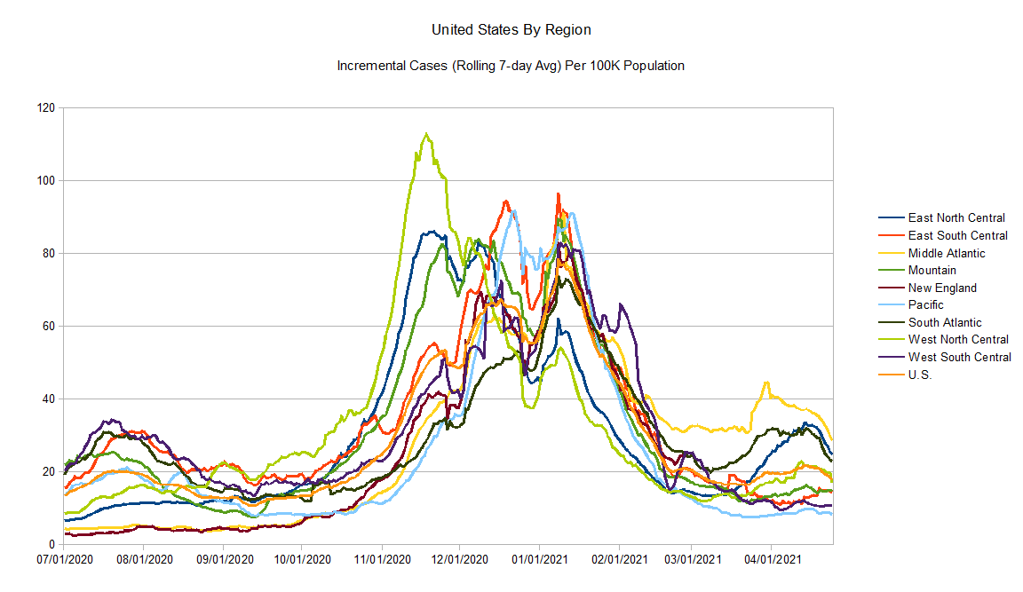
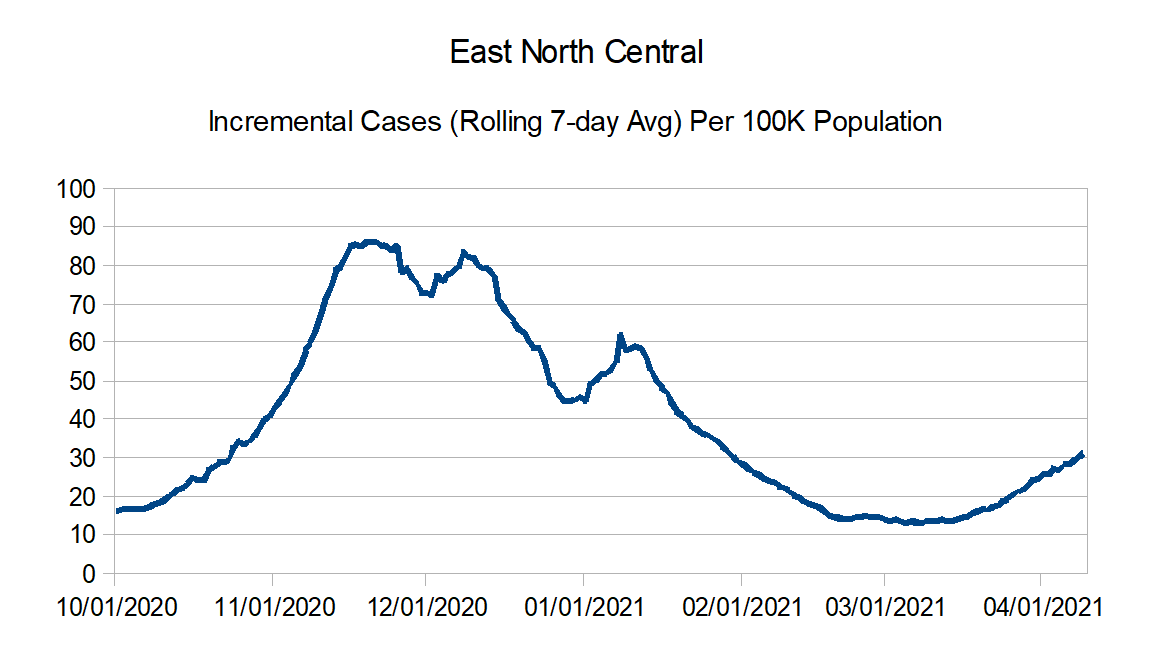
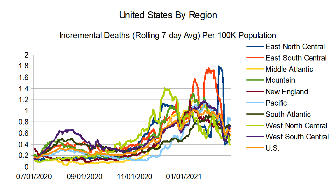
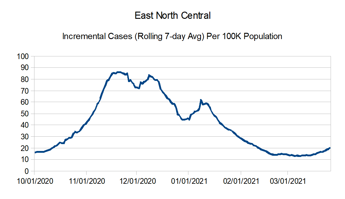
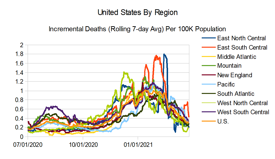
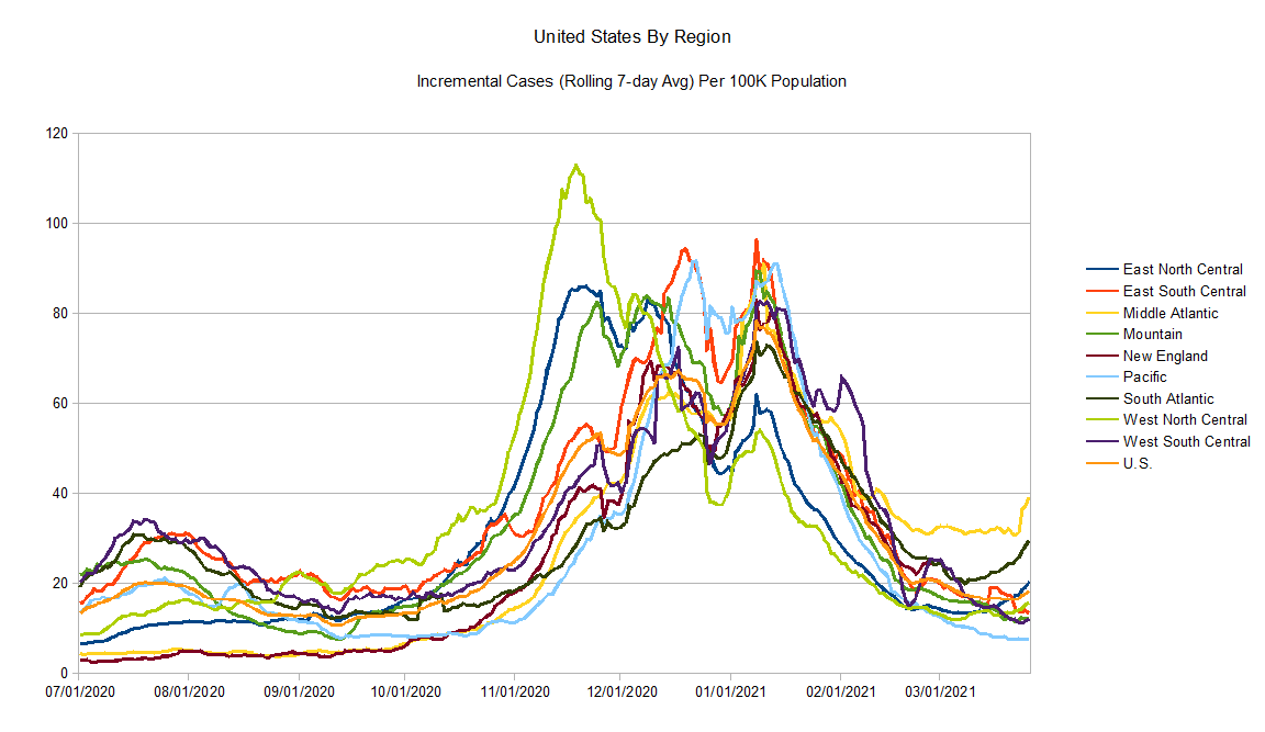
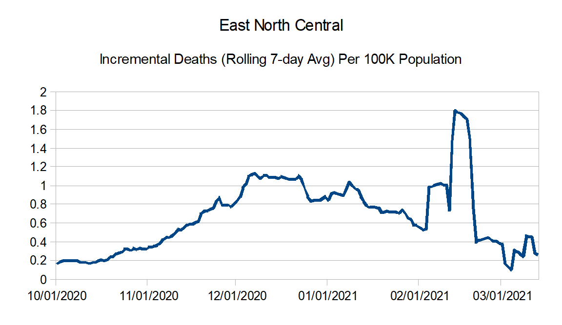
East North Central: Illinois, Indiana, Michigan, Ohio, and Wisconsin
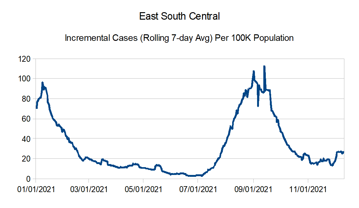
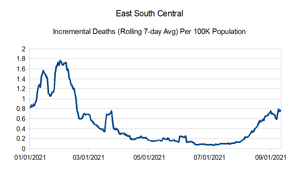
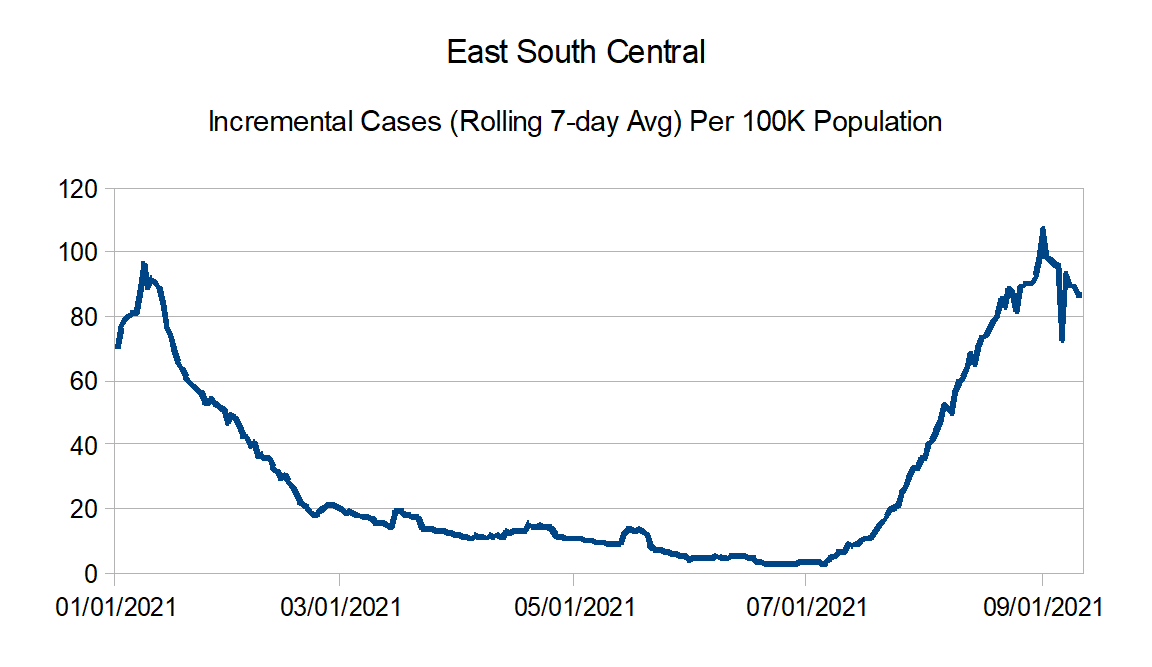
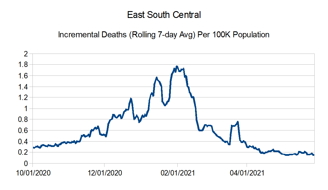
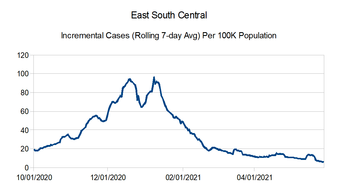
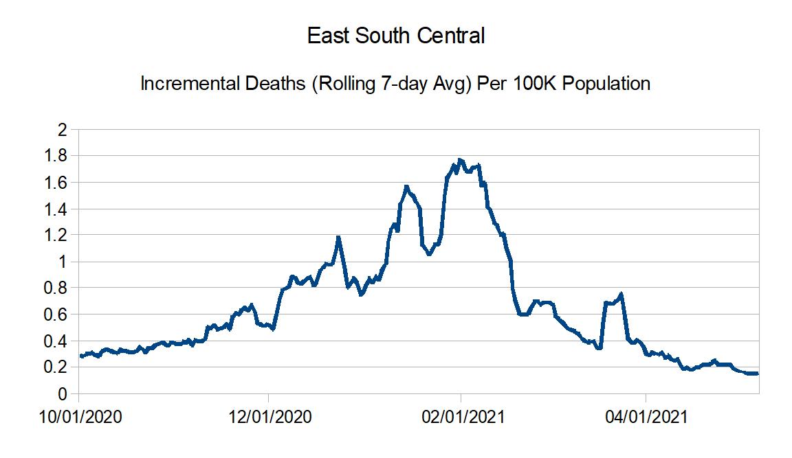
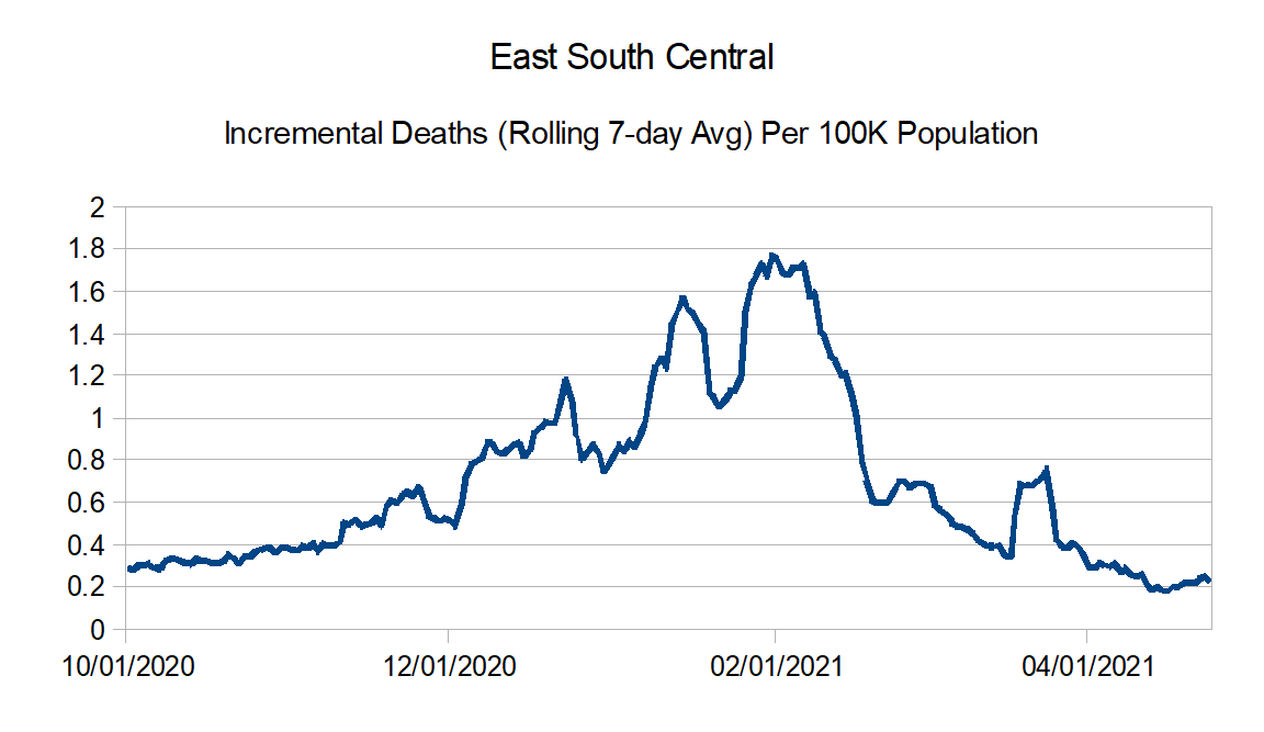
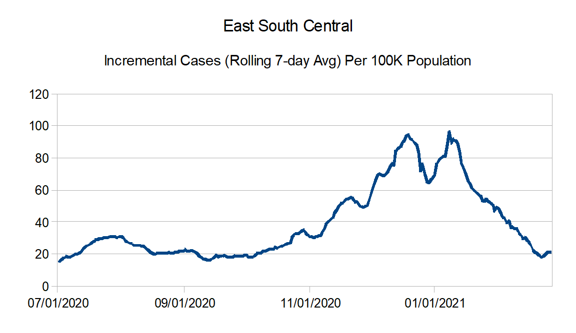
East South Central: Alabama, Kentucky, Mississippi, and Tennessee
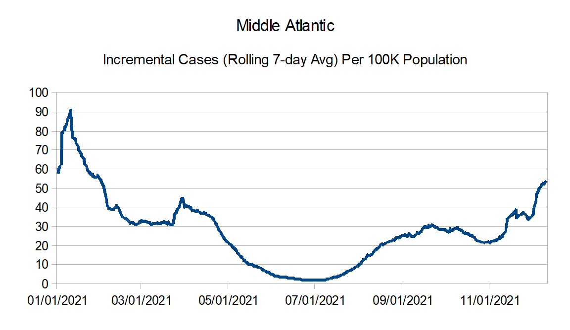
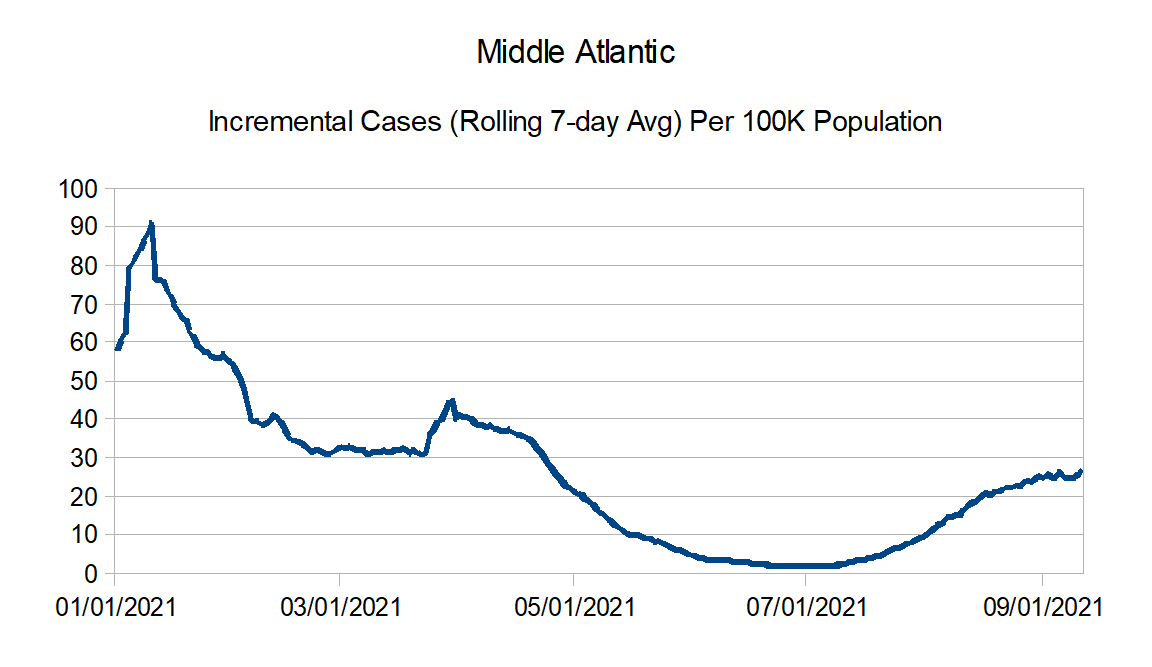
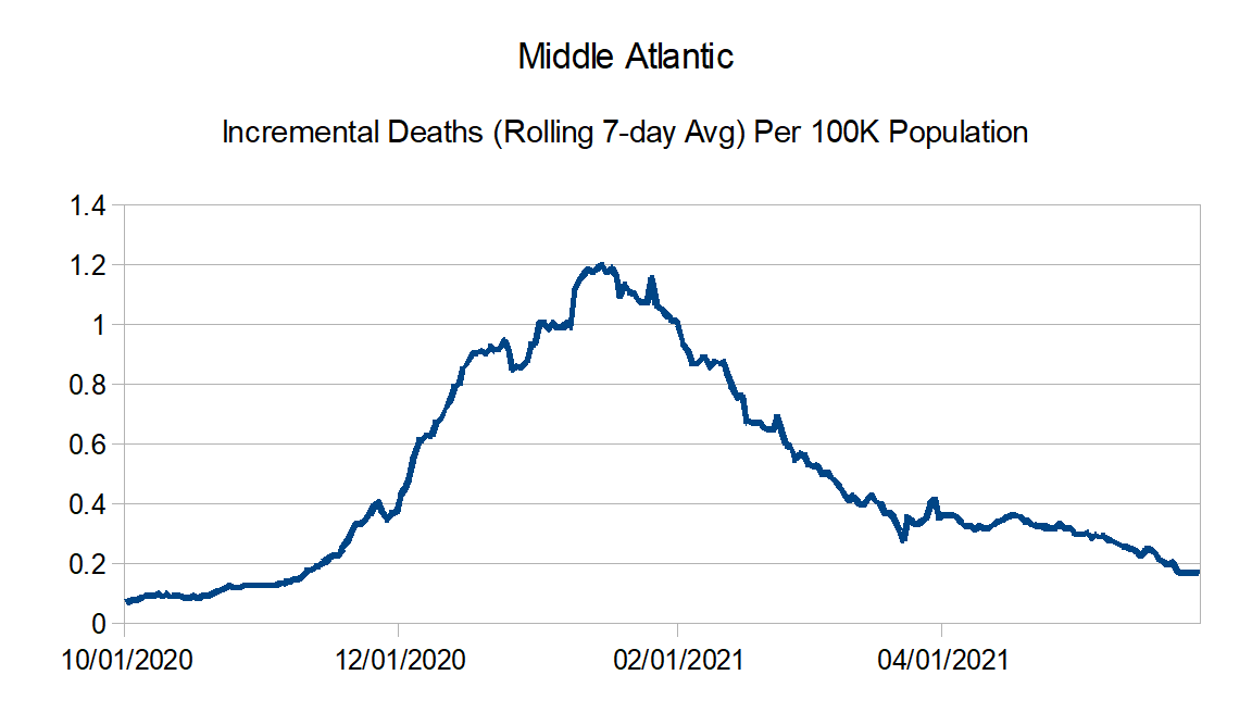
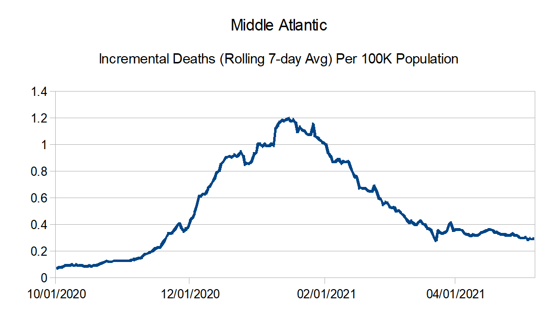
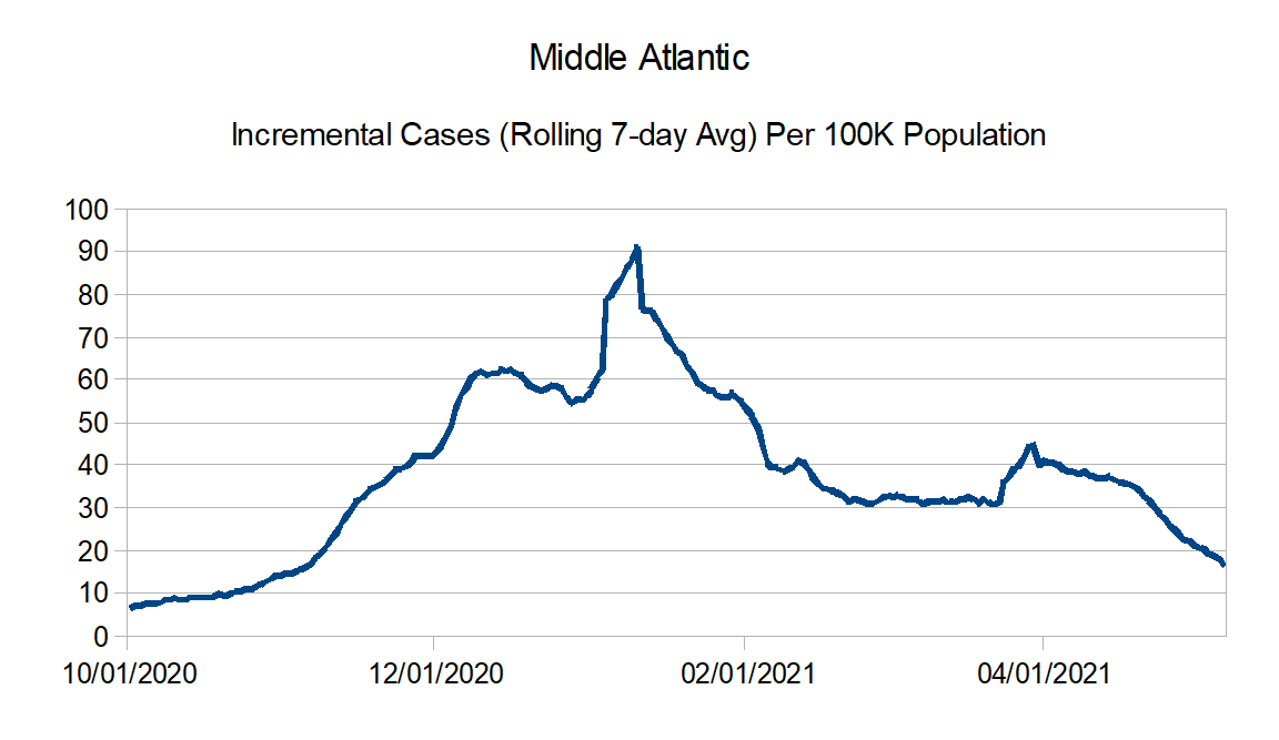
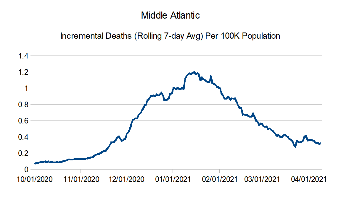
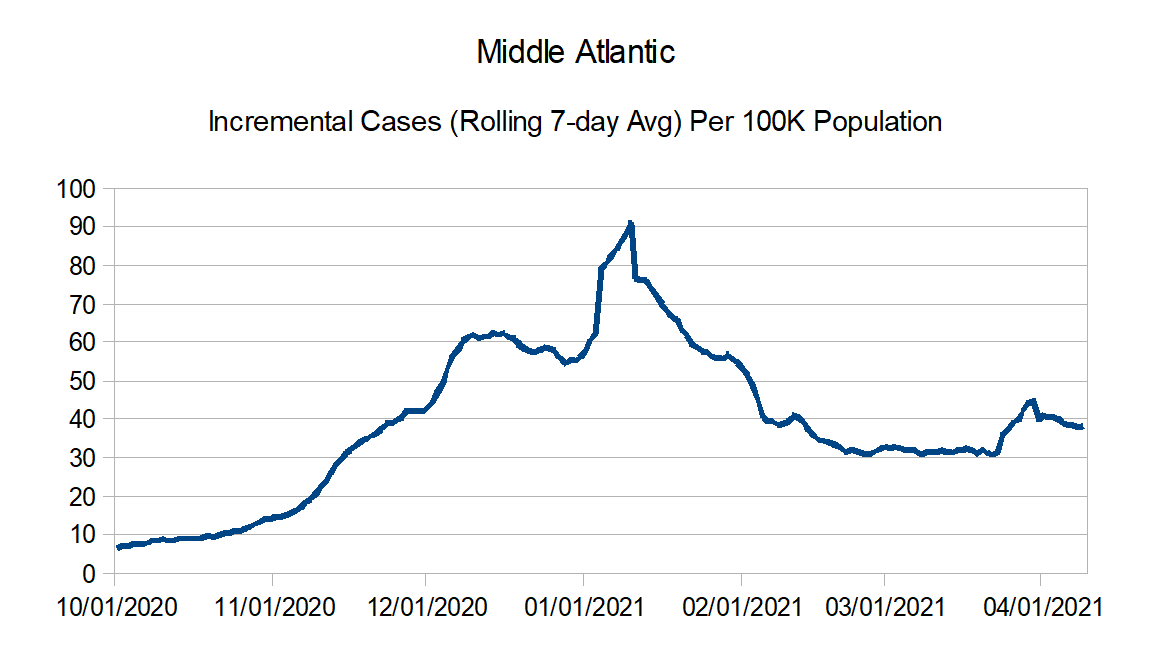
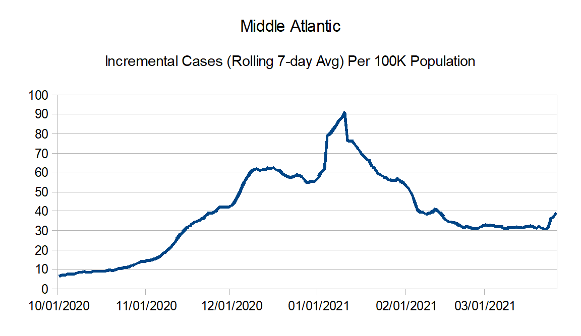
Middle Atlantic: Delaware, New Jersey, New York, and Pennsylvania
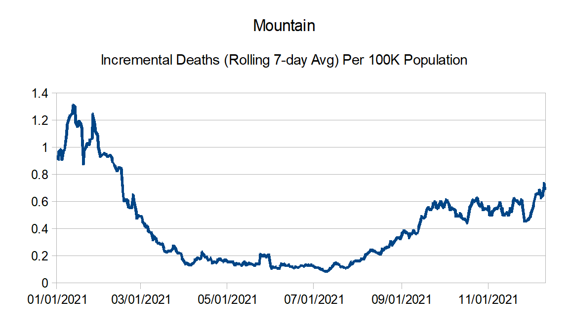
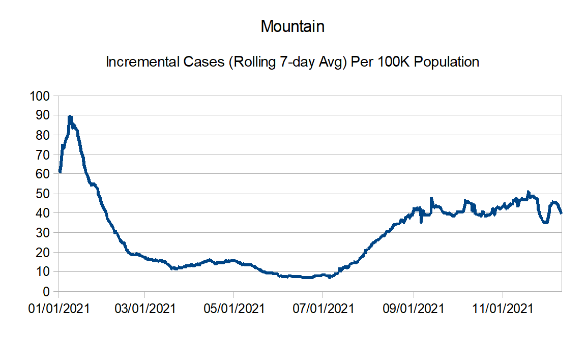
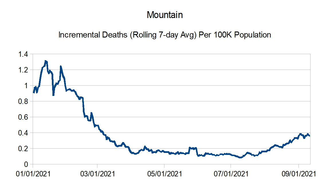
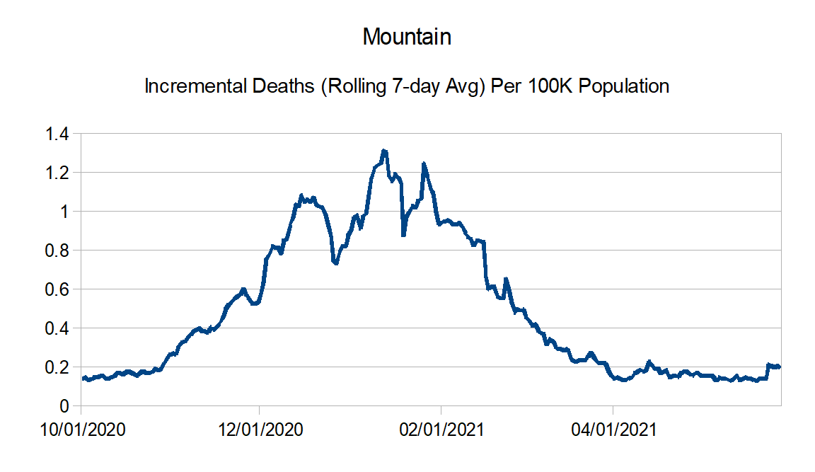
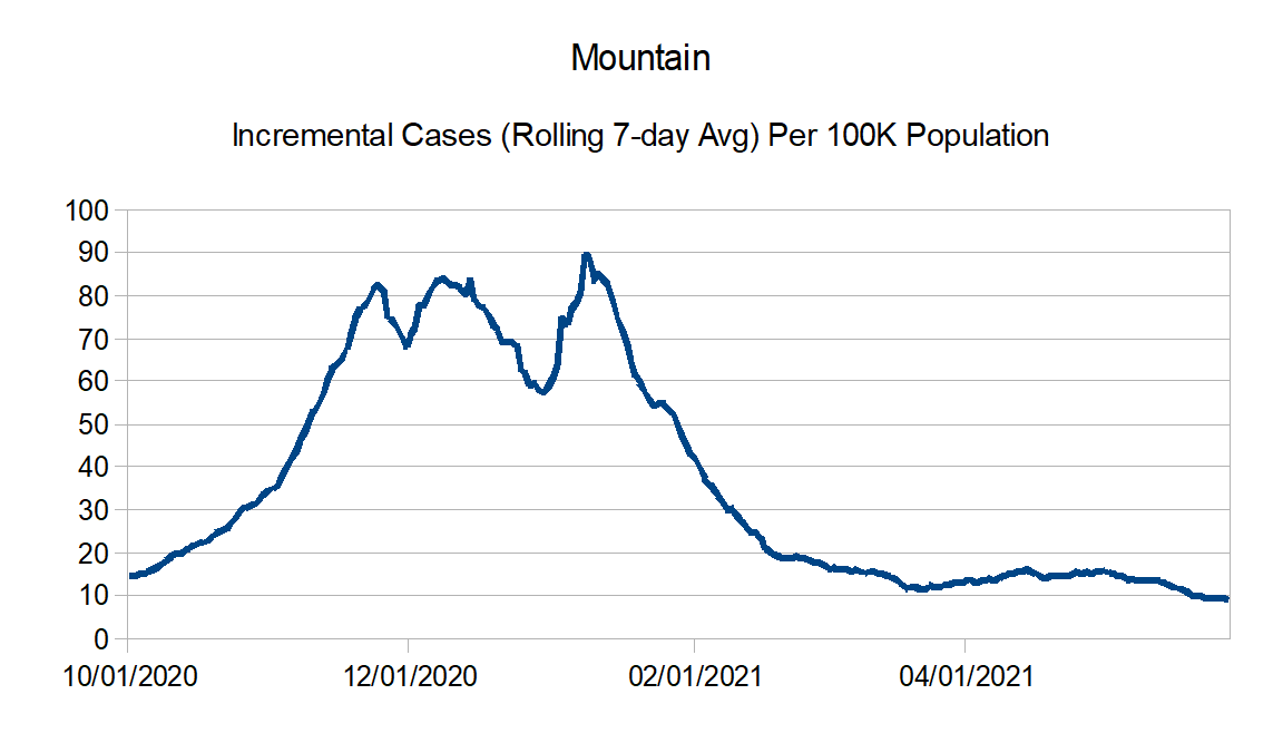
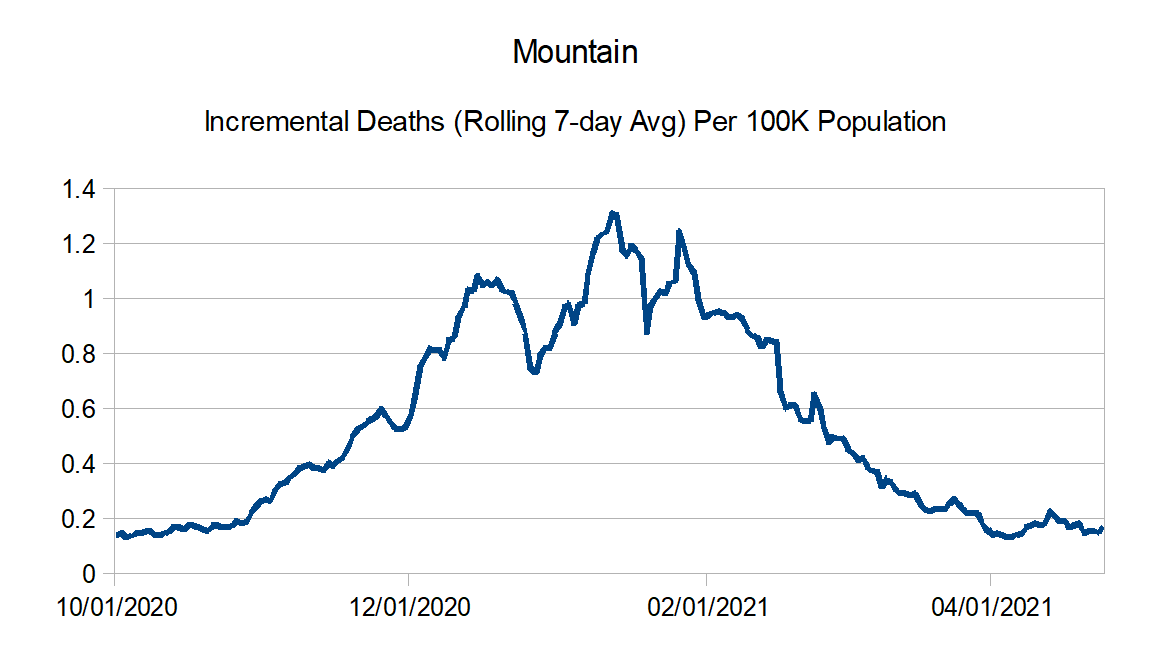
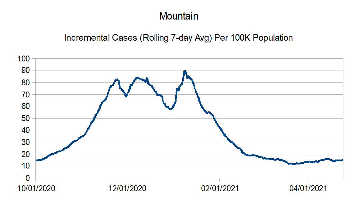
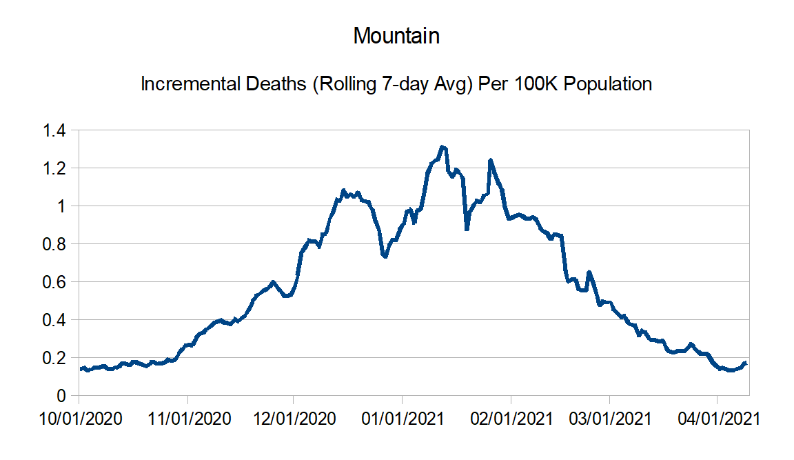
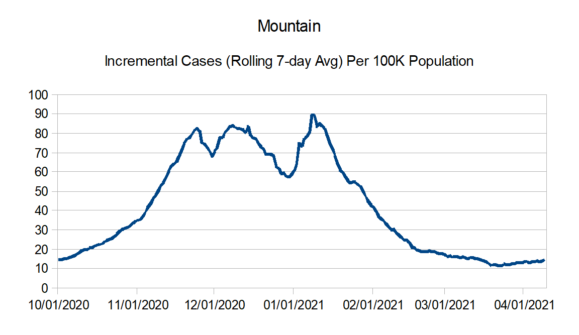
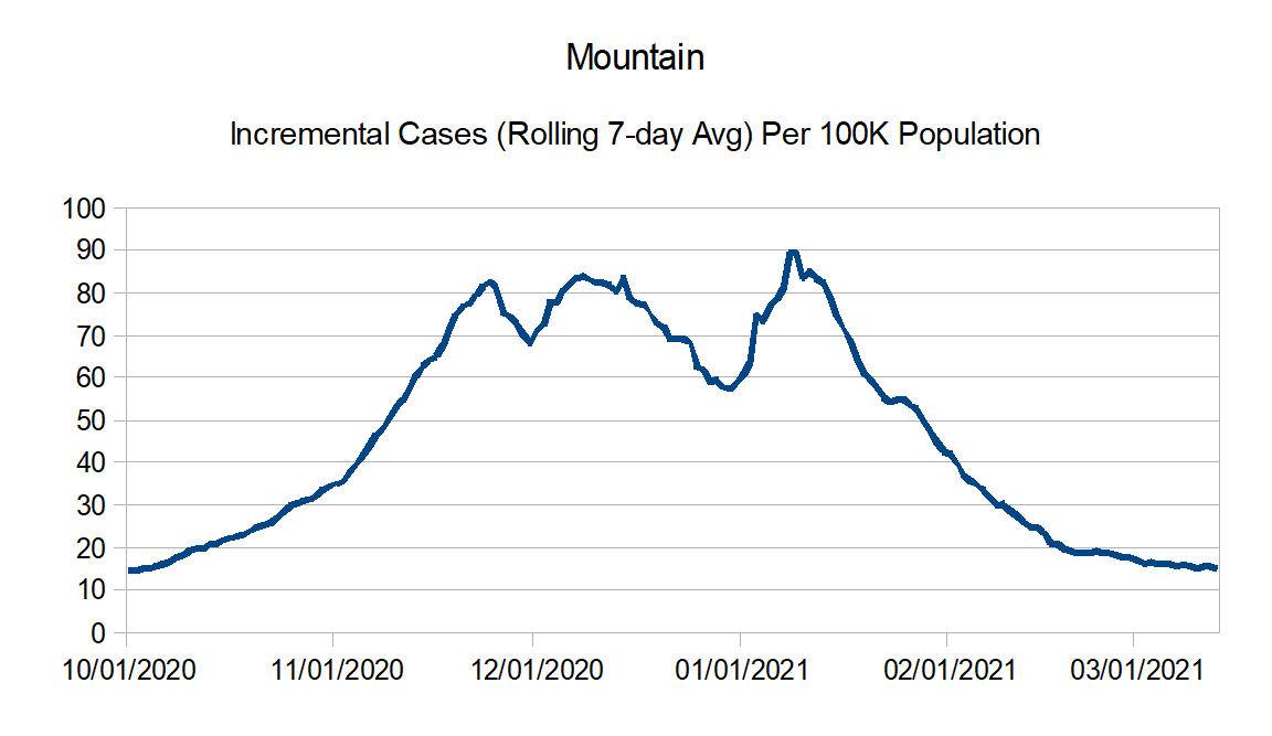
Mountain: Arizona, Colorado, Idaho, Montana, Nevada, New Mexico, Utah, and Wyoming
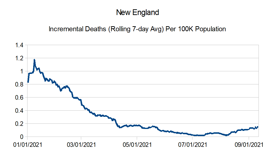
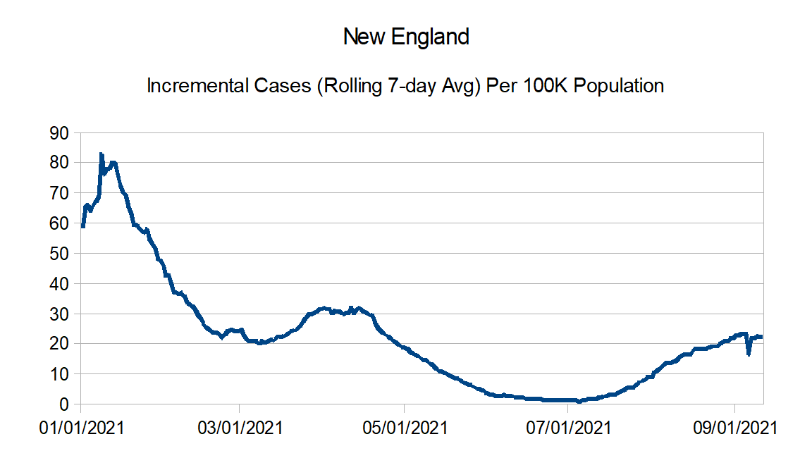
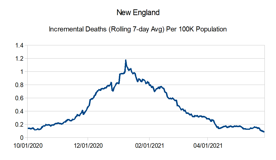
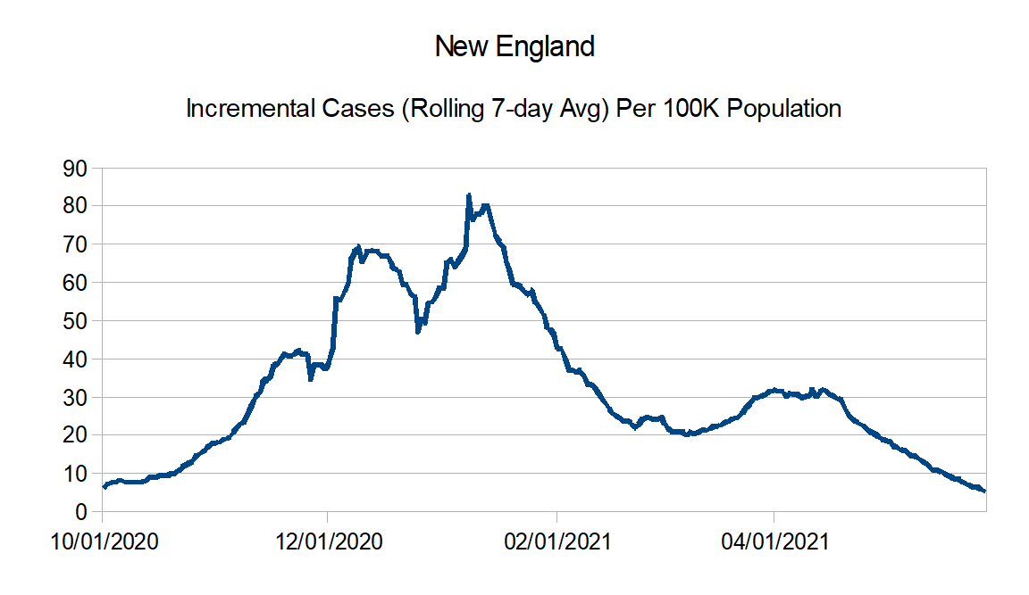
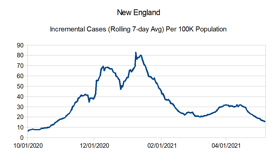
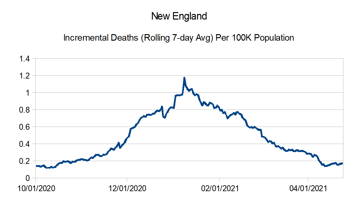
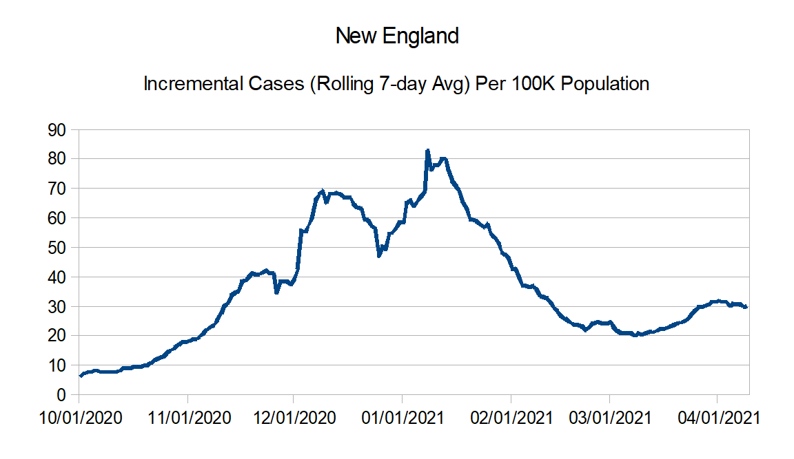
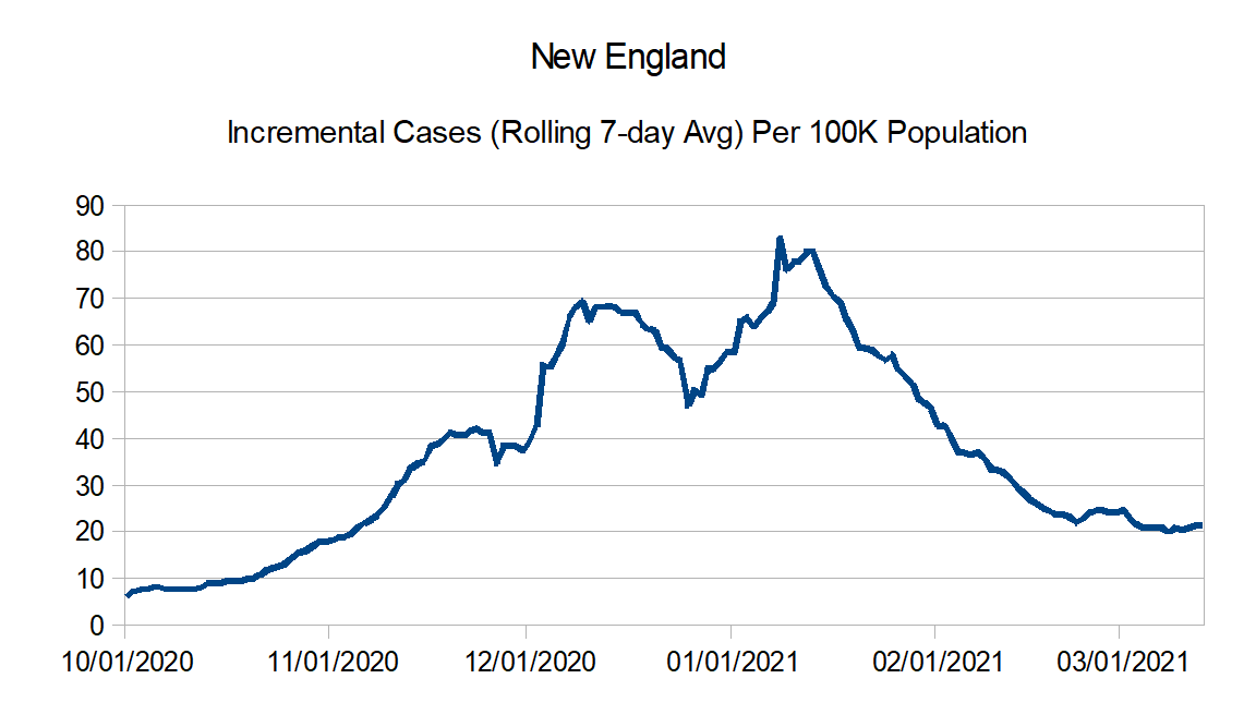
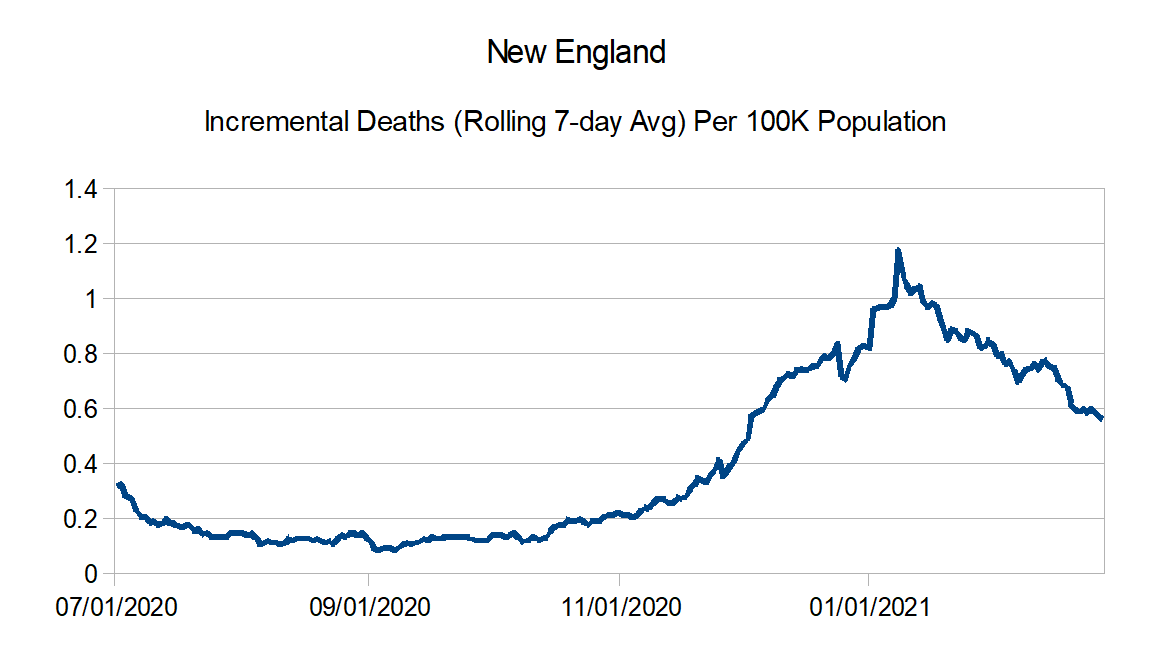
New England: Connecticut, Maine, Massachusetts, New Hampshire, Rhode Island, and Vermont
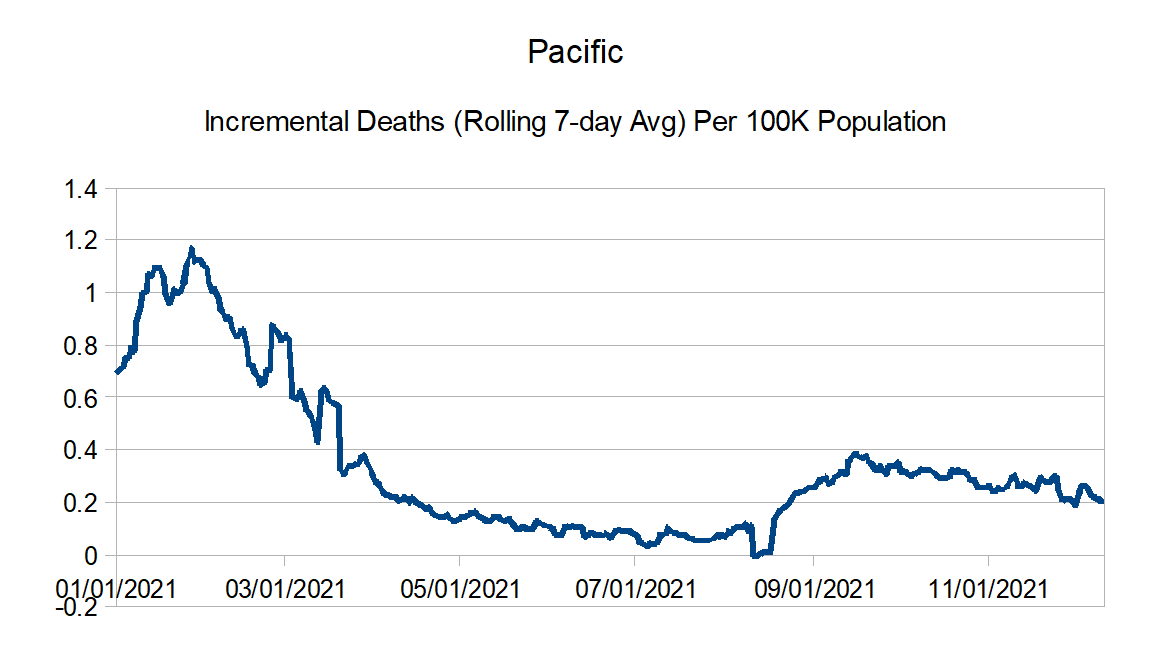
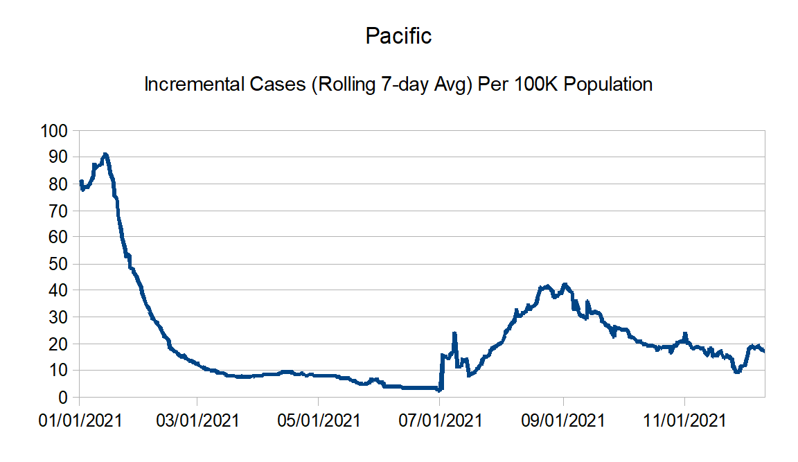
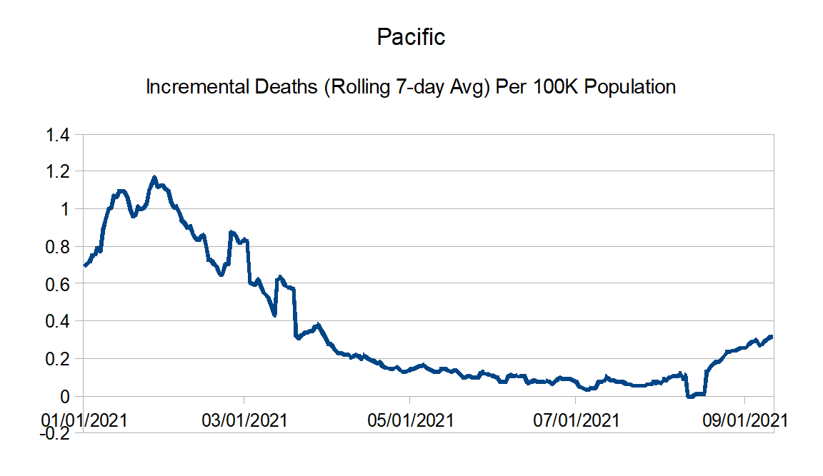
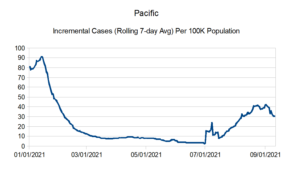
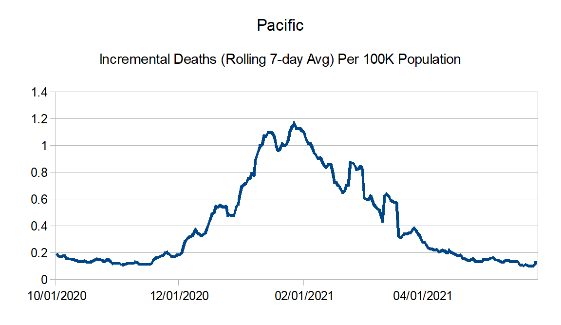
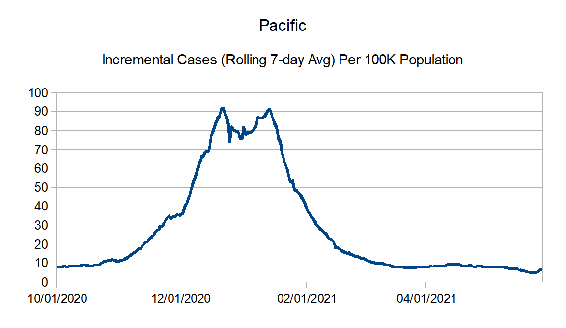
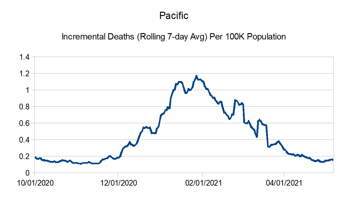
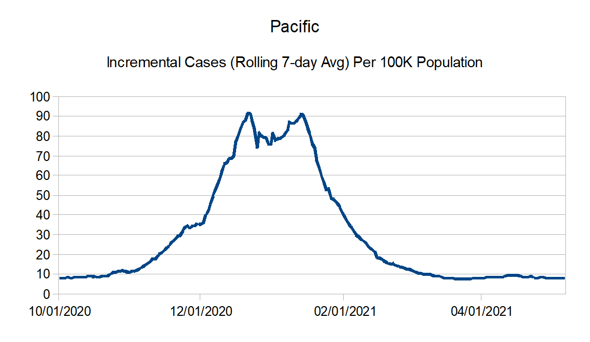
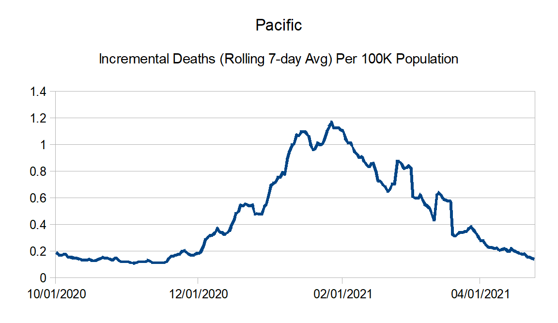
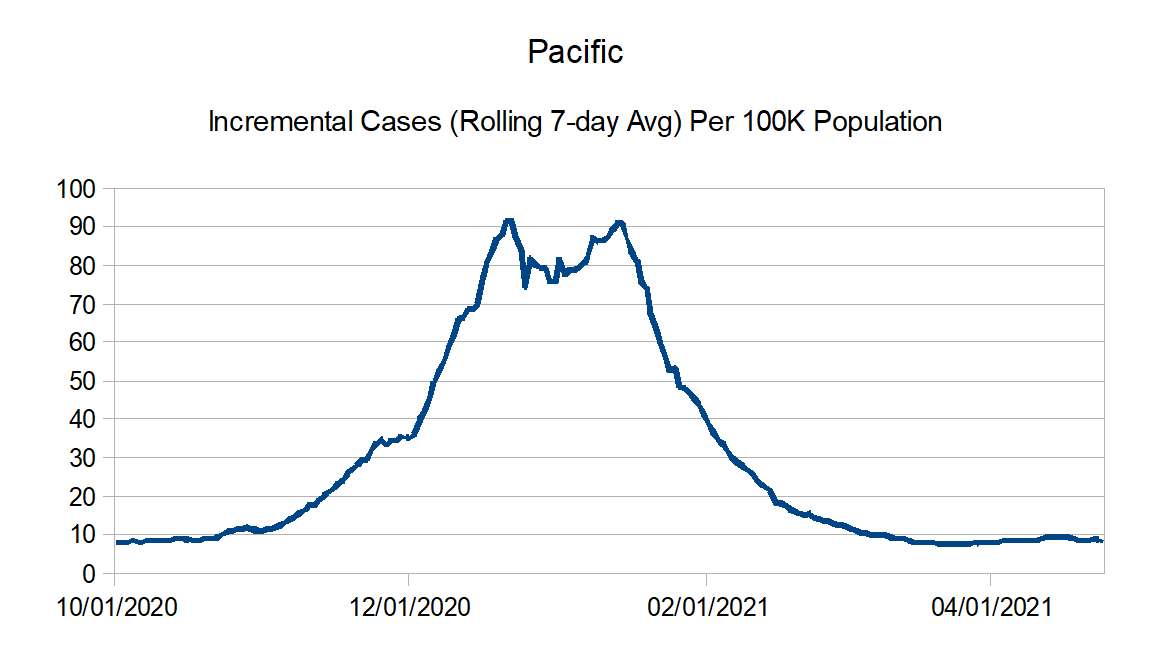
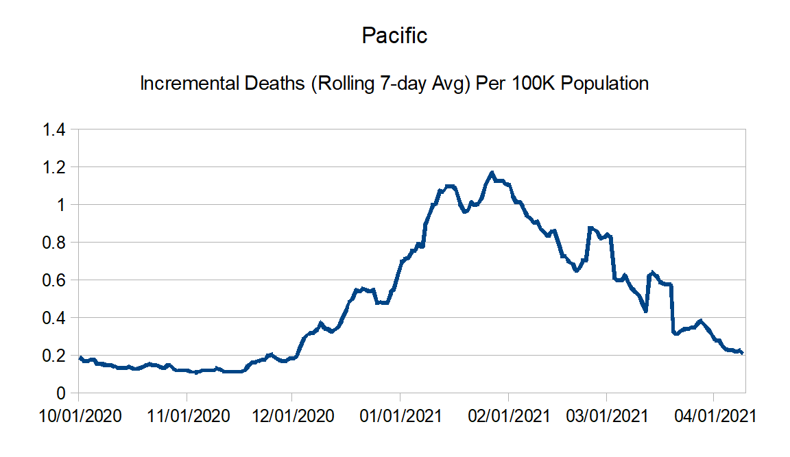
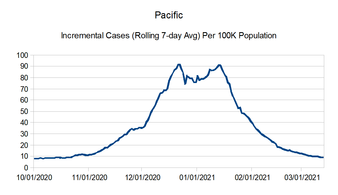
Pacific: Alaska, California, Hawaii, Oregon, and Washington
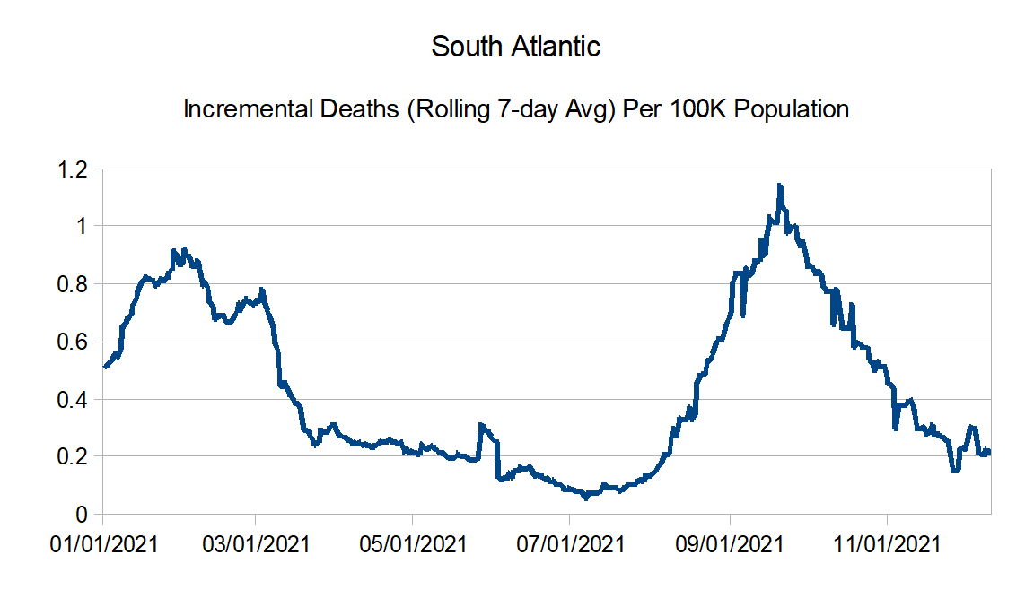
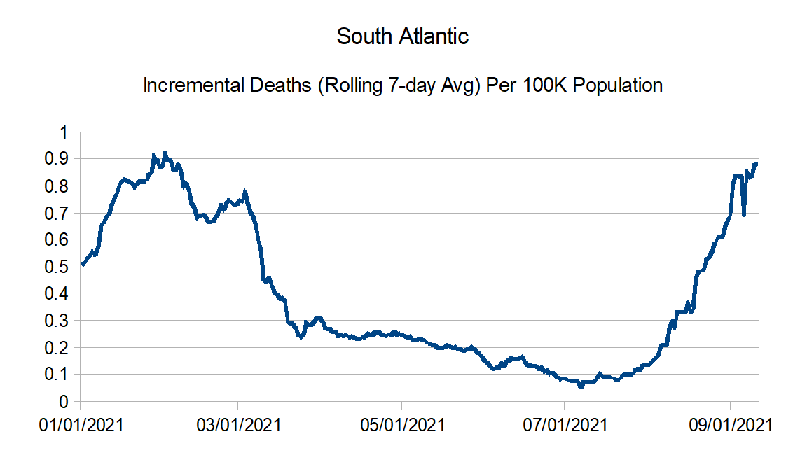
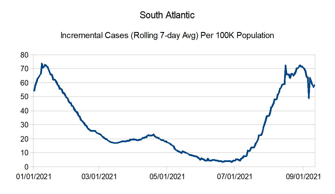
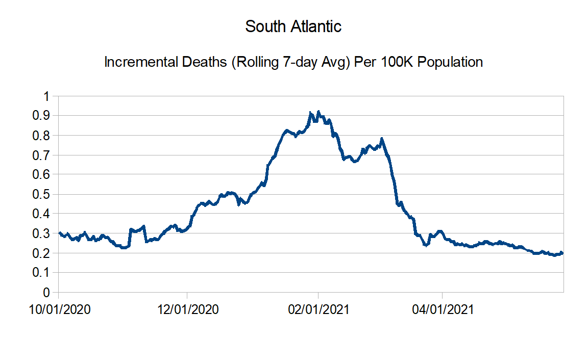
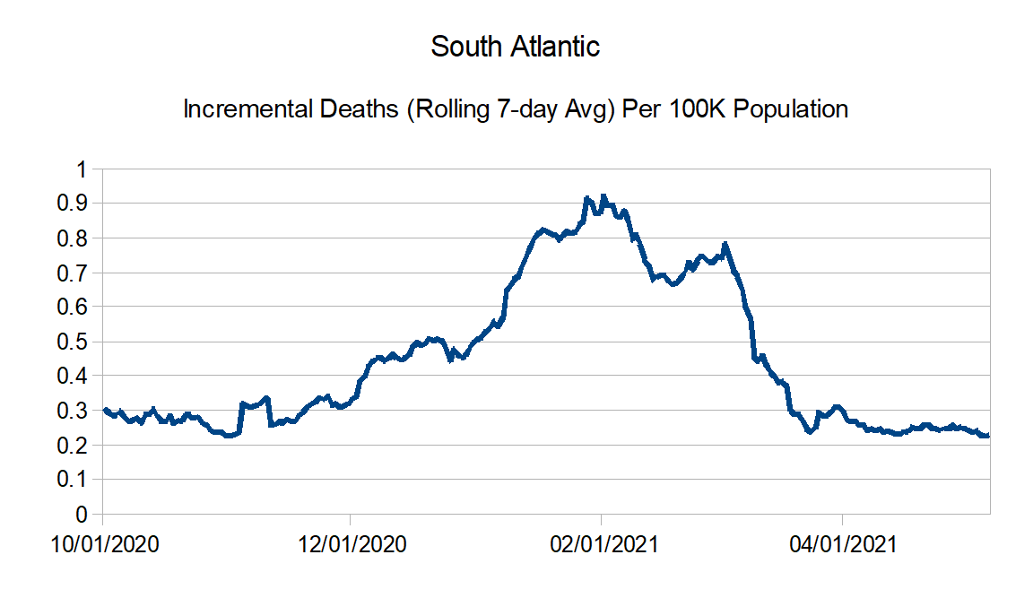
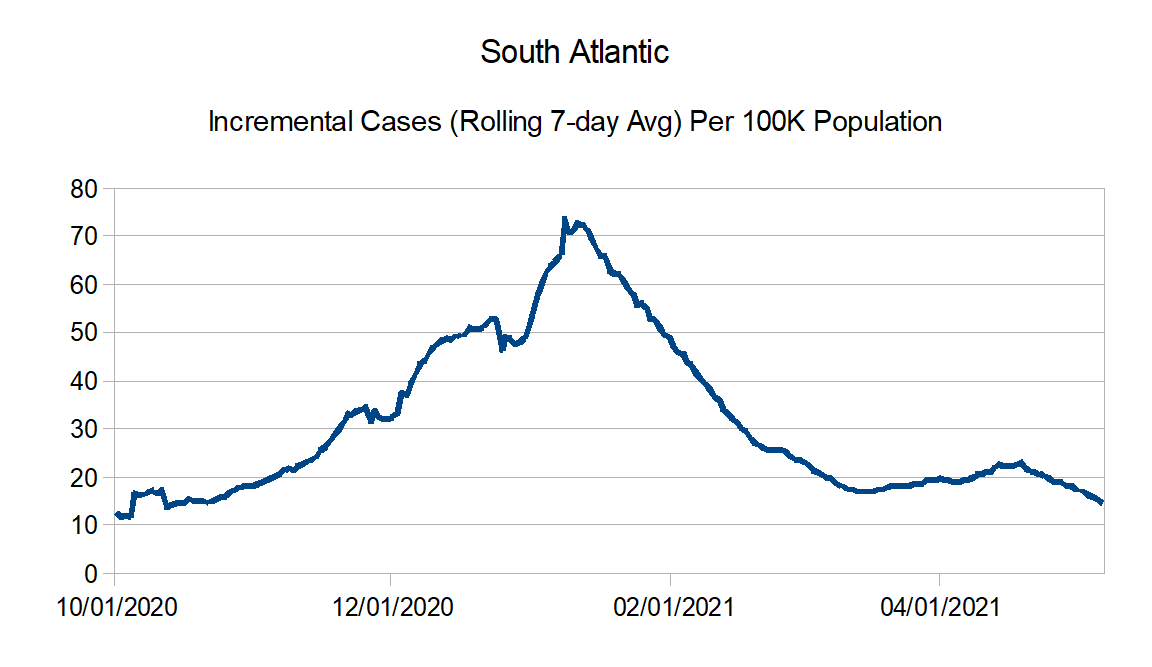
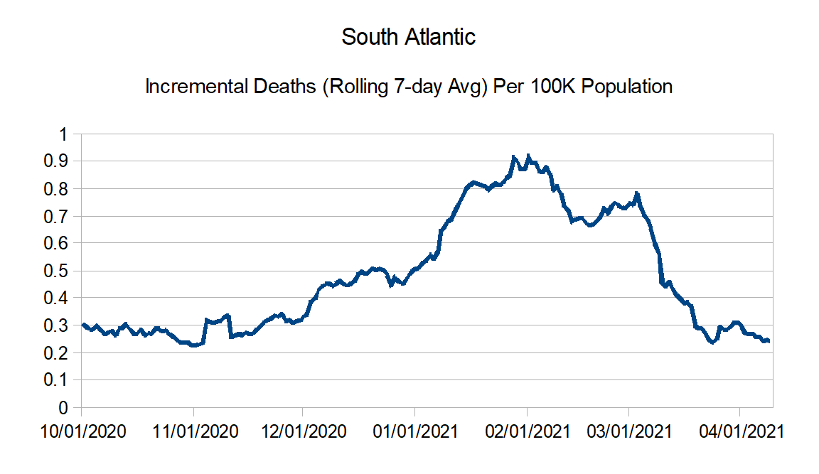
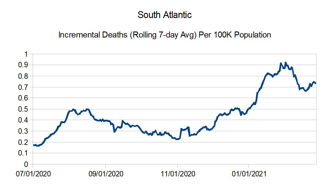
South Atlantic: Florida, Georgia, Maryland, North Carolina, South Carolina, Virginia, West Virginia, District of Columbia, Puerto Rico, Northern Mariana Islands, and Virgin Islands
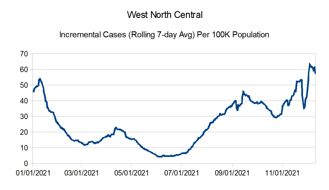
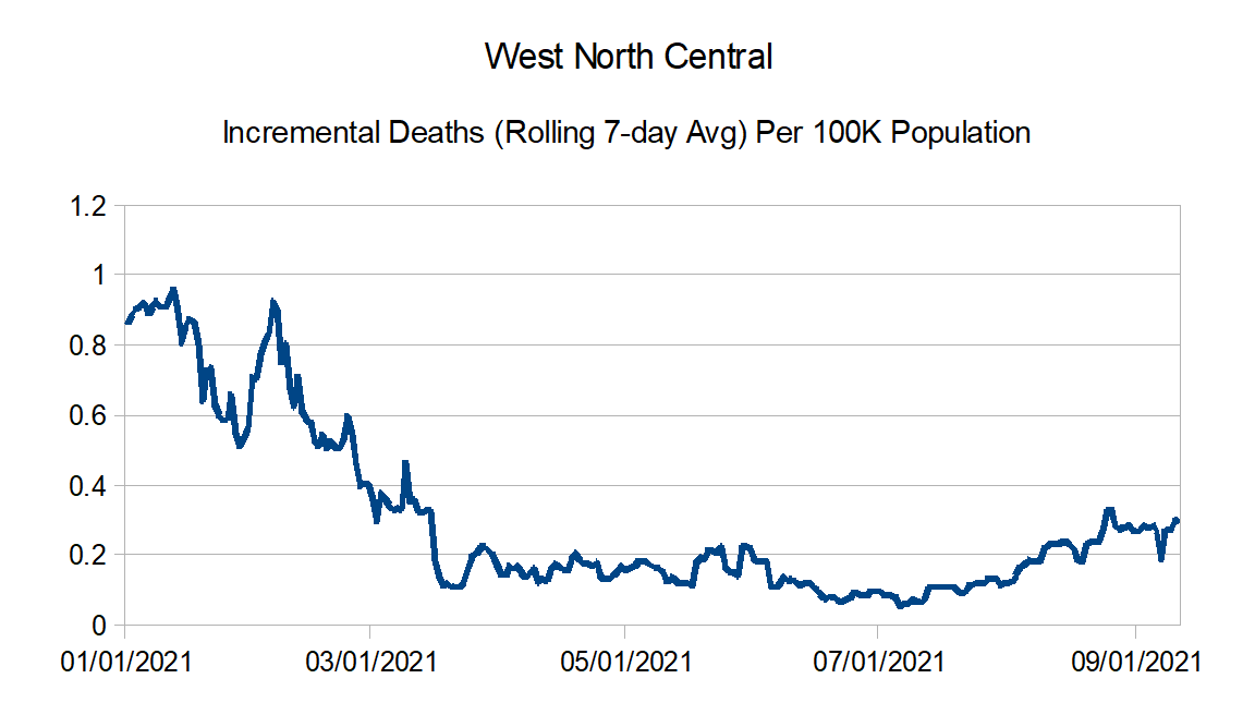
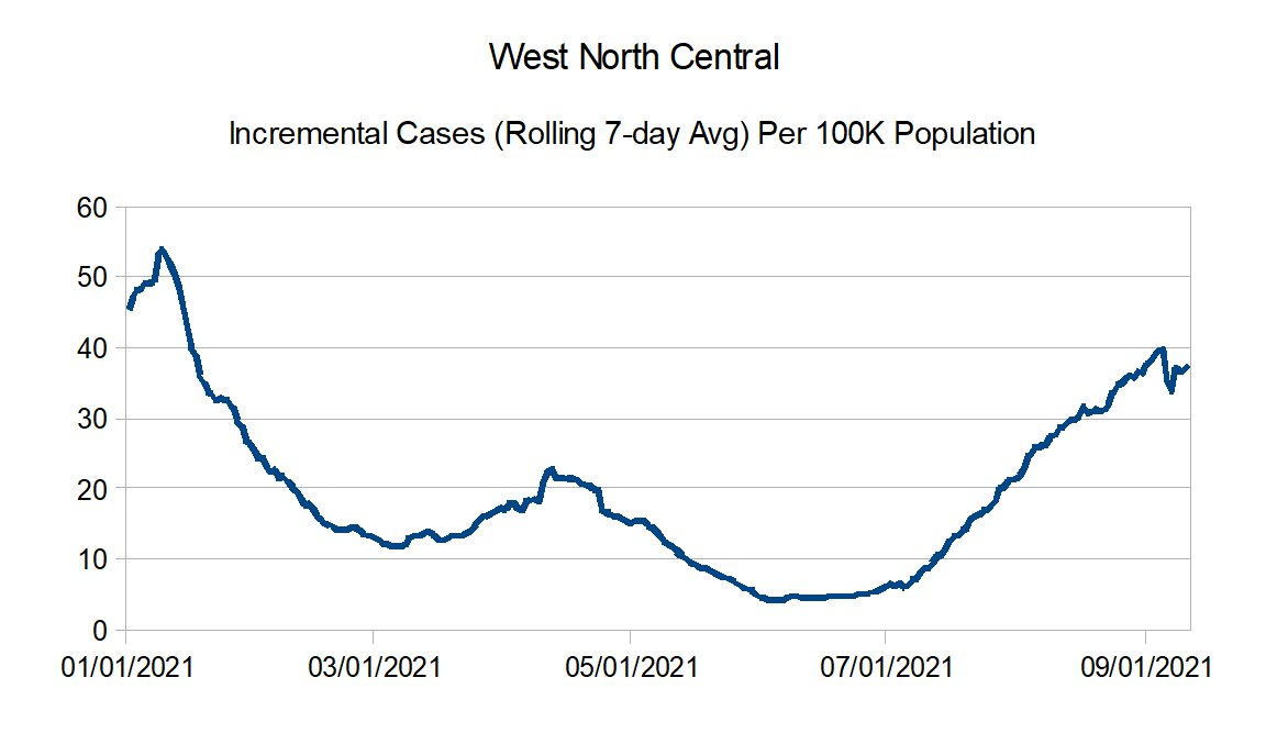
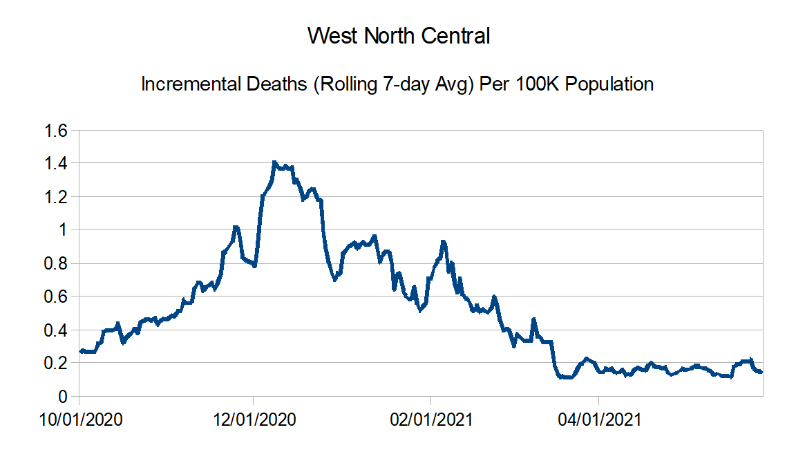
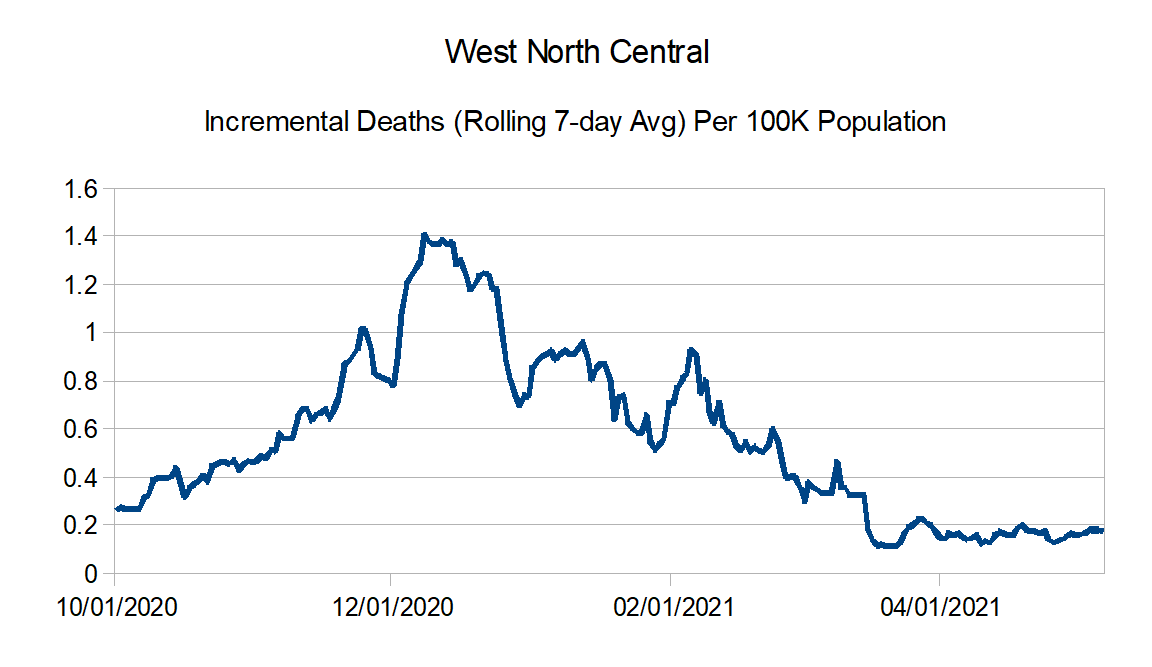
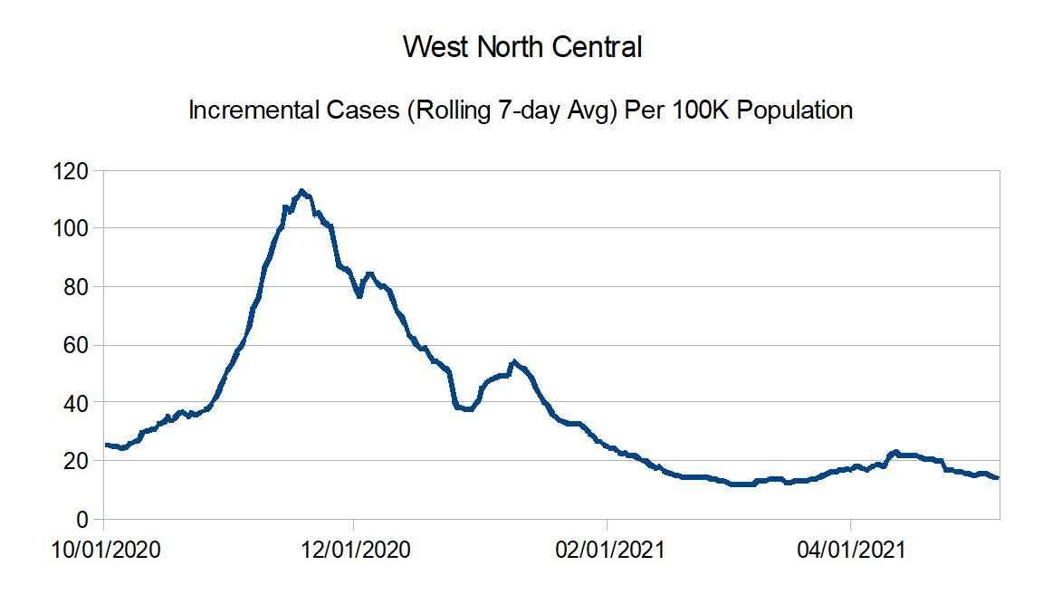
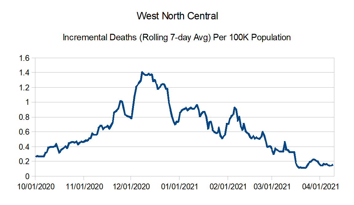
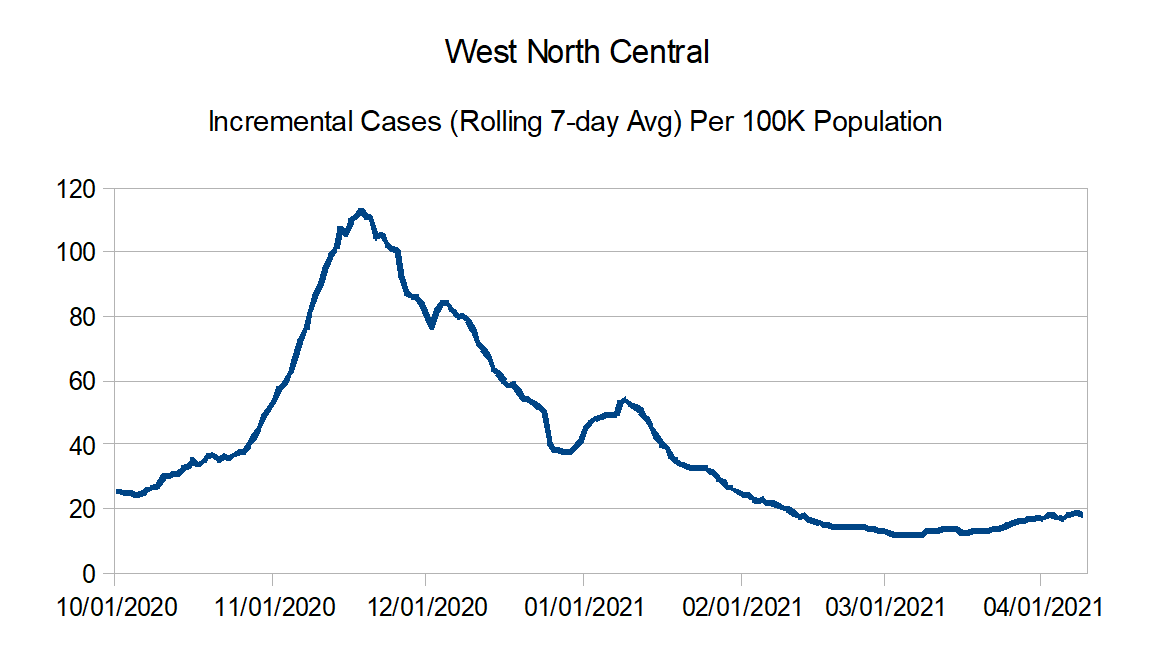
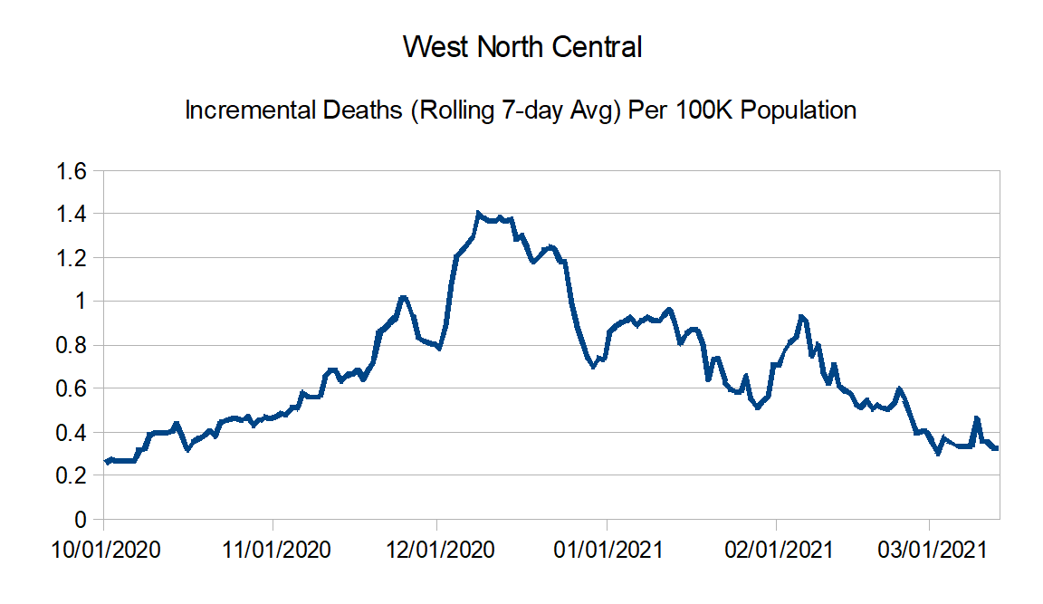
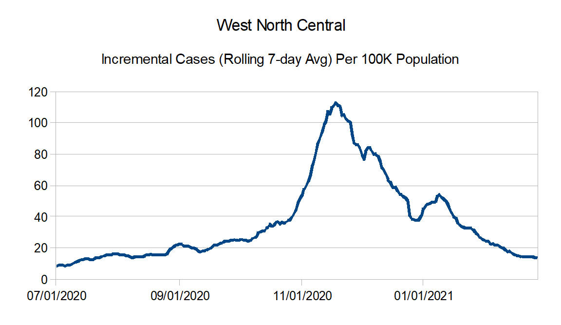
West North Central: Iowa, Kansas, Minnesota, Missouri, Nebraska, North Dakota, and South Dakota
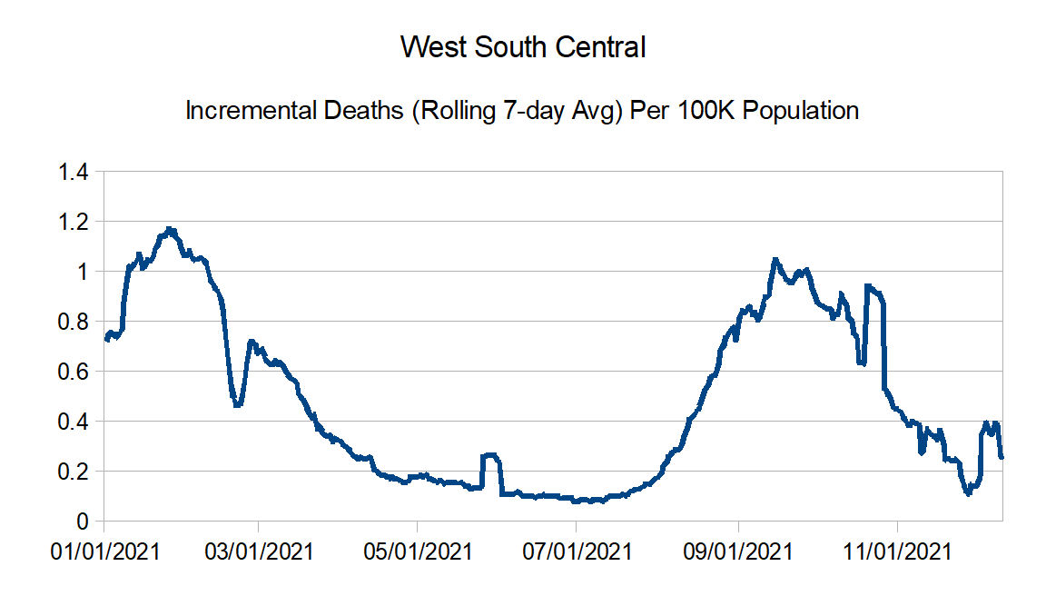
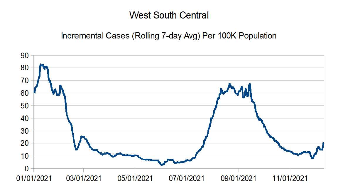
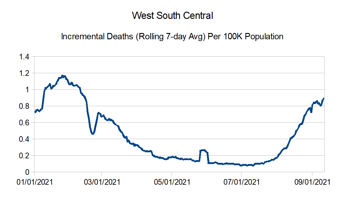
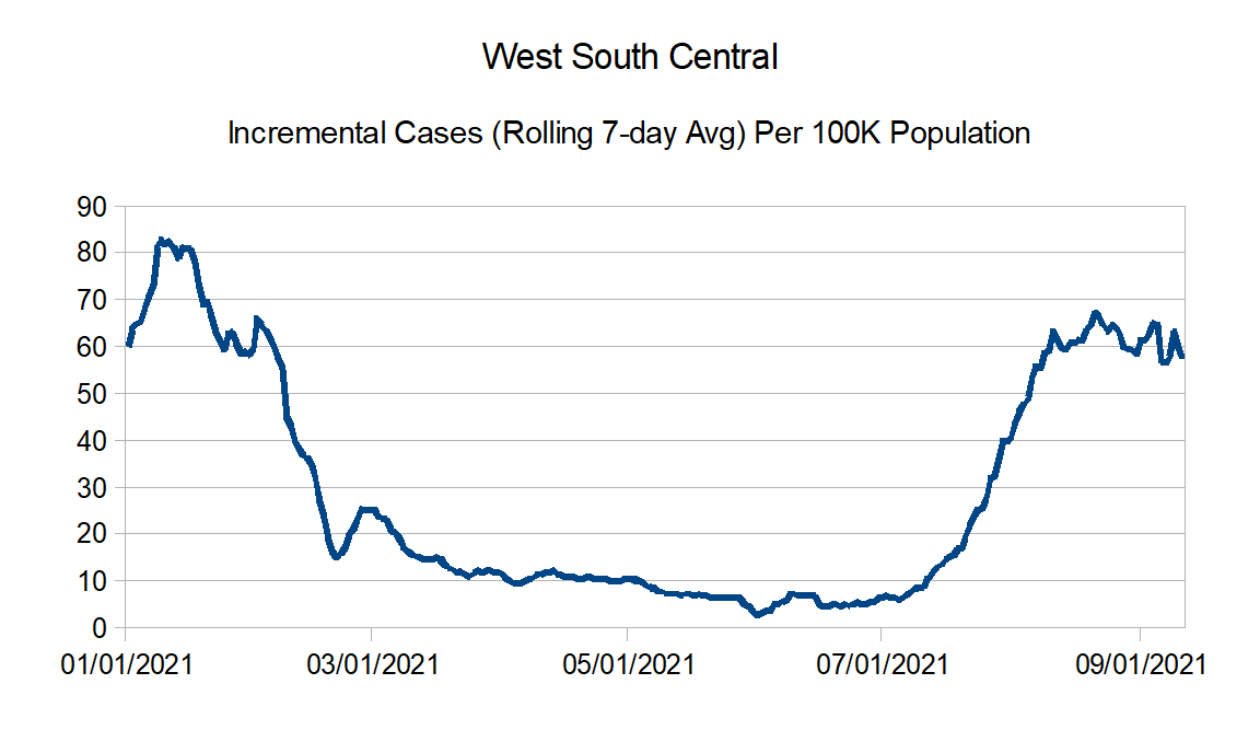
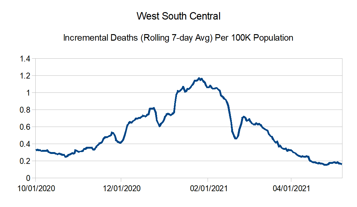
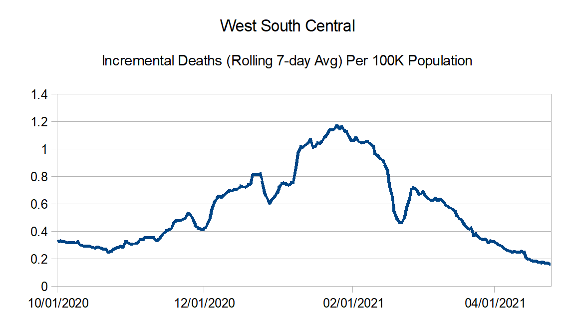
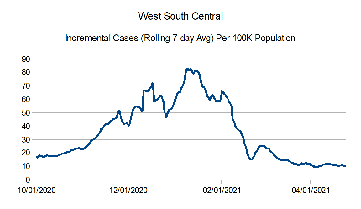
West South Central: Arkansas, Louisiana, Oklahoma, and Texas
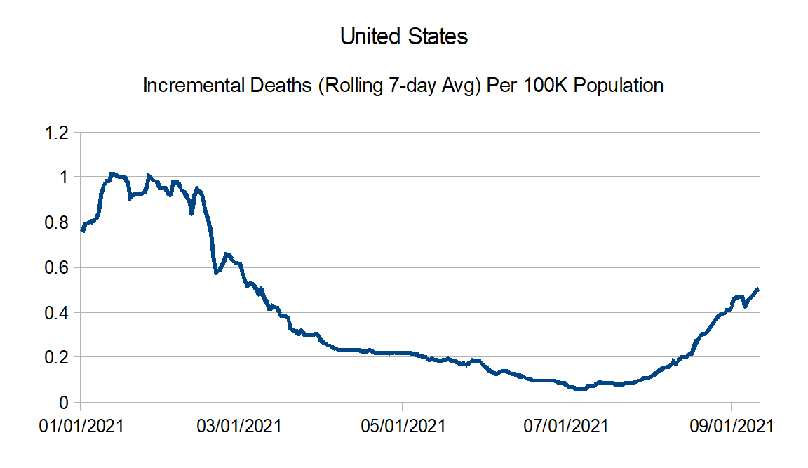
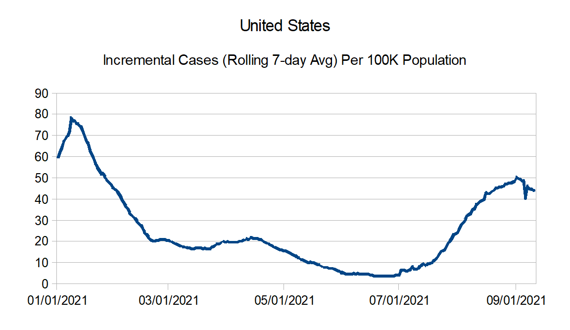
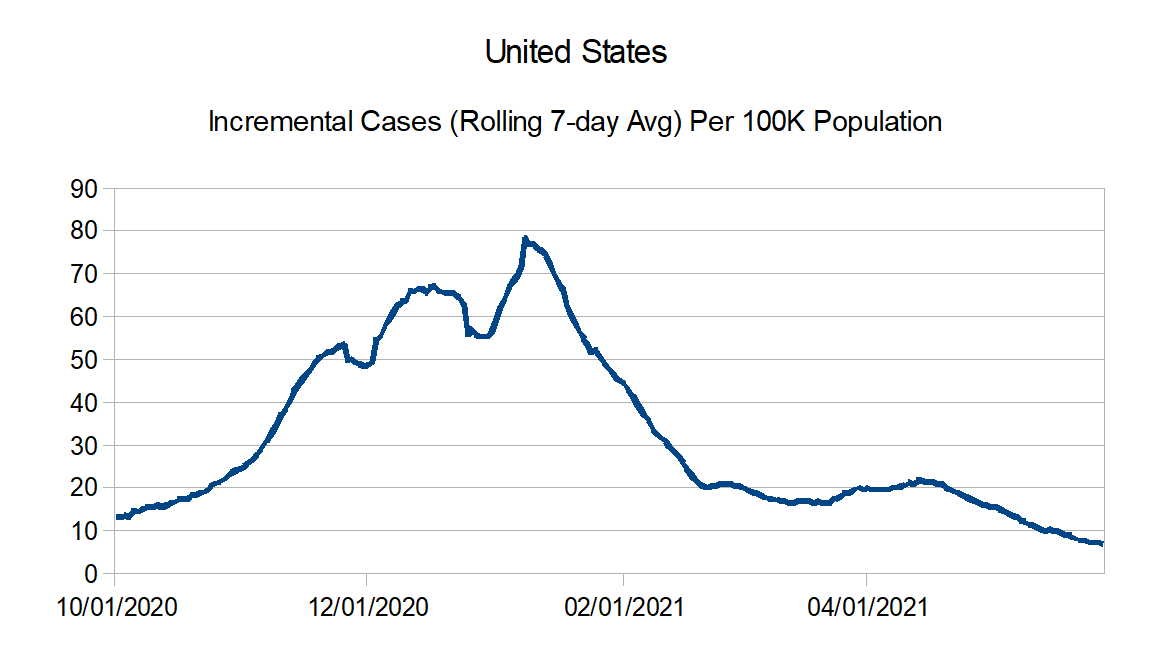
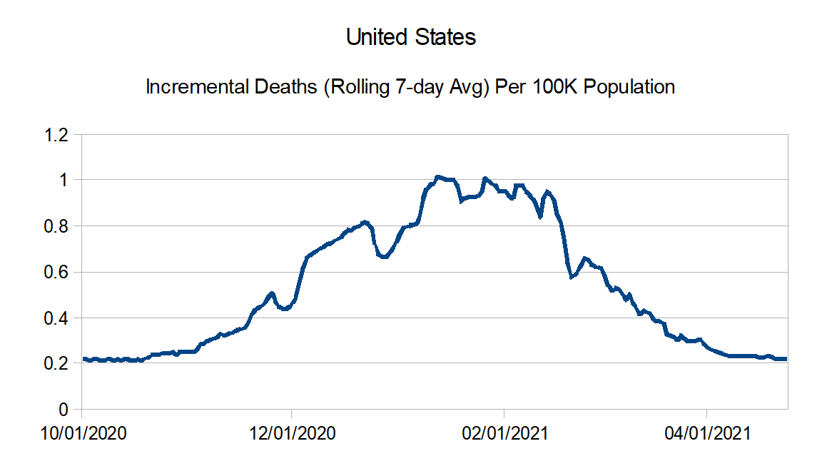
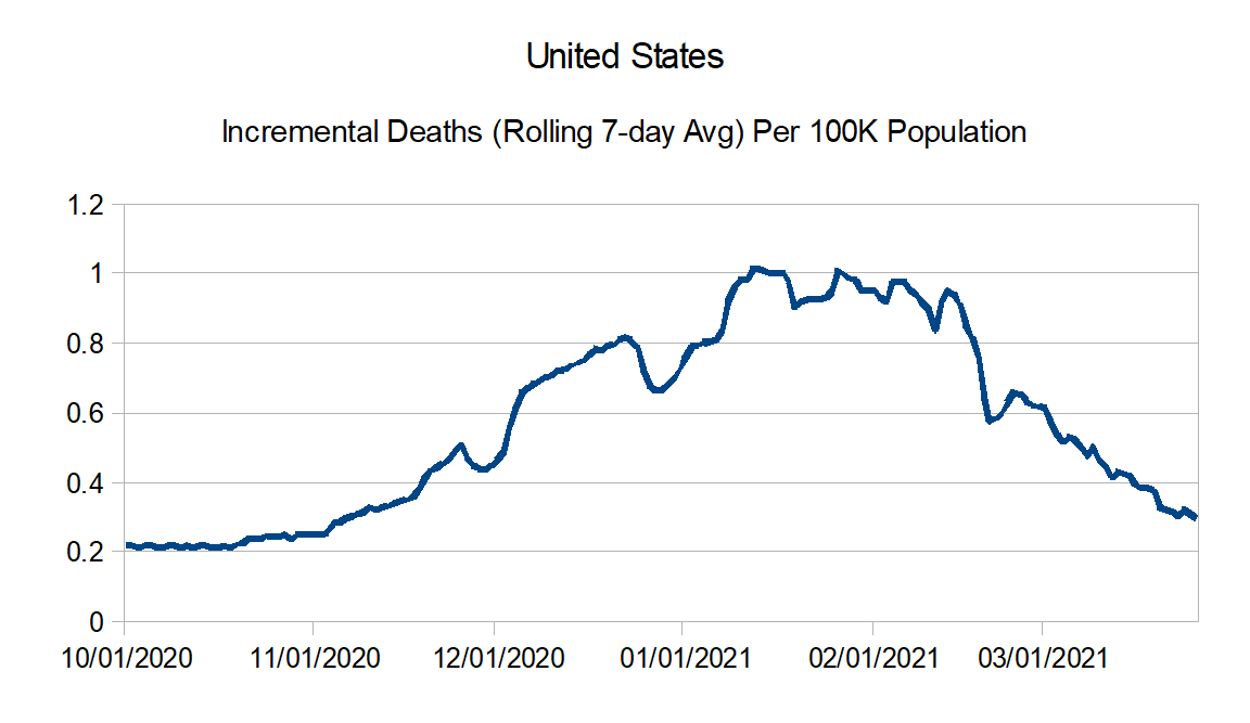
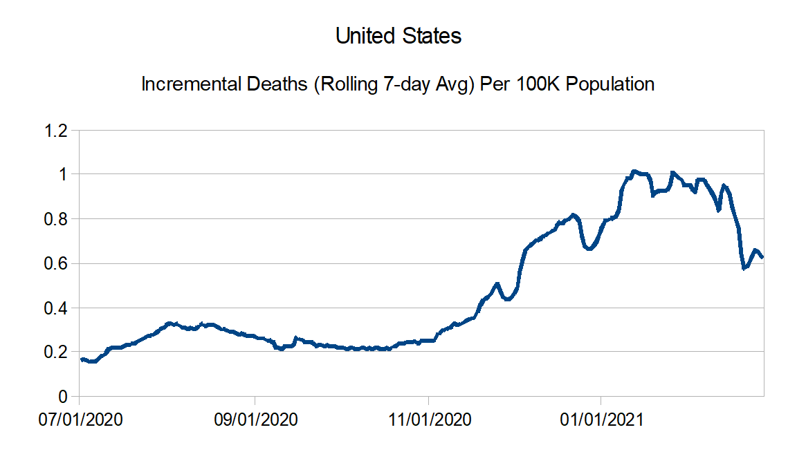
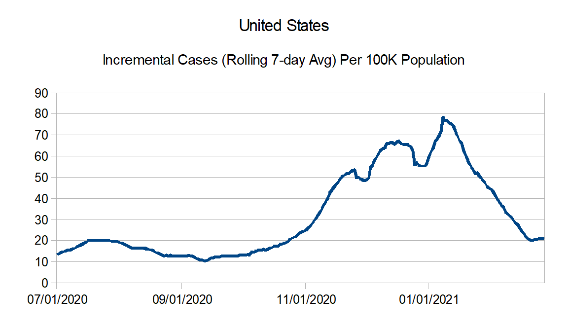
Here are the countrywide charts:
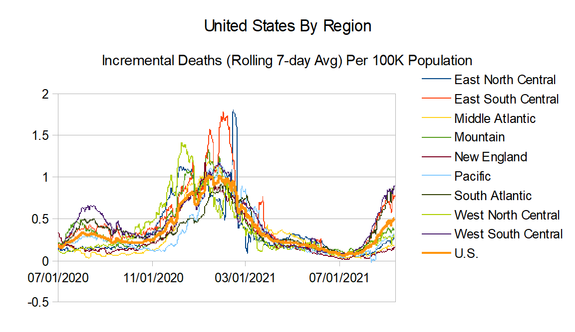
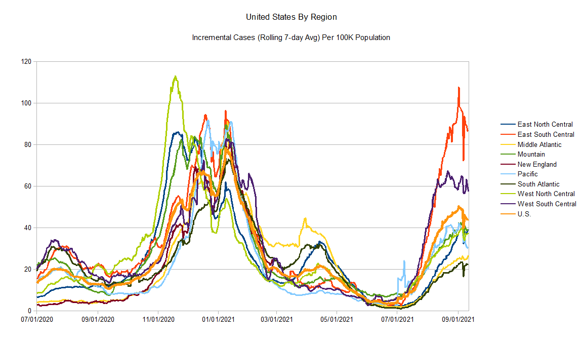
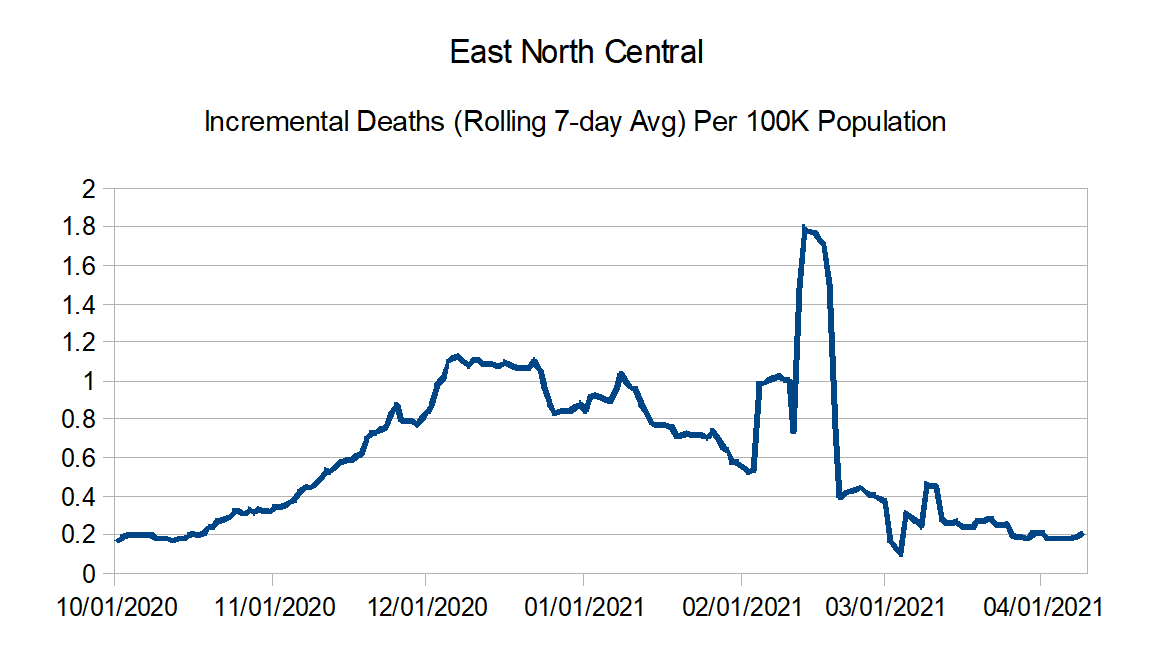
Regional charts:
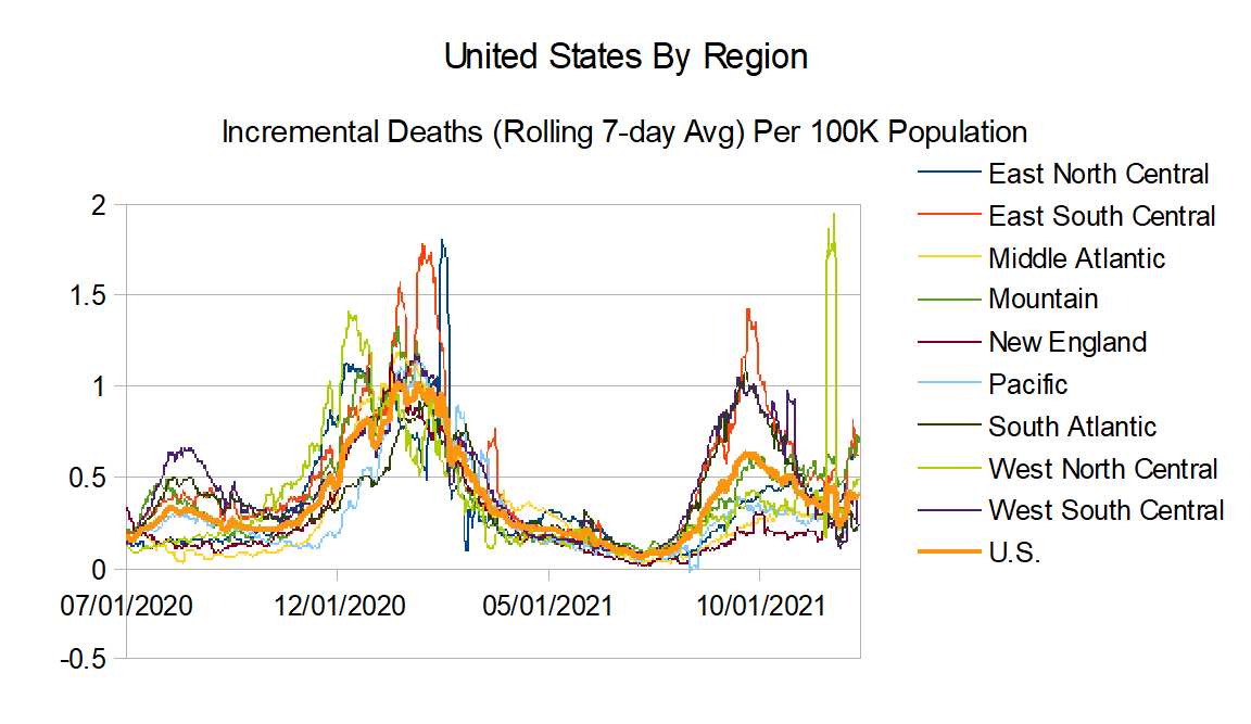
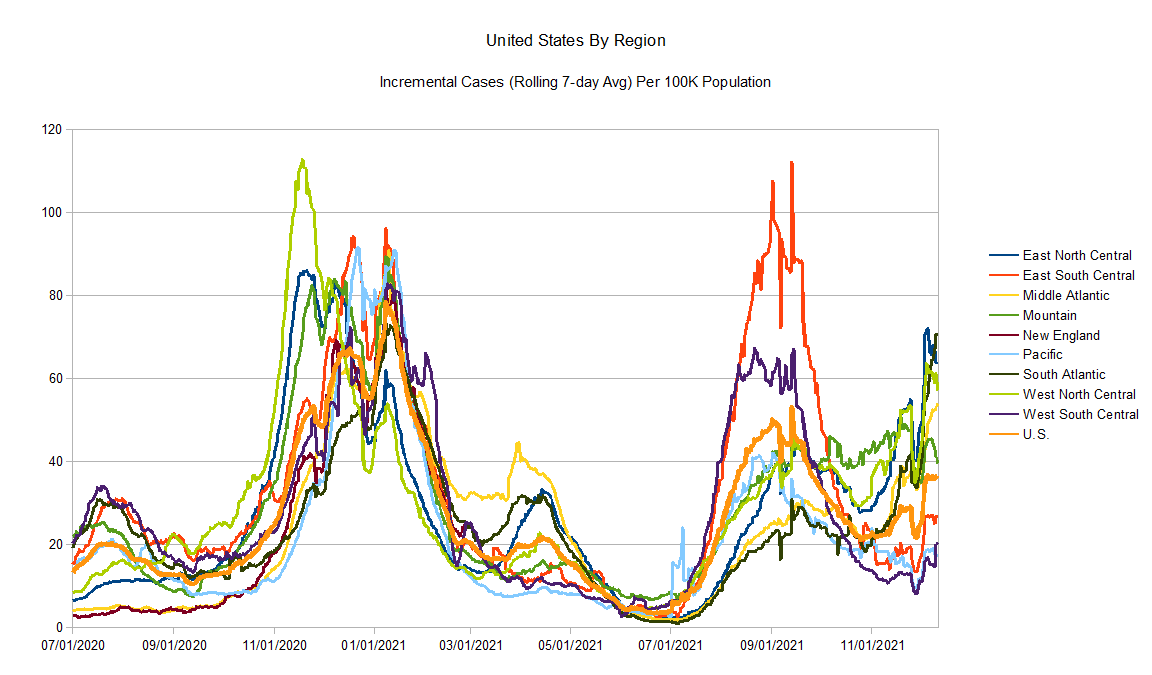
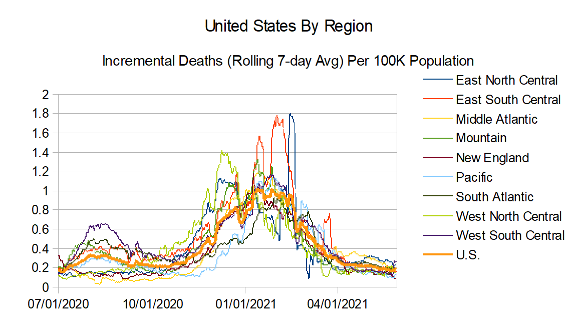
And finally the regional comparison charts:
I am coming up against my busy season at work, so it may be couple of months before I get a chance to update these again.
Updating the graphs again. Generally speaking, the bad news as I thought might happen, reported deaths are now trending back upwards. If there is a glimmer of good news, it looks like maybe reported cases are peaking.
East North Central: Illinois, Indiana, Michigan, Ohio, and Wisconsin
East South Central: Alabama, Kentucky, Mississippi, and Tennessee
Middle Atlantic: Delaware, New Jersey, New York, and Pennsylvania
Mountain: Arizona, Colorado, Idaho, Montana, Nevada, New Mexico, Utah, and Wyoming
New England: Connecticut, Maine, Massachusetts, New Hampshire, Rhode Island, and Vermont
Pacific: Alaska, California, Hawaii, Oregon, and Washington
South Atlantic: Florida, Georgia, Maryland, North Carolina, South Carolina, Virginia, West Virginia, District of Columbia, Puerto Rico, Northern Mariana Islands, and Virgin Islands
West North Central: Iowa, Kansas, Minnesota, Missouri, Nebraska, North Dakota, and South Dakota
West South Central: Arkansas, Louisiana, Oklahoma, and Texas
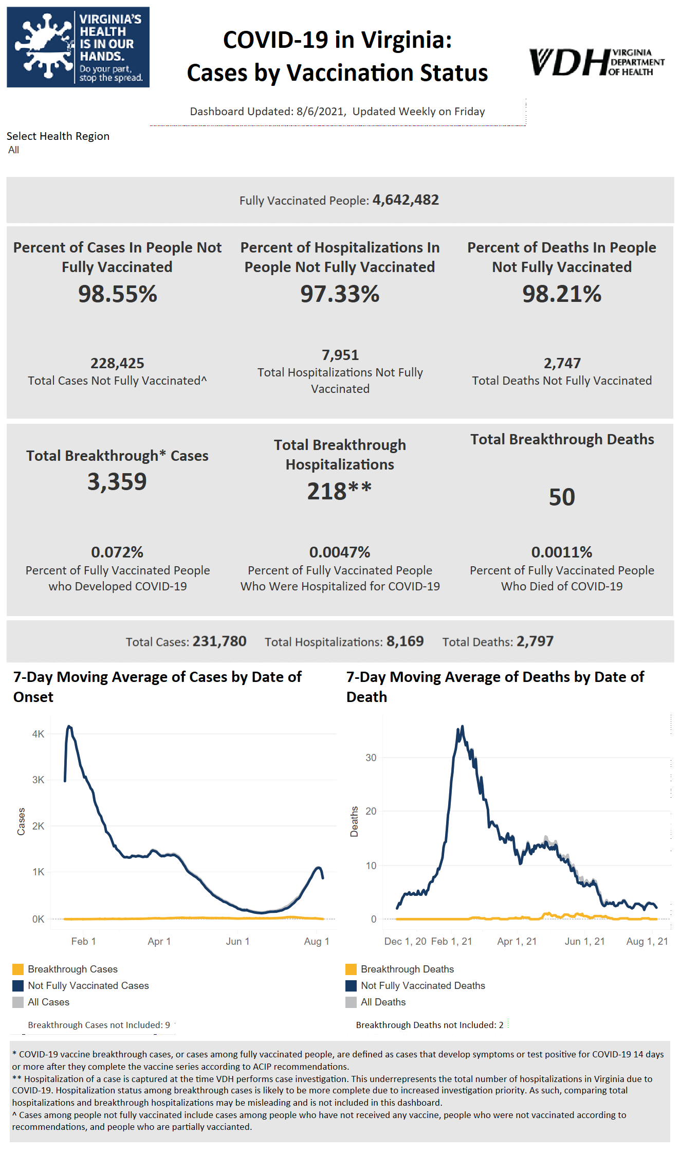
More Data Like This Would Really Help Demonstrate the Effectiveness of The Vaccines (Good Job VA)
Going to update the graphs this weekend, but first I thought I would make a post with some of the thoughts rattling around my head:
Masks and other social distancing measures do help mitigate the spread of the virus. But they are not the way we get out of this and never meant to be. Immunity is the way out. The easier way would be the vaccines. The hard way is getting the virus itself and hoping you live through it so you have natural immunity afterwards. The hard way is going to be more taxing on our health systems and will lead to more pain and more deaths.
Vaccines are not 100% effective. They weren’t in testing, so they aren’t going to be in the real world.
However the evidence says they work a the best mitigation against the disease. Even the events in Provincetown, the real story is that the numbers are consistent with a working vaccine. The headlines are using the wrong denominator. They are presenting the number of fully vaccinated cases divided by total cases. The true numbers you need to present is the number of fully vaccinated cases divided by the number of vaccinated people and compare that to the number of non-vaccinated cases divided by the number of non-vaccinated people. After all, assuming the disease does not go away which is probably won’t, if everyone gets the vaccination then 100% of the cases will be among vaccinated people. That doesn’t mean the vaccine doesn’t work.
Let’s take an example. Let’s say that there is a super-spreader event to the extreme, maybe in a totally tight indoor location with no ventilation to speak of. Let’s say there is 10,000 people in the room. Further, let’s say that 8,500 people are vaccinated and 1,500 people are not. And 125 of the vaccinated get COVID, while 120 of the non-vaccinated get COVID. The scary headlines to put other there is “Over Half The People Who Got COVID At The Super-spreader Event Was Vaccinated!!!!”. And that would be true such at it is. But the thing that actually matters would be that 125 out of 8,500 vaccinated folks got it (1.5%) while 120 out of the 1,500 unvaccinated folks got it (8.0%). If this was a clinical trial, the results would say that the vaccine has a 82% efficacy rate ([0.015 – 0.08]/0.08). This is how much your risk was reduced due to the vaccine.
And reducing the risk of getting the virus is just part of the story. Vaccinations also help those that contract the virus from being admitted into the hospital (and by definition from dying). So far, it has been very very effective in that regard.
Us vaccinated folks do need to be aware though that if it does breakthrough, that doesn’t mean we won’t get sick. In fact, we may get quite sick. “Minor” from a clinical point of view means they didn’t have to admit you into the hospital. I think most of of us think of “minor” has maybe we get the sniffles. But we may (and sometimes will) get sick enough to need to stay home in bed and miss work and feel awful. We just need to be mentally prepared for that.
The CDC may be the experts at disease. But they are awful at communications and are in desperate need of somebody that can take their information and effectively communicate it to the public. Not sure how much of this has to do with “noble lies” in an attempt to try to influence public behavior but I think it’s been poor.
I also don’t think the Biden administration’s attempt to get more folks vaccinated has been the best. Maybe I missing the behind-the-scenes work, but the strategy (especially until recently) seems mostly one of just rah-rah encouragement. I think to get more remaining to vaccinate, it’s going to take a more hands-on roll up your sleeves effort to figure out the barriers still have to vaccination and how to remove them. Educate as much as possible (how was the vaccine developed so fast [quick answer, a lot of the work had already been done before COVID-19], where can you get the vaccine now [many more places than originally], how much does it cost [it’s free….and by free….free free, not flu vaccine “free”, for this one you don’t even need health insurance, it’s free for everyone], etc.
It’s been told that some in hospitals have begged for vaccinations. I hope there isn’t too much of a misconception that vaccines can be used as treatments and therefore you can wait to get Covid and then get the vaccine. It’s too late once you get the virus.
Speaking of treatments, there does seem to be good progress on that front. That will also help us get out of this mess.
In closing, I would say don’t even bother listening to Trump or Biden or Pelosi or McConnell or Fox News or CNN. But do at least talk to people you trust like your doctor or perhaps a friend or family member who have received the vaccine and ask questions. Ask why they chose to get vaccinated, what concerns did they have and how did they get past those concerns, what were the cons but why they think the pros outweigh those, etc. Right now everyone gets to make a personal decision in regards to the vaccine, but the more folks we can get vaccinated, the sooner this thing becomes a nothingburger.
With a little delay I am updating the charts again.
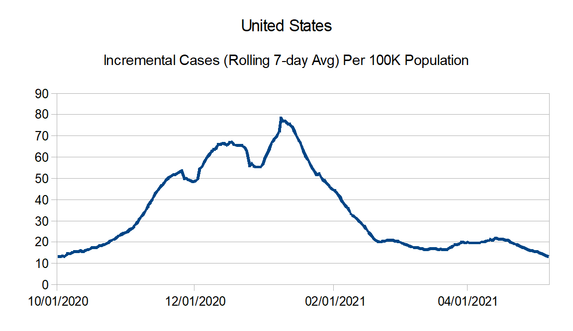
First, reported case numbers are really declining nicely. This should start showing up in the reported death numbers really soon. In fact I believe some of why it is not is because of reporting artifacts. I was able to find one and adjust for Maryland where they went back and updated their counts for 517 additional deaths. Oklahoma also had something like that, but they declined to differentiate how may of their reported counts were for catch up and how much actually were new for the week, so I decided not to adjust. Look like to me there may have been a couple of other instances.
Also with the improving numbers, I believe I am going to cut back these updates to once a month rather than every two weeks.
East North Central: Illinois, Indiana, Michigan, Ohio, and Wisconsin
East South Central: Alabama, Kentucky, Mississippi, and Tennessee
Middle Atlantic: Delaware, New Jersey, New York, and Pennsylvania
Mountain: Arizona, Colorado, Idaho, Montana, Nevada, New Mexico, Utah, and Wyoming
New England: Connecticut, Maine, Massachusetts, New Hampshire, Rhode Island, and Vermont
Pacific: Alaska, California, Hawaii, Oregon, and Washington
South Atlantic: Florida, Georgia, Maryland, North Carolina, South Carolina, Virginia, West Virginia, District of Columbia, Puerto Rico, Northern Mariana Islands, and Virgin Islands
West North Central: Iowa, Kansas, Minnesota, Missouri, Nebraska, North Dakota, and South Dakota
West South Central: Arkansas, Louisiana, Oklahoma, and Texas
Hey all. First, on a personal note, I received my second Covid-19 vaccination shot on Thursday. For me, it (this is the Moderna vaccine) definitely packed more of a punch than the first one as I definitely had more side effects. Basically it was like a minor short-run flu (fatigue, chills, fever…but not as bad as a full-fledged flu and also only lasting a few hours), to go along with the same sore arm as I had last time. But overall it wasn’t that bad and I think it will definitely be worth the benefits.
Second, a couple of housekeeping notes in regards to the data. New Jersey subtracted a bunch of duplicate reported cases on 4/27 while West Virginia subtracted reported deaths on 4/26 and I have adjusted for that in the graphs.
In regards to the graph trends, reported deaths are holding stubbornly steady overall. However reported cases are declining and I expect that once the lag period works it way through the reported deaths will follow in a few weeks.
East North Central: Illinois, Indiana, Michigan, Ohio, and Wisconsin
East South Central: Alabama, Kentucky, Mississippi, and Tennessee
Middle Atlantic: Delaware, New Jersey, New York, and Pennsylvania
Mountain: Arizona, Colorado, Idaho, Montana, Nevada, New Mexico, Utah, and Wyoming
New England: Connecticut, Maine, Massachusetts, New Hampshire, Rhode Island, and Vermont
Pacific: Alaska, California, Hawaii, Oregon, and Washington
South Atlantic: Florida, Georgia, Maryland, North Carolina, South Carolina, Virginia, West Virginia, District of Columbia, Puerto Rico, Northern Mariana Islands, and Virgin Islands
West North Central: Iowa, Kansas, Minnesota, Missouri, Nebraska, North Dakota, and South Dakota
West South Central: Arkansas, Louisiana, Oklahoma, and Texas
Time to update the graphs again. This time I did make an adjustment for cases as Missouri found and removed 11,000 duplicate case reports on April 17th after fixing a system issue.
Looks like generally speaking numbers still continue to hold steady to slowly declining for both the reported cases and reported deaths.
East North Central: Illinois, Indiana, Michigan, Ohio, and Wisconsin
East South Central: Alabama, Kentucky, Mississippi, and Tennessee
Middle Atlantic: Delaware, New Jersey, New York, and Pennsylvania
Mountain: Arizona, Colorado, Idaho, Montana, Nevada, New Mexico, Utah, and Wyoming
New England: Connecticut, Maine, Massachusetts, New Hampshire, Rhode Island, and Vermont
Pacific: Alaska, California, Hawaii, Oregon, and Washington
South Atlantic: Florida, Georgia, Maryland, North Carolina, South Carolina, Virginia, West Virginia, District of Columbia, Puerto Rico, Northern Mariana Islands, and Virgin Islands
West North Central: Iowa, Kansas, Minnesota, Missouri, Nebraska, North Dakota, and South Dakota
West South Central: Arkansas, Louisiana, Oklahoma, and Texas
First, on a personal note, I have received round one of one of the Covid vaccines. My experience for round 1, minimal side effects, mostly just soreness and redness at the shot location. (Now the logistics at a certain America’s largest retail chain left a lot to be desired, but fortunately I only have to do this one more time.)
Obviously I am pro-getting the vaccine. I don’t know if this will help, but if there are worries in regards to the quick development, it’s really a bit of a misnomer that the vaccine was developed in less than a year. You can read more at this link, but the quick version is that the developers were able to leverage vaccine development that is decades old and combined with the resources to do very large studies and having enough cases to make testing more viable, they were able to fast track versions for this particular virus. Bottom line, they didn’t have to start from scratch.
One note on the graphs before I present them, Oklahoma had a large dump of death reports on April 7th. I decided to adjust that number to smooth out the graph. So generally speaking, it looks like the reports of deaths are really continuing to decline, while the reports of cases have generally flatten out.
East North Central: Illinois, Indiana, Michigan, Ohio, and Wisconsin
East South Central: Alabama, Kentucky, Mississippi, and Tennessee
Middle Atlantic: Delaware, New Jersey, New York, and Pennsylvania
Mountain: Arizona, Colorado, Idaho, Montana, Nevada, New Mexico, Utah, and Wyoming
New England: Connecticut, Maine, Massachusetts, New Hampshire, Rhode Island, and Vermont
Pacific: Alaska, California, Hawaii, Oregon, and Washington
South Atlantic: Florida, Georgia, Maryland, North Carolina, South Carolina, Virginia, West Virginia, District of Columbia, Puerto Rico, Northern Mariana Islands, and Virgin Islands
West North Central: Iowa, Kansas, Minnesota, Missouri, Nebraska, North Dakota, and South Dakota
West South Central: Arkansas, Louisiana, Oklahoma, and Texas
Before I show the updated graphs, I ran across an article from The Atlantic that described the limitations of the data we continue to have. Apparently for all the planning, the U.S. was not prepared to actually collect data (an apparent oversight in all the planning, as there were all sorts of plans for using data in such situations…but apparently it was either just assumed that the infrastructure for collection of the data just already existed or just wasn’t thought about at all). And while the data collection has improved, there are still limitations.
One example is that apparently the positivity rate (positive tests divided by total tests) is still a shaky proposition to calculate as the reporting of test results and particularly negative test results is inconsistent. Positive test results tend to be reported more quickly than negative or total tests administered do. (This is likely just due to the nature of thinking positive results are more important than negative results. And in a way they are and you can do a lot with knowing the number of positive tests. But if the timing of the results vary for positive tests versus negative tests, what you can’t do is calculate a positivity rate accurately in real time. This is particularly problematic if you are basing public policy such as opening schools based on positivity rates.)
Another example if the lag time between a COVID-19 death and the actual report of that death. I’ve always cringed when I’ve heard members of the media report ‘x number of people died yesterday’, because I knew that wasn’t true, it is simply the number of deaths reported that day and there is always going to be some lag time that varies death to death. But I had no idea that, at least according to this article, that the median lag time is 20 days (with only about 25% reported within 6 days or so, but another 25% taking more than 45 days after death). Worse still is the average lags vary over time. This definitely means that trying to analyze the cause and effect of any trends can’t be done anywhere close to in real time.
Anyway, it’s good reminder that the data is far from perfect. Probably the best way to think about the graphs I am posting is more in terms of general directions….trending up, trending down, or staying flat. But the specific numbers probably have much less meaning. One change I am making is that I am going to stop calculating the percentage change from post to post, as that implies precision in the data that really doesn’t exist. But I do believe at least directionally the data seems to have some value.
So in general, it looks like based on reported data that the deaths are continuing to decline. It looks like the drop in cases is stalling though. In the past, whatever cases did, deaths would follow later. What will be interesting is will that continue to be the case as we get more and more of the most vulnerable population vaccinated. (Keeping in mind the lag though, it could well be that we see a blip in increased reported deaths because of timing before we see the effect of the vaccinations kick in.)
East North Central: Illinois, Indiana, Michigan, Ohio, and Wisconsin
East South Central: Alabama, Kentucky, Mississippi, and Tennessee
Middle Atlantic: Delaware, New Jersey, New York, and Pennsylvania
Mountain: Arizona, Colorado, Idaho, Montana, Nevada, New Mexico, Utah, and Wyoming
New England: Connecticut, Maine, Massachusetts, New Hampshire, Rhode Island, and Vermont
Pacific: Alaska, California, Hawaii, Oregon, and Washington
South Atlantic: Florida, Georgia, Maryland, North Carolina, South Carolina, Virginia, West Virginia, District of Columbia, Puerto Rico, Northern Mariana Islands, and Virgin Islands
West North Central: Iowa, Kansas, Minnesota, Missouri, Nebraska, North Dakota, and South Dakota
West South Central: Arkansas, Louisiana, Oklahoma, and Texas
Have a couple of things before I show the updated charts.
First, I do wonder if the communication in regards to the vaccines is being overcautious or at the very least overemphasizing what might go wrong over what would most likely go right. While I certainly recognize there is no certainties, so yes it may be possible that you might still be able to spread the virus even if you are vaccinated and yes the vaccines are not 100% effective and yes there are variants so we don’t know exactly how effective the vaccines will be, I personally believe that the most likely reason that the vaccine effort could fail is simply because not enough people get vaccinated.
So I believe, while certainly you shouldn’t hide the information in regards to possible risks and potential problems, the emphasis should be on the most likely results, which is most likely not only are the vaccines effective in preventing getting the virus and mitigating the impacts of the virus if you do get it, but most likely also help mitigate the spread of the virus to others. And we probably should incentivize getting the vaccines as much as possible, which would mean as much reasonable freedom in the guidance for those that have the vaccine even if it is not risk free. My gut feeling is if vaccines are seen as the way out, you may even get some who are not exactly big believers of the seriousness of the epidemic to begrudgingly take the vaccine anyway. My fear is if it looks too much like taking the vaccine doesn’t change anything for anyone that too many will decide to blow off taking the vaccine at all.
Second, some housecleaning notes for the charts. I did make an adjustment to the case numbers for West North Central region. Missouri on 3/8 decided to add antigen test positive results in bulk, so they reported over 50,000 new positive cases that day. To avoid that number skewing the charts, I replaced that number with the average of reported cases for 3/7 and 3/9. Also for most of the charts I have shifted the starting date to 10/1. Finally I believe this will be the last time I post a Northeast versus Rest of the United States reported death chart for a while. When I started, I wanted to see how much the northeast was driving the national totals. However over the last several months, there really hasn’t been any appreciable difference between the northeast and the rest of the country in reported deaths.
East North Central: Illinois, Indiana, Michigan, Ohio, and Wisconsin
East South Central: Alabama, Kentucky, Mississippi, and Tennessee
Middle Atlantic: Delaware, New Jersey, New York, and Pennsylvania
Mountain: Arizona, Colorado, Idaho, Montana, Nevada, New Mexico, Utah, and Wyoming
New England: Connecticut, Maine, Massachusetts, New Hampshire, Rhode Island, and Vermont
Pacific: Alaska, California, Hawaii, Oregon, and Washington
South Atlantic: Florida, Georgia, Maryland, North Carolina, South Carolina, Virginia, West Virginia, District of Columbia, Puerto Rico, Northern Mariana Islands, and Virgin Islands
West North Central: Iowa, Kansas, Minnesota, Missouri, Nebraska, North Dakota, and South Dakota
West South Central: Arkansas, Louisiana, Oklahoma, and Texas
A week later with my update than usual because of work obligations. In summary, numbers are down for both cases and deaths, but there may be signs that the drop is stalling.
East North Central: Illinois, Indiana, Michigan, Ohio, and Wisconsin
East South Central: Alabama, Kentucky, Mississippi, and Tennessee
Middle Atlantic: Delaware, New Jersey, New York, and Pennsylvania
Mountain: Arizona, Colorado, Idaho, Montana, Nevada, New Mexico, Utah, and Wyoming
New England: Connecticut, Maine, Massachusetts, New Hampshire, Rhode Island, and Vermont
Pacific: Alaska, California, Hawaii, Oregon, and Washington
South Atlantic: Florida, Georgia, Maryland, North Carolina, South Carolina, Virginia, West Virginia, District of Columbia, Puerto Rico, Northern Mariana Islands, and Virgin Islands
West North Central: Iowa, Kansas, Minnesota, Missouri, Nebraska, North Dakota, and South Dakota
West South Central: Arkansas, Louisiana, Oklahoma, and Texas