With a little delay I am updating the charts again.
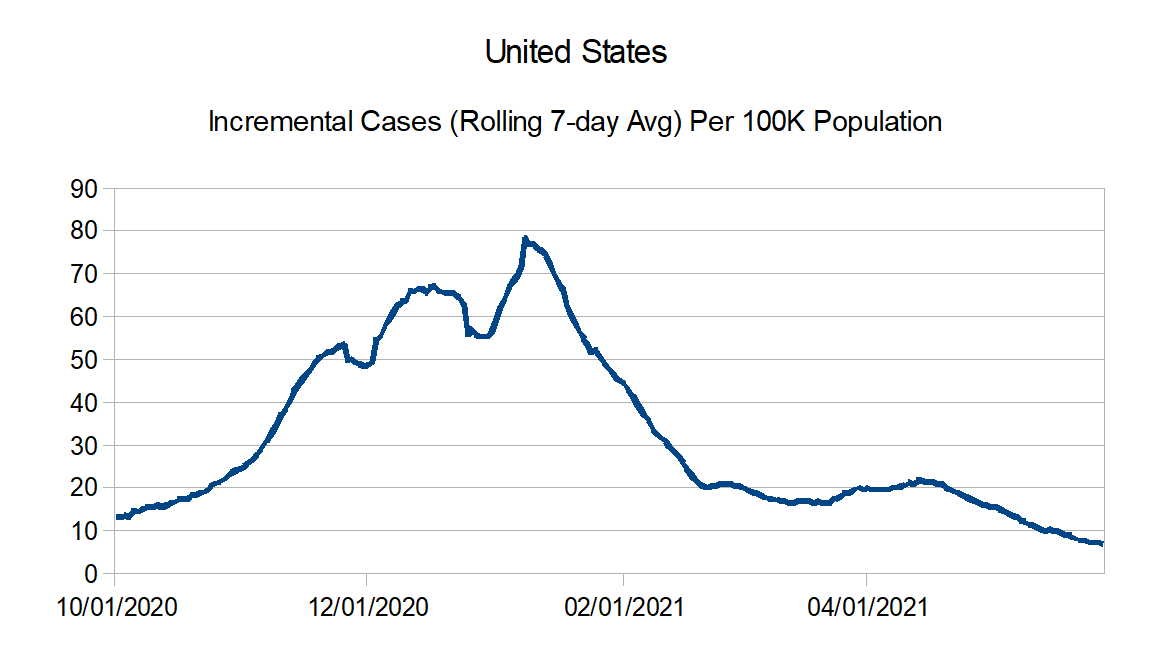
First, reported case numbers are really declining nicely. This should start showing up in the reported death numbers really soon. In fact I believe some of why it is not is because of reporting artifacts. I was able to find one and adjust for Maryland where they went back and updated their counts for 517 additional deaths. Oklahoma also had something like that, but they declined to differentiate how may of their reported counts were for catch up and how much actually were new for the week, so I decided not to adjust. Look like to me there may have been a couple of other instances.
Also with the improving numbers, I believe I am going to cut back these updates to once a month rather than every two weeks.
Without further ado, here are the updated charts:
Data Source – New York Times github
Data Info – New York Times data info
Regions:
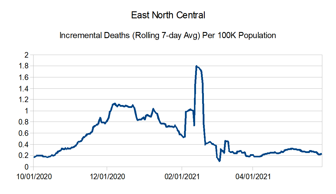
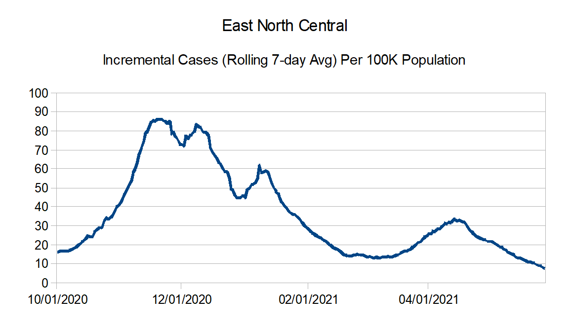
East North Central: Illinois, Indiana, Michigan, Ohio, and Wisconsin
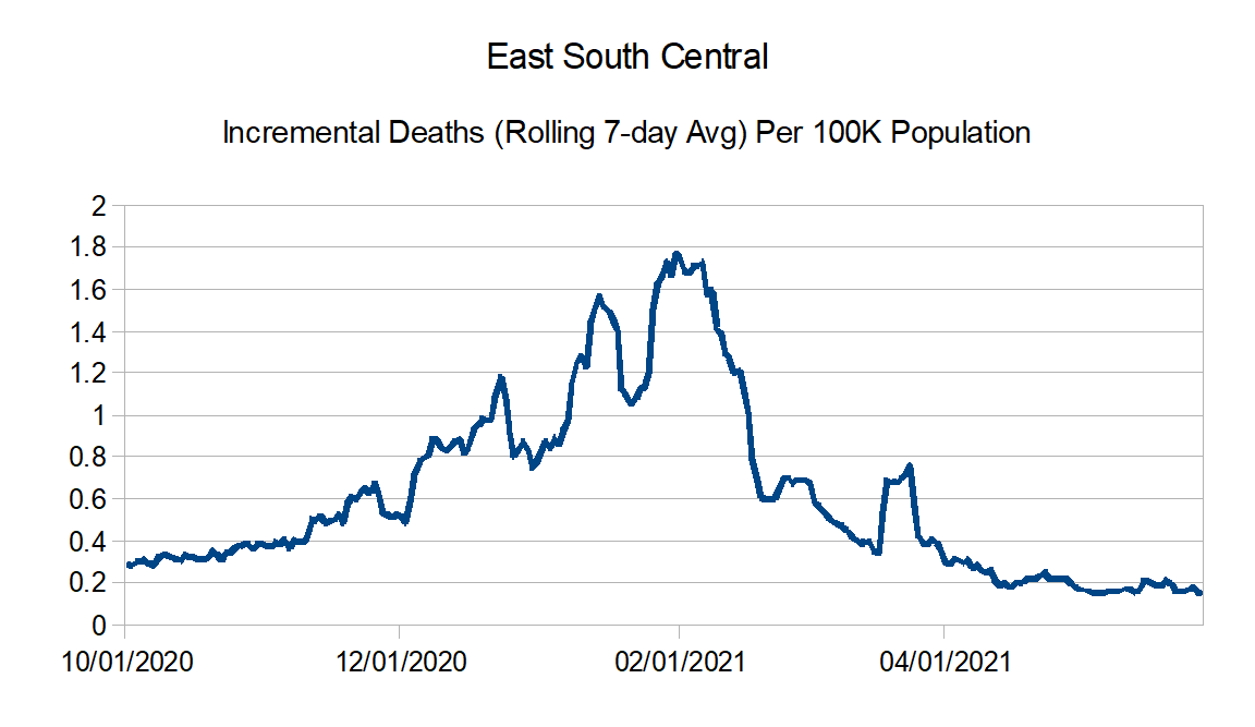
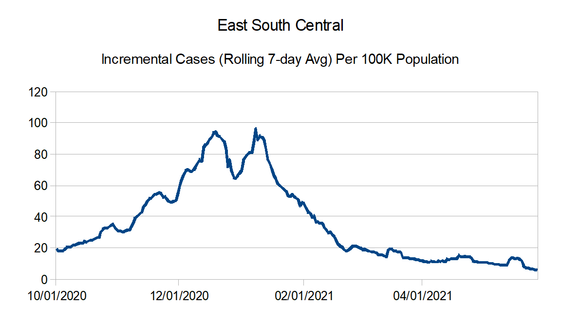
East South Central: Alabama, Kentucky, Mississippi, and Tennessee
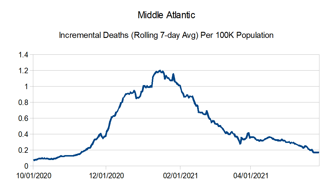
Middle Atlantic: Delaware, New Jersey, New York, and Pennsylvania
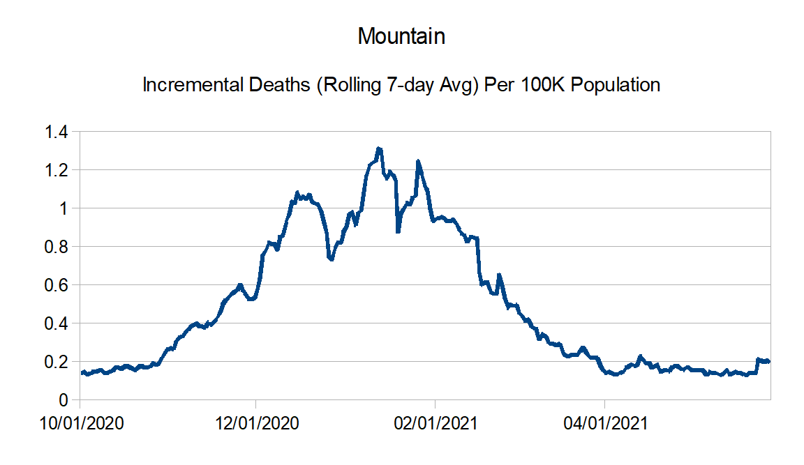
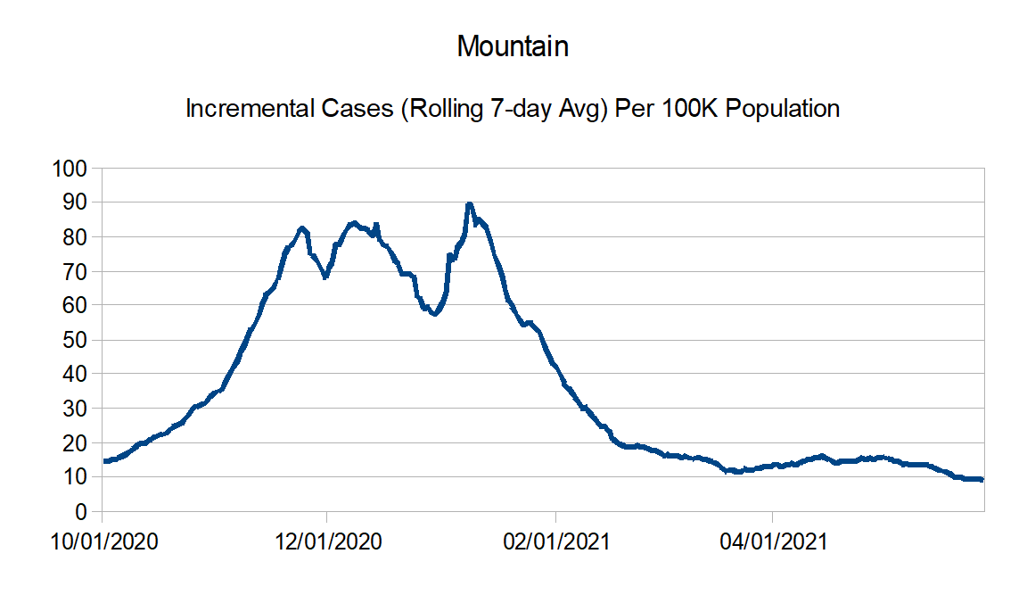
Mountain: Arizona, Colorado, Idaho, Montana, Nevada, New Mexico, Utah, and Wyoming
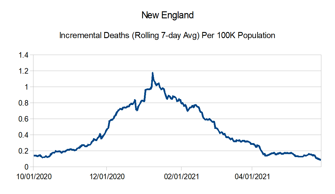
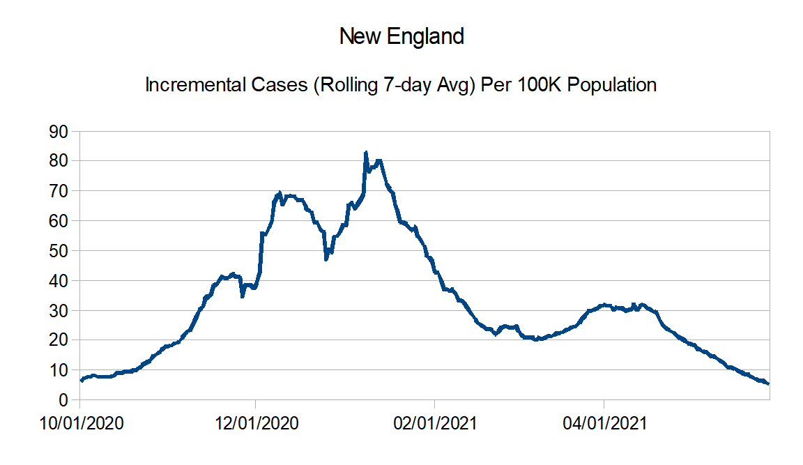
New England: Connecticut, Maine, Massachusetts, New Hampshire, Rhode Island, and Vermont
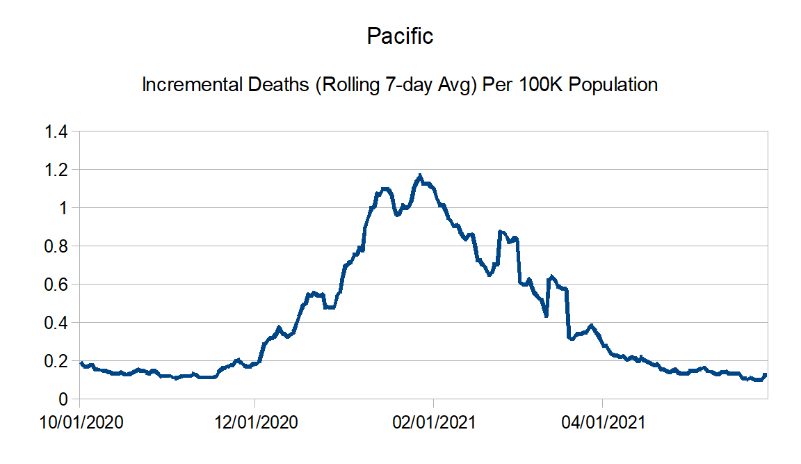
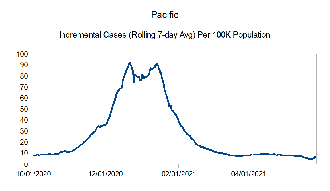
Pacific: Alaska, California, Hawaii, Oregon, and Washington
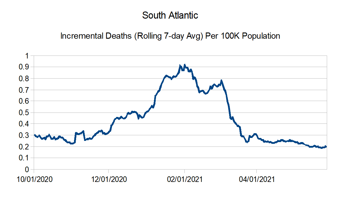
South Atlantic: Florida, Georgia, Maryland, North Carolina, South Carolina, Virginia, West Virginia, District of Columbia, Puerto Rico, Northern Mariana Islands, and Virgin Islands
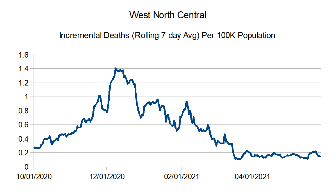
West North Central: Iowa, Kansas, Minnesota, Missouri, Nebraska, North Dakota, and South Dakota
West South Central: Arkansas, Louisiana, Oklahoma, and Texas
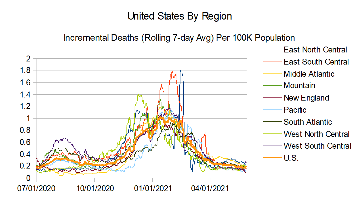
United States Graphs:

Regional Charts:


And finally the regional comparison charts:

See you all at the end of June.
