Hey all. First, on a personal note, I received my second Covid-19 vaccination shot on Thursday. For me, it (this is the Moderna vaccine) definitely packed more of a punch than the first one as I definitely had more side effects. Basically it was like a minor short-run flu (fatigue, chills, fever…but not as bad as a full-fledged flu and also only lasting a few hours), to go along with the same sore arm as I had last time. But overall it wasn’t that bad and I think it will definitely be worth the benefits.
Second, a couple of housekeeping notes in regards to the data. New Jersey subtracted a bunch of duplicate reported cases on 4/27 while West Virginia subtracted reported deaths on 4/26 and I have adjusted for that in the graphs.
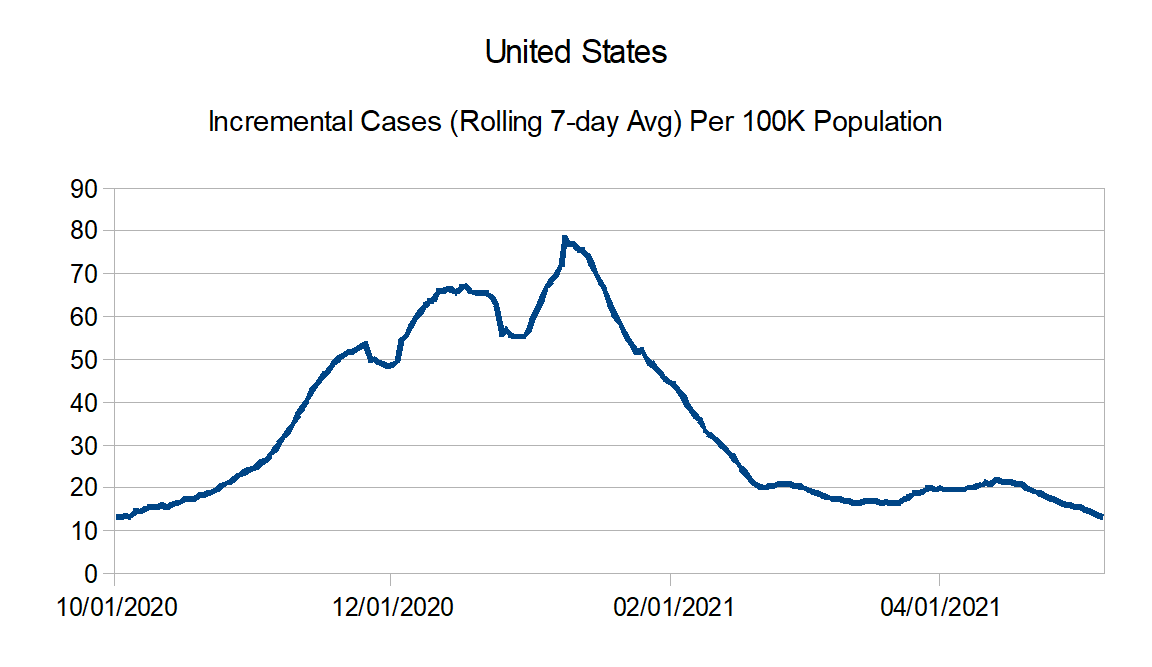
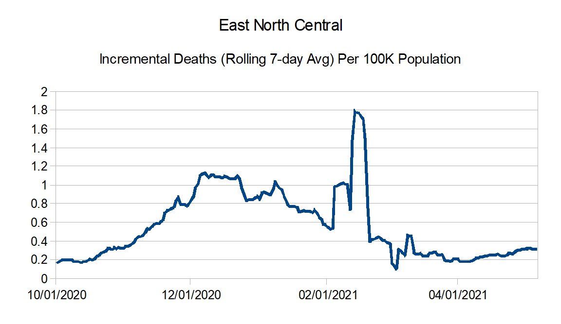
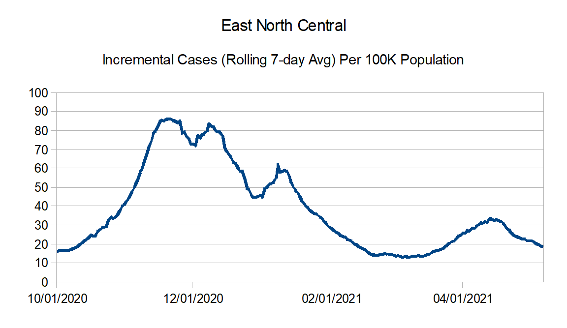
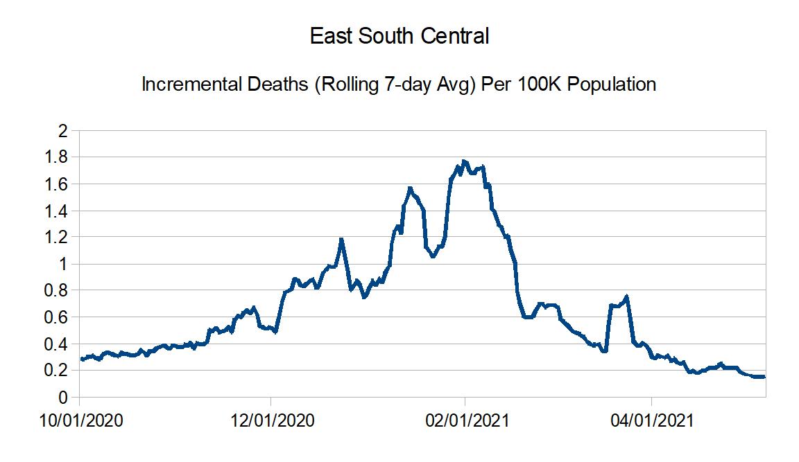
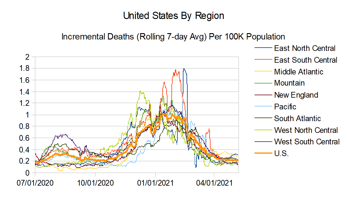
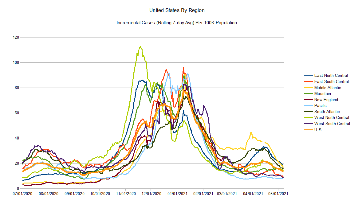
In regards to the graph trends, reported deaths are holding stubbornly steady overall. However reported cases are declining and I expect that once the lag period works it way through the reported deaths will follow in a few weeks.
Data Source – New York Times github
Data Info – New York Times data info
Regions:
East North Central: Illinois, Indiana, Michigan, Ohio, and Wisconsin
East South Central: Alabama, Kentucky, Mississippi, and Tennessee
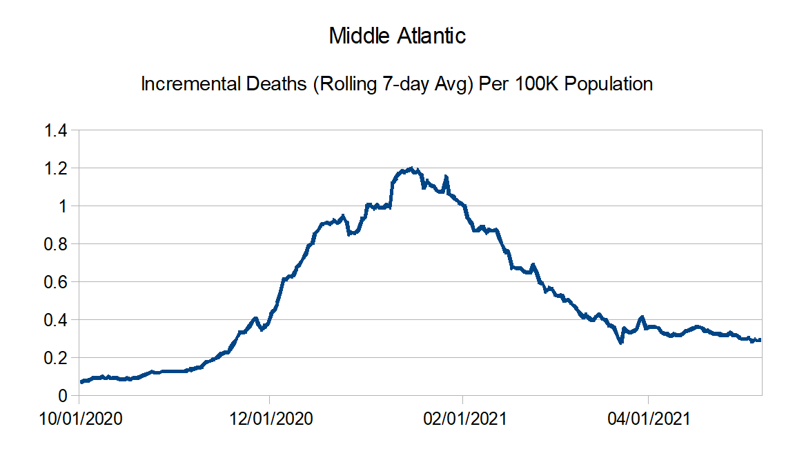
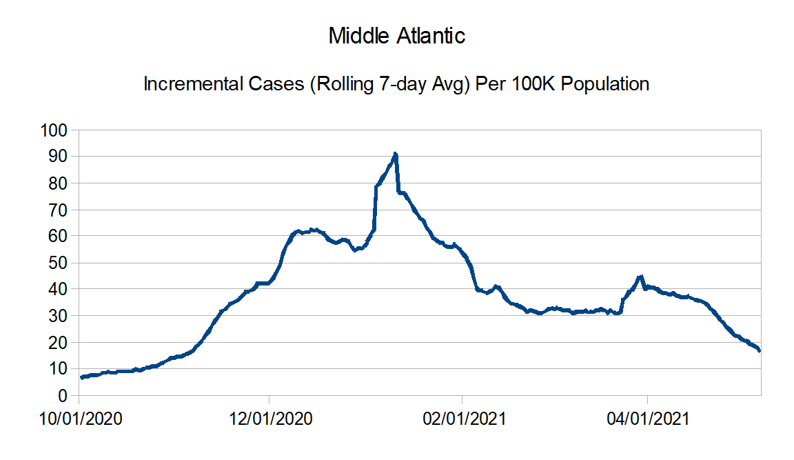
Middle Atlantic: Delaware, New Jersey, New York, and Pennsylvania
Mountain: Arizona, Colorado, Idaho, Montana, Nevada, New Mexico, Utah, and Wyoming
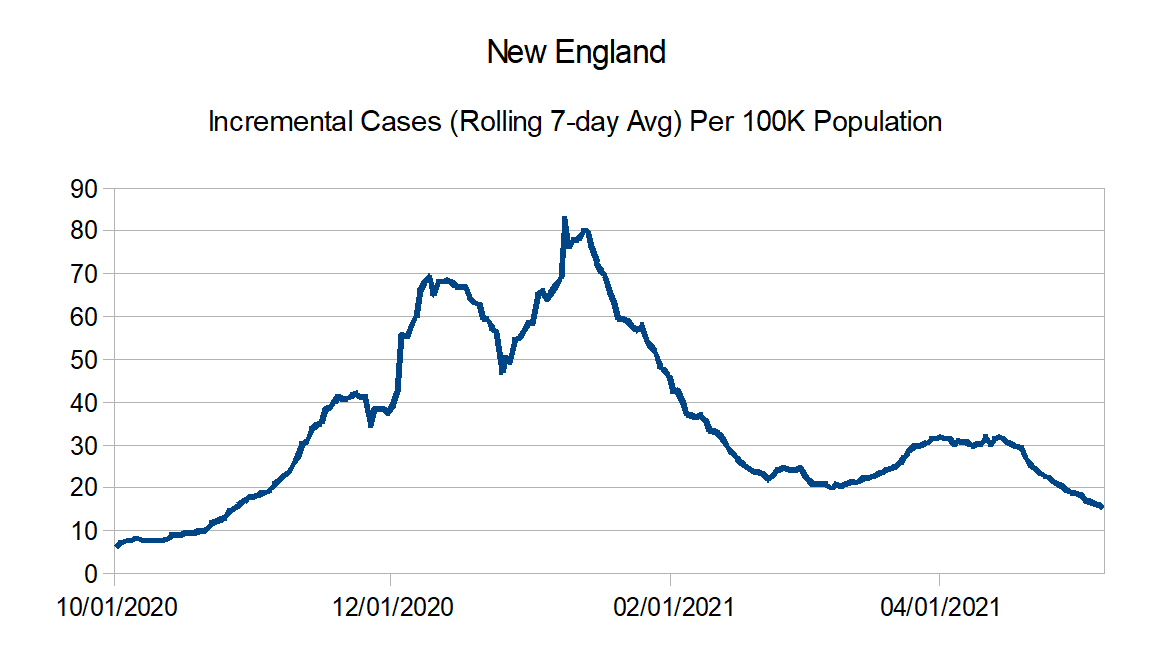
New England: Connecticut, Maine, Massachusetts, New Hampshire, Rhode Island, and Vermont
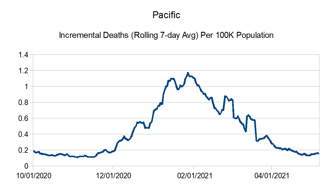
Pacific: Alaska, California, Hawaii, Oregon, and Washington
South Atlantic: Florida, Georgia, Maryland, North Carolina, South Carolina, Virginia, West Virginia, District of Columbia, Puerto Rico, Northern Mariana Islands, and Virgin Islands
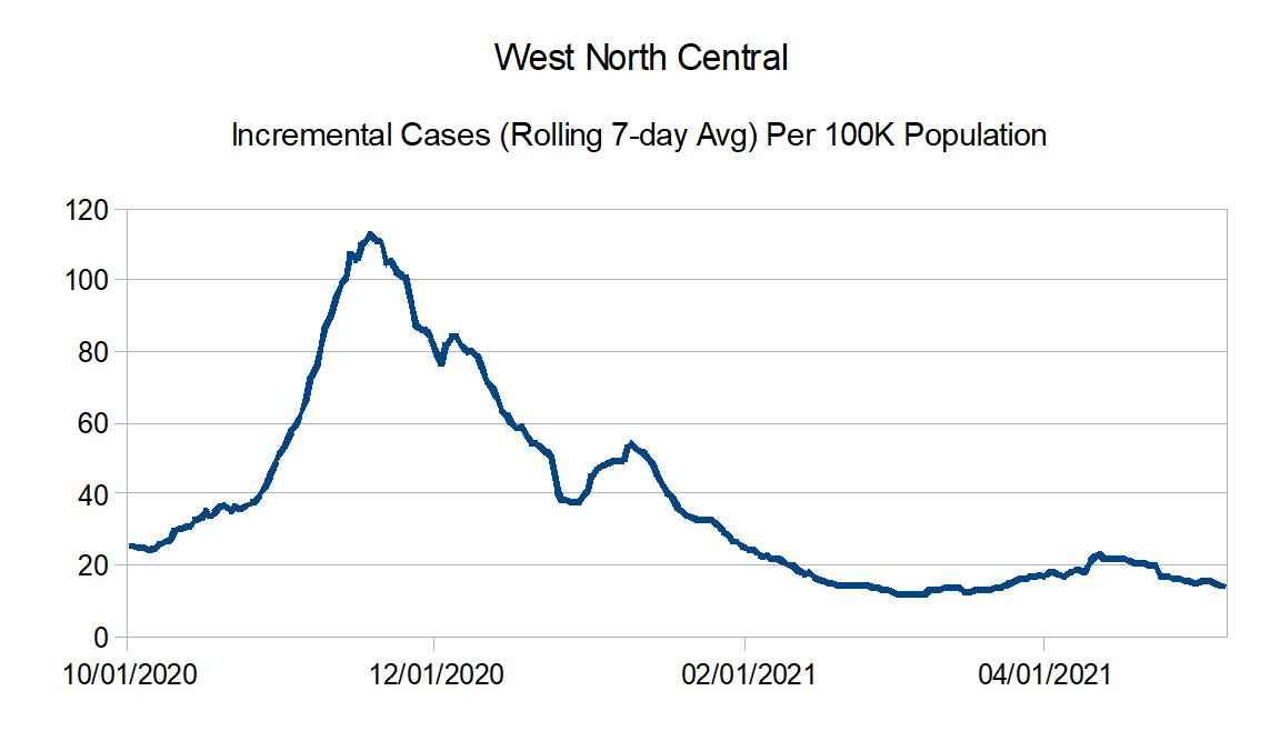
West North Central: Iowa, Kansas, Minnesota, Missouri, Nebraska, North Dakota, and South Dakota
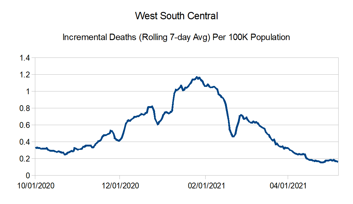
West South Central: Arkansas, Louisiana, Oklahoma, and Texas
United States Graphs:

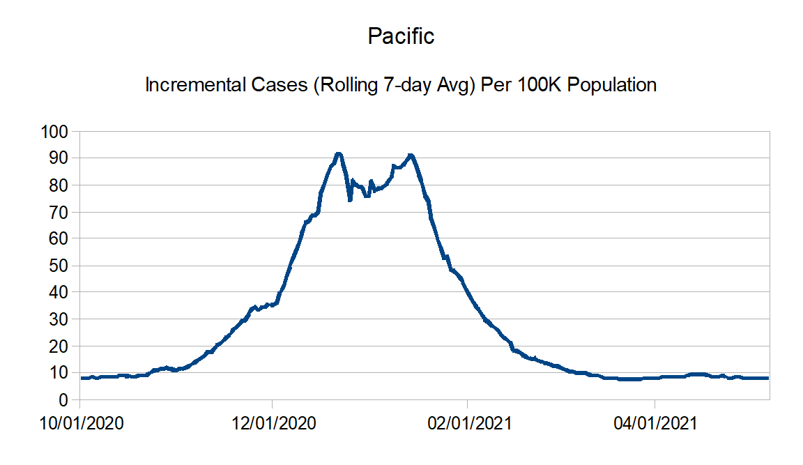
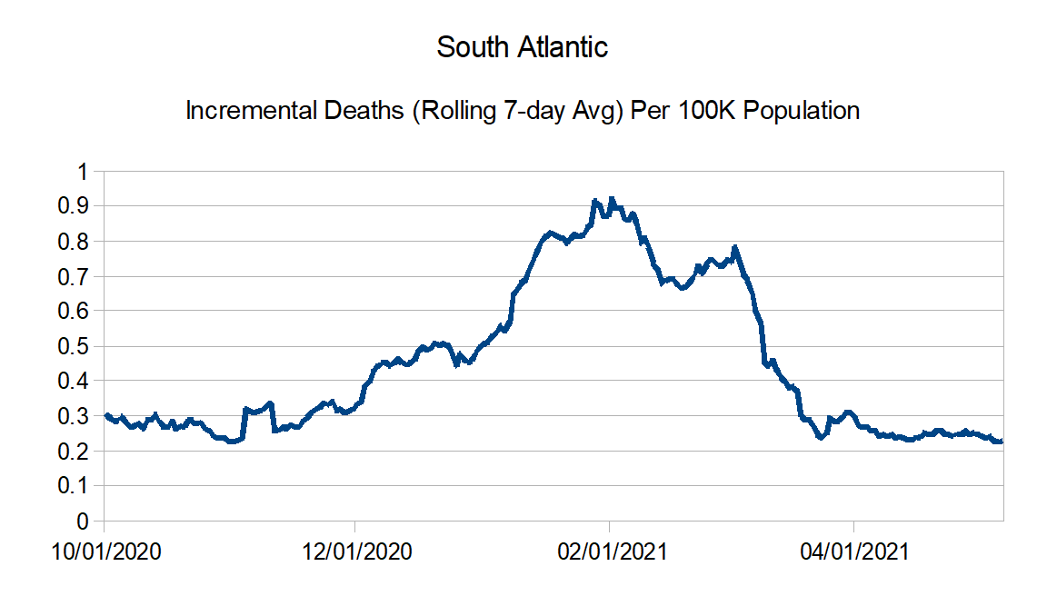
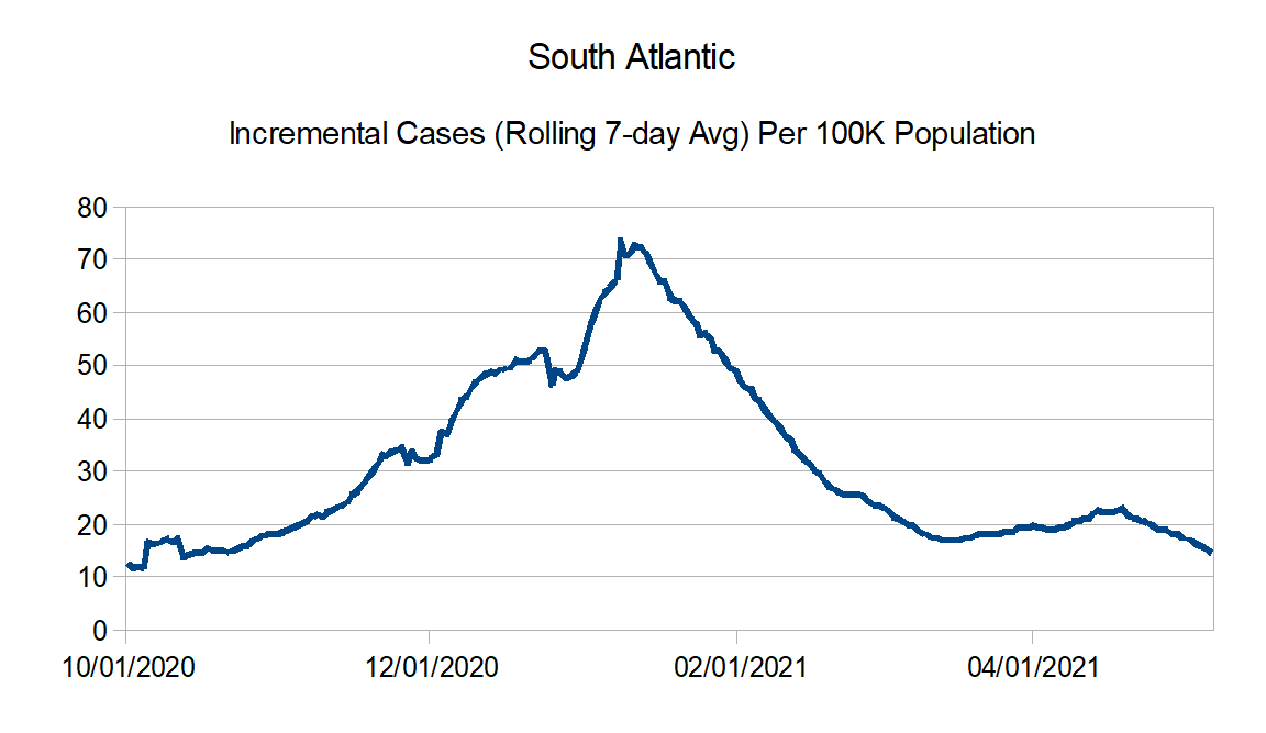
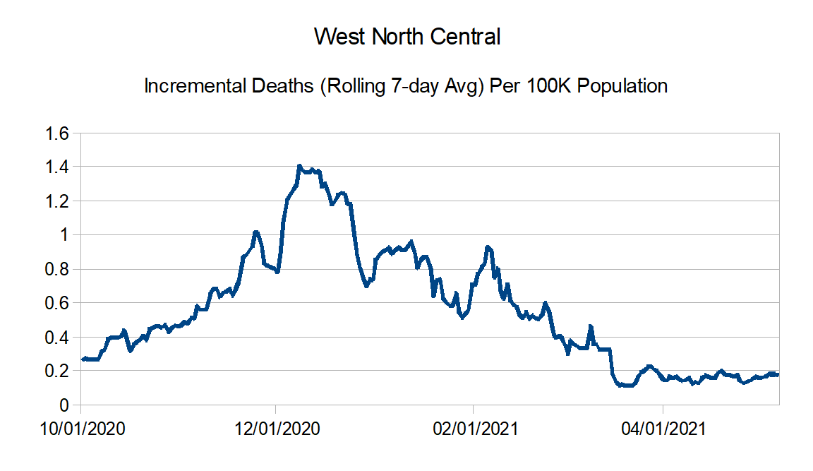
Region Charts:


And finally the regional comparison charts:
Next update in a couple of weeks.
