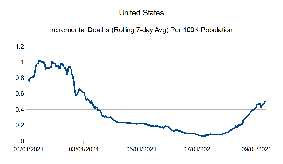
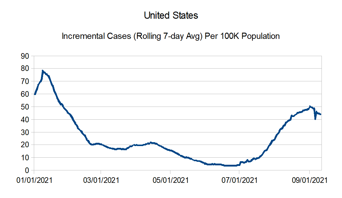
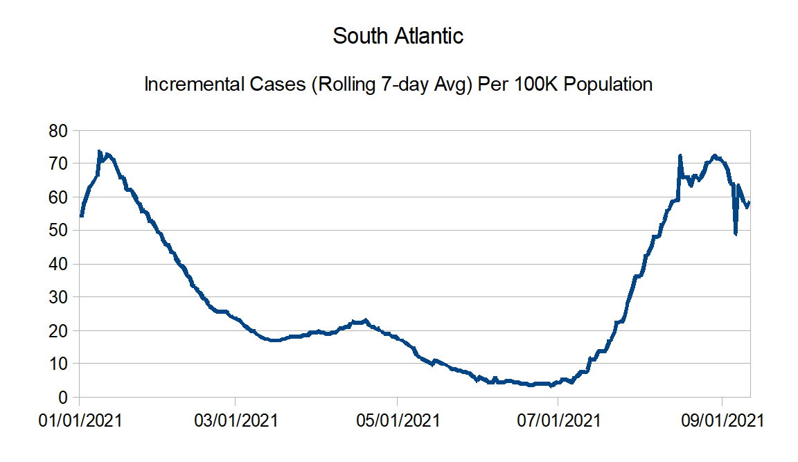
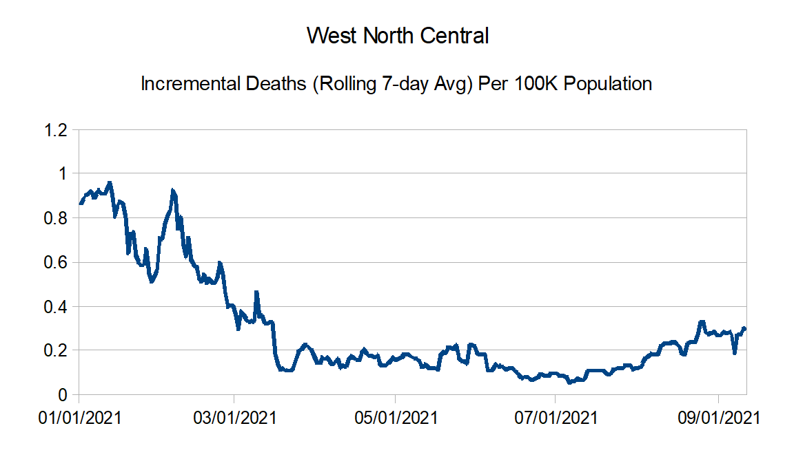
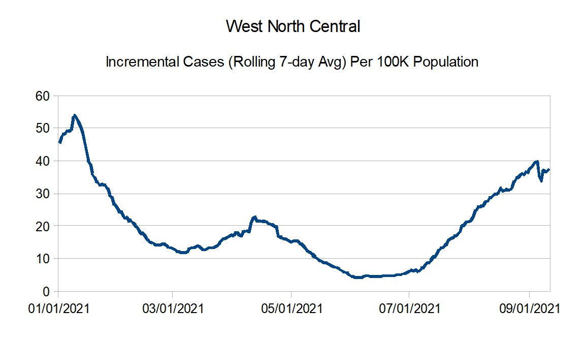
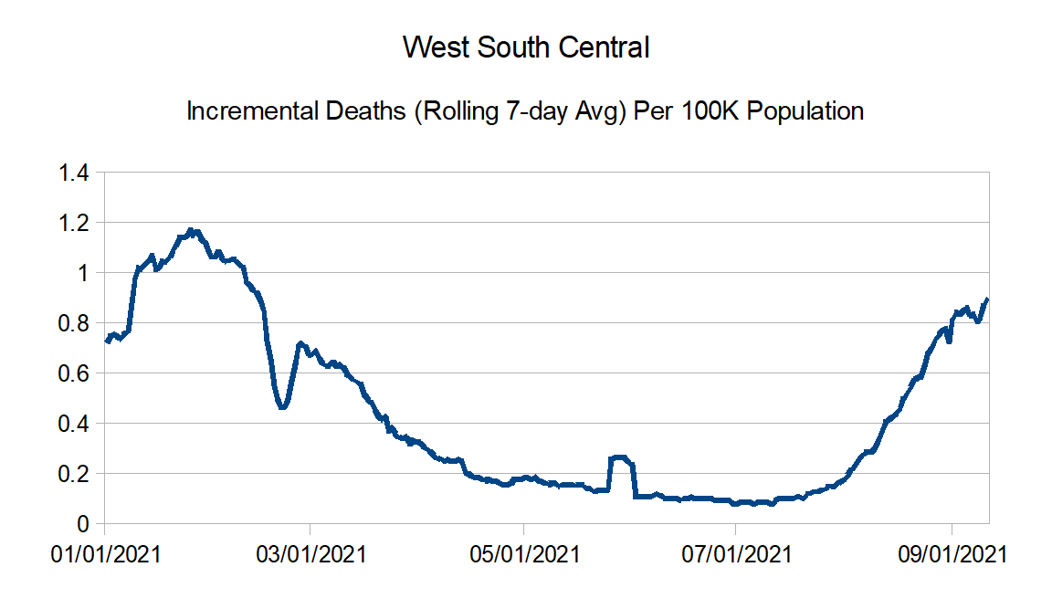
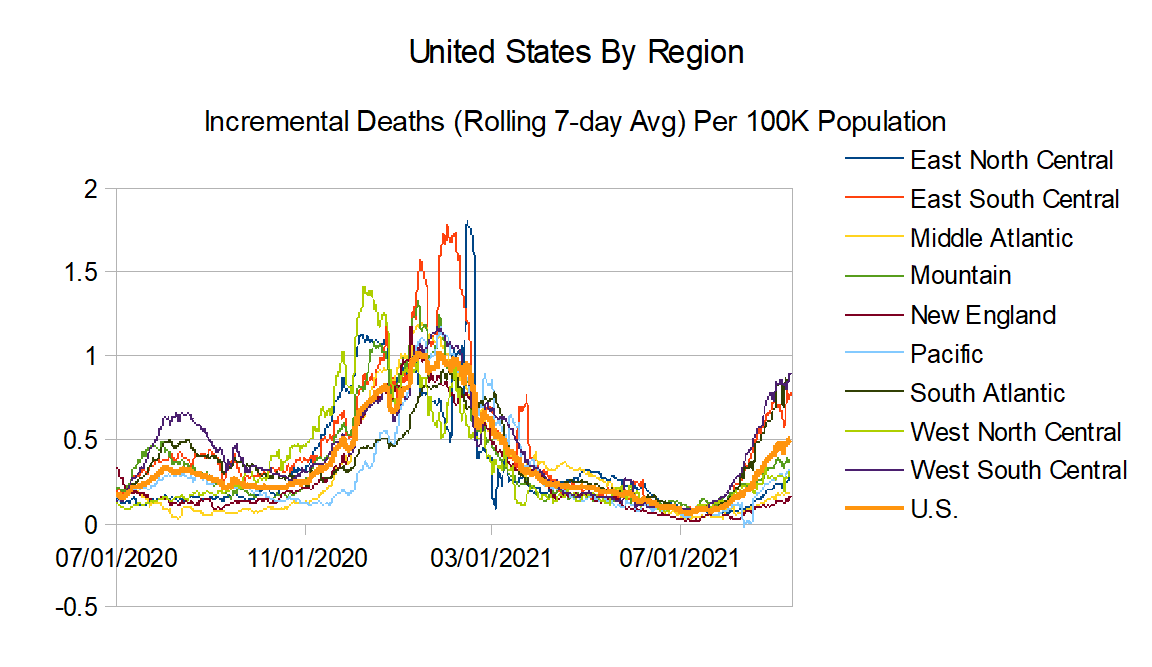
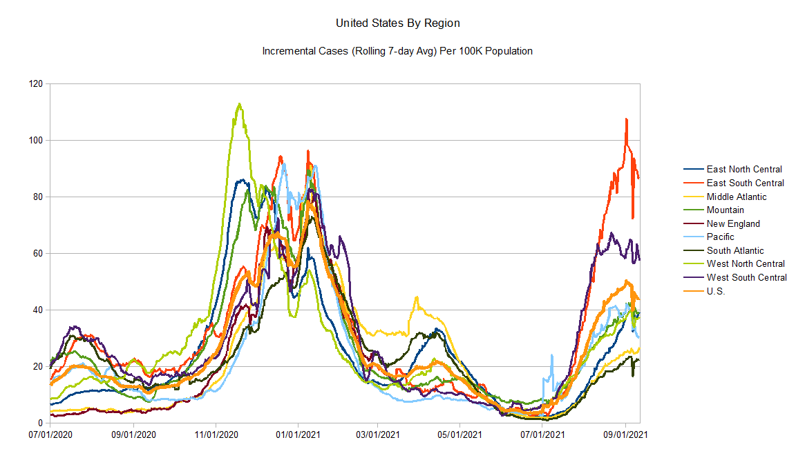
Updating the graphs again. Generally speaking, the bad news as I thought might happen, reported deaths are now trending back upwards. If there is a glimmer of good news, it looks like maybe reported cases are peaking.
Data Source – New York Times github
Data Info – New York Times data info
Regions:
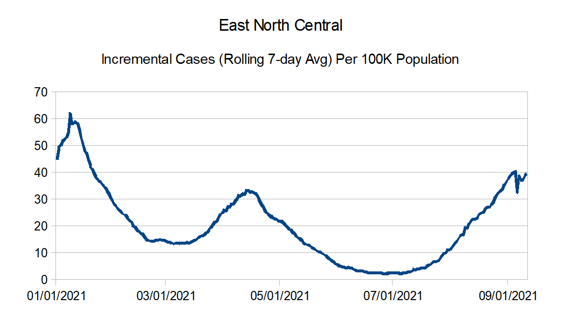
East North Central: Illinois, Indiana, Michigan, Ohio, and Wisconsin
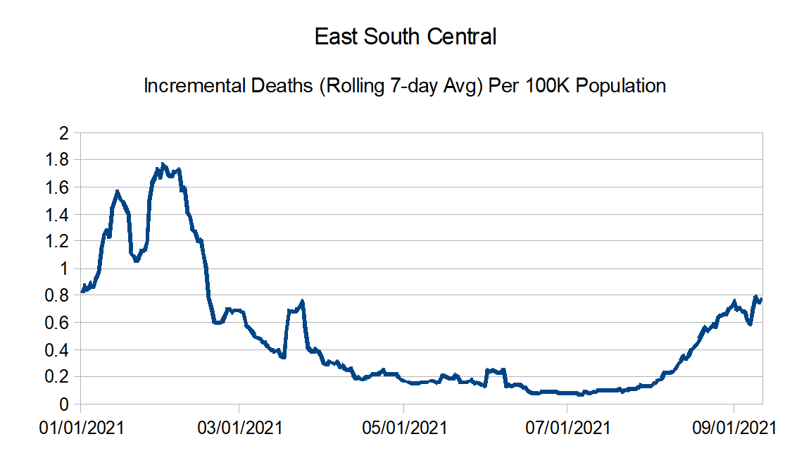
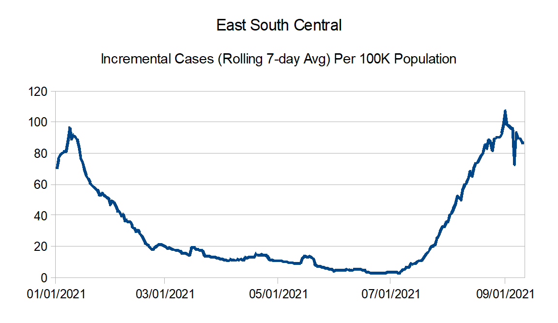
East South Central: Alabama, Kentucky, Mississippi, and Tennessee
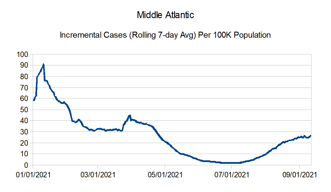
Middle Atlantic: Delaware, New Jersey, New York, and Pennsylvania
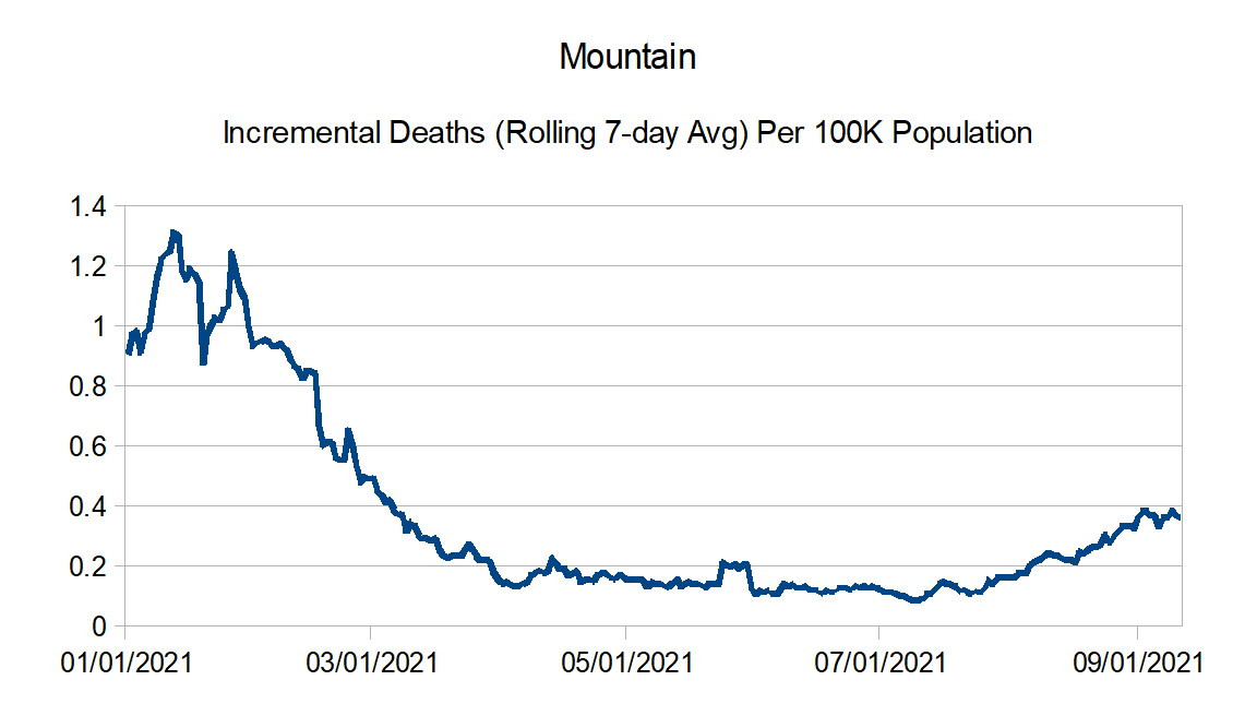
Mountain: Arizona, Colorado, Idaho, Montana, Nevada, New Mexico, Utah, and Wyoming
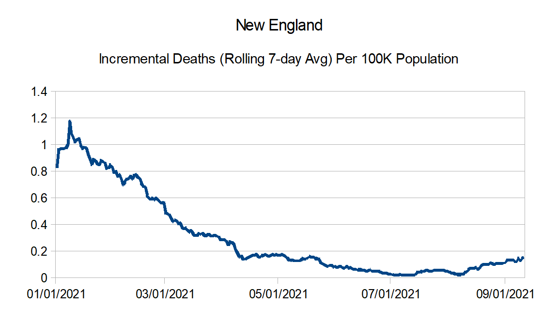
New England: Connecticut, Maine, Massachusetts, New Hampshire, Rhode Island, and Vermont
Pacific: Alaska, California, Hawaii, Oregon, and Washington
South Atlantic: Florida, Georgia, Maryland, North Carolina, South Carolina, Virginia, West Virginia, District of Columbia, Puerto Rico, Northern Mariana Islands, and Virgin Islands
West North Central: Iowa, Kansas, Minnesota, Missouri, Nebraska, North Dakota, and South Dakota
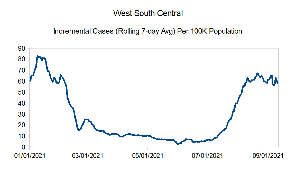
West South Central: Arkansas, Louisiana, Oklahoma, and Texas
Here are the countrywide charts:
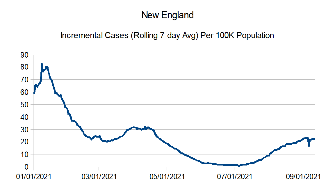
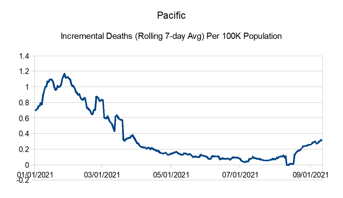
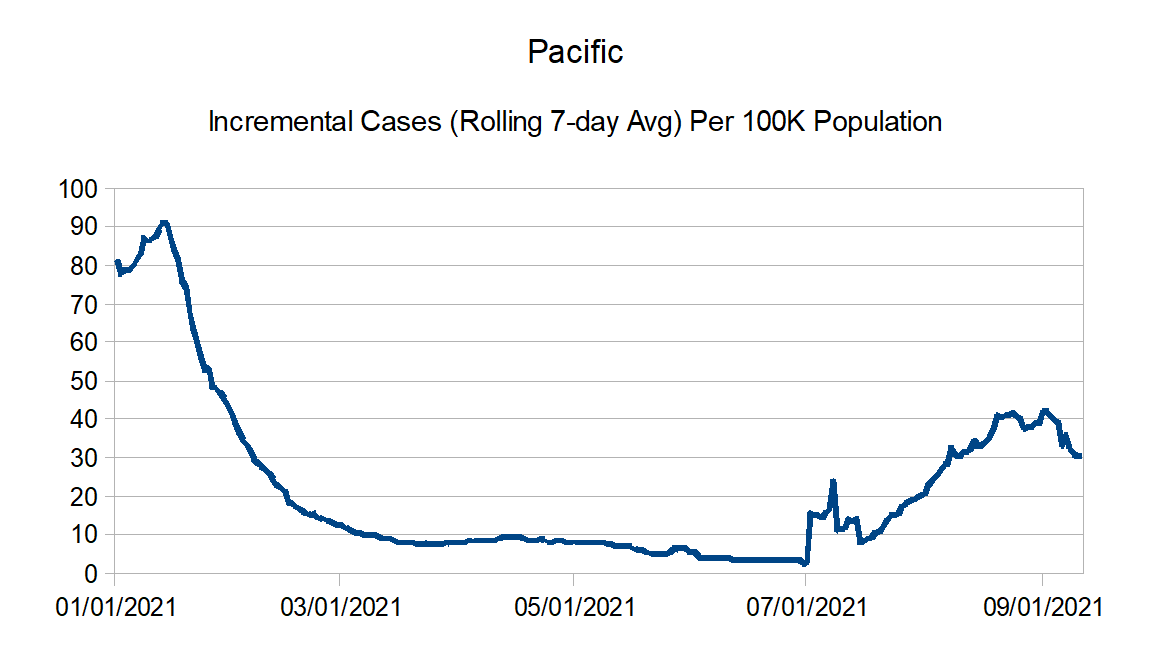
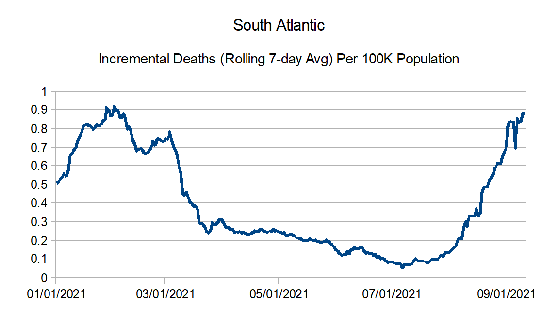
Here are the regional charts:


And finally the regional comparison charts:
Back in a month or so.
