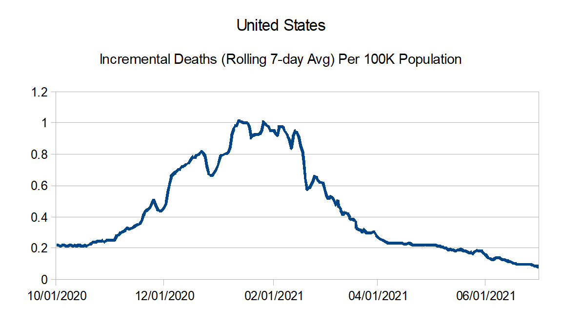
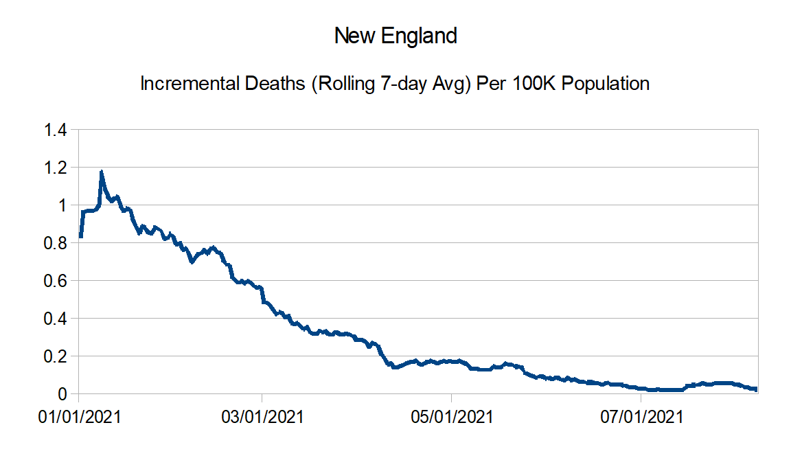
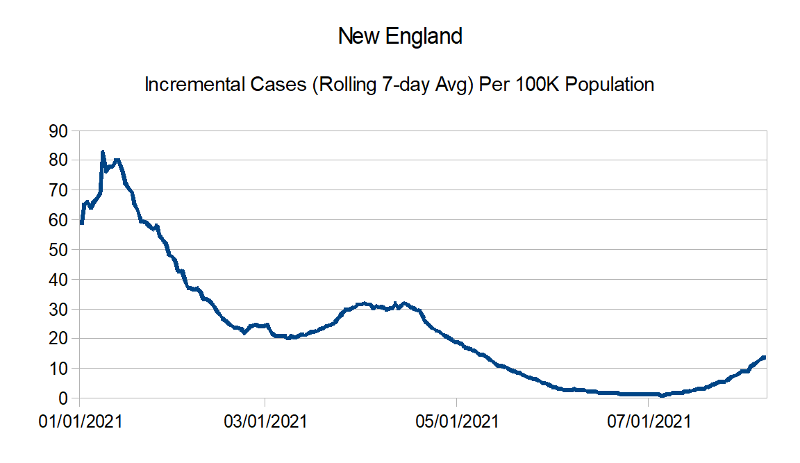
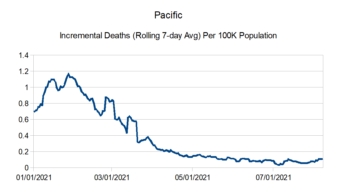
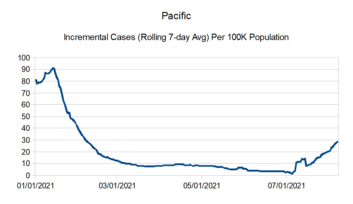
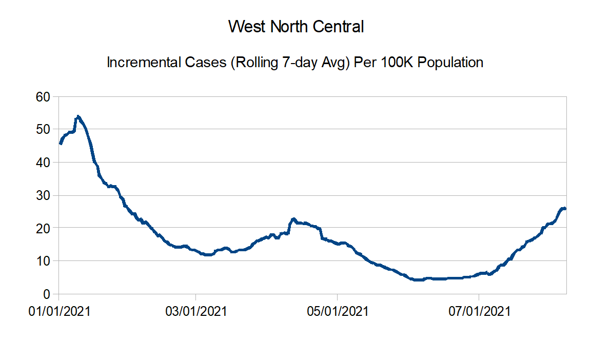
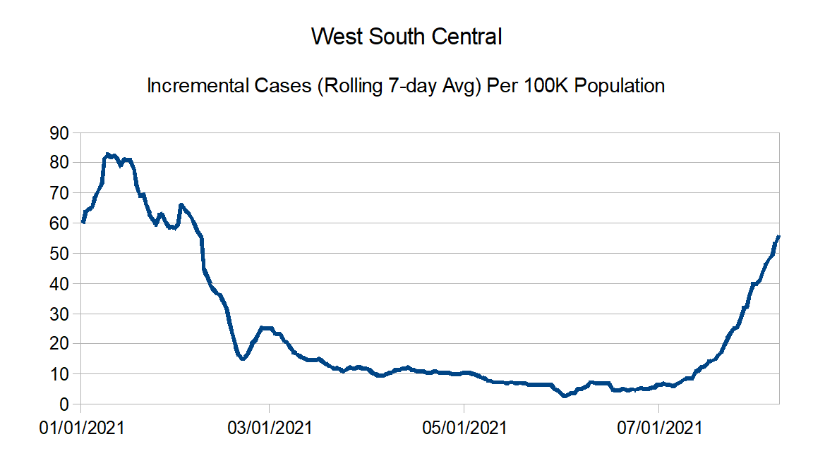
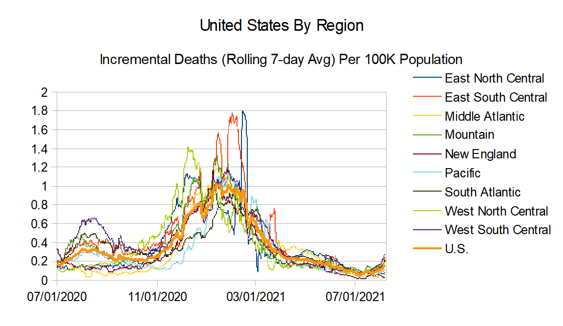
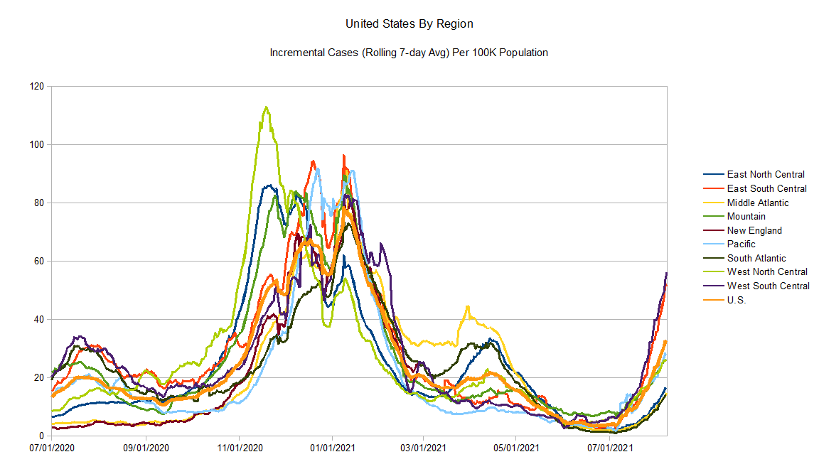
Now for the updated graphs. Bottom line is overall reported cases are going back up and at a pretty good clip. Reported deaths are still flat to going slightly up. Hopefully with the most vulnerable vaccinated, they don’t quite follow as closely at case, but it won’t surprise me if they start going up just based on the sheer volume of number of cases.
Data Source – New York Times github
Data Info – New York Times data info
Regions:
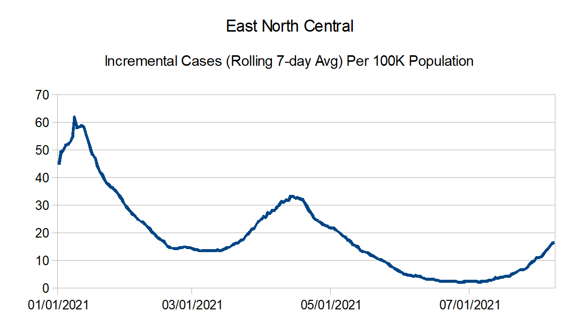
East North Central: Illinois, Indiana, Michigan, Ohio, and Wisconsin
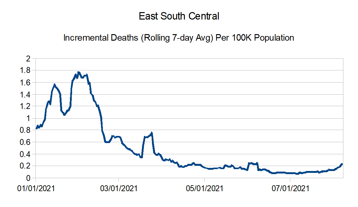
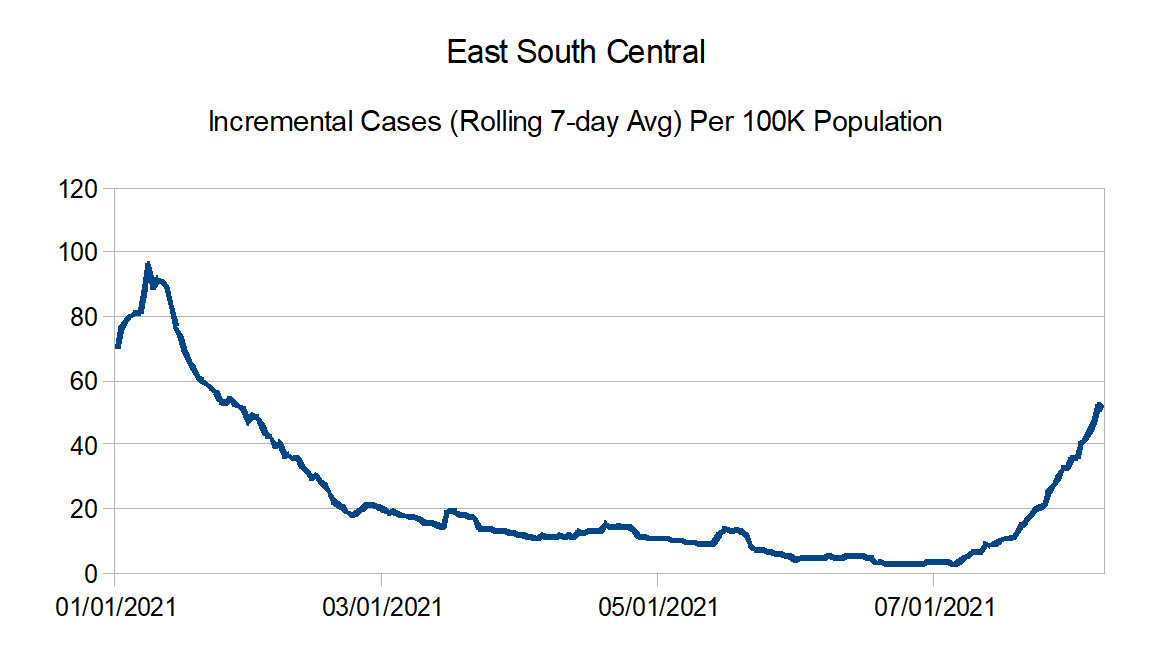
East South Central: Alabama, Kentucky, Mississippi, and Tennessee
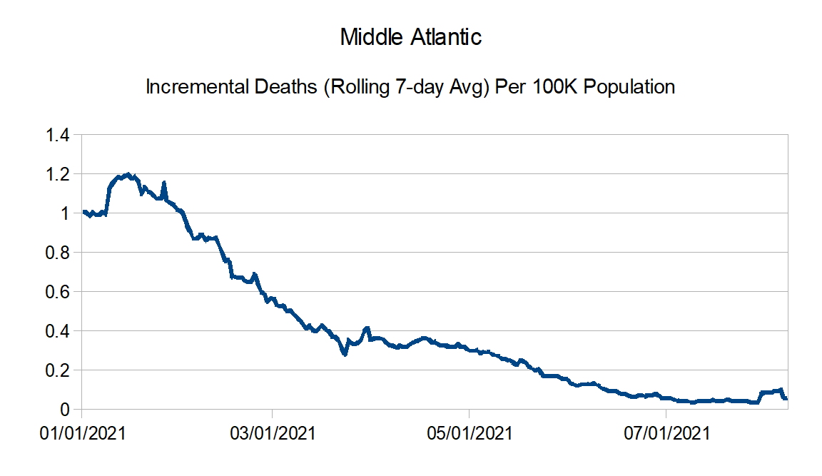
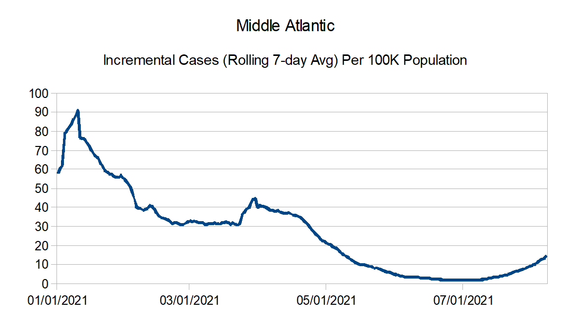
Middle Atlantic: Delaware, New Jersey, New York, and Pennsylvania
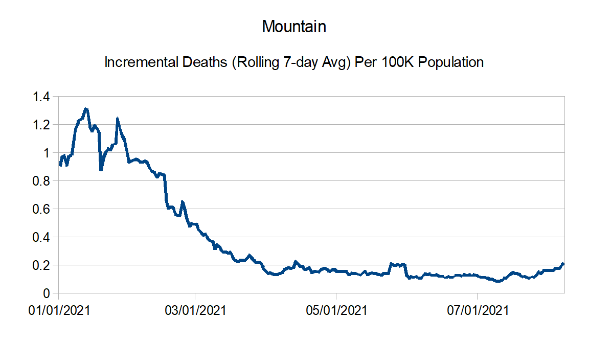
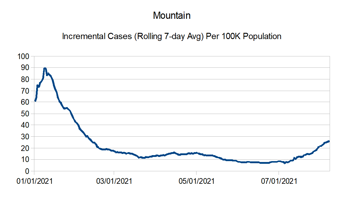
Mountain: Arizona, Colorado, Idaho, Montana, Nevada, New Mexico, Utah, and Wyoming
New England: Connecticut, Maine, Massachusetts, New Hampshire, Rhode Island, and Vermont
Pacific: Alaska, California, Hawaii, Oregon, and Washington
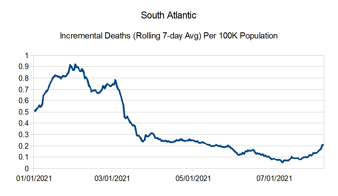
South Atlantic: Florida, Georgia, Maryland, North Carolina, South Carolina, Virginia, West Virginia, District of Columbia, Puerto Rico, Northern Mariana Islands, and Virgin Islands
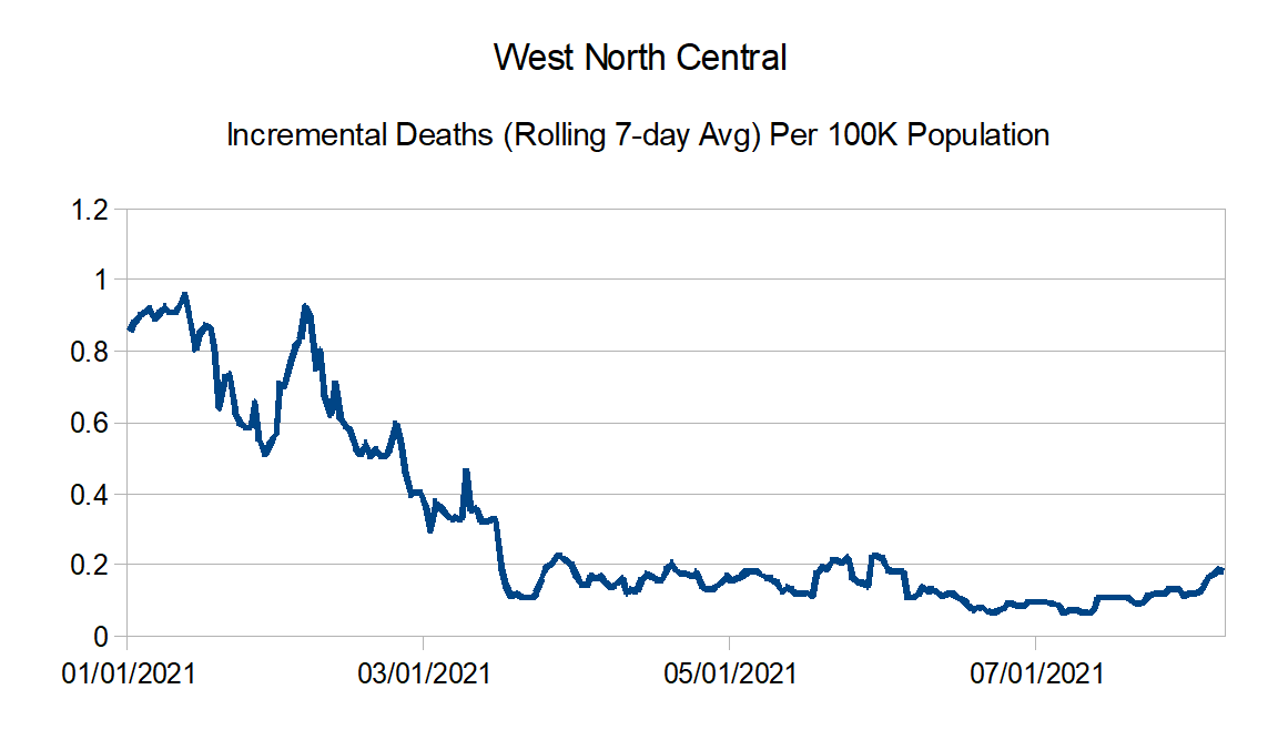
West North Central: Iowa, Kansas, Minnesota, Missouri, Nebraska, North Dakota, and South Dakota
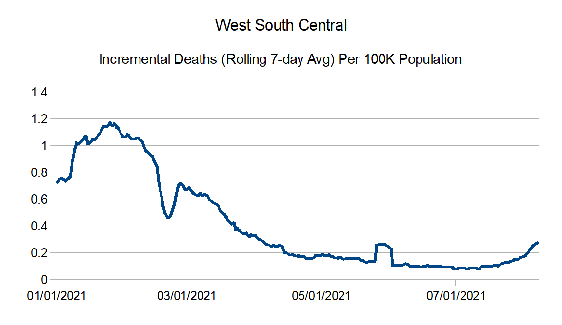
West South Central: Arkansas, Louisiana, Oklahoma, and Texas
Here are the countrywide charts:

Here are the regional charts:


And finally the regional comparison charts:
See in you all in a month or so.
