First, I suppose I can’t ignore that President Trump is now hospitalized with COVID-19. Don’t have much to say about it, other than it’s a good reminder that this virus doesn’t care who you are and anyone can get infected, so taking precautions like wearing masks, stay spread apart, washing hands, etc. are still very important.
Next, I am changing things up a bit. I am going to start the charts with the rolling 7-day average at 7/1/20 now to show the more recent history. You can always go back to the older posts to see the prior to 7/1 history (though in summary, things got pretty bad in the Northeast and then measures were put in place nationwide and things improved in the Northeast while the rest of the nation started getting cases, but kept their curves relatively flatten).
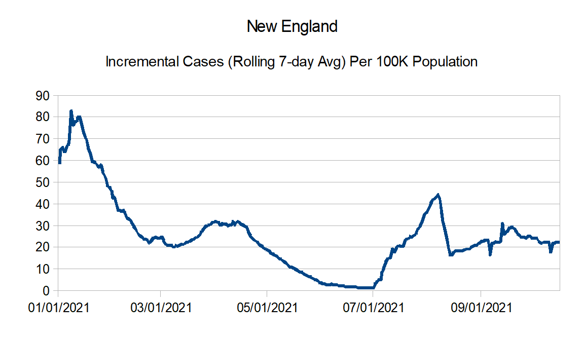
Finally I am going to add charts that show reported incremental cases per 100K population starting with rolling 7-day averages at 7/1/20. Once again, I am going to use the data as is, which means data anomalies will just roll through (which will become quite obvious when looking at the New England and see negative cases as a result of some large adjustment in Massachusetts.
Data source – https://github.com/nytimes/covid-19-data/blob/master/us-states.csv
Data information – https://www.nytimes.com/interactive/2020/us/coronavirus-us-cases.html
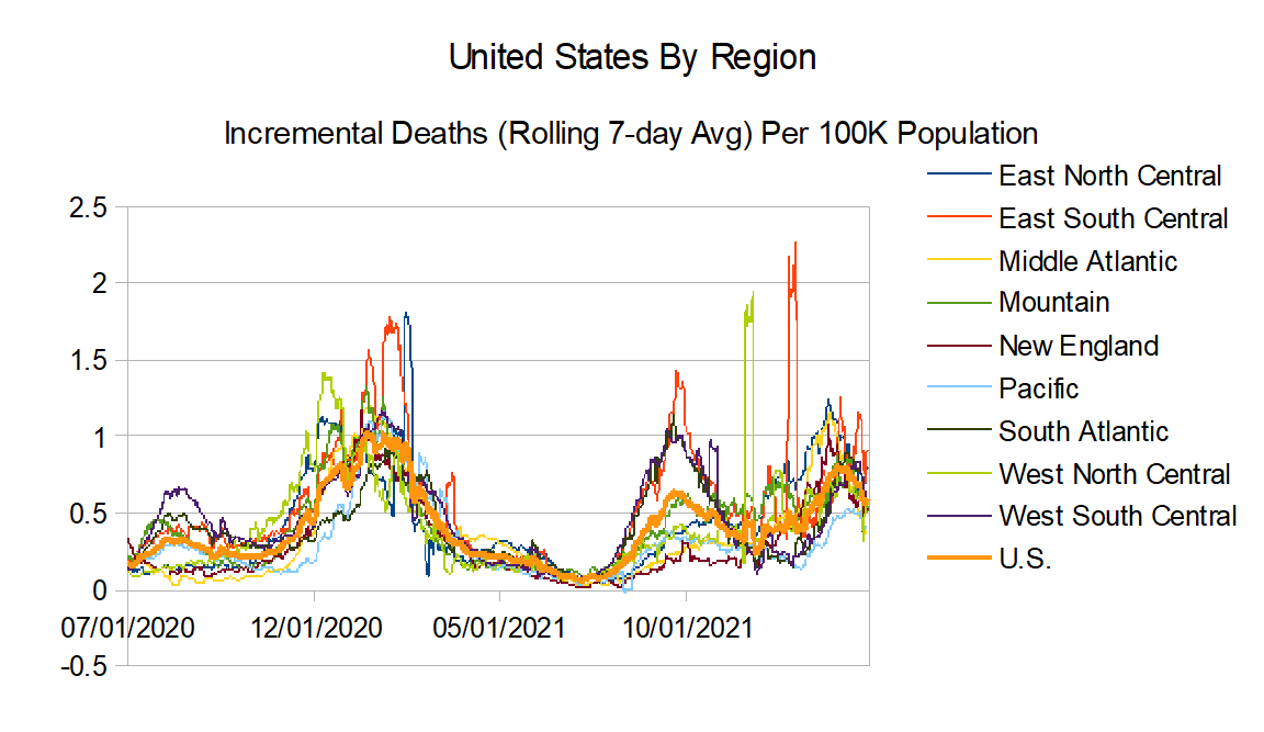
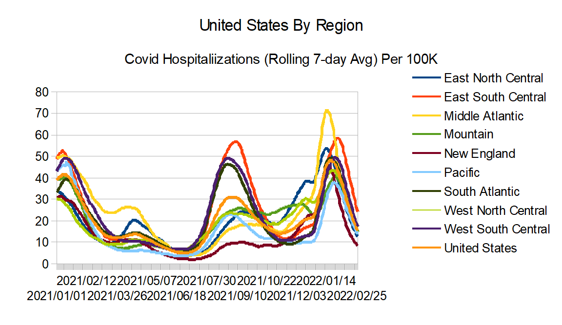
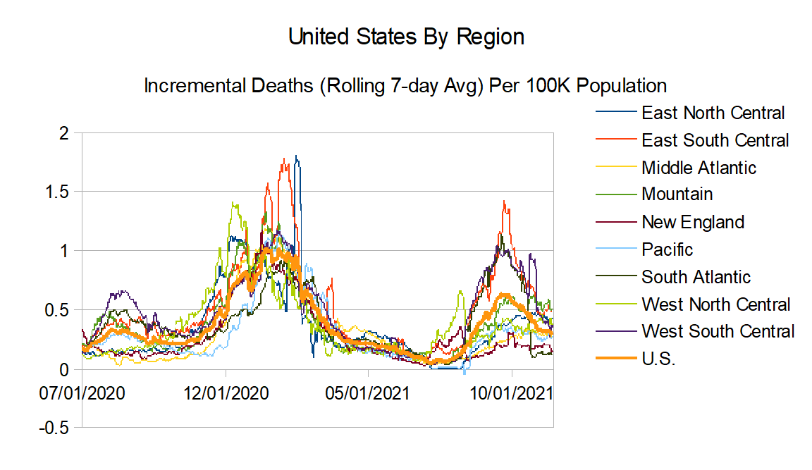
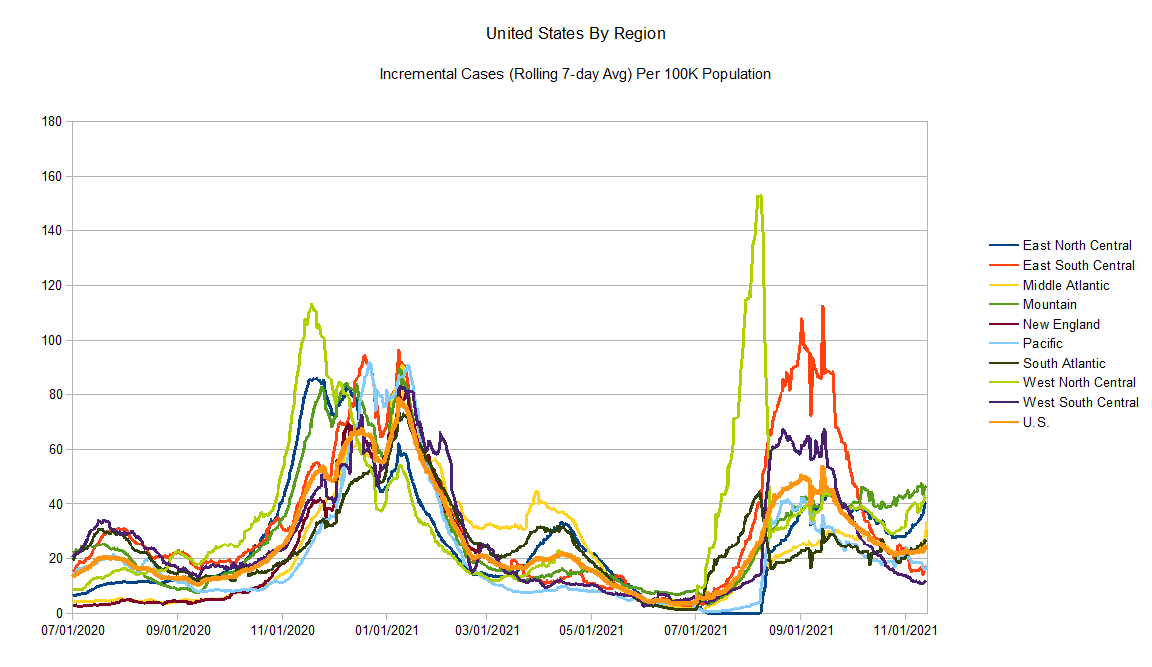
Here are the region definitions:
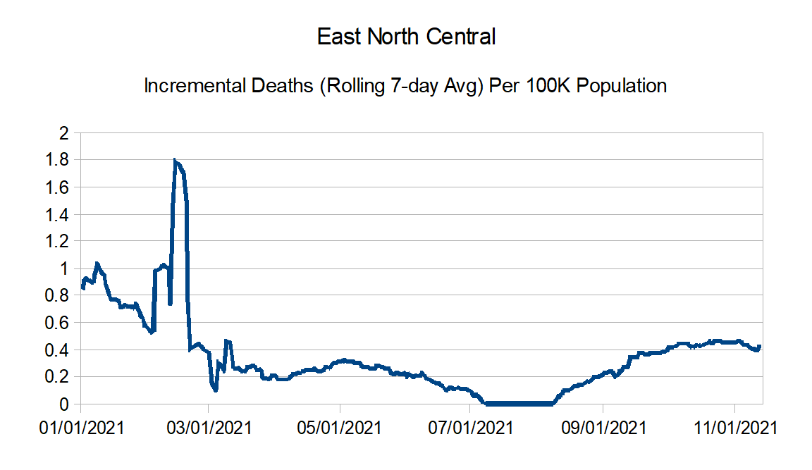
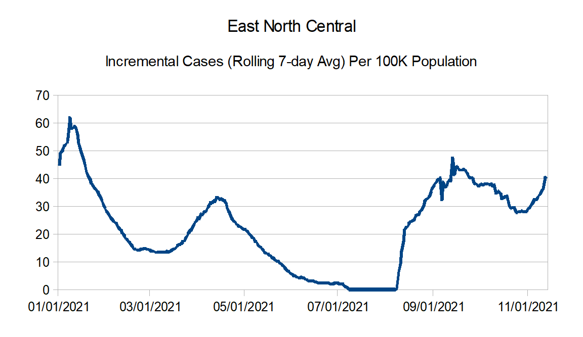
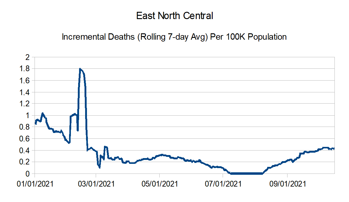
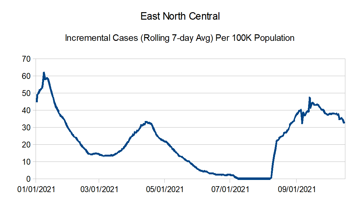
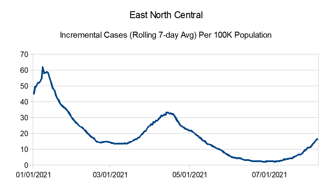
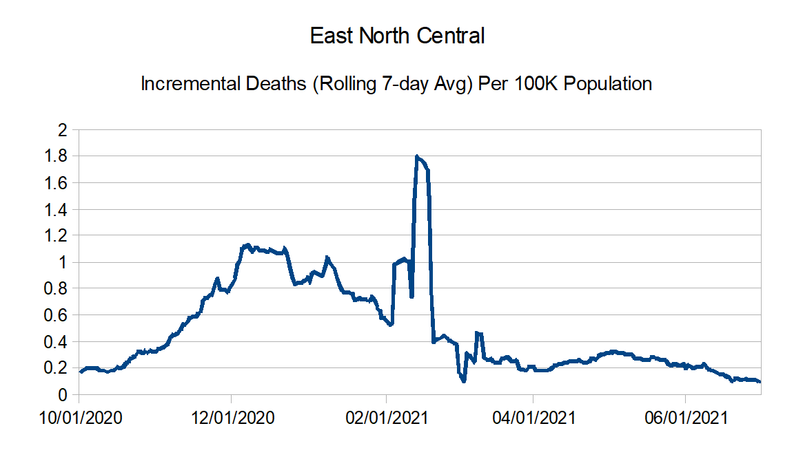
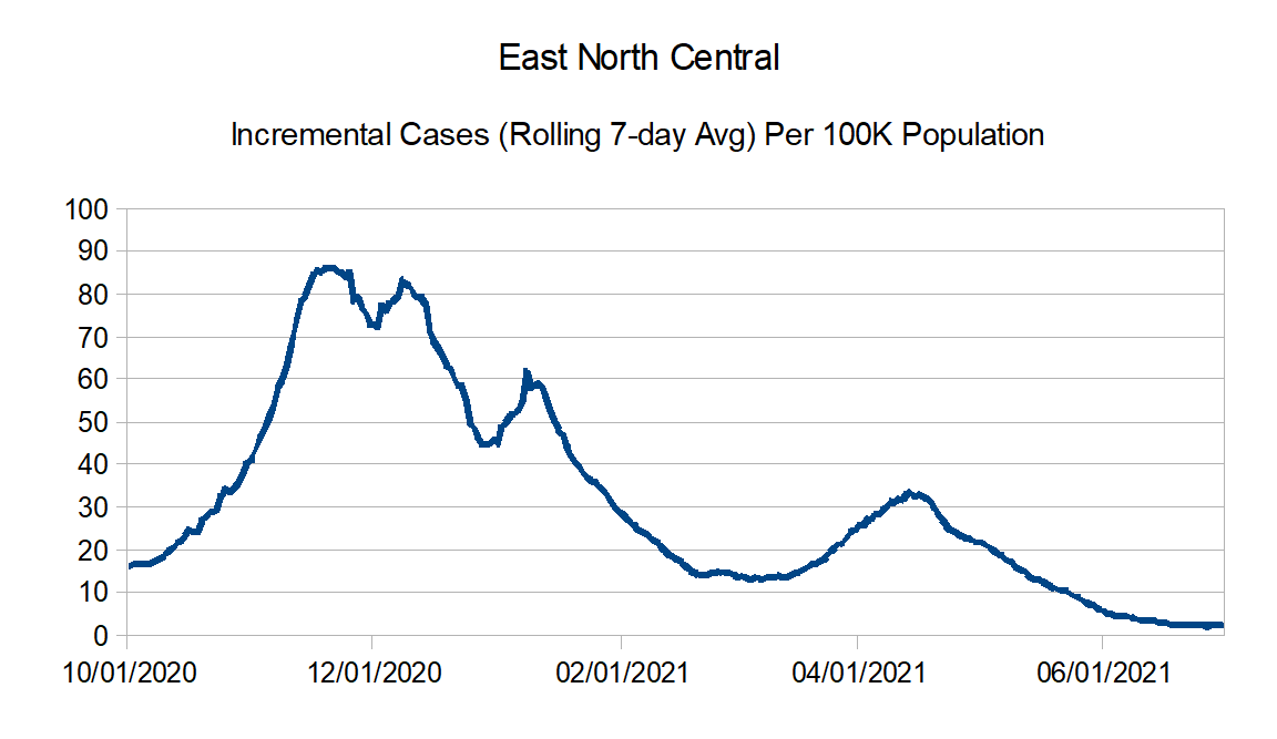
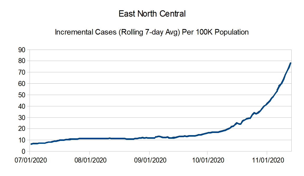
East North Central: Illinois, Indiana, Michigan, Ohio, and Wisconsin
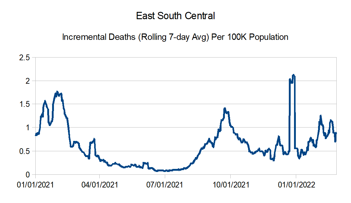
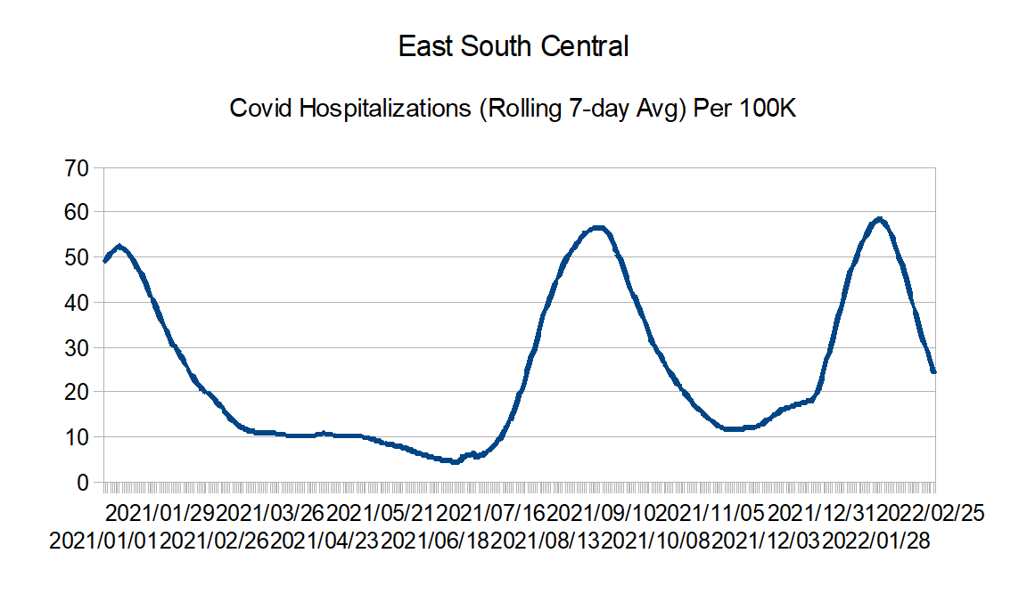
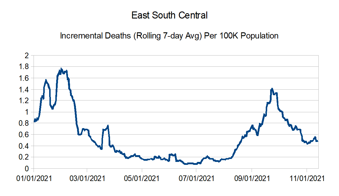
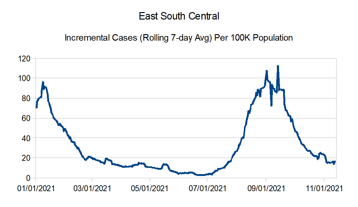
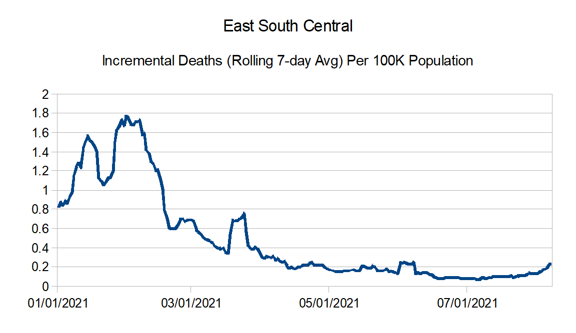
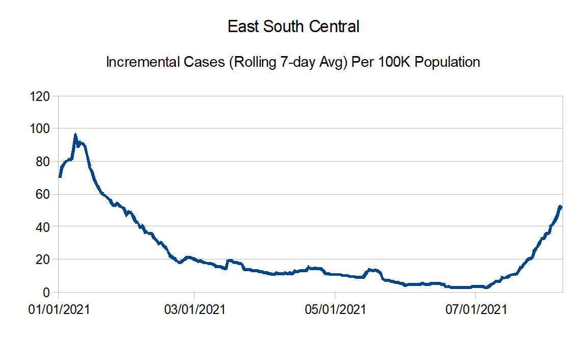
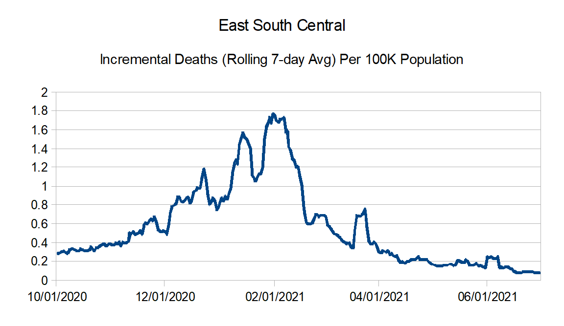
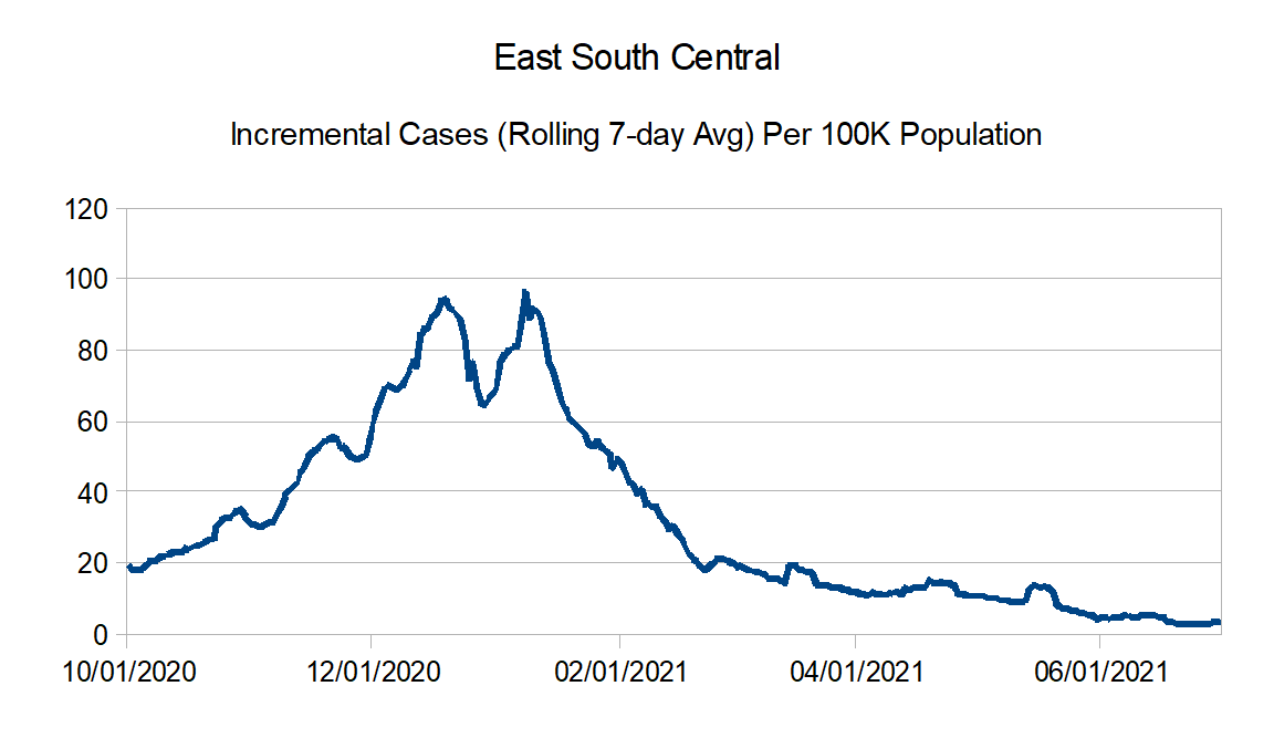
East South Central: Alabama, Kentucky, Mississippi, and Tennessee
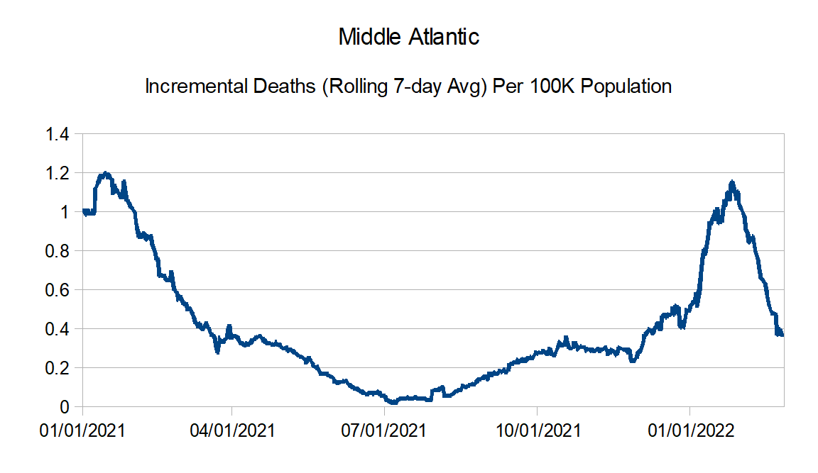
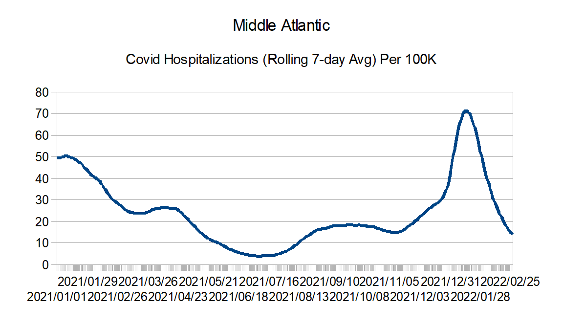
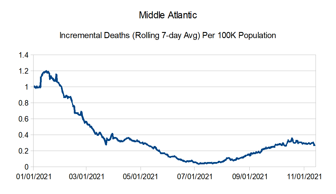
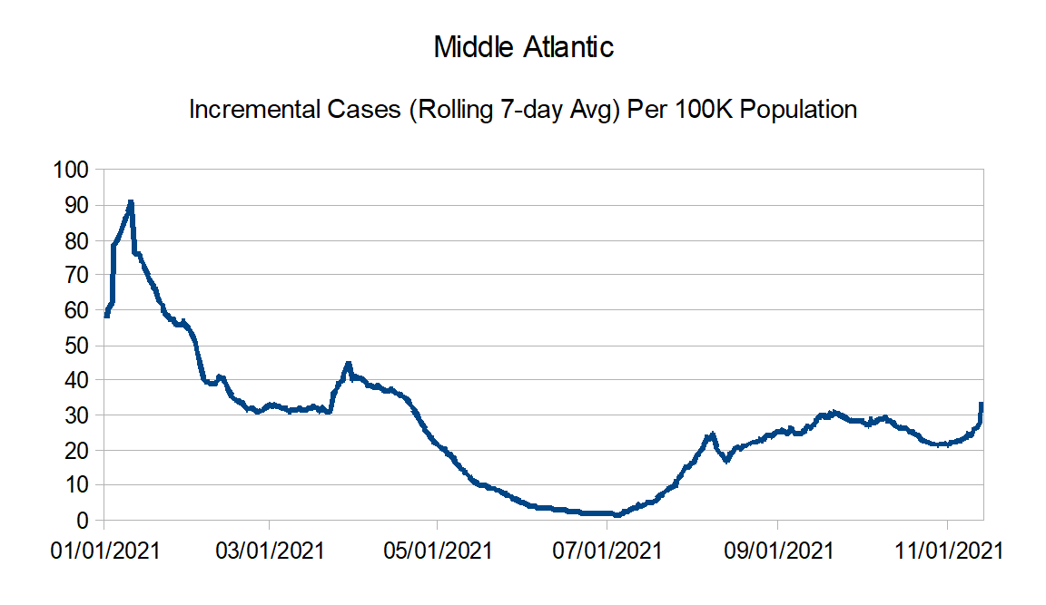
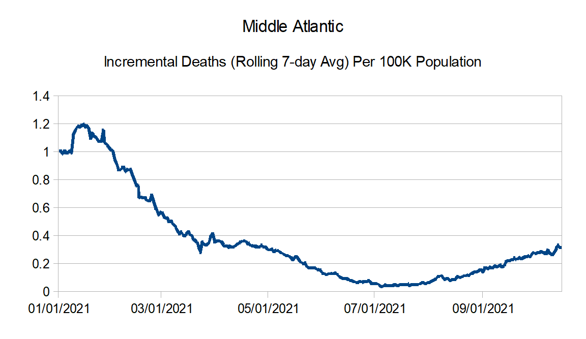
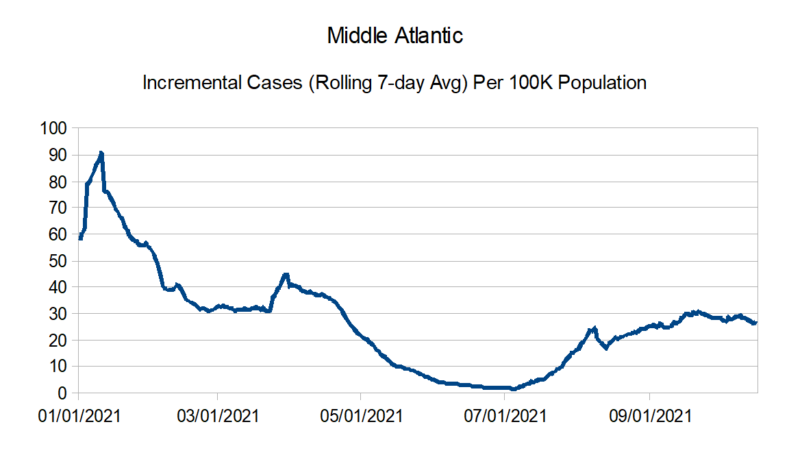
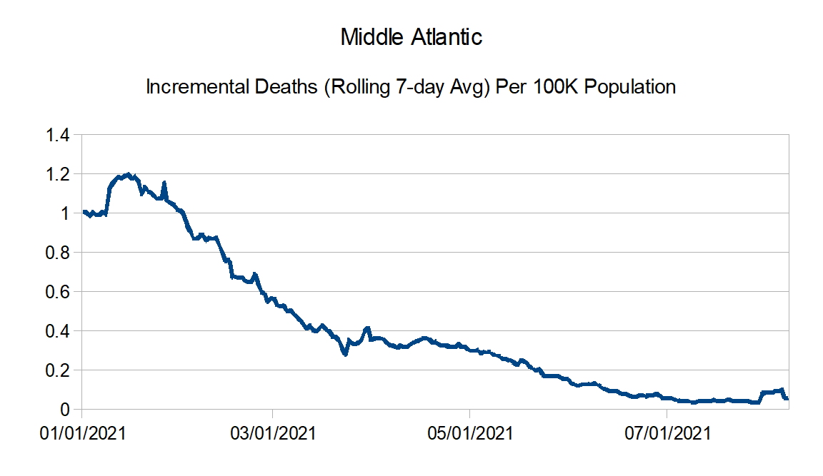
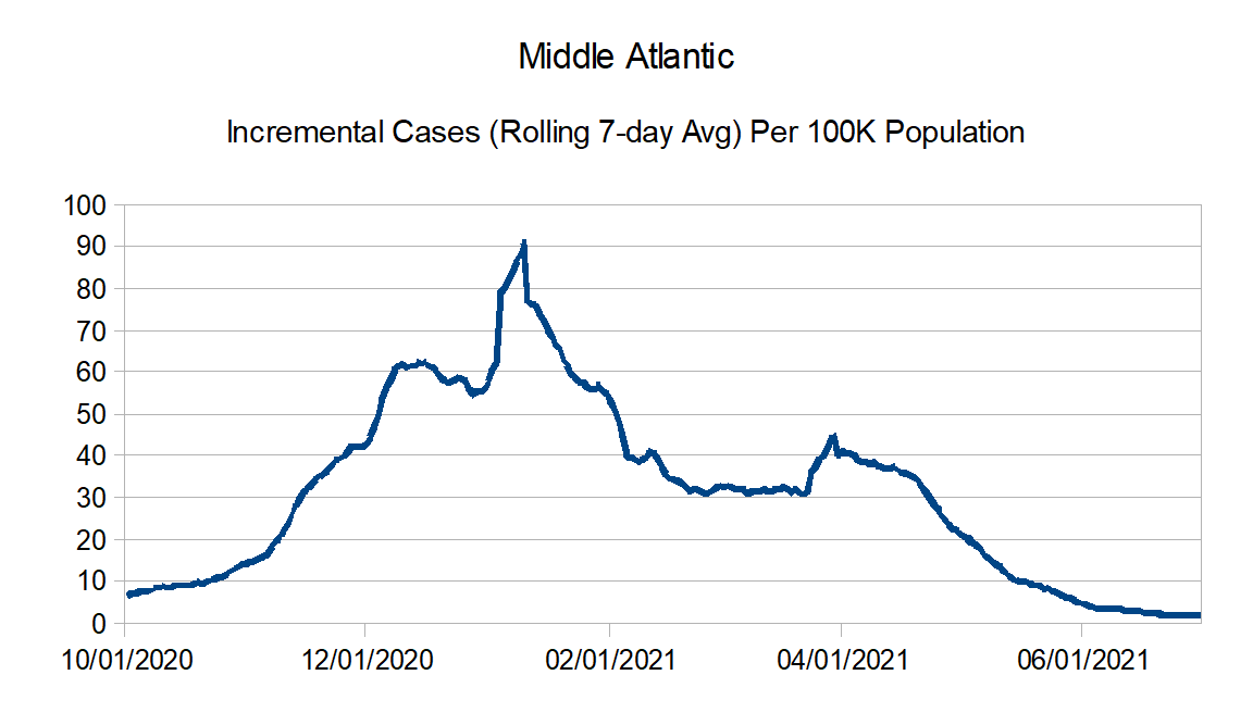
Middle Atlantic: Delaware, New Jersey, New York, and Pennsylvania
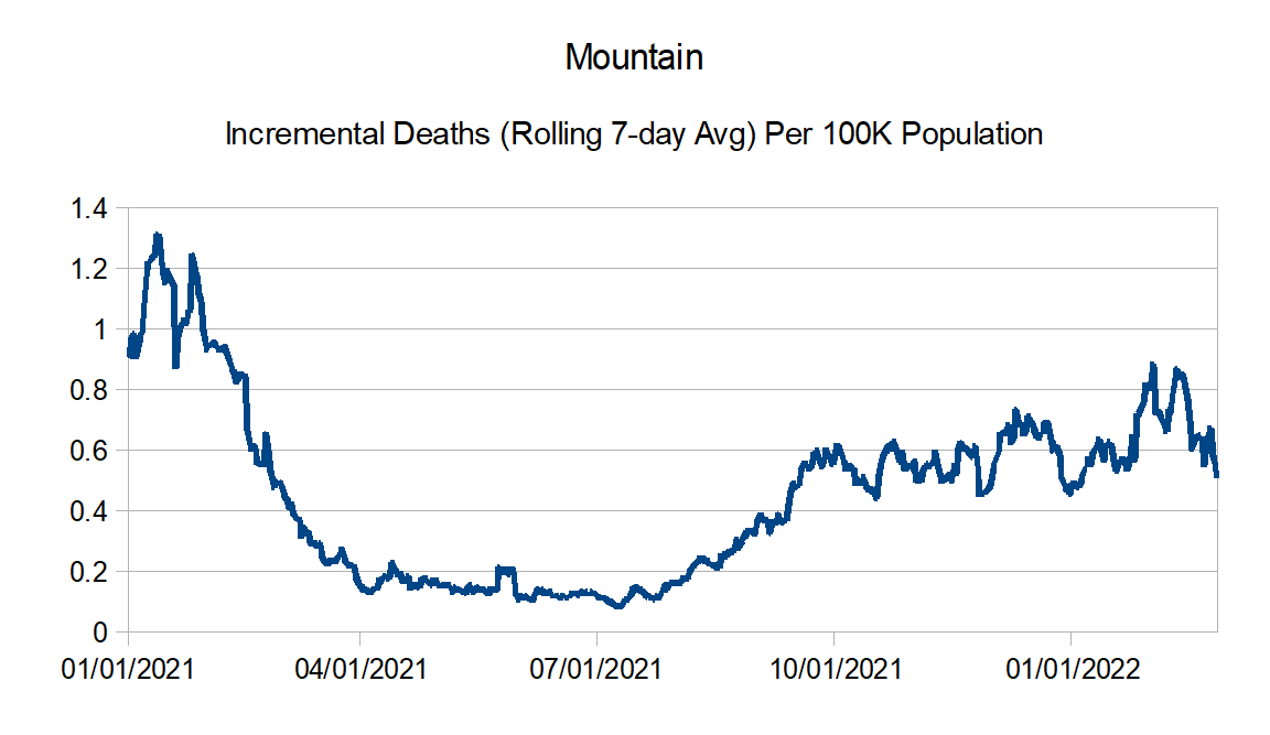
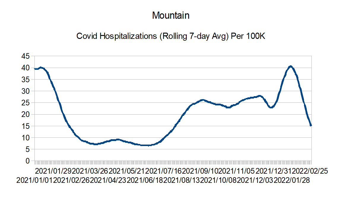
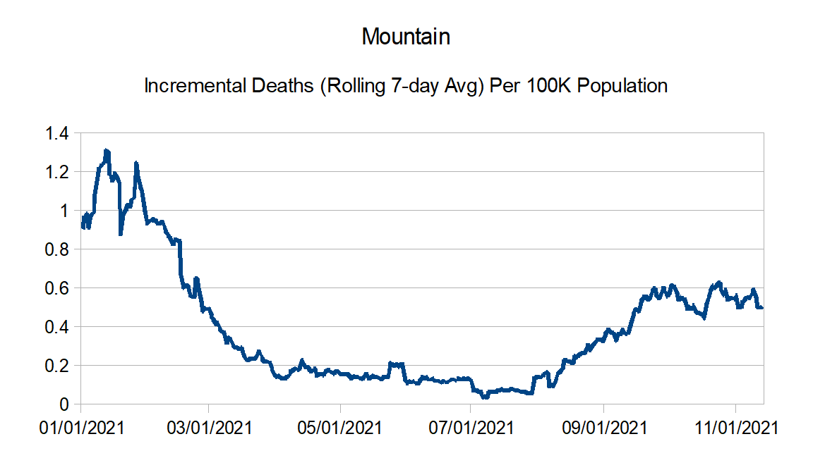
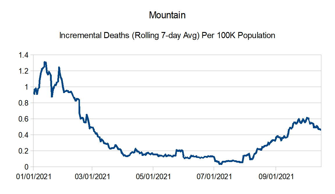
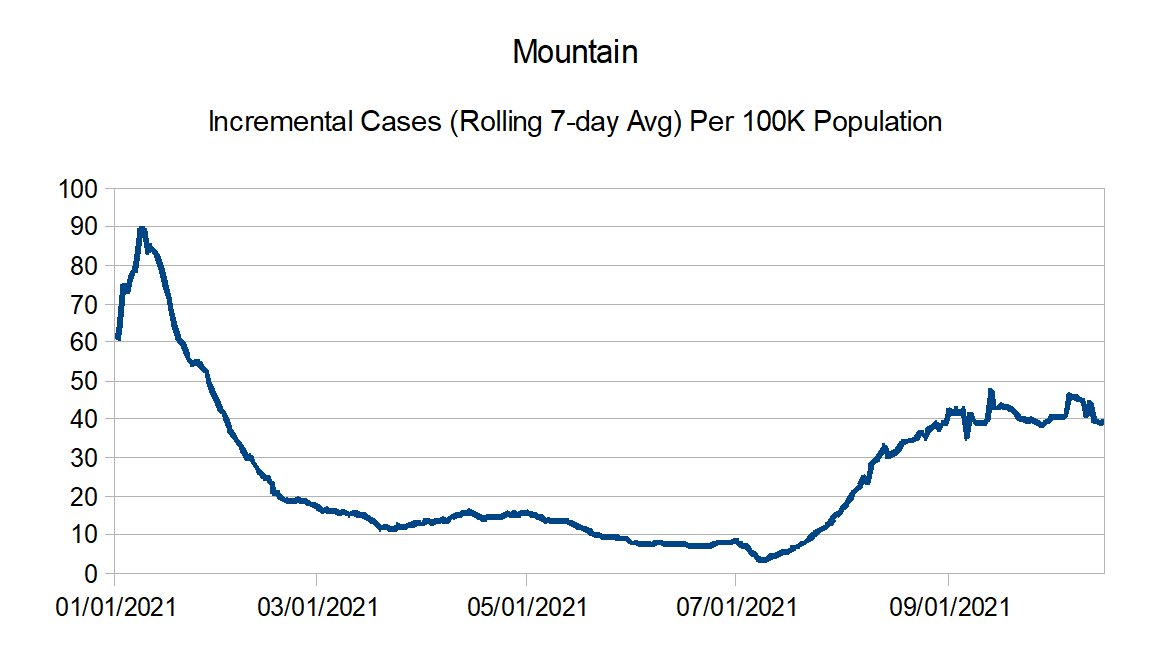
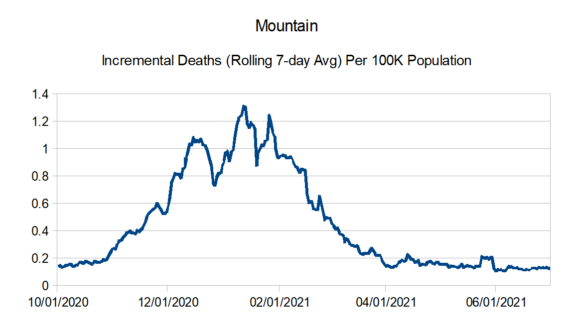
Mountain: Arizona, Colorado, Idaho, Montana, Nevada, New Mexico, Utah, and Wyoming
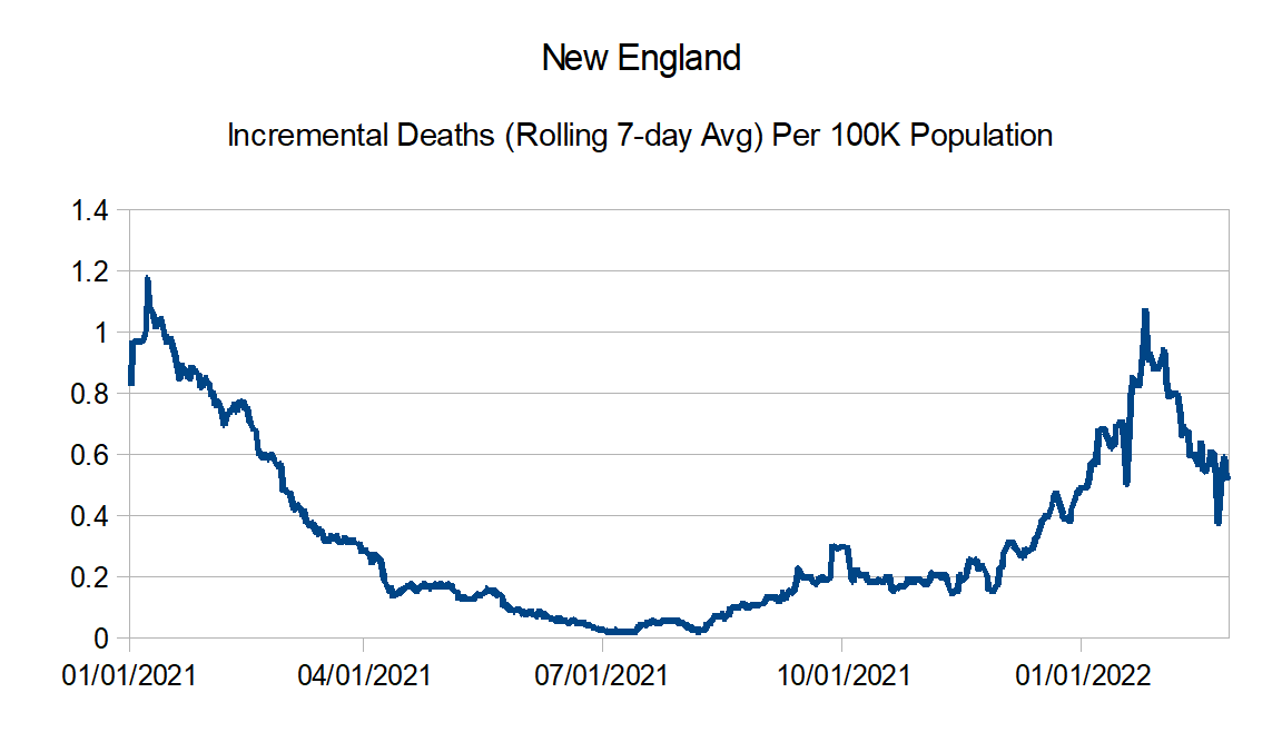
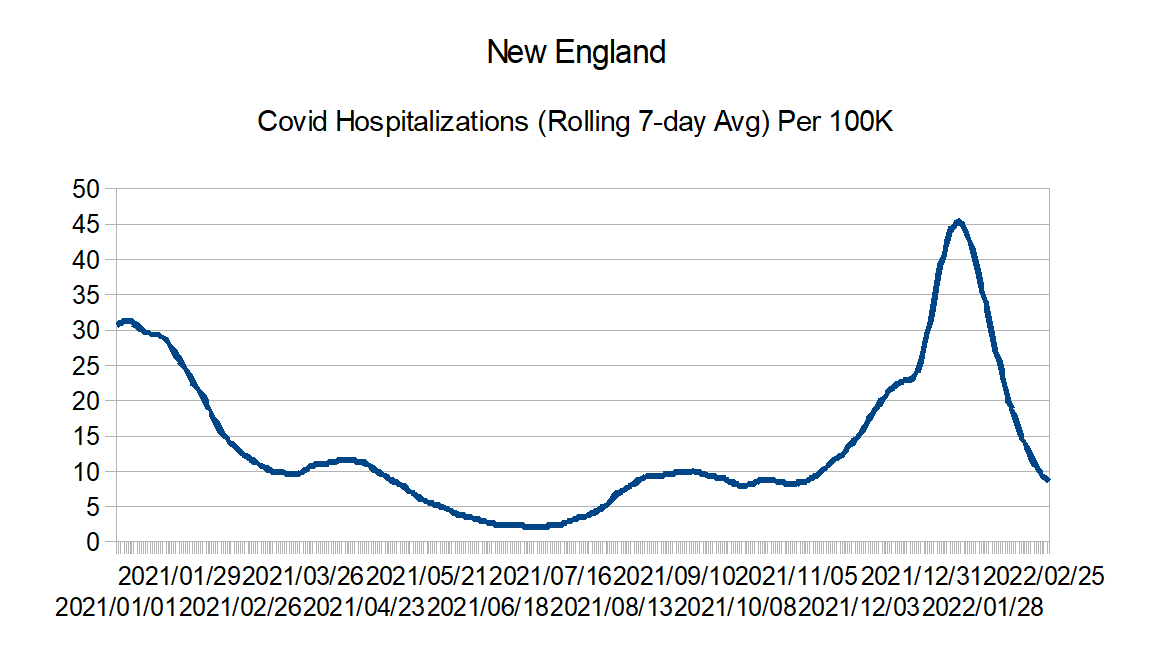
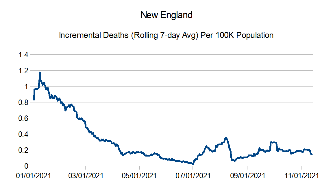
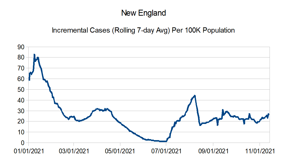
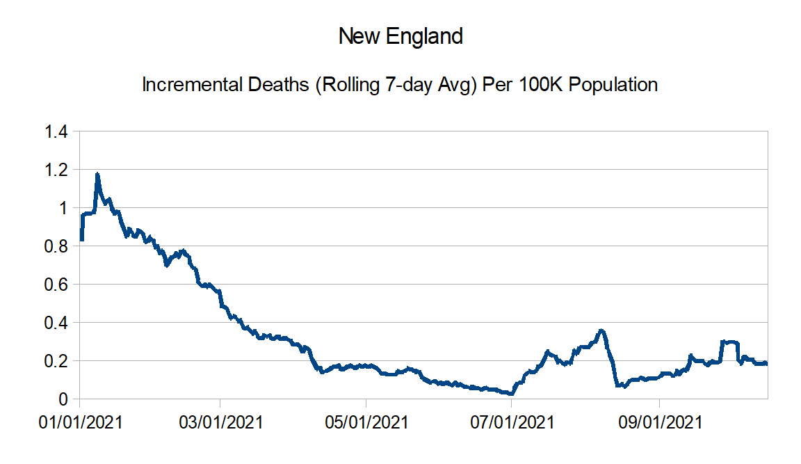
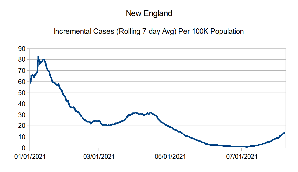
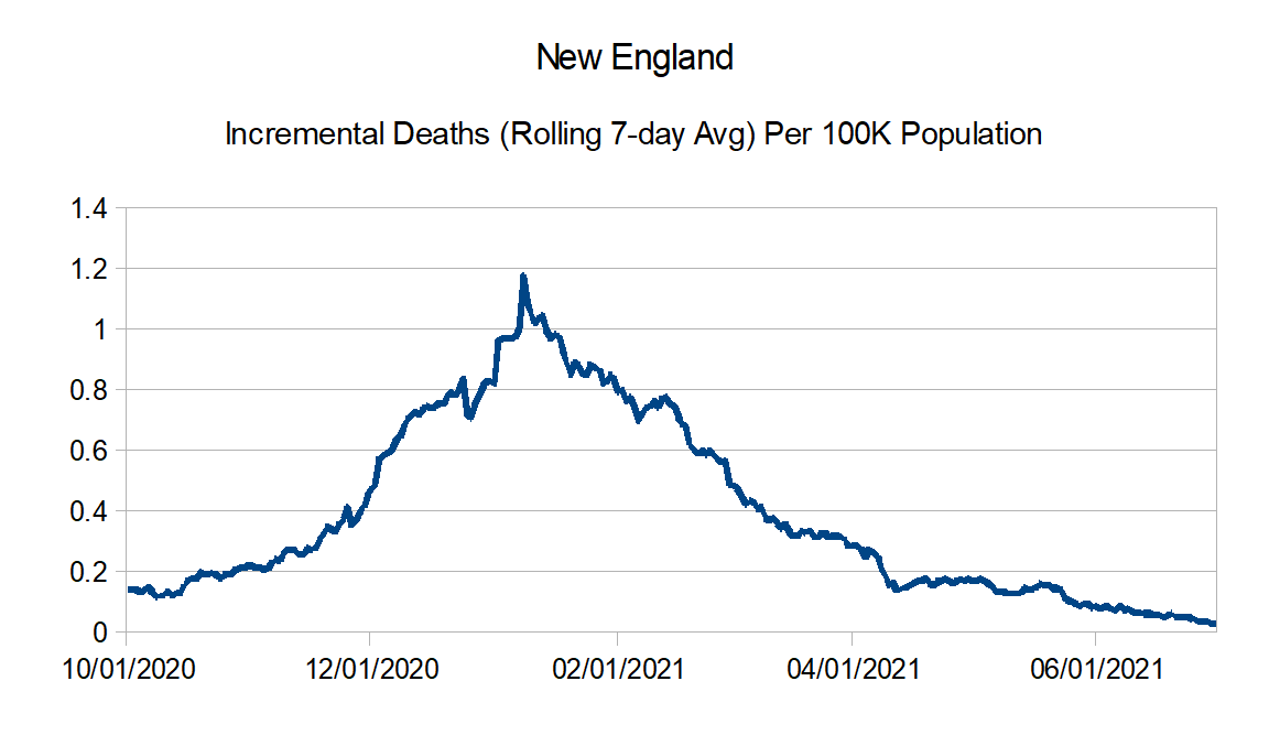
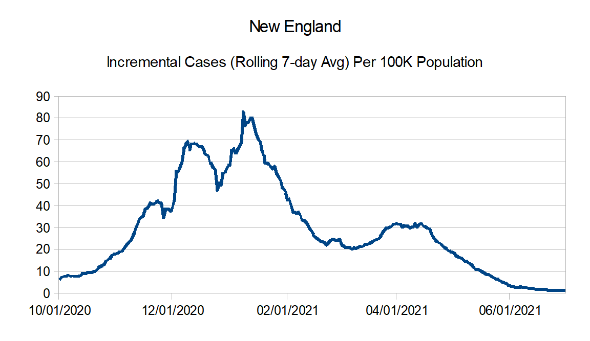
New England: Connecticut, Maine, Massachusetts, New Hampshire, Rhode Island, and Vermont
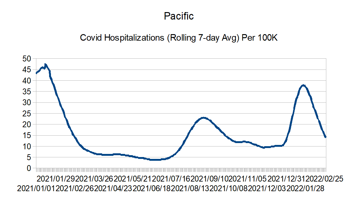
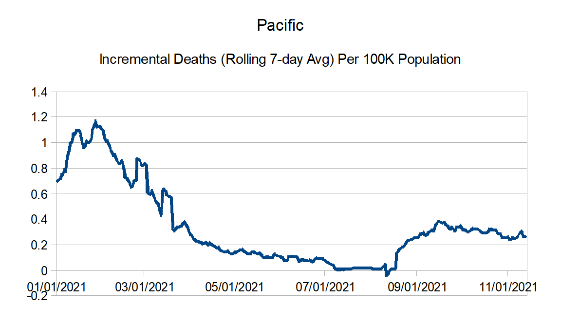
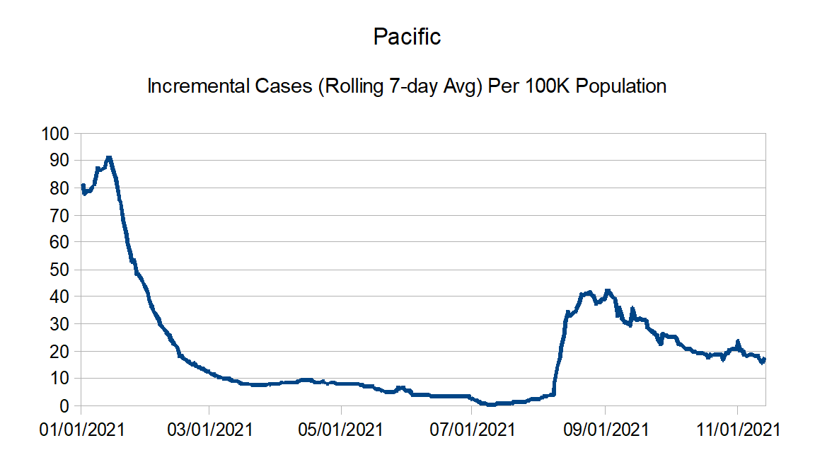
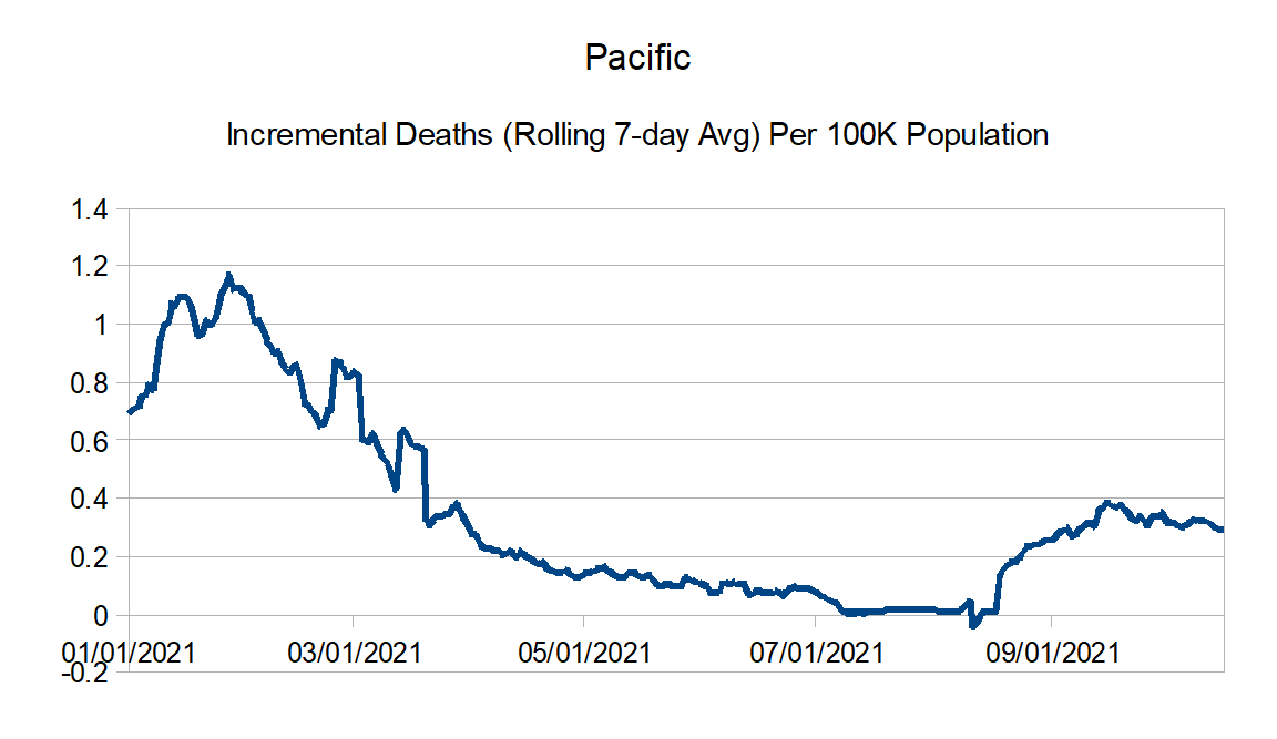
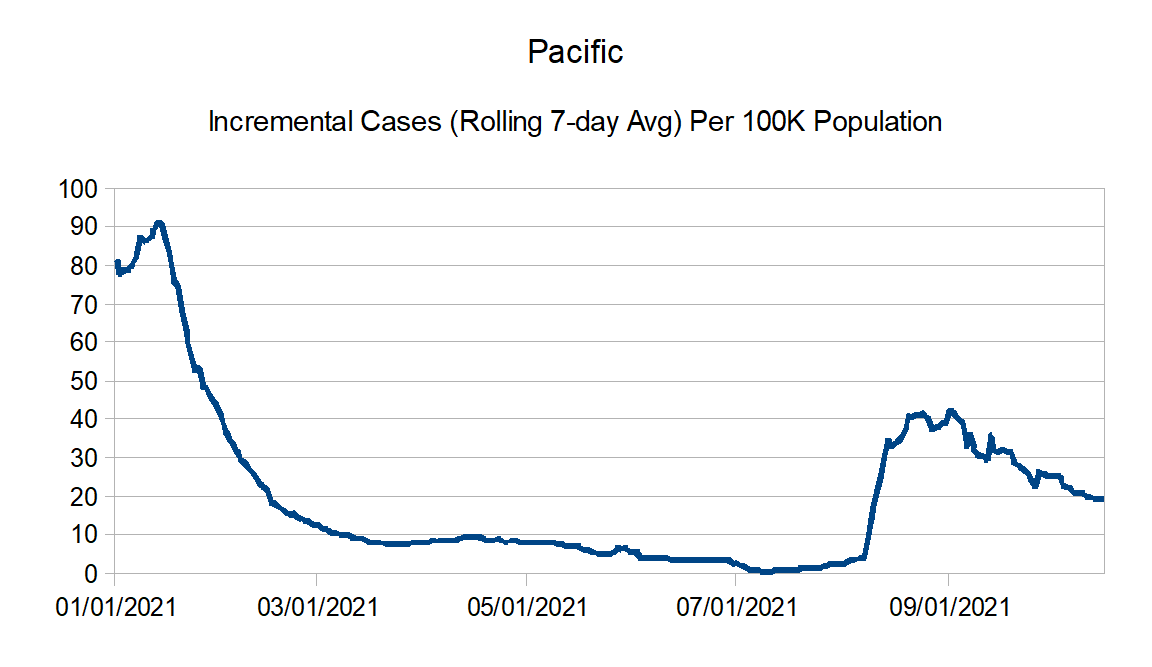
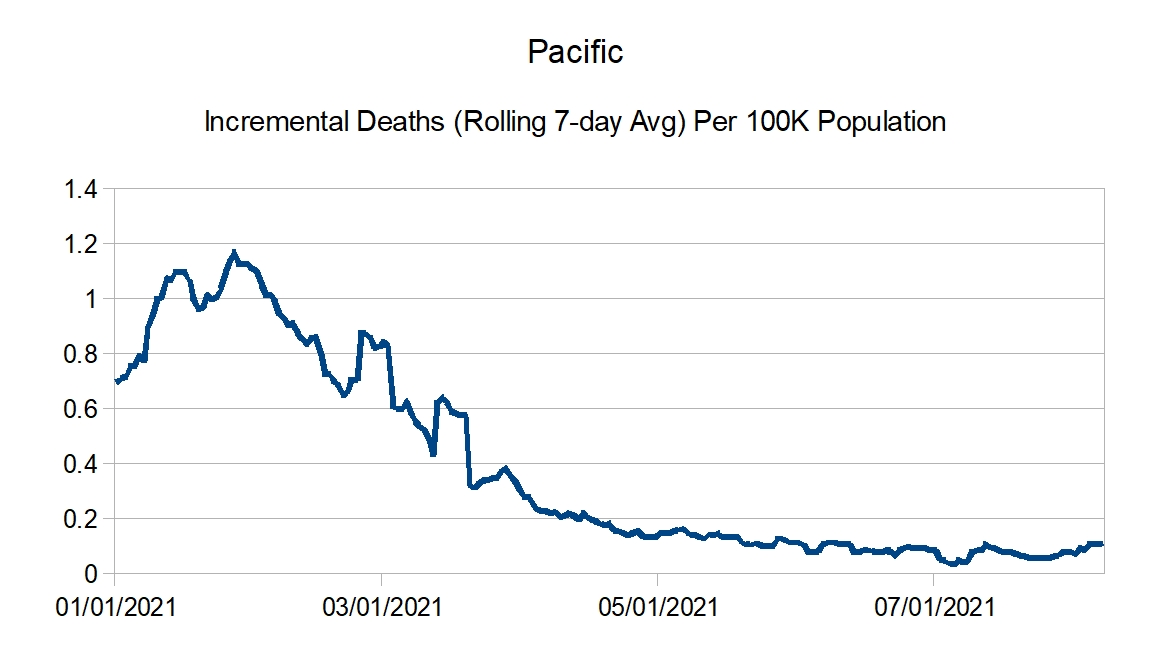
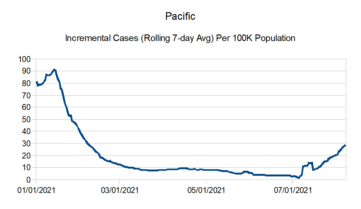
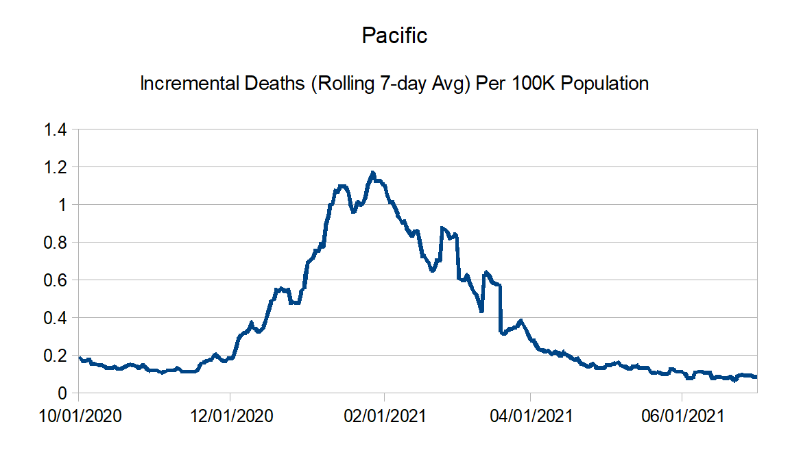
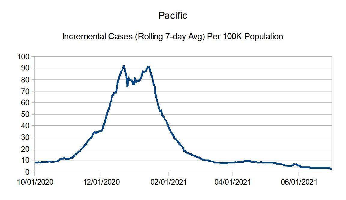
Pacific: Alaska, California, Hawaii, Oregon, and Washington
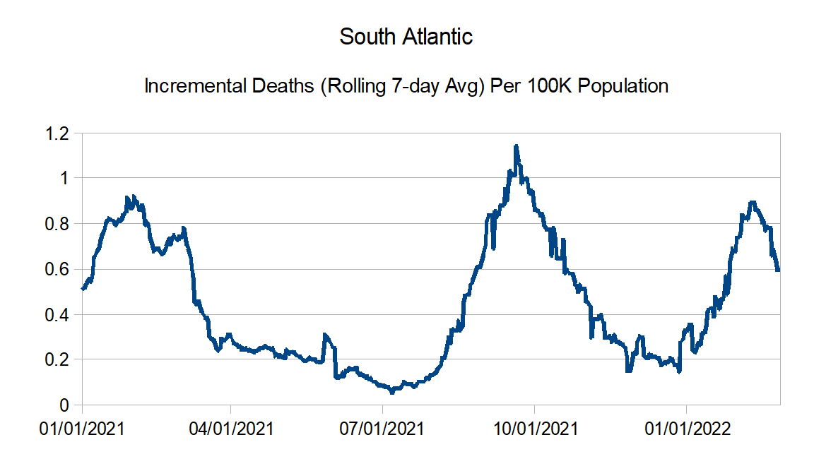
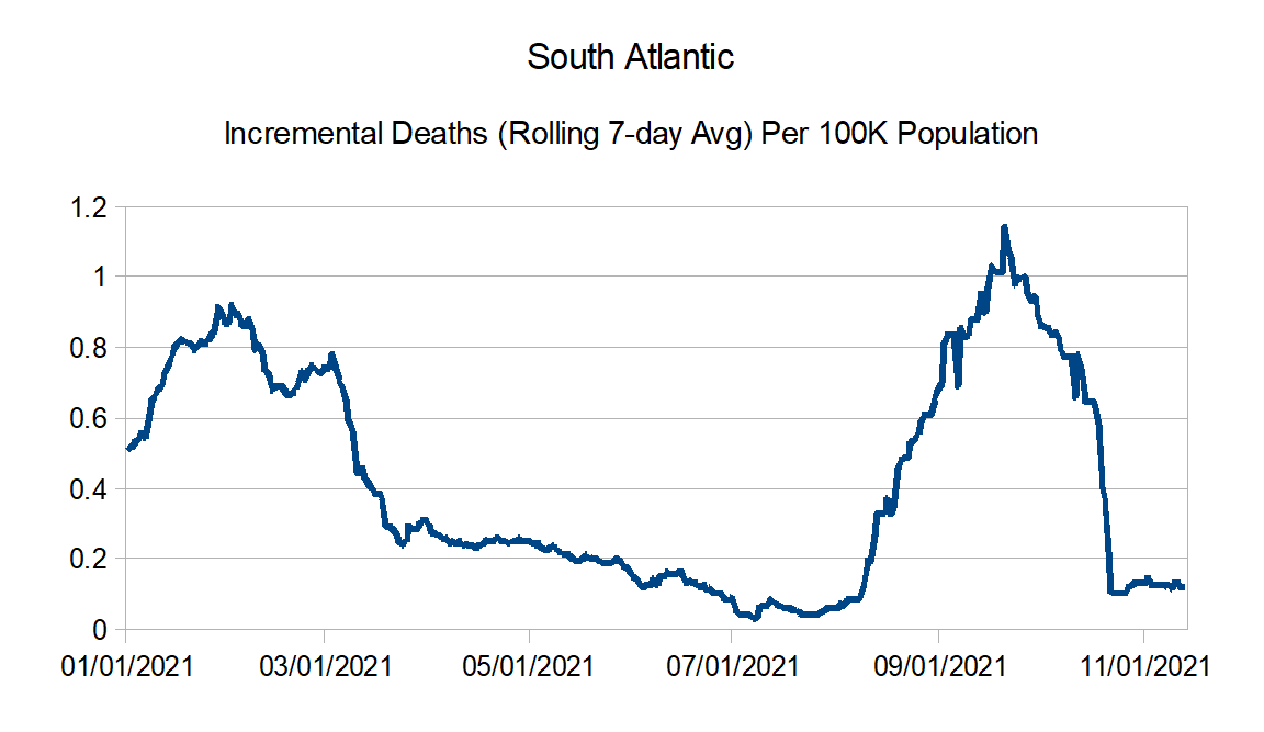
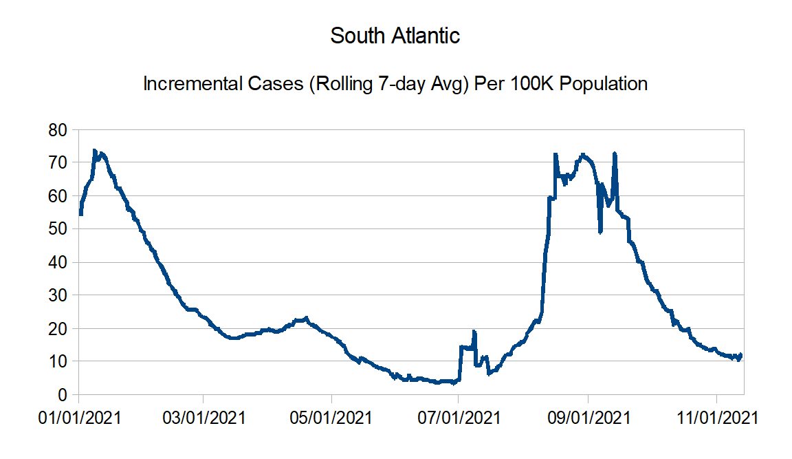
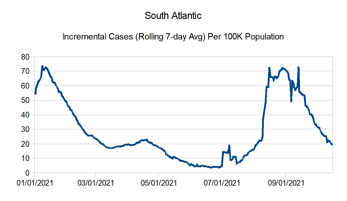
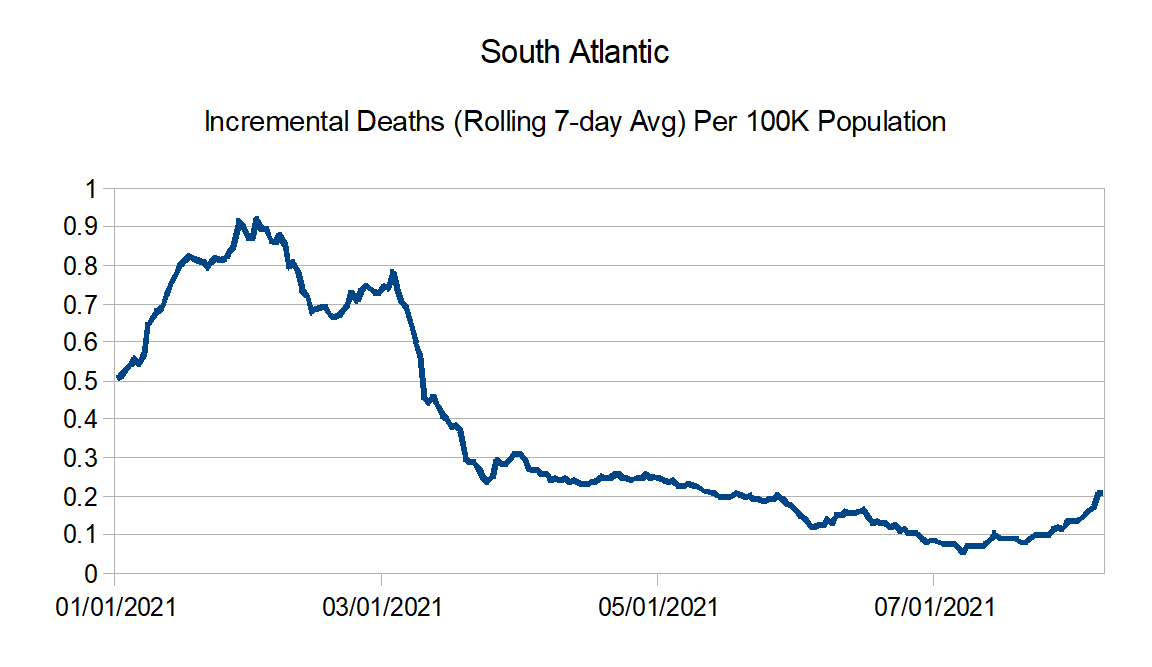
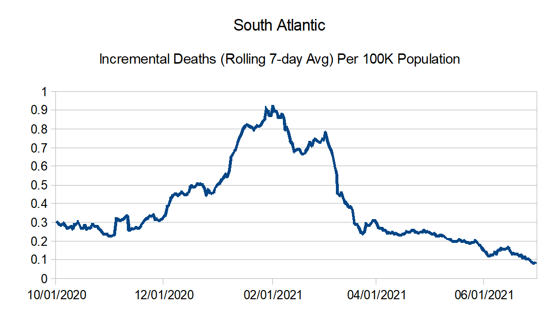
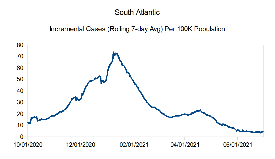
South Atlantic: Florida, Georgia, Maryland, North Carolina, South Carolina, Virginia, West Virginia, District of Columbia, Puerto Rico, Northern Mariana Islands, and Virgin Islands
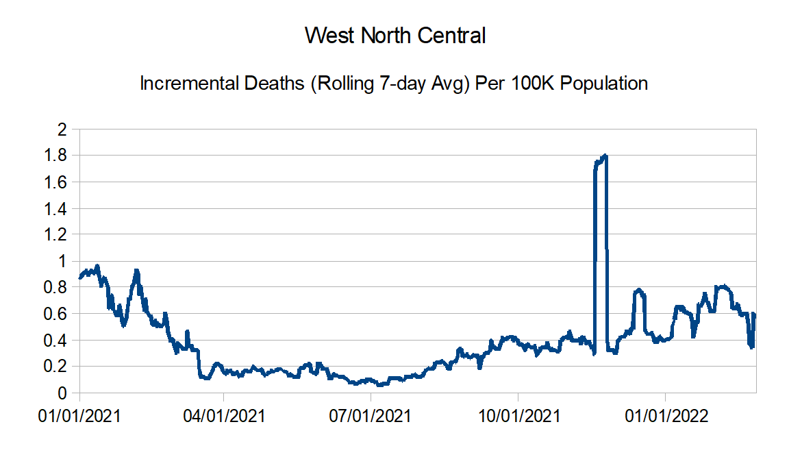
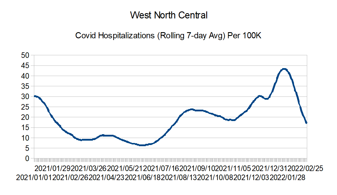
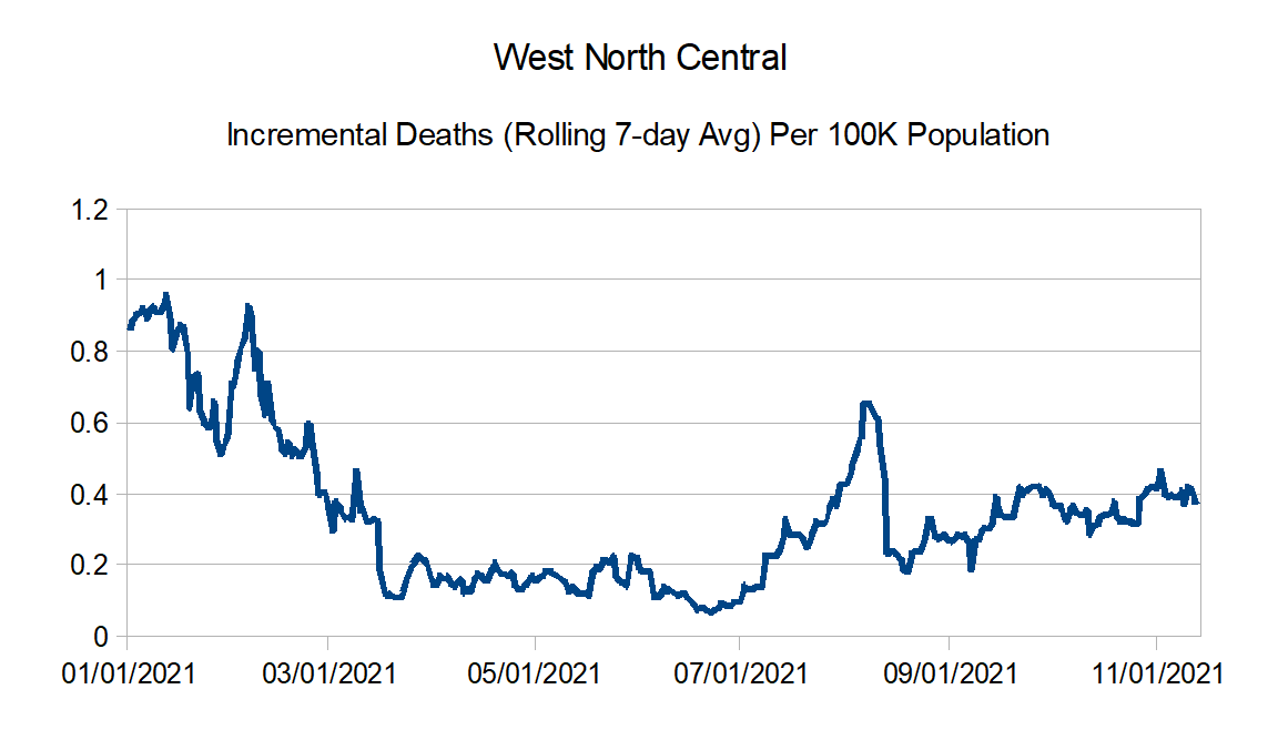
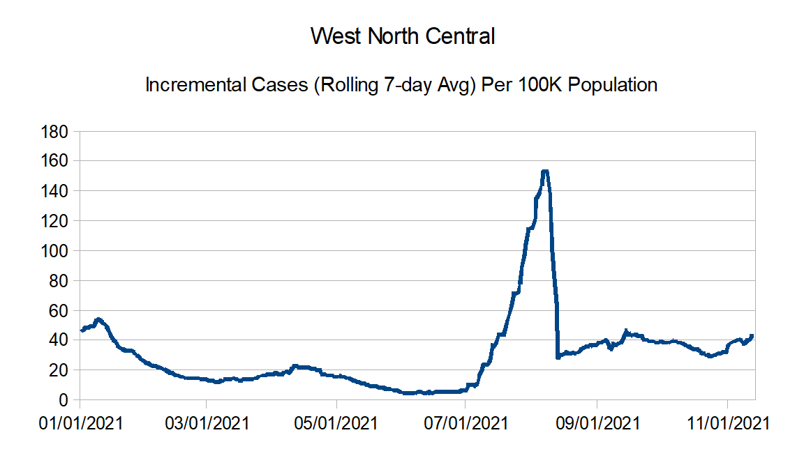
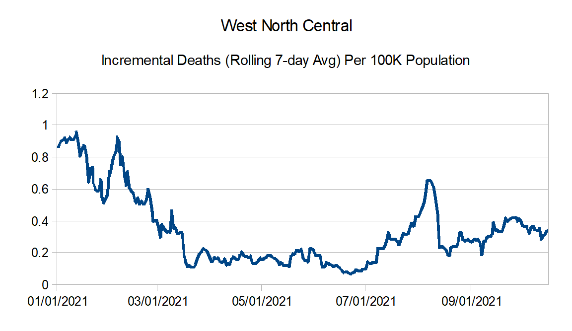
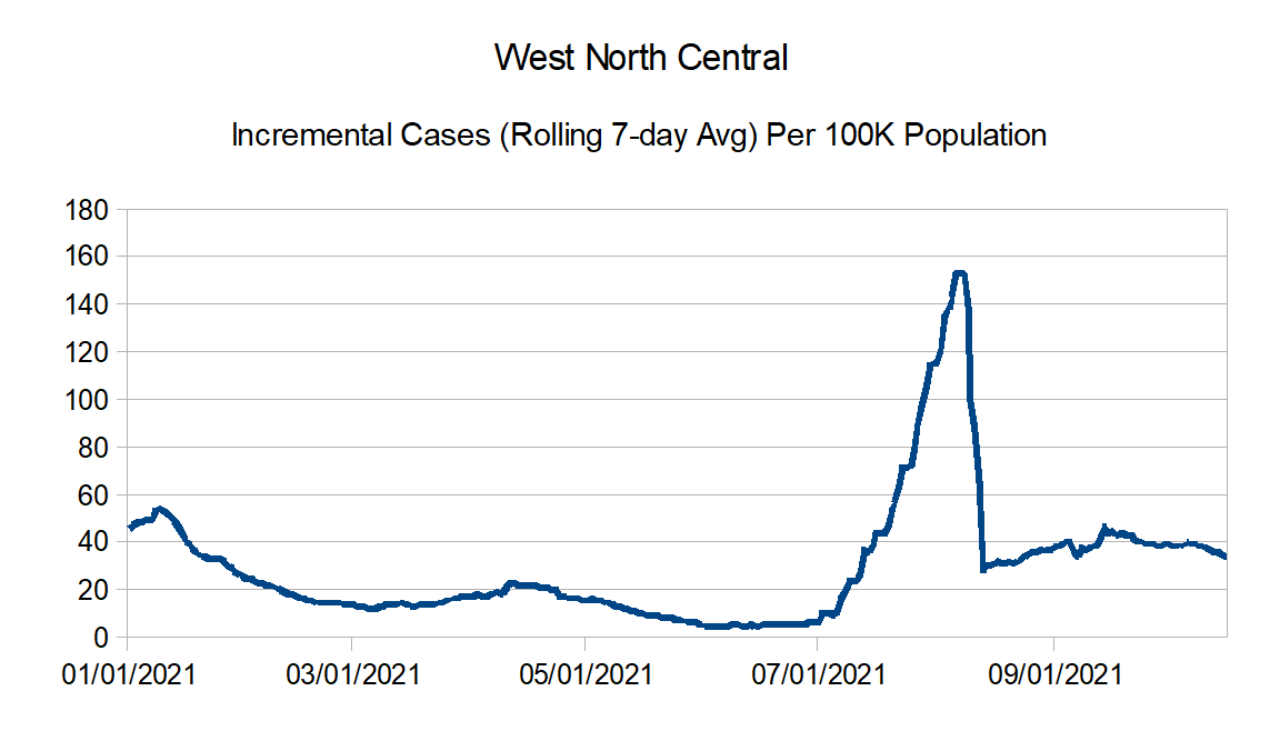
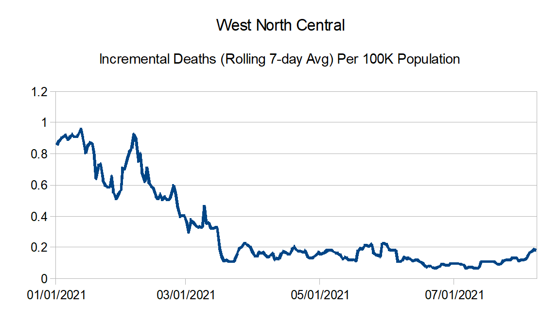
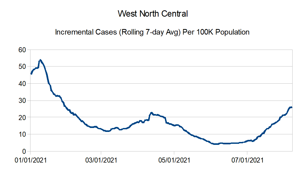
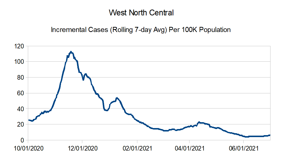
West North Central: Iowa, Kansas, Minnesota, Missouri, Nebraska, North Dakota, and South Dakota
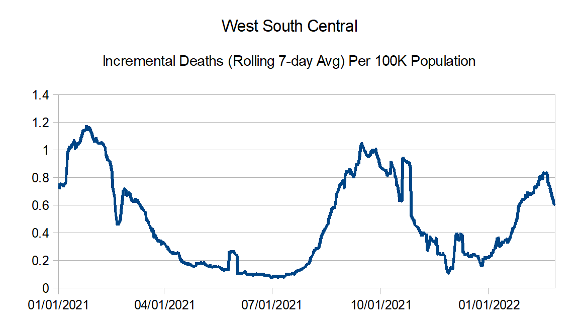
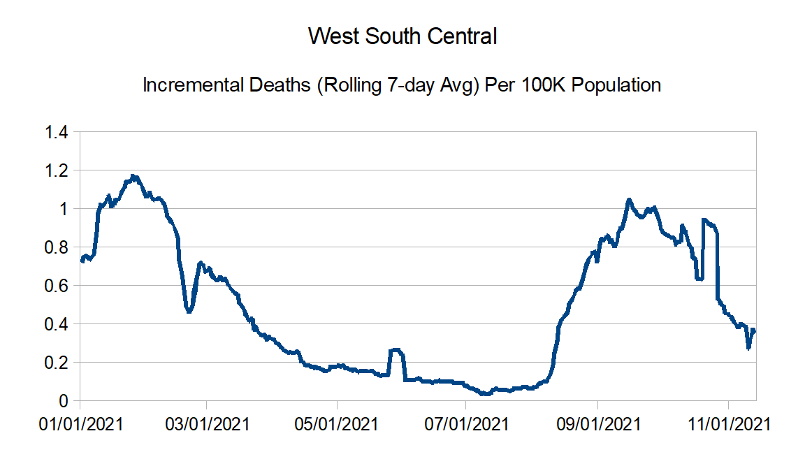
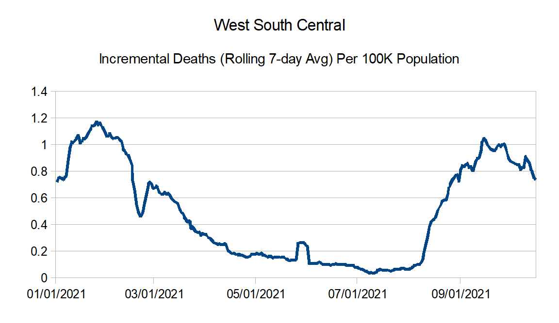
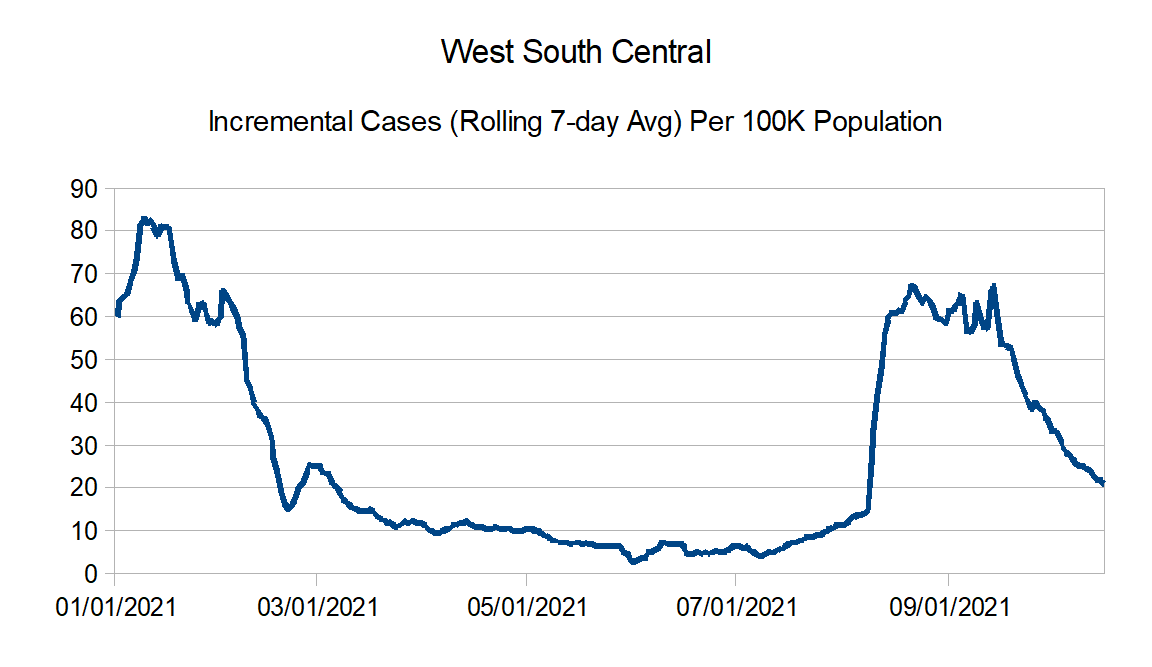
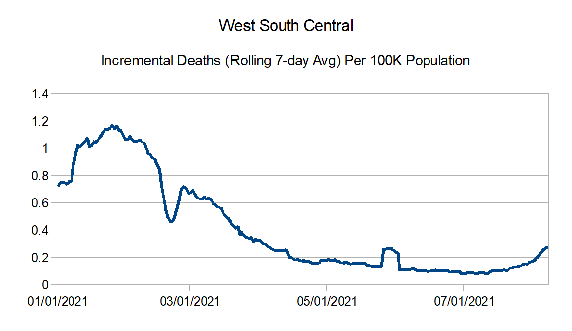
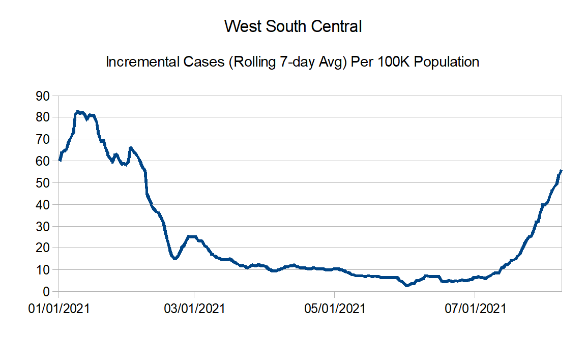
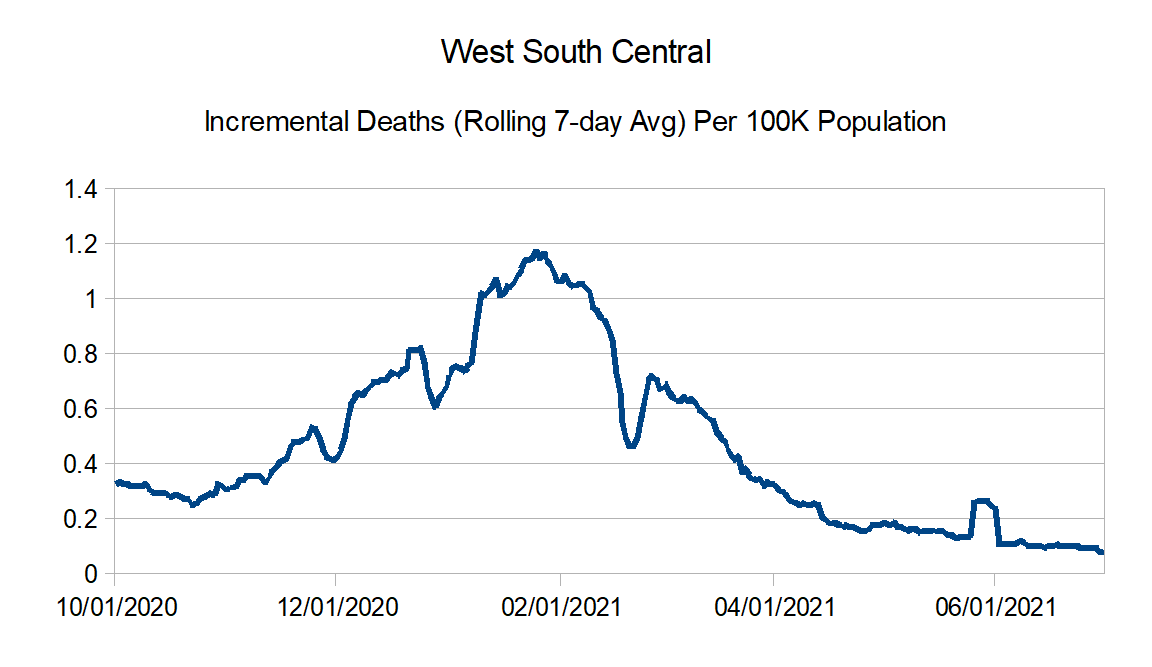
West South Central: Arkansas, Louisiana, Oklahoma, and Texas
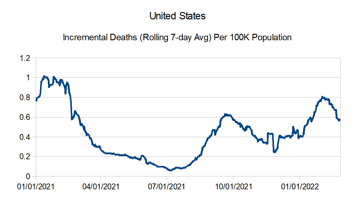
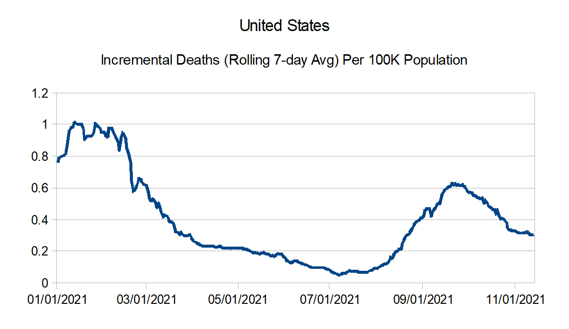
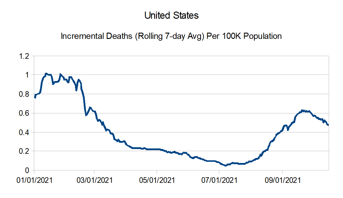
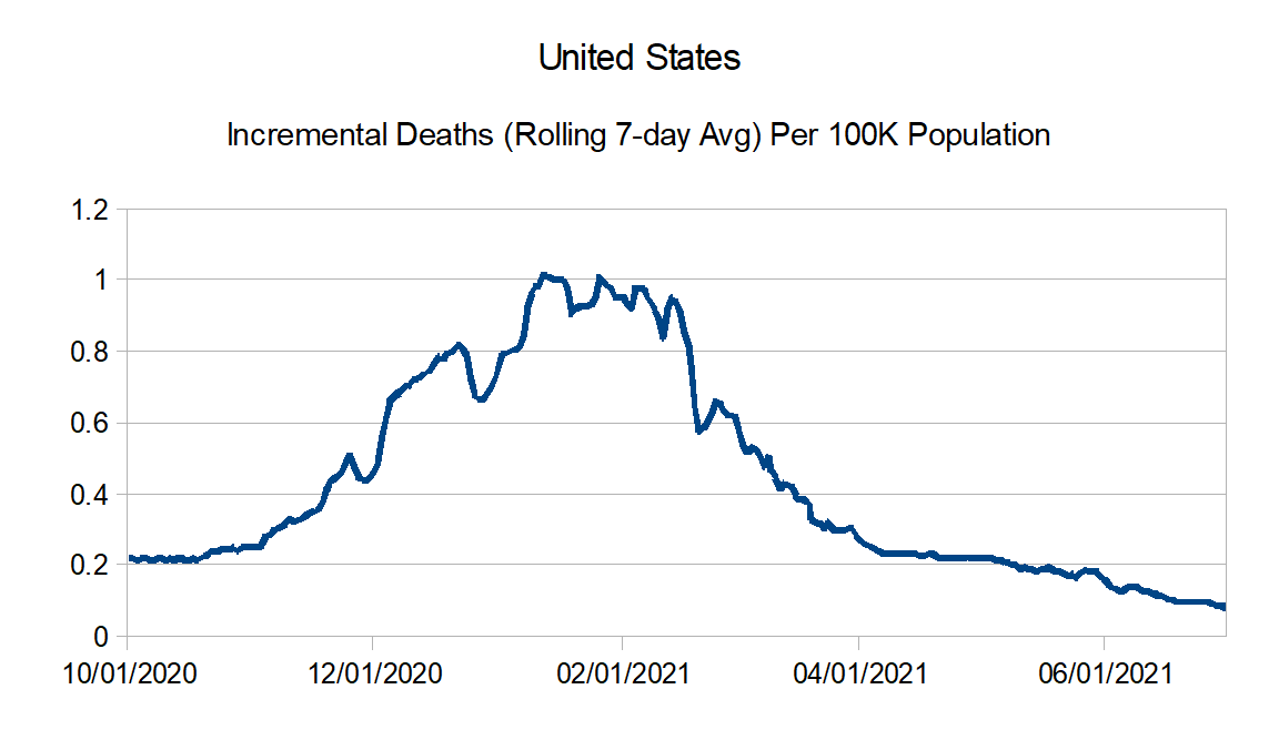
First, the death statistics. Here is the United States in total:

Reported deaths per 1M: 10/3 = 2.13; 9/18 = 2.42; Change = -12.2%
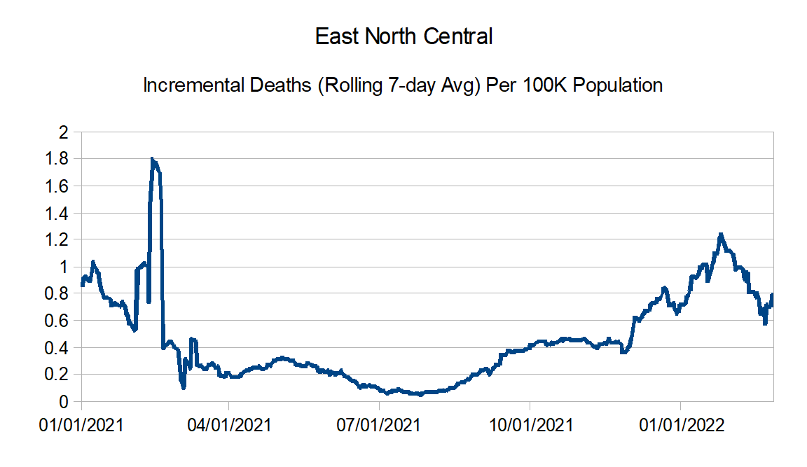
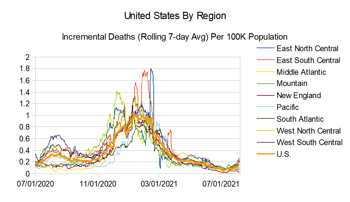
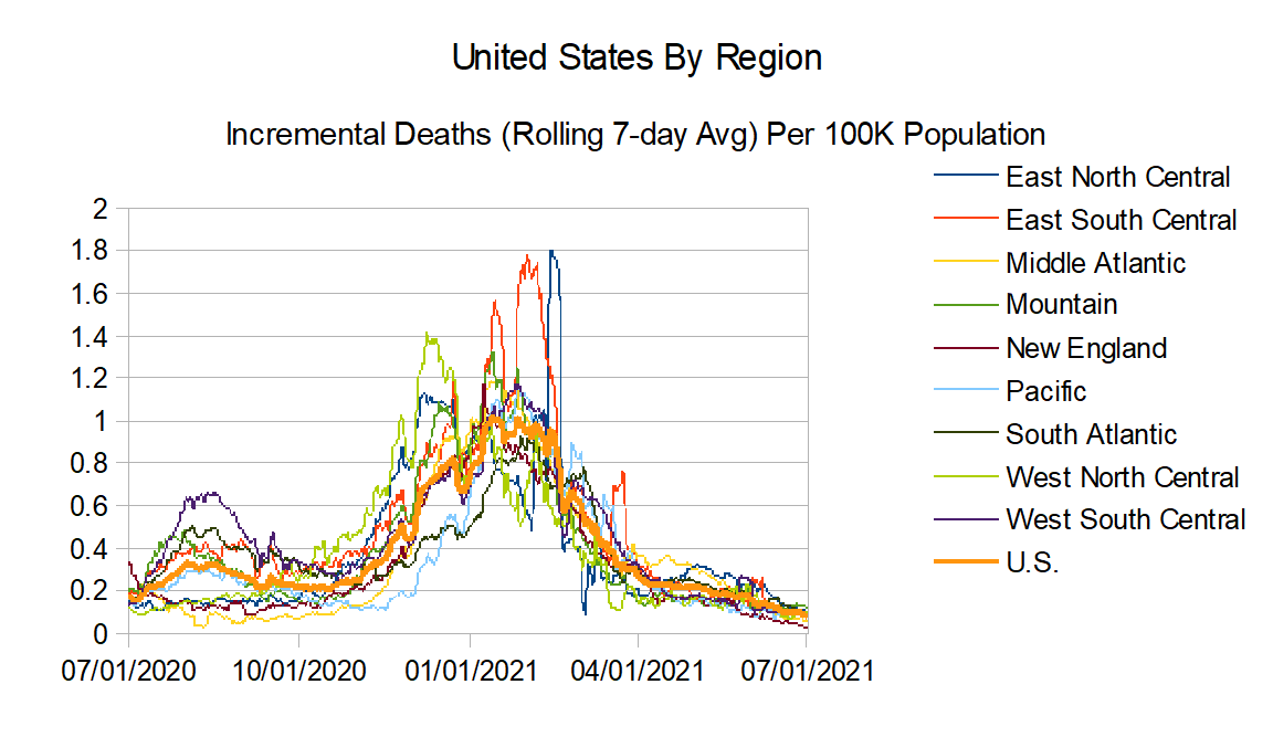
And now the regional death charts:

Reported deaths per 1M: 10/3 = 1.94; 9/18 = 1.58; Change = +22.3%

Reported deaths per 1M: 10/3 = 2.96; 9/18 = 3.25; Change = -8.7%

Reported deaths per 1M: 10/3 = 0.89; 9/18 = 0.95; Change = -5.7%

Reported deaths per 1M: 10/3 = 1.33; 9/18 = 2.02; Change = -33.9%

Reported deaths per 1M: 10/3 = 1.40; 9/18 = 1.22; Change = +14.2%

Reported deaths per 1M: 10/3 = 1.67; 9/18 = 1.99; Change = -16.0%

Reported deaths per 1M: 10/3 = 2.77; 9/18 = 3.48; Change = -20.5%

Reported deaths per 1M: 10/3 = 2.64; 9/18 = 2.21; Change = +19.6%

Reported deaths per 1M: 10/3 = 3.23; 9/18 = 4.10; Change = -21.3%
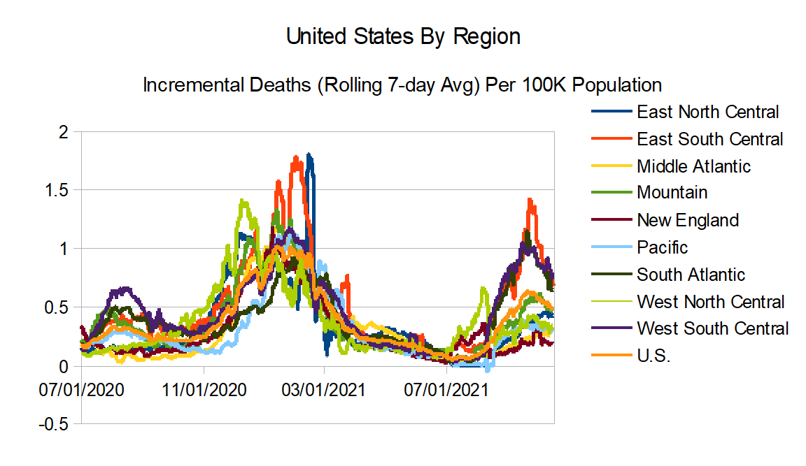
And here are all the regions on the same graph:

And here is the Northeast versus the rest of the United States:

Reported deaths per 1M: Northeast: 10/3 = 1.02; 9/18 = 1.02; Change = +0.5%; Rest of United States: 10/3 = 2.36; 9/18 = 2.71; Change = -13.2%
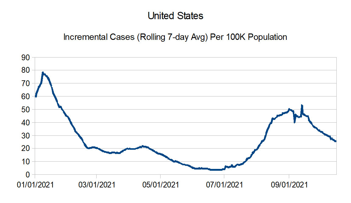
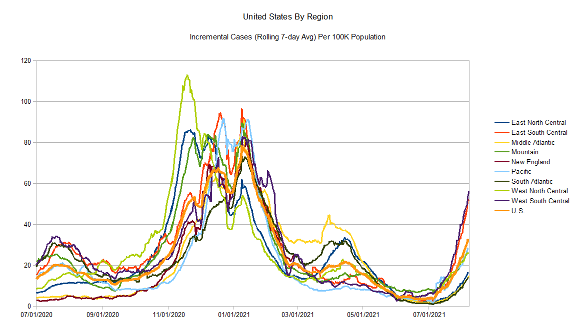
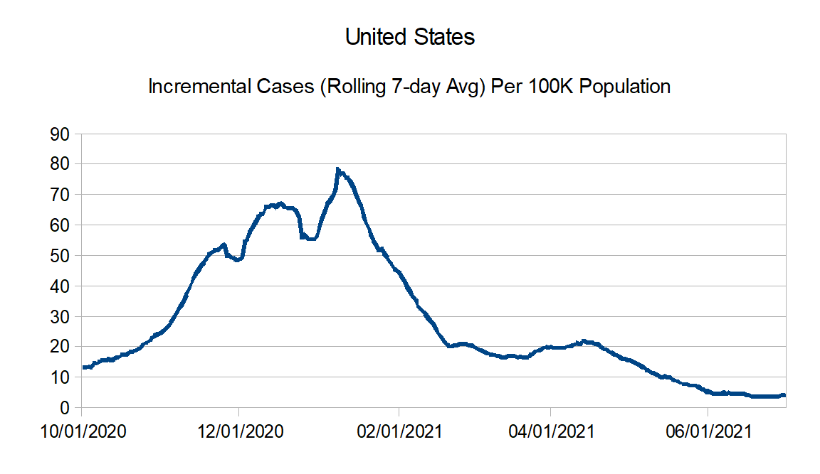
And now here are the case graphs. First for the United States:

Reported cases per 1M: 10/3 = 132.7; 9/18 = 121.5; Change = +9.2%

Reported cases per 1M: 10/3 = 165.4; 9/18 = 130.6; Change = +26.6%

Reported cases per 1M: 10/3 = 182.4; 9/18 = 183.8; Change = -0.8%

Reported cases per 1M: 10/3 = 87.7; 9/18 = 62.1; Change = +41.2%

Reported cases per 1M: 10/3 = 148.9; 9/18 = 121.8; Change = +22.3%

Reported cases per 1M: 10/3 = 73.2; 9/18 = 48.7; Change = +50.4%

Reported cases per 1M: 10/3 = 78.6; 9/18 = 80.4; Change = -2.2%

Reported cases per 1M: 10/3 = 108.2; 9/18 = 126.5; Change = -14.4%

Reported cases per 1M: 10/3 = 249.3; 9/18 = 219.1; Change = +13.8%

Reported cases per 1M: 10/3 = 180.4; 9/18 = 163.9; Change = +10.1%
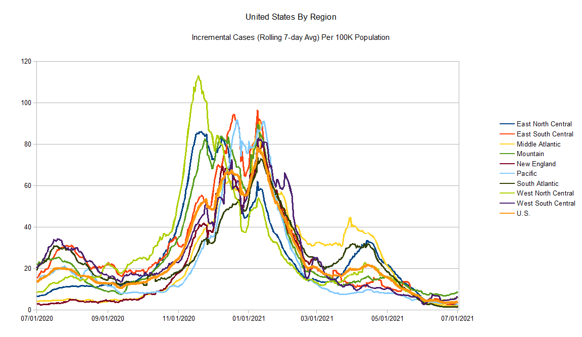
And here is the cases graph of all the regions on one graph:

Observations:
- For the time being, reported deaths are in a general decline, with the notable exception of the north central part of the country which is unfortunately seeing increases.
- You can see how cases have been going up in the north central portion of the country for quite a while now. For the rest of the country, several regions seem to be seeing recent upticks in cases reported as well. Some of that may be the testing of students as schools have been reopening. If it’s that, hopefully we will see that flatten next time.
Stay tuned for the next update in a couple of weeks.