Updating the graphs again.
One thing that is occurring to me that at some point the tracking of cases may lose value as the number of vaccinated and other immunity builds and as treatments become available changes in the numbers of cases will become less of a true predictor of future hospitalizations and deaths. Or at the very least such a small percentage of cases will become hospitalizations/deaths that it won’t matter as much. The only true end game is that Covid-19 will transition from pandemic to endemic at which point there will likely still be patterns in increases and decreases of cases, just in a relatively predictable manner.
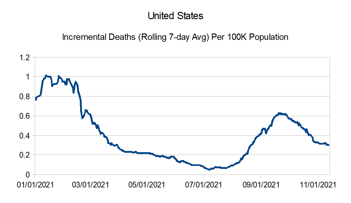
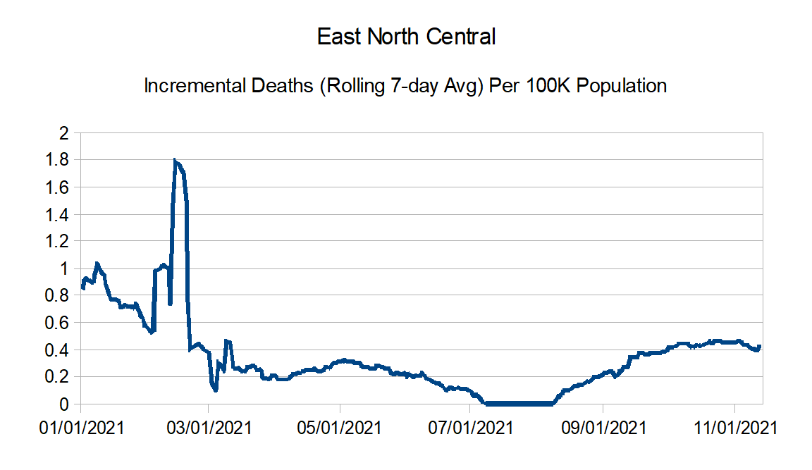
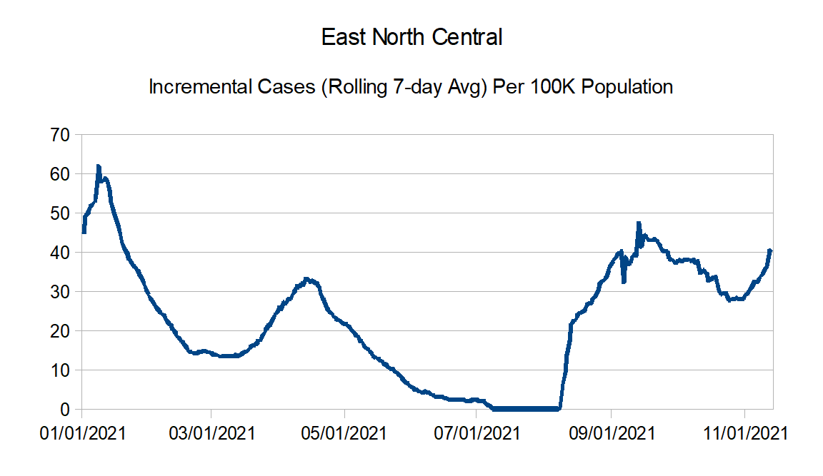
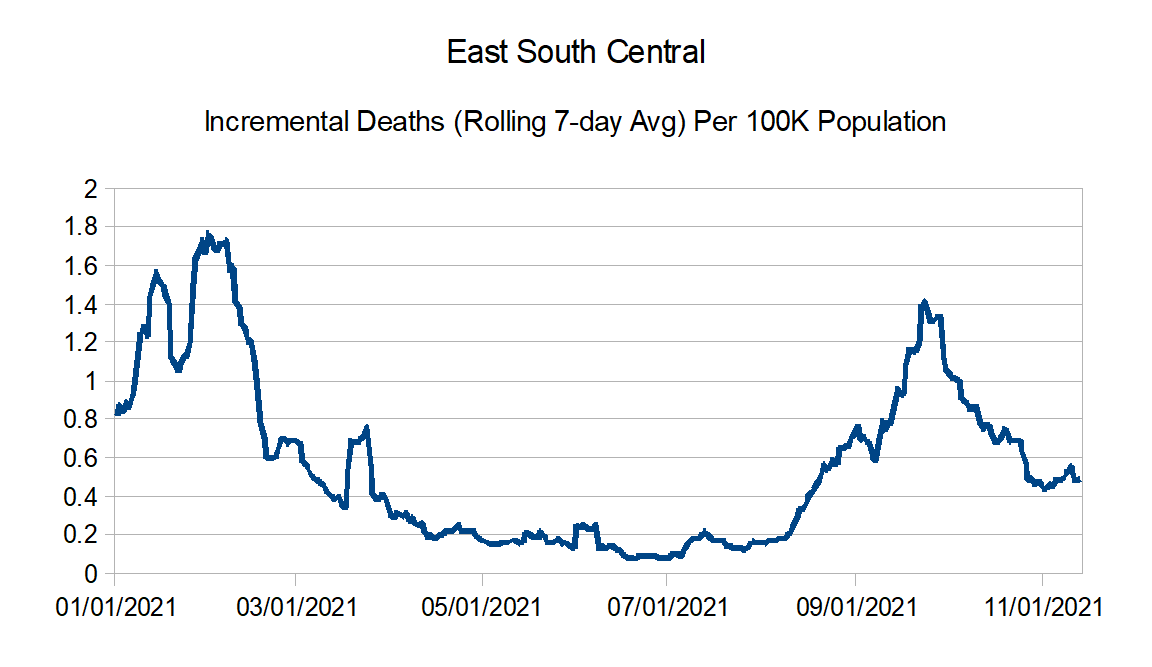
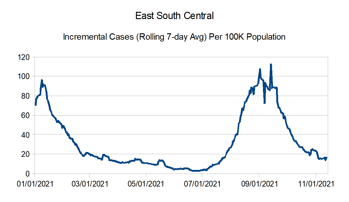
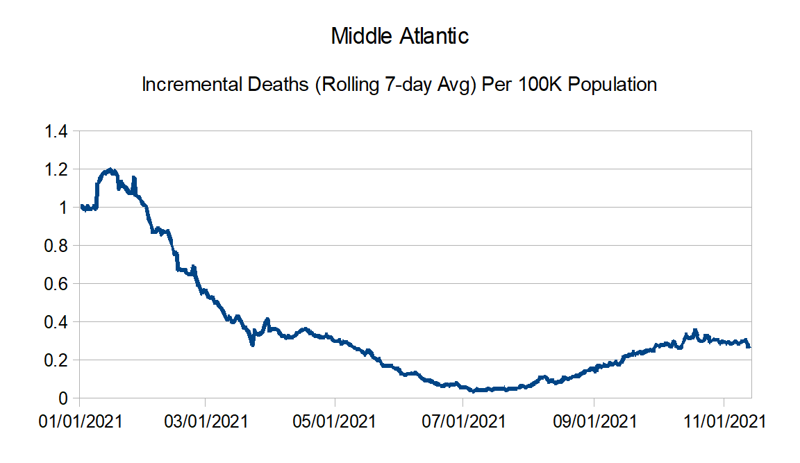
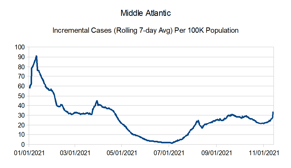
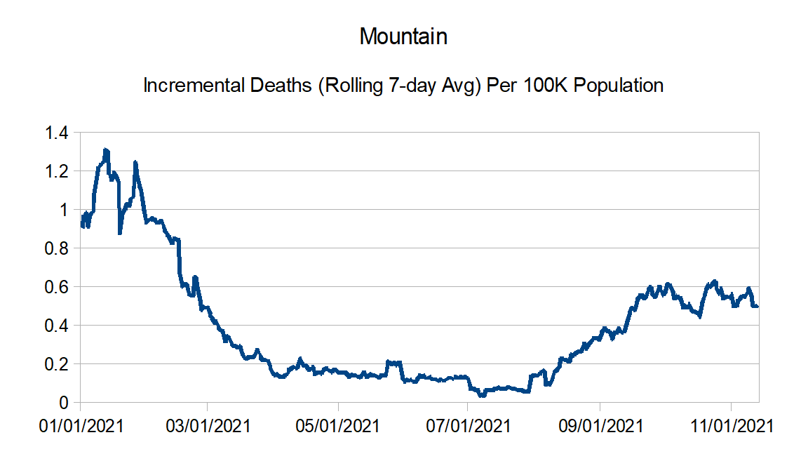
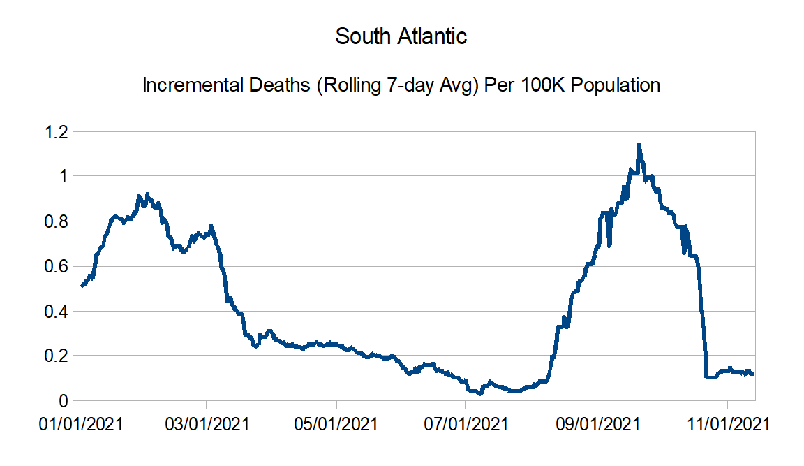
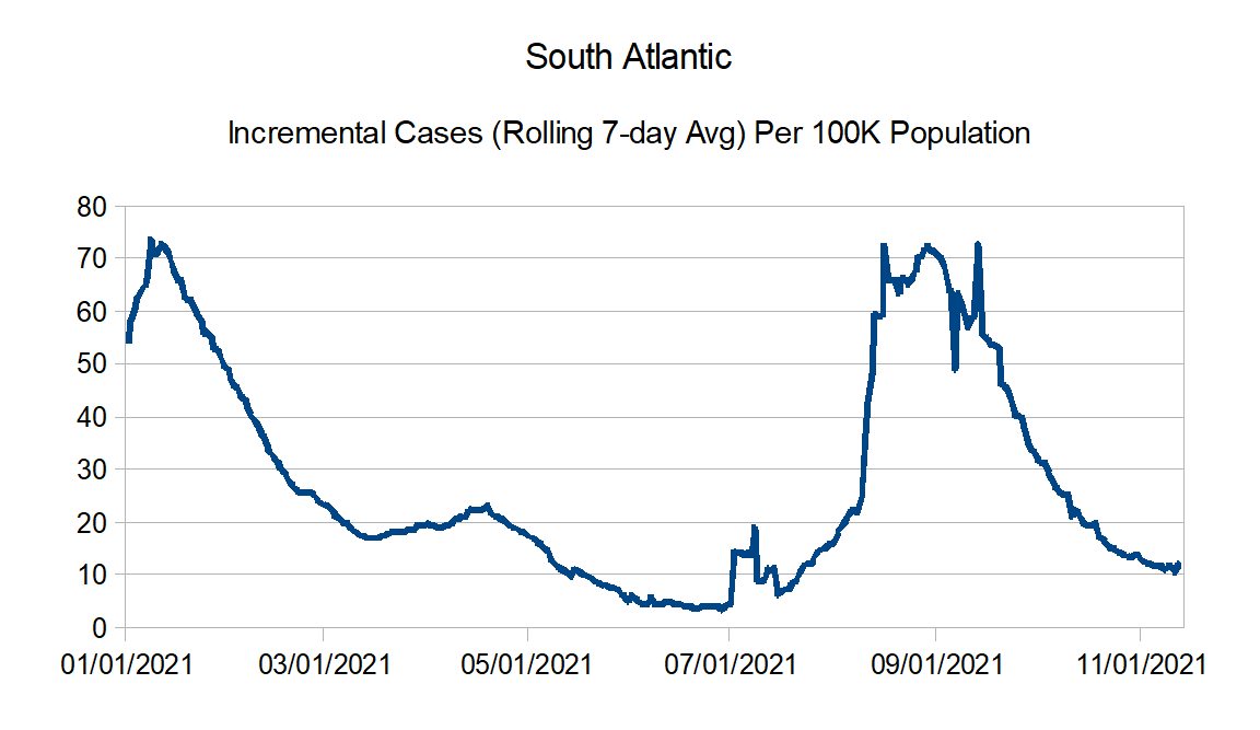
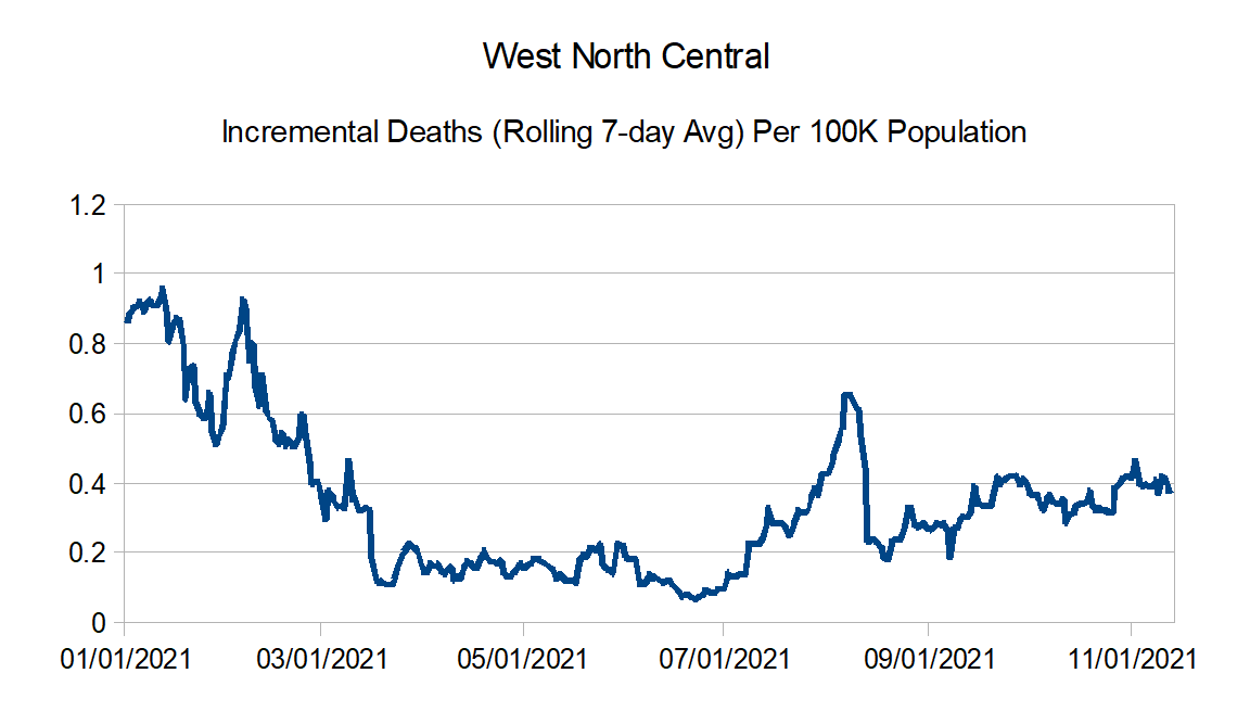
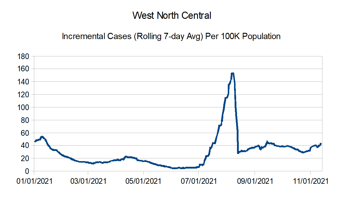
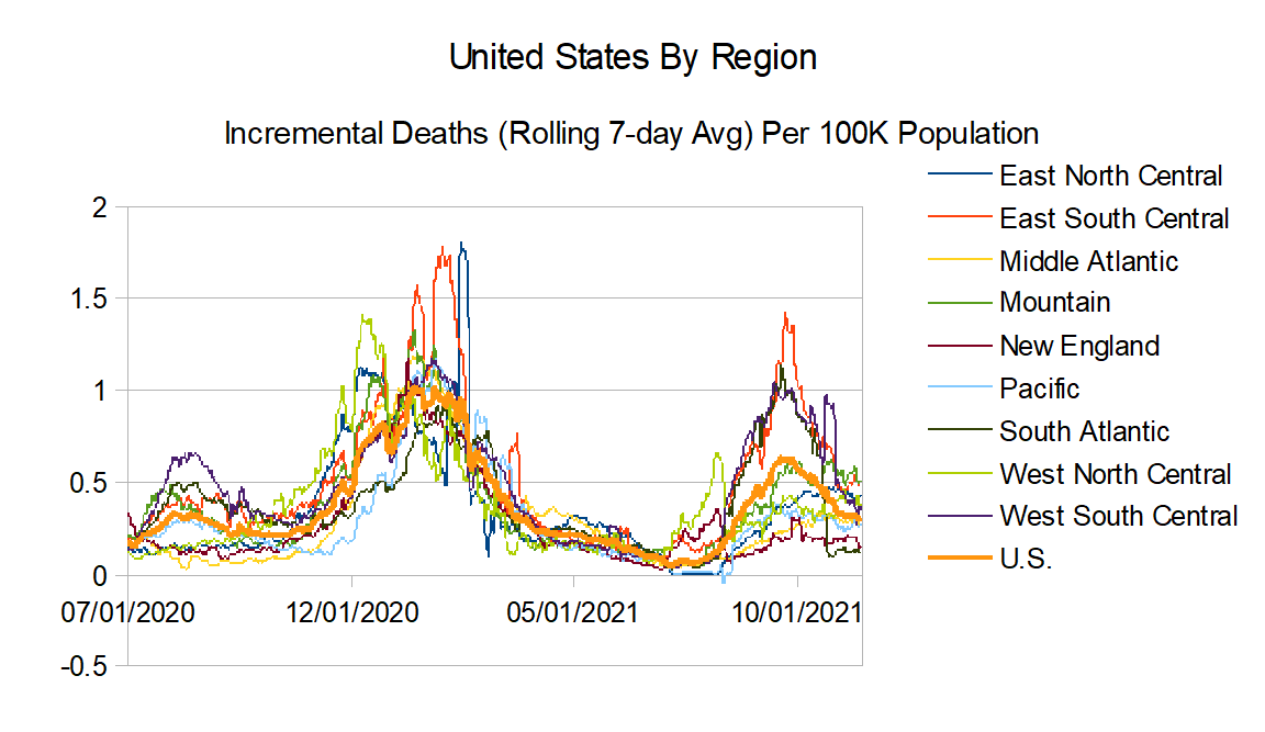
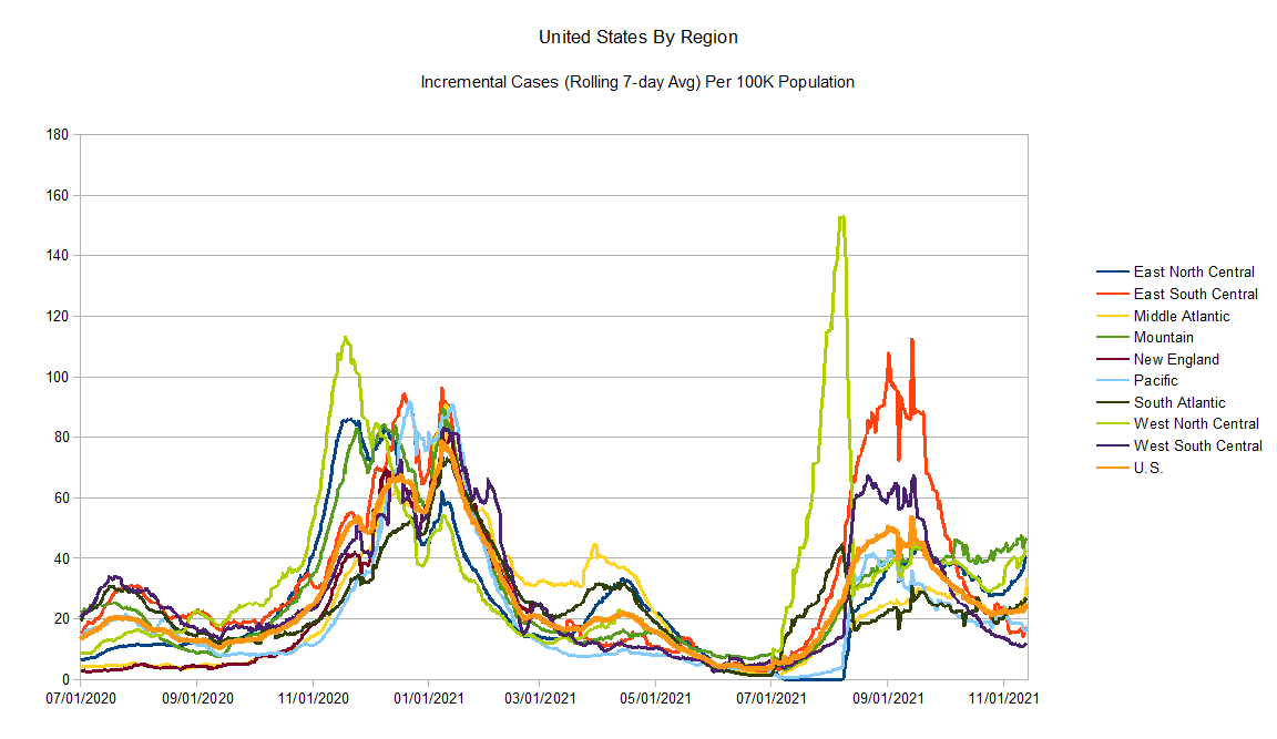
But for now I think I will continue to chart those. It does look like an increase in reported cases is beginning again, likely as part of the winter season (increases are primarily in the northern portions of the country). Reported deaths is slightly decreasing countrywide, with it stagnant in most regions with a big decreases mostly in southern regions.
Data Source – New York Times github
Data Info – New York Times data info
Regions:
East North Central: Illinois, Indiana, Michigan, Ohio, and Wisconsin
East South Central: Alabama, Kentucky, Mississippi, and Tennessee
Middle Atlantic: Delaware, New Jersey, New York, and Pennsylvania
Mountain: Arizona, Colorado, Idaho, Montana, Nevada, New Mexico, Utah, and Wyoming
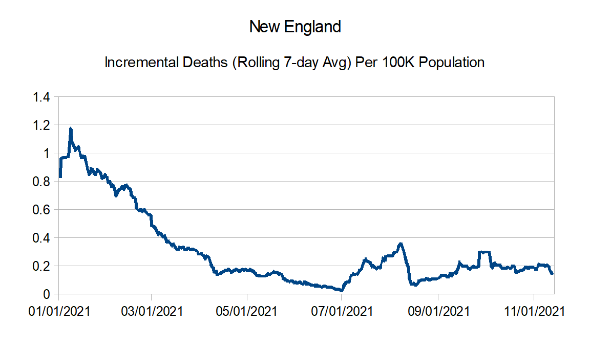
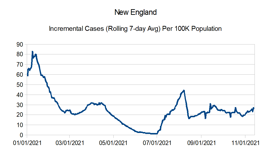
New England: Connecticut, Maine, Massachusetts, New Hampshire, Rhode Island, and Vermont
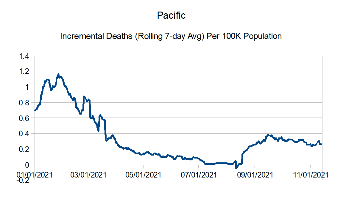
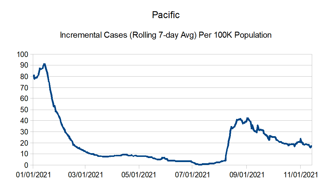
Pacific: Alaska, California, Hawaii, Oregon, and Washington
South Atlantic: Florida, Georgia, Maryland, North Carolina, South Carolina, Virginia, West Virginia, District of Columbia, Puerto Rico, Northern Mariana Islands, and Virgin Islands
West North Central: Iowa, Kansas, Minnesota, Missouri, Nebraska, North Dakota, and South Dakota
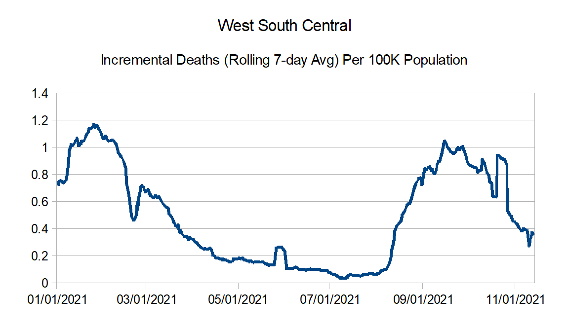
West South Central: Arkansas, Louisiana, Oklahoma, and Texas
Here are the countrywide charts:

Regional charts:


And finally the regional comparison charts:
Next update in a month or so.
