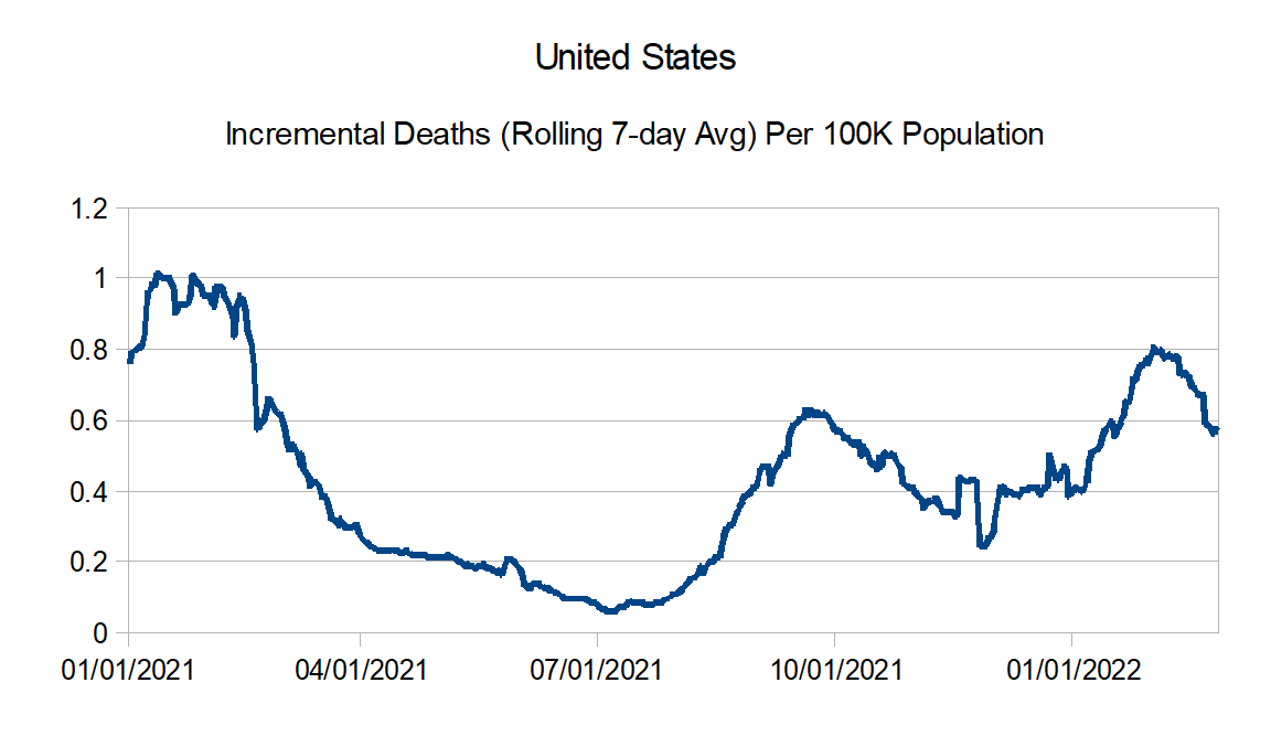
So finally got done with the busy period at work. So I decided to update the Covid-19 graphs. Basically we get to see the results of the Omicron wave.
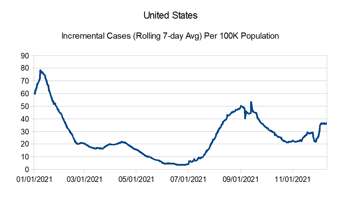
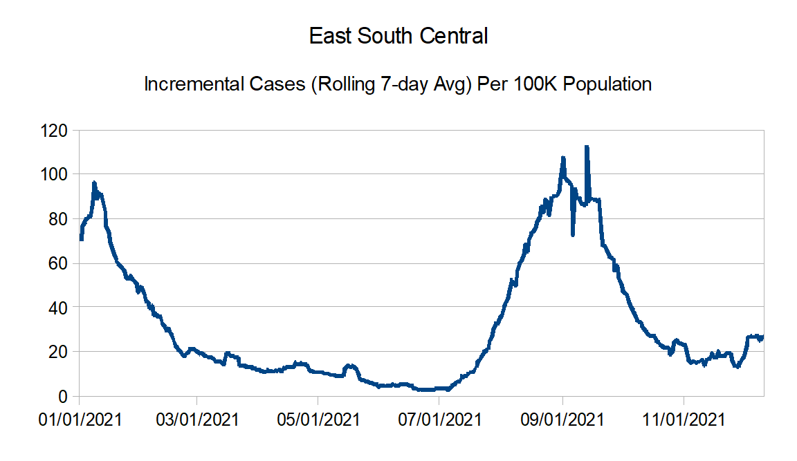
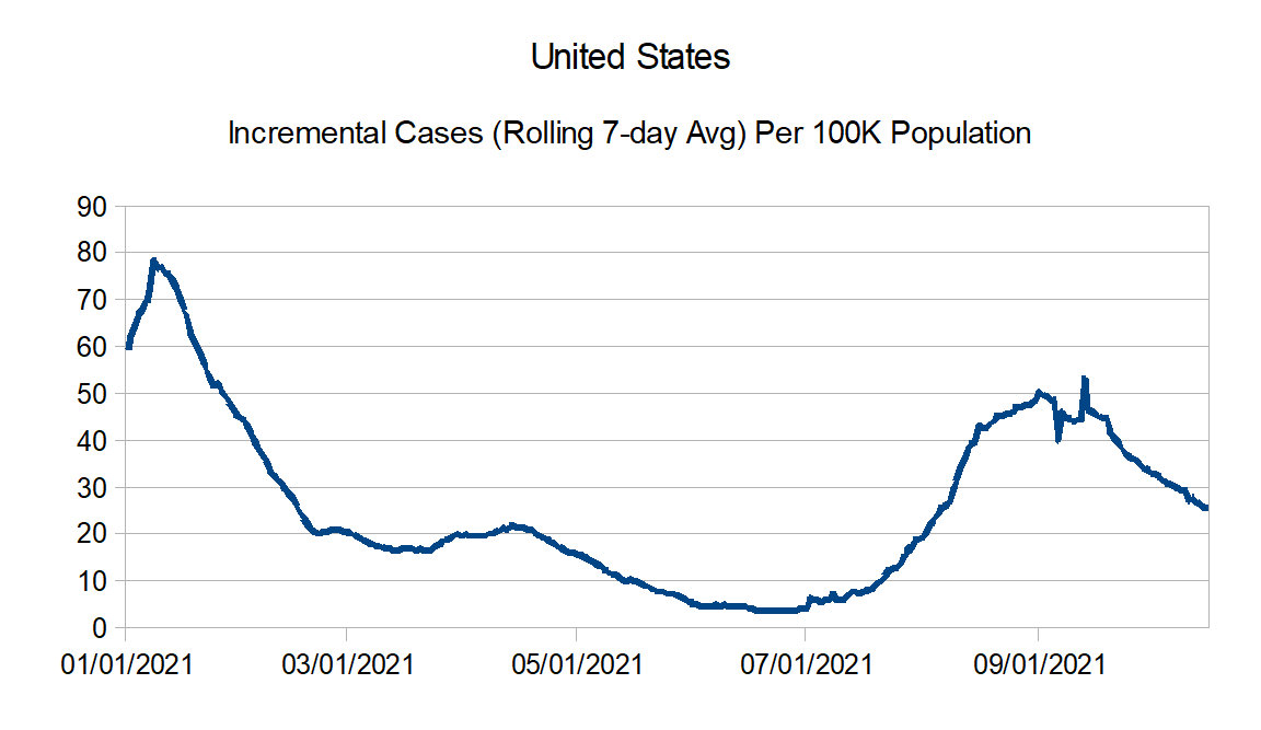
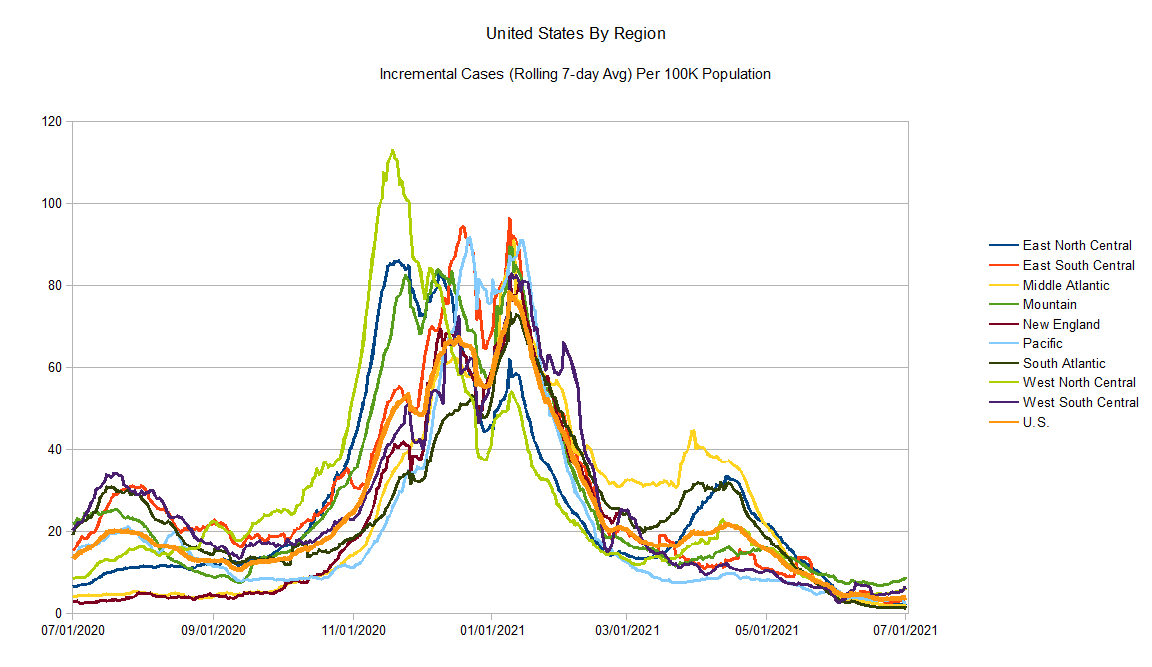
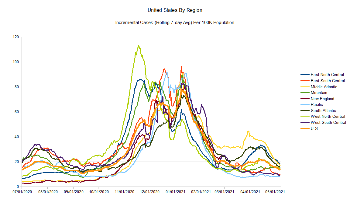
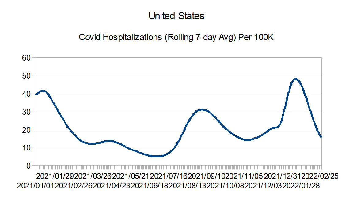
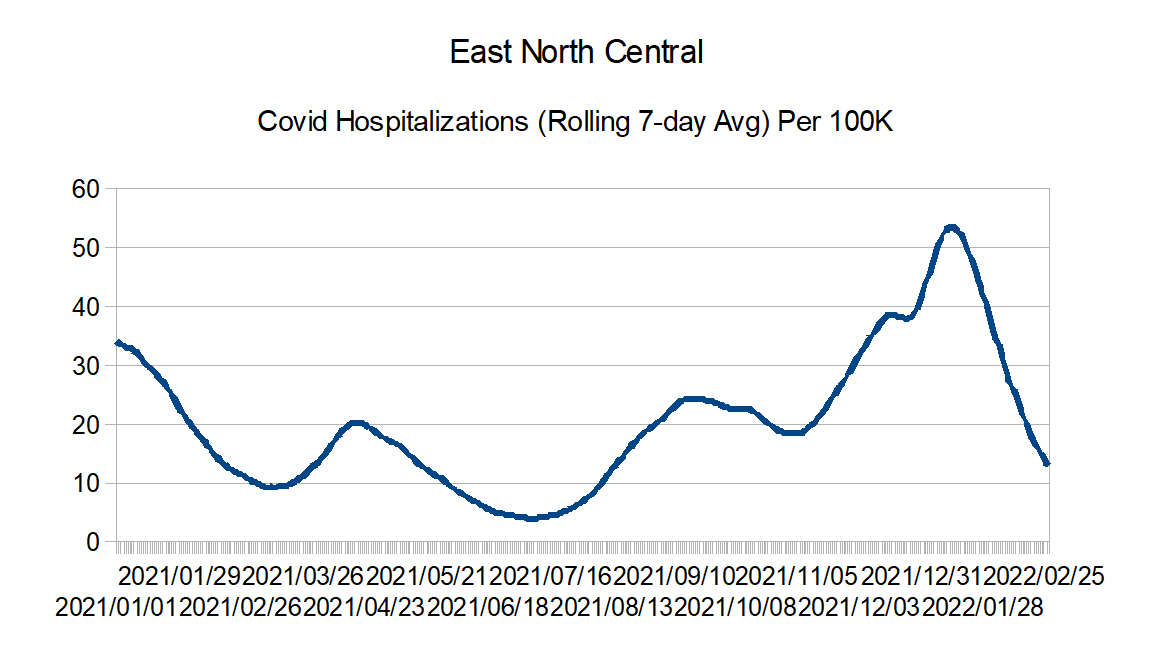
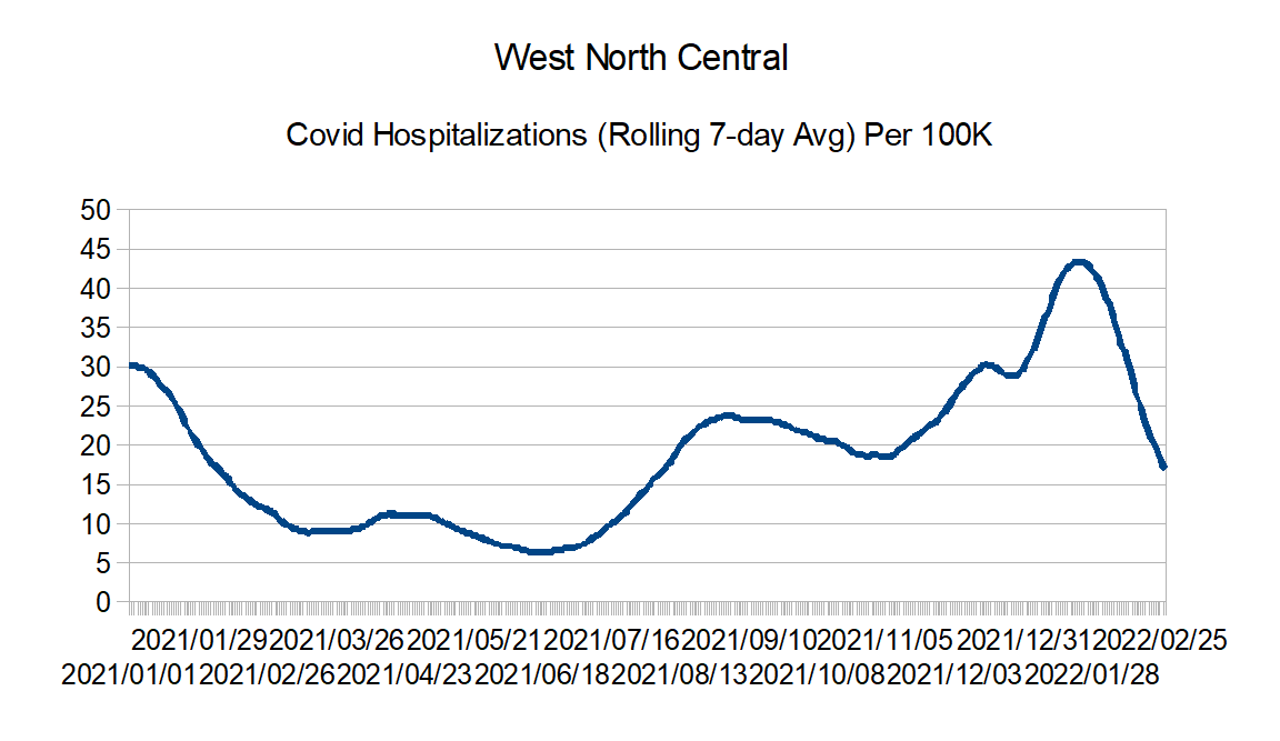
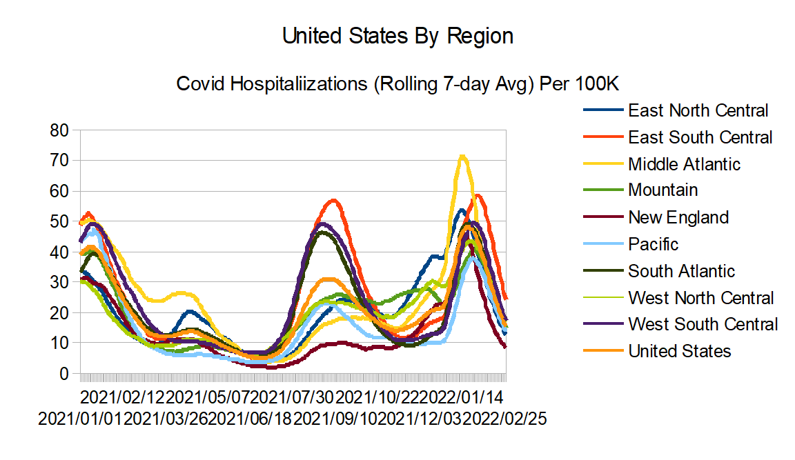
I have decided to replace the cases graphs with hospitalizations graphs. The hospitalizations data is from the HHS.
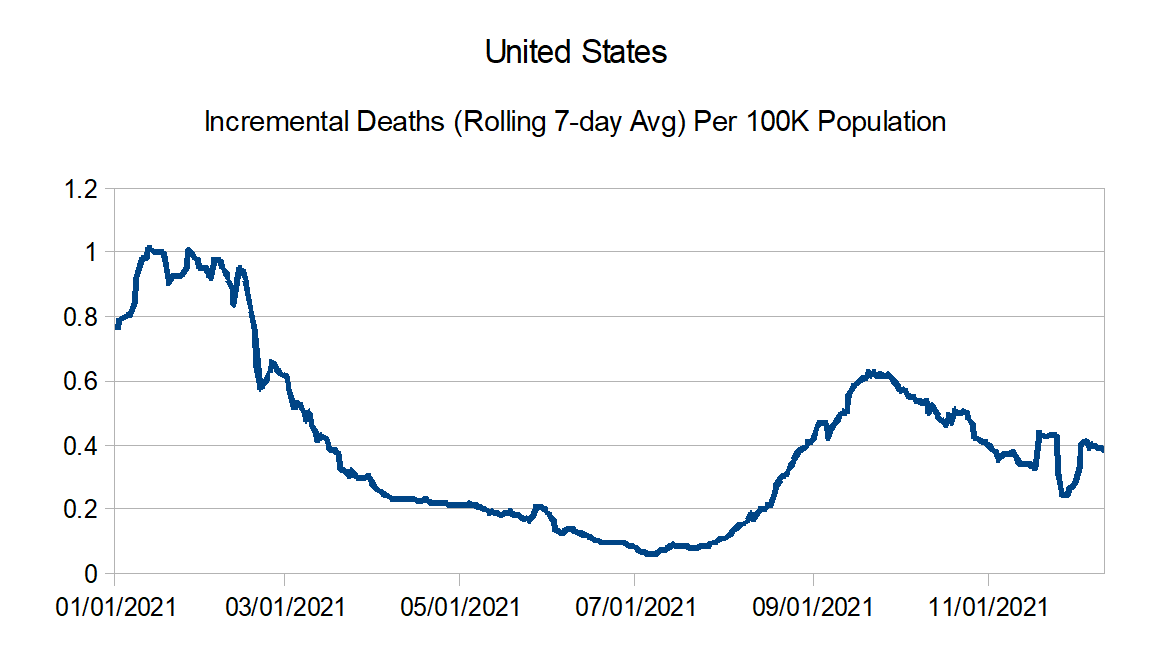
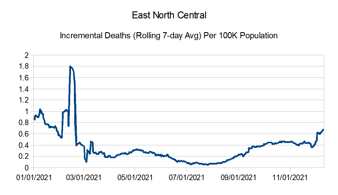
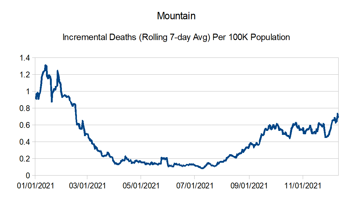
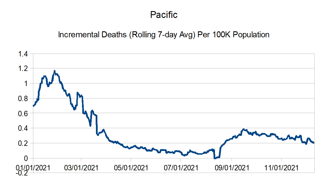
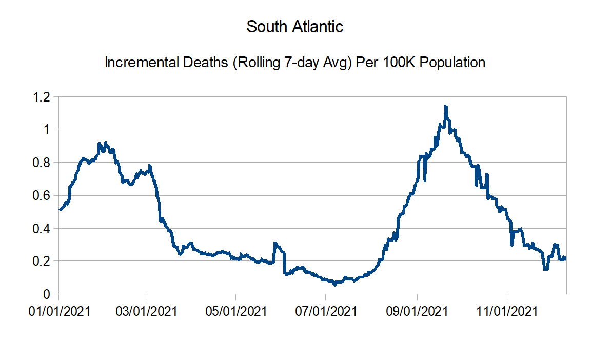
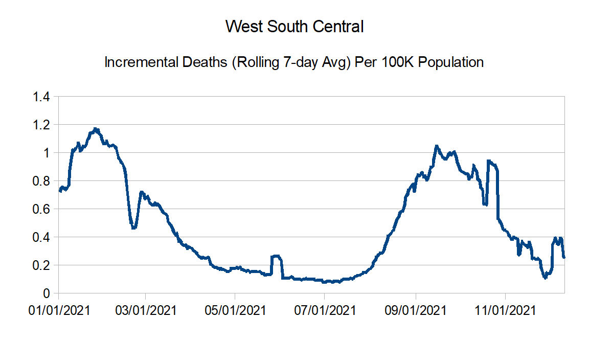
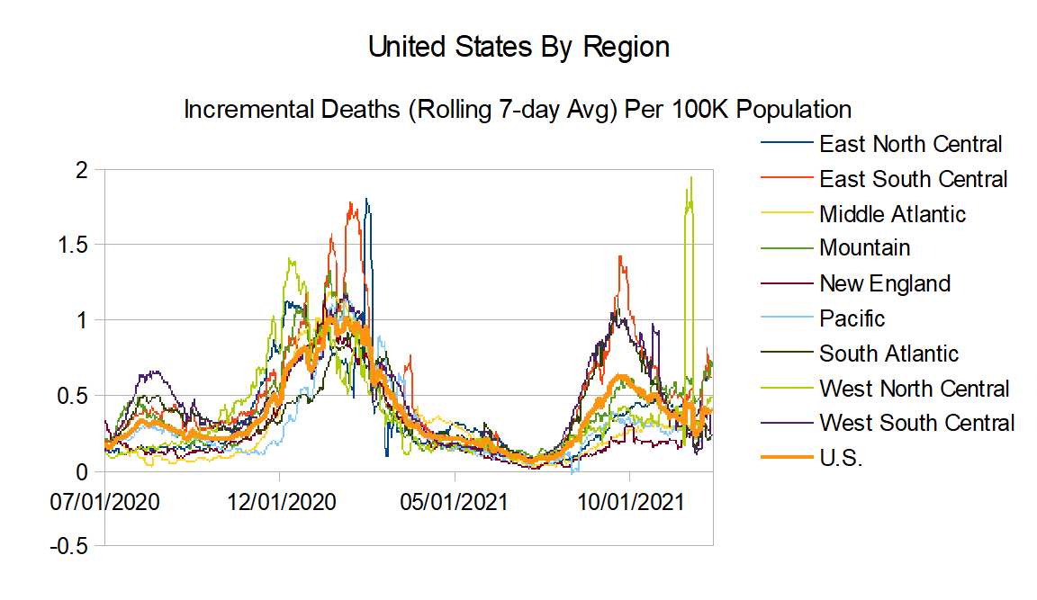
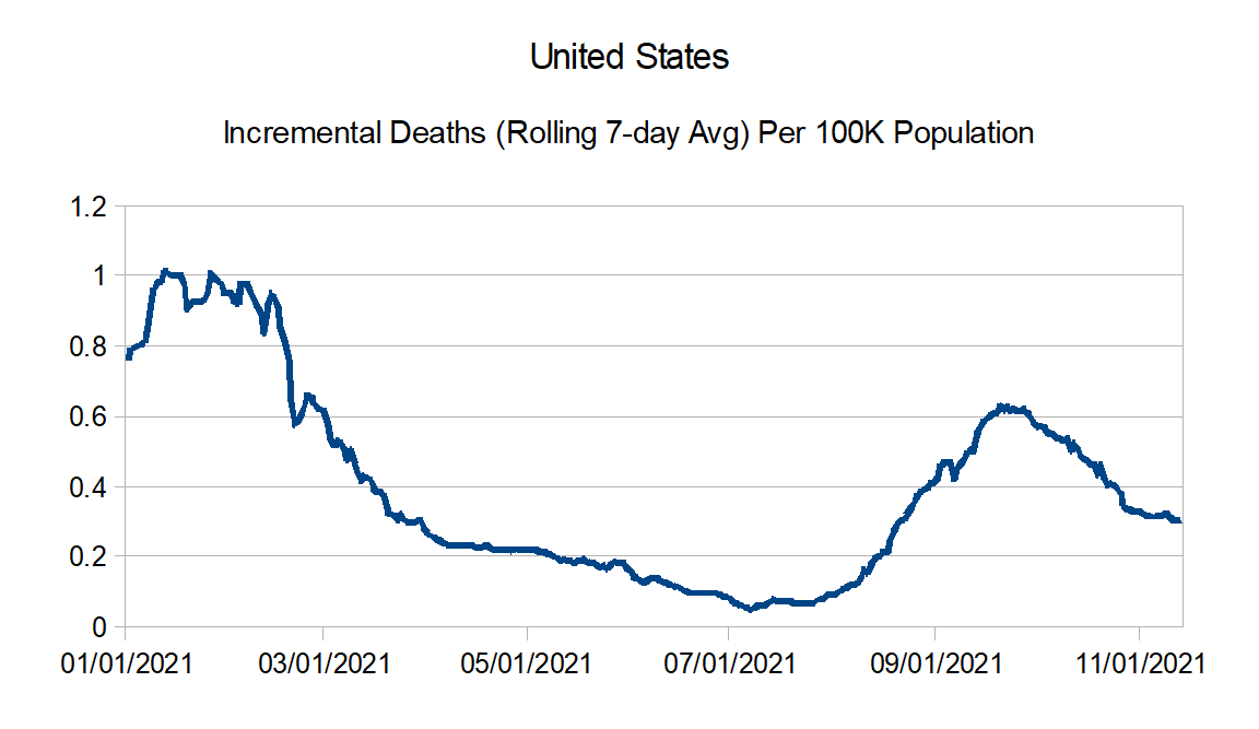
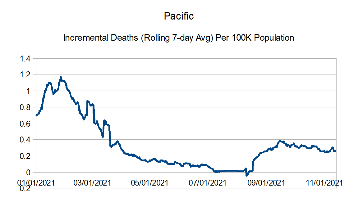
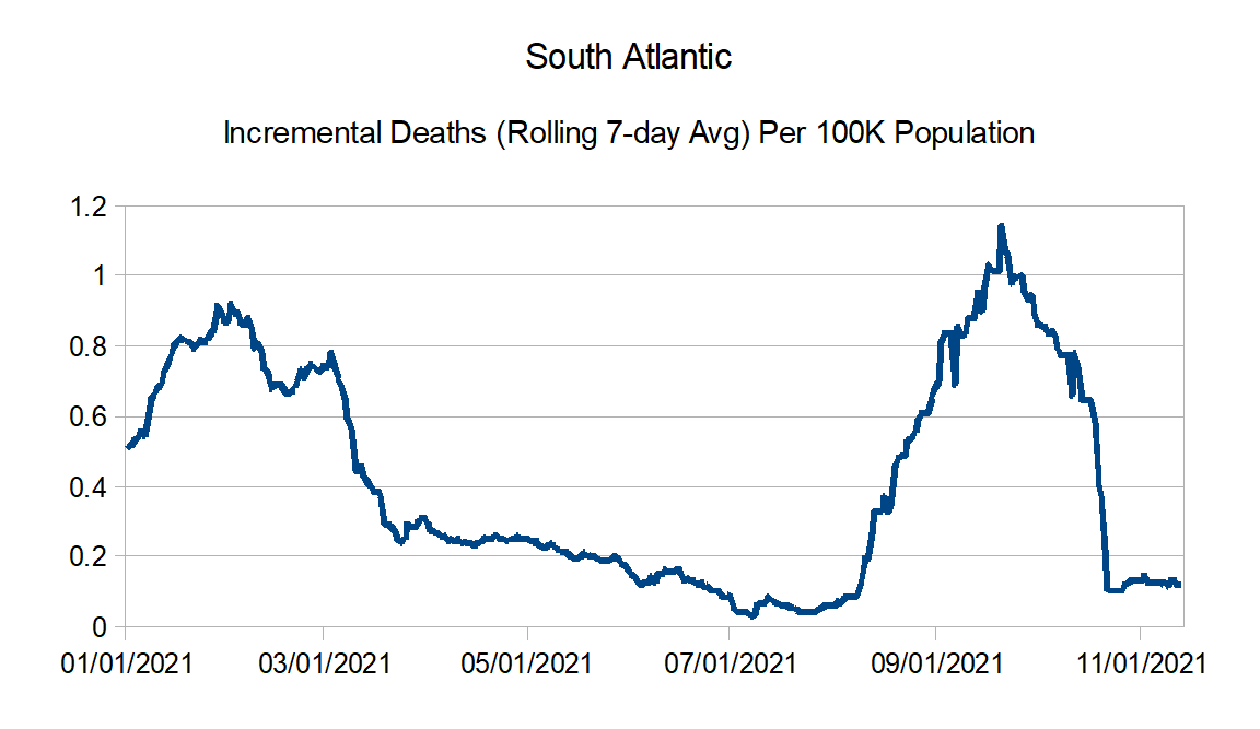
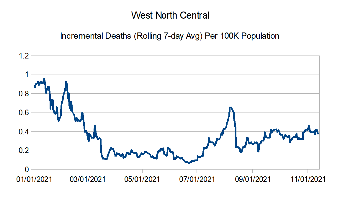
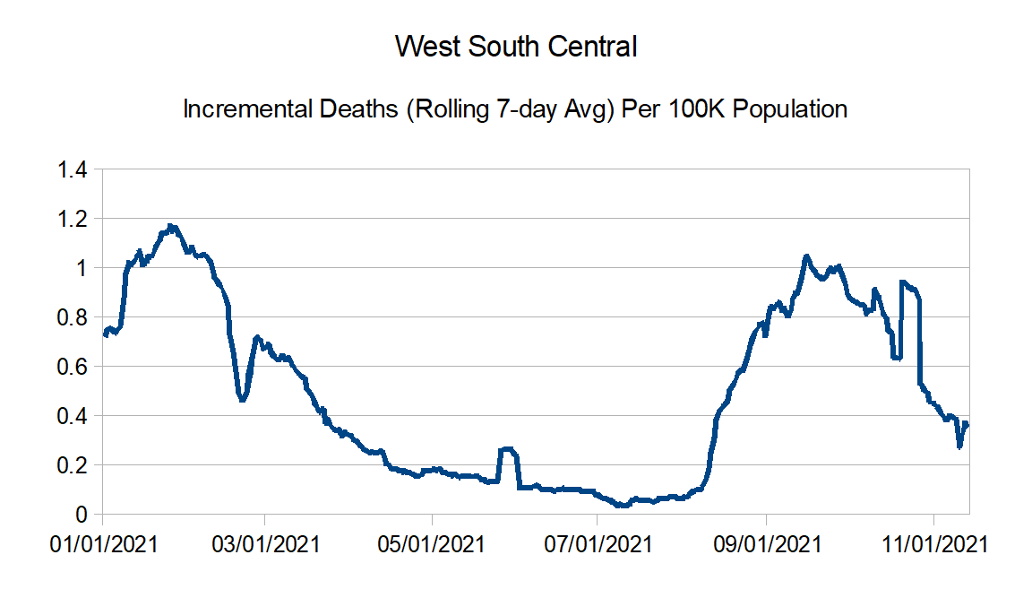
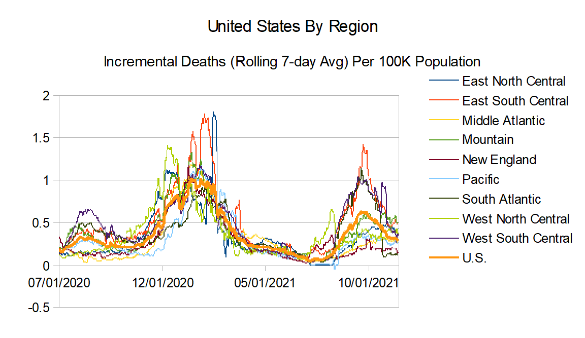
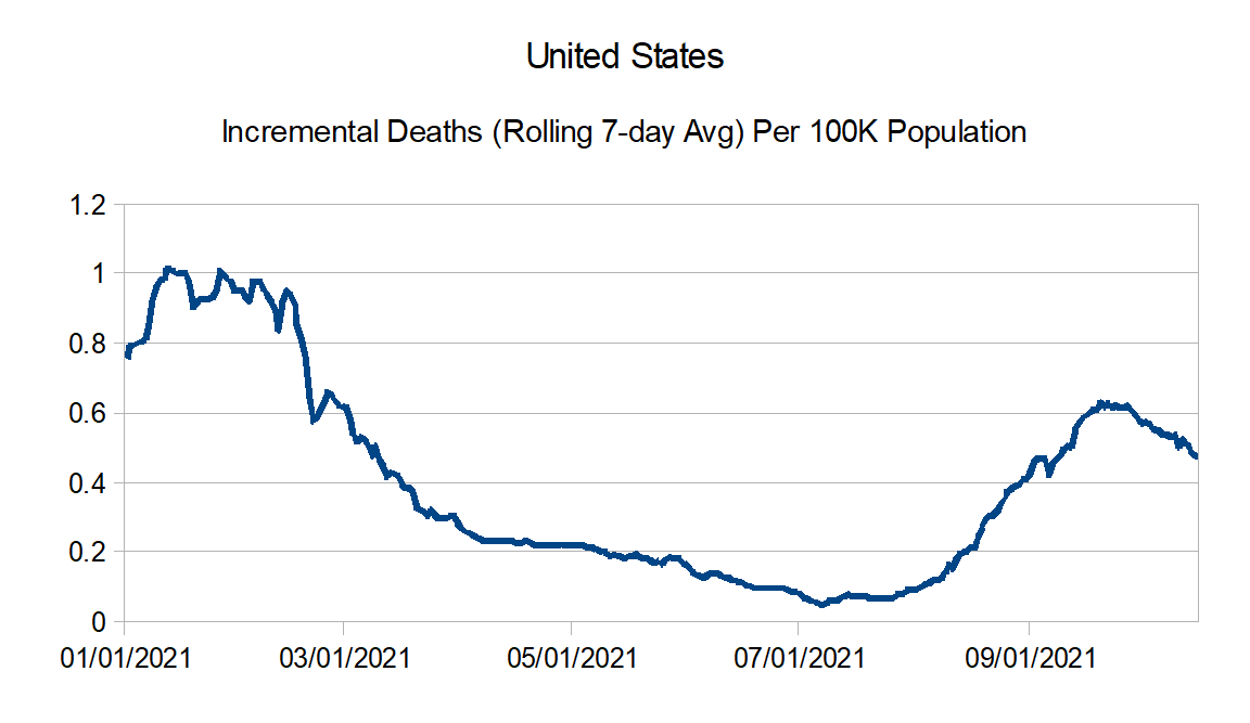
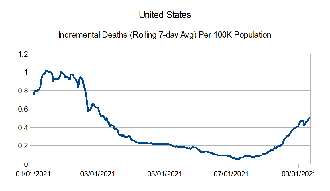
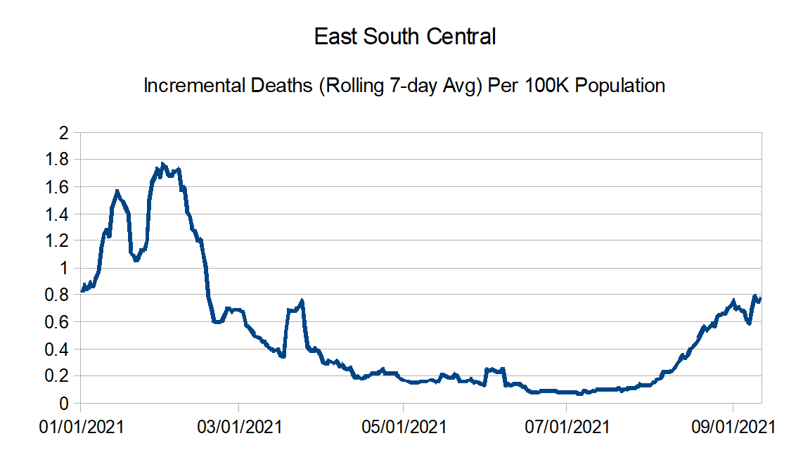
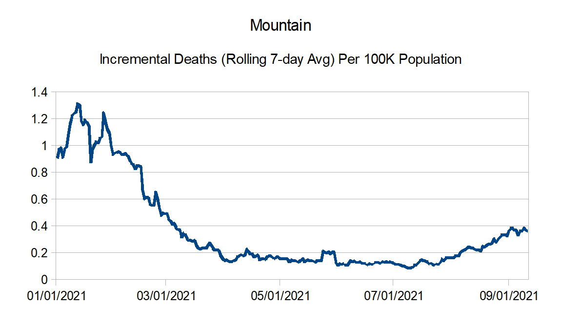
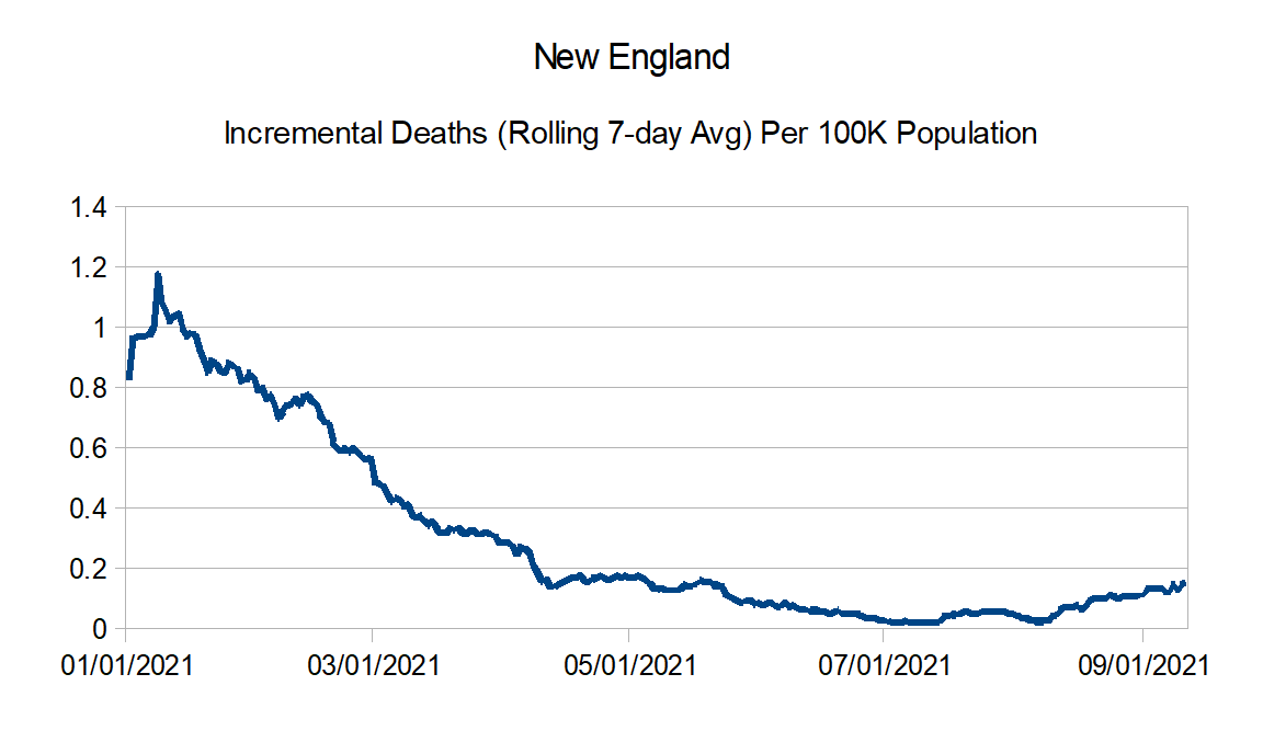
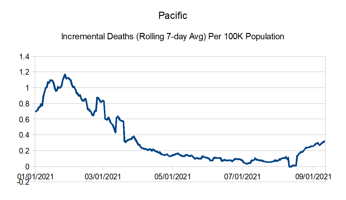
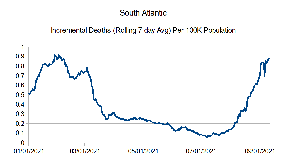
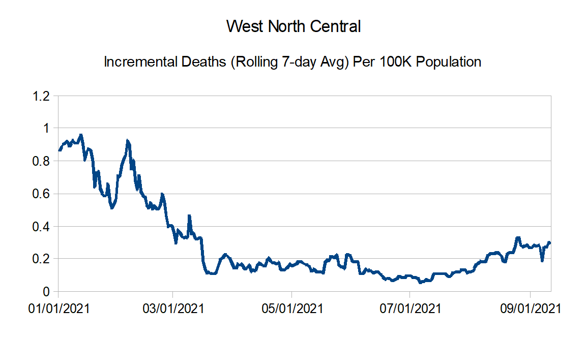
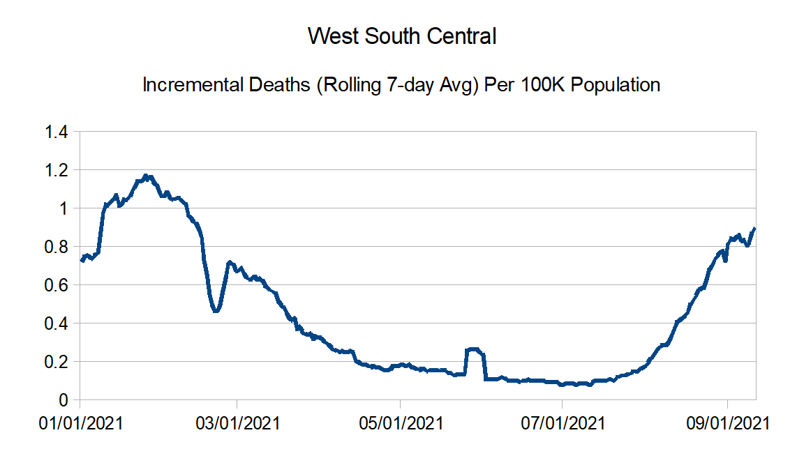
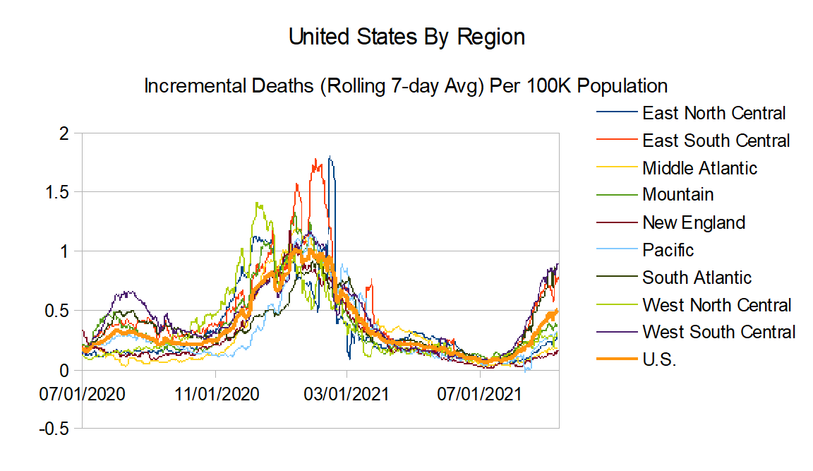
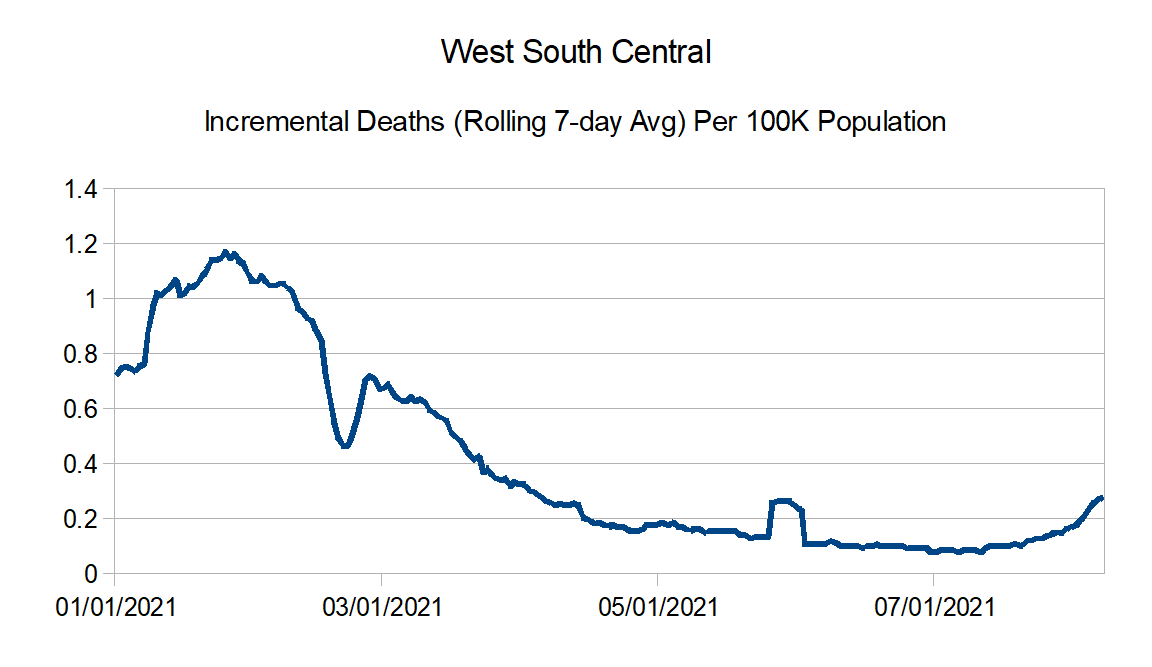
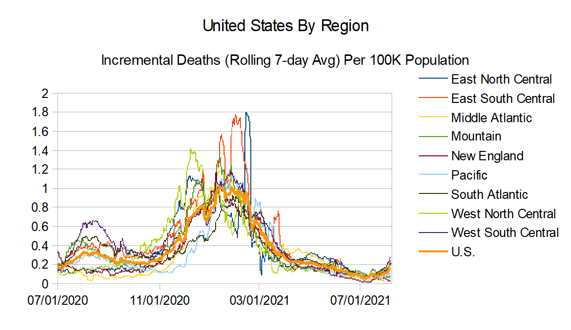
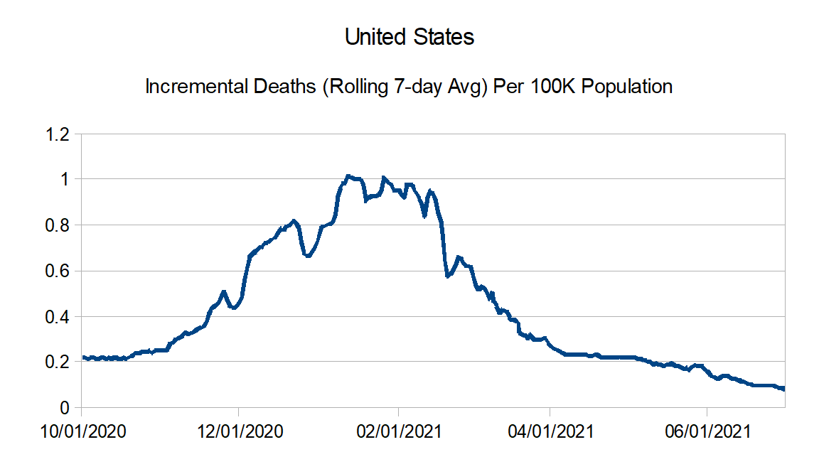
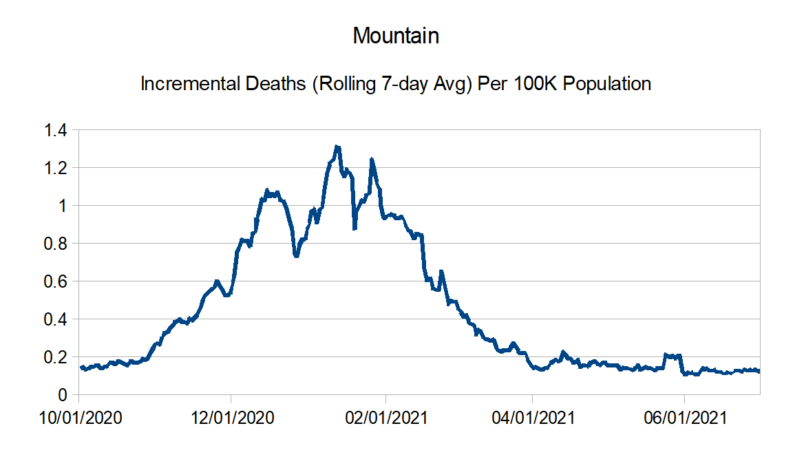
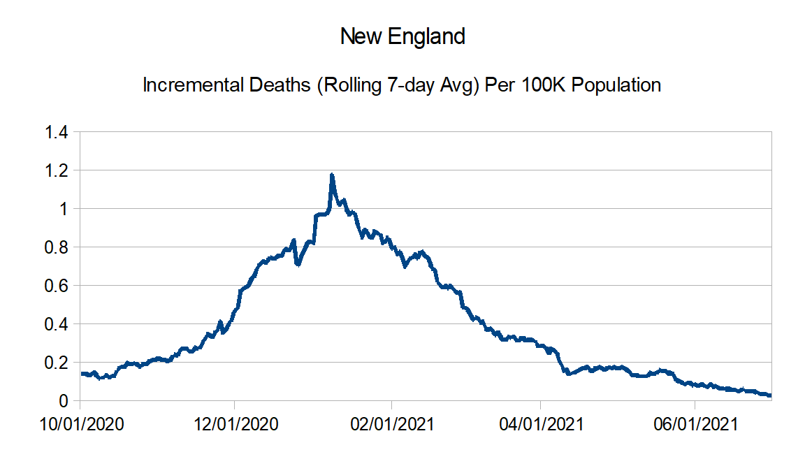
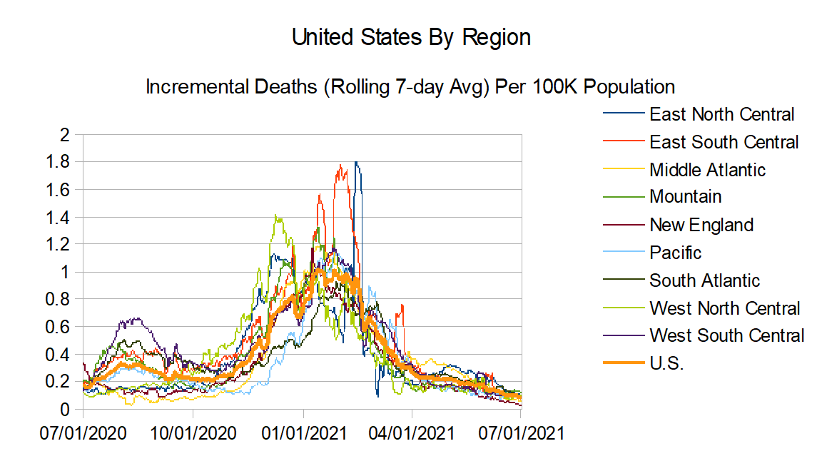
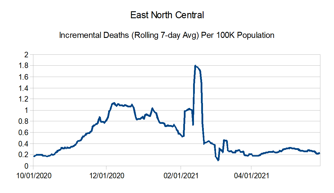
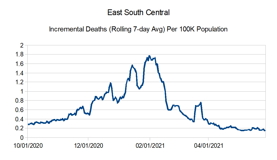
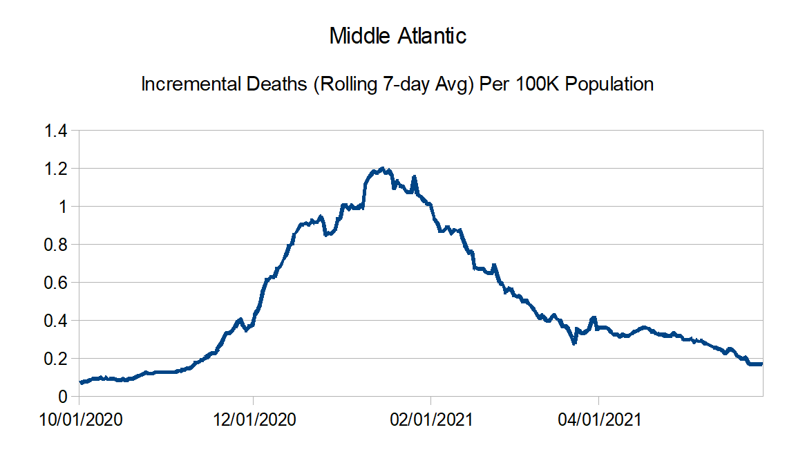
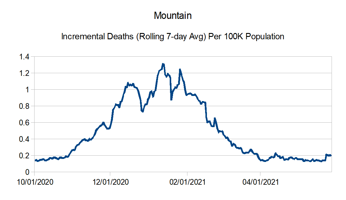
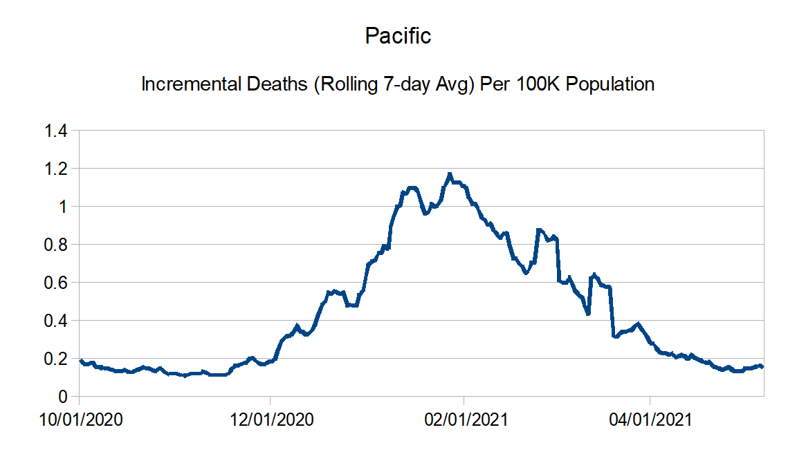
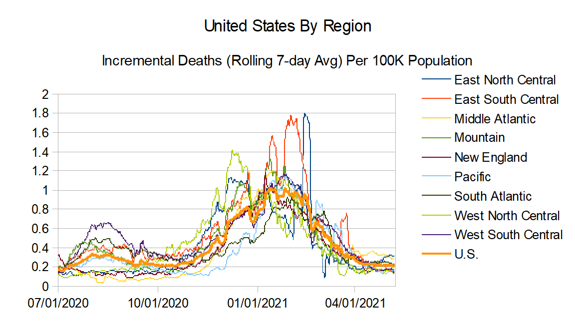
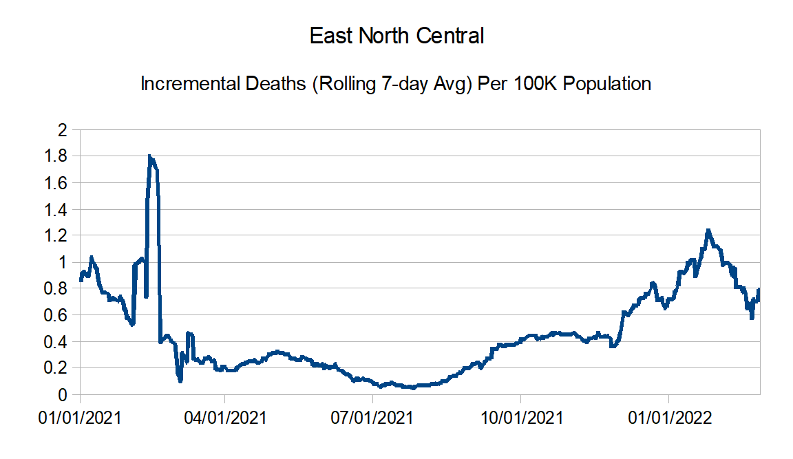
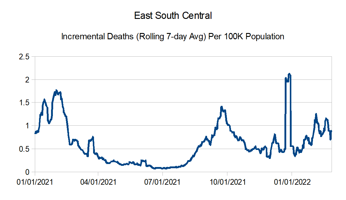
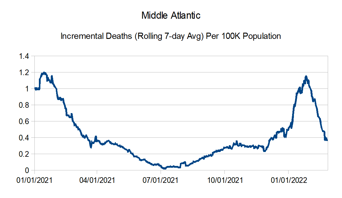
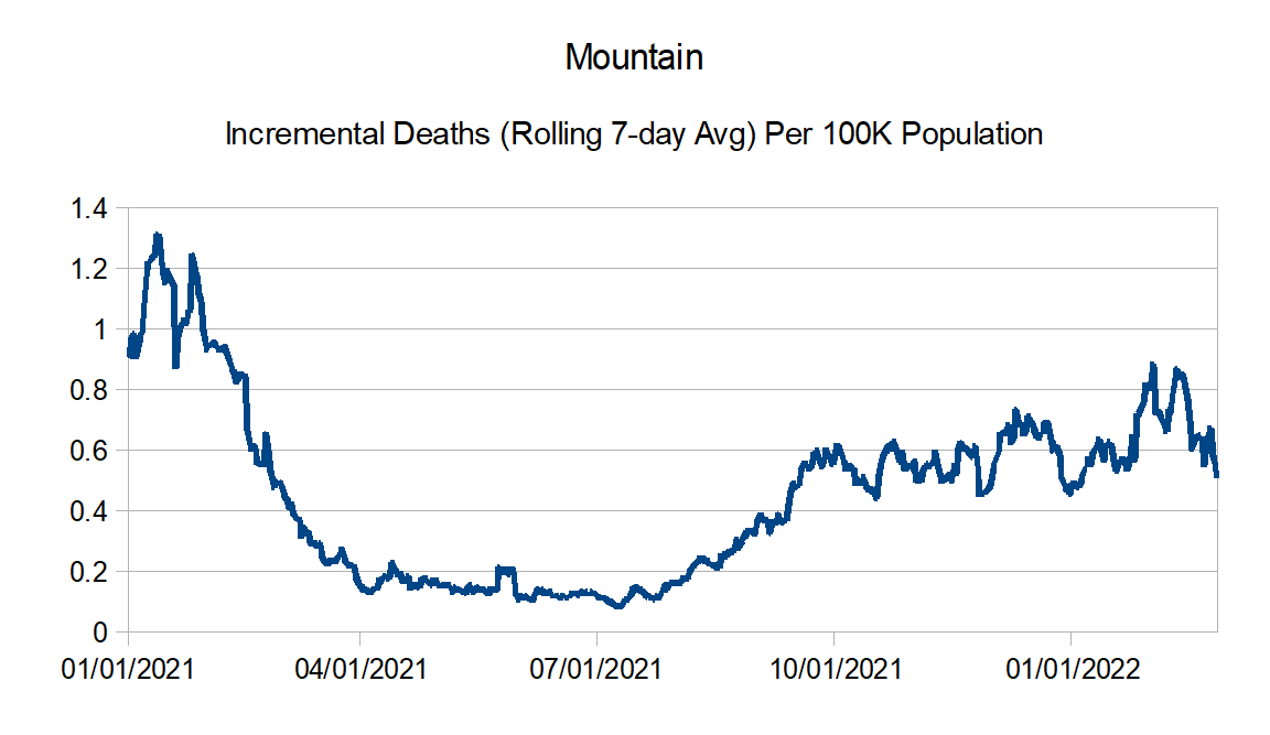
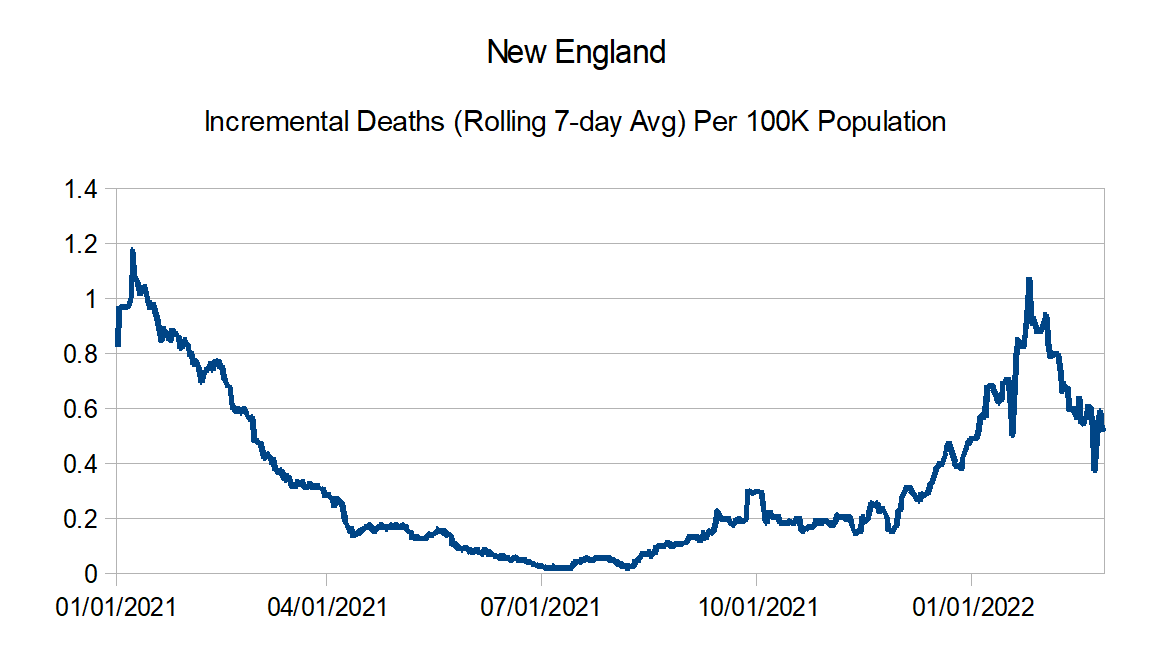
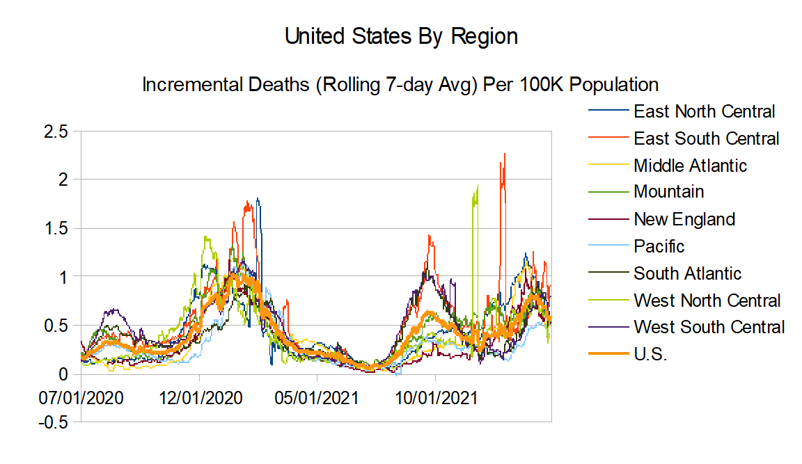
The reported deaths data continues to be from the New York Times.
Data Source – New York Times github
Data Info – New York Times data info
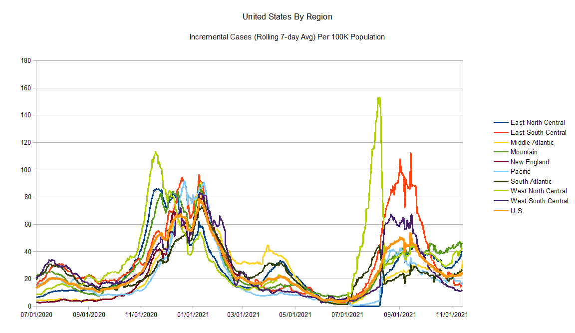
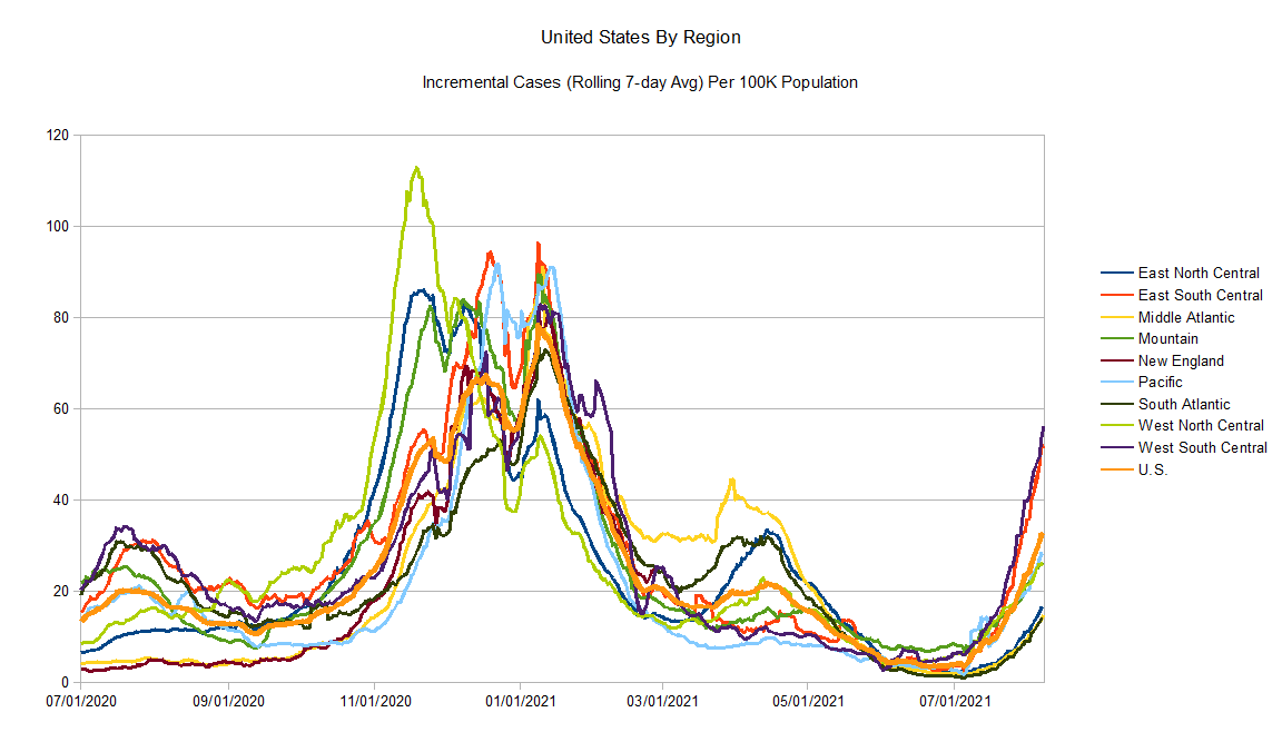
Regions:
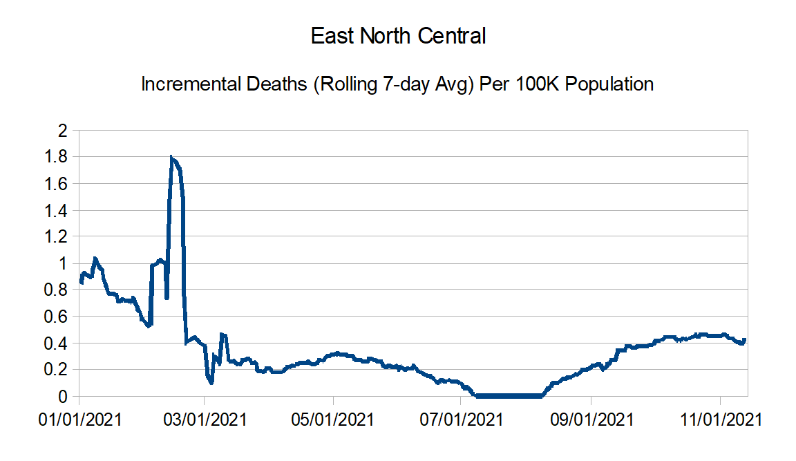
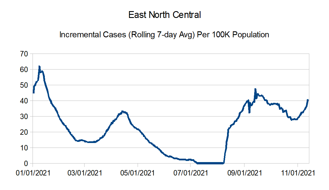
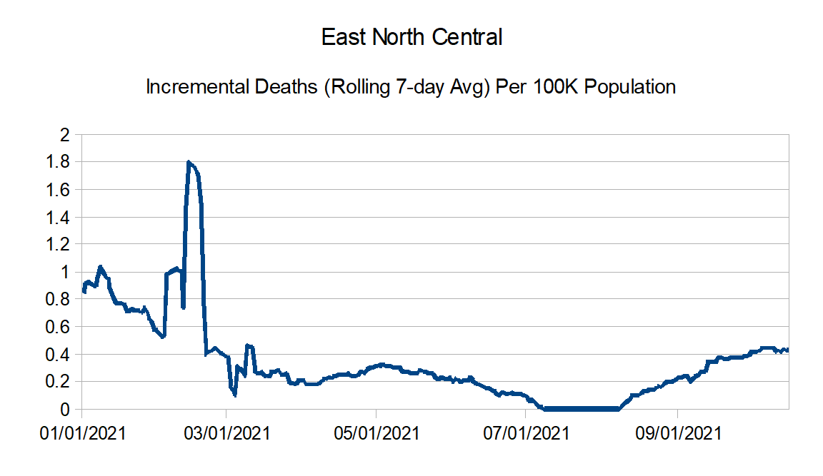
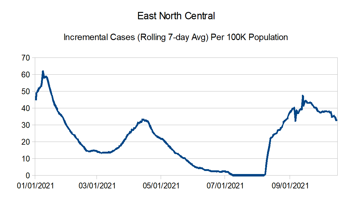
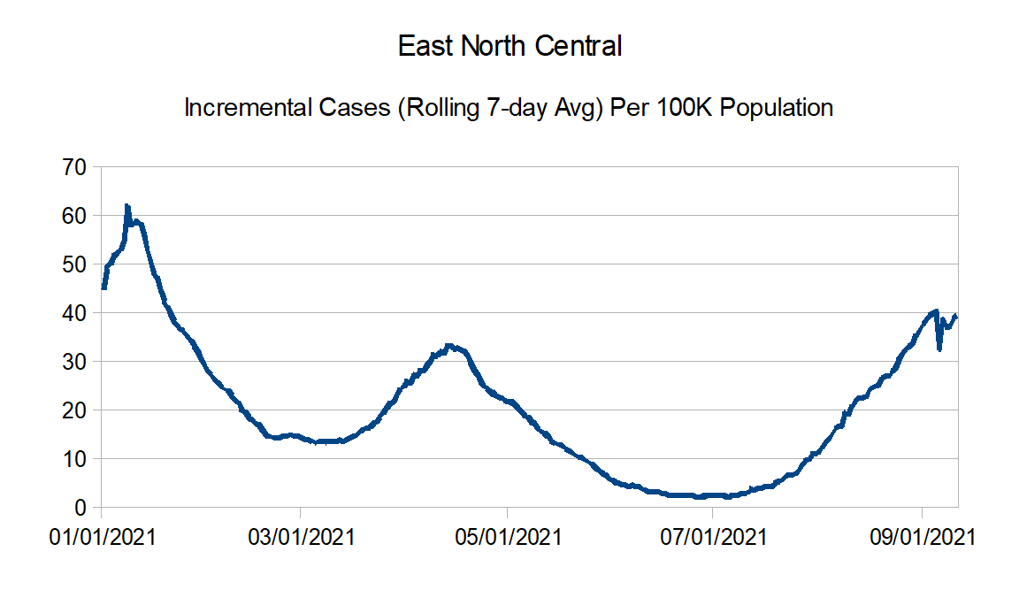
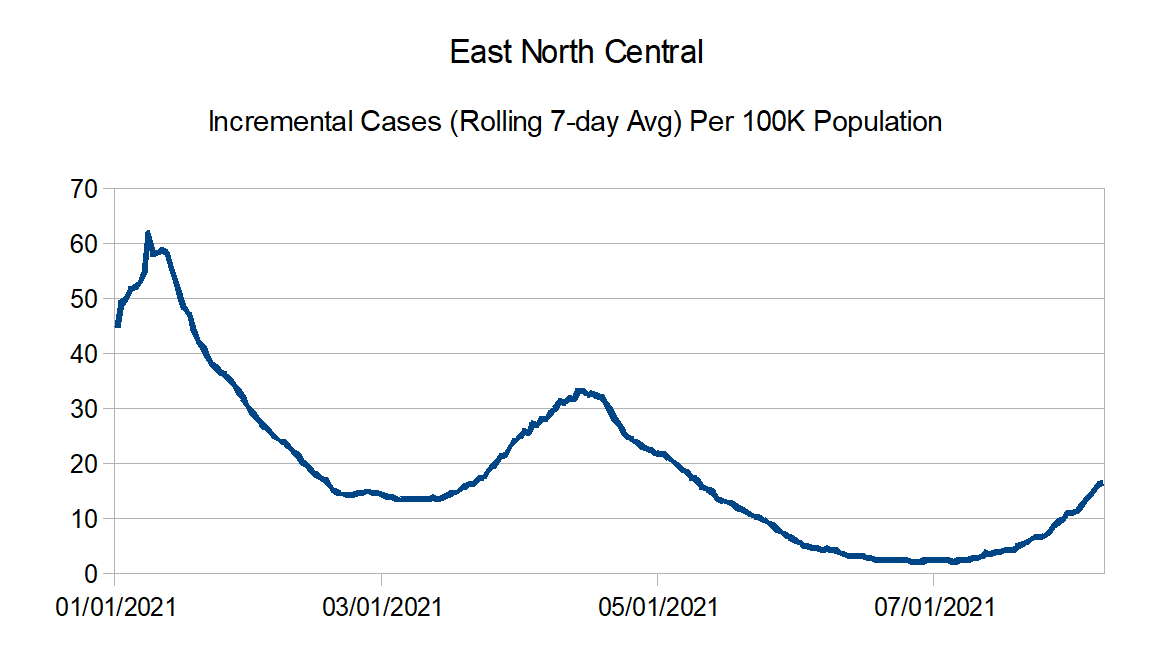
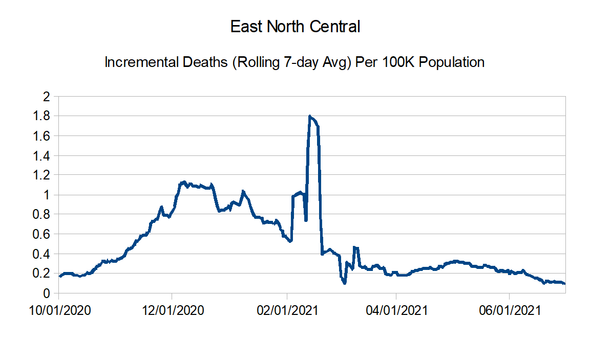
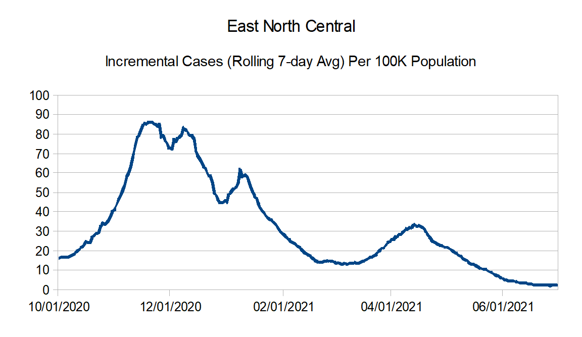
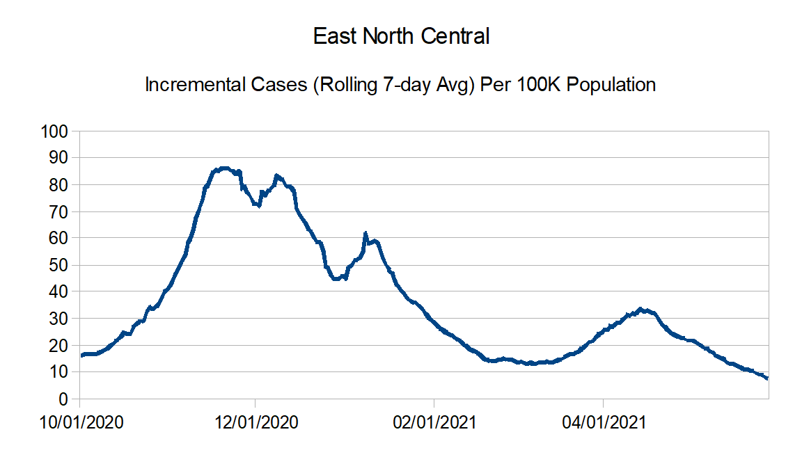
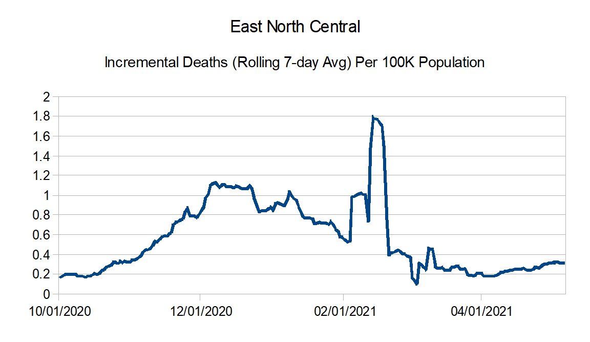
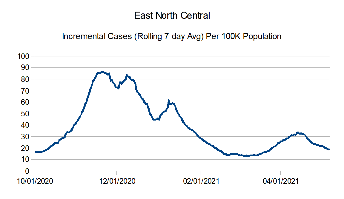
East North Central: Illinois, Indiana, Michigan, Ohio, and Wisconsin
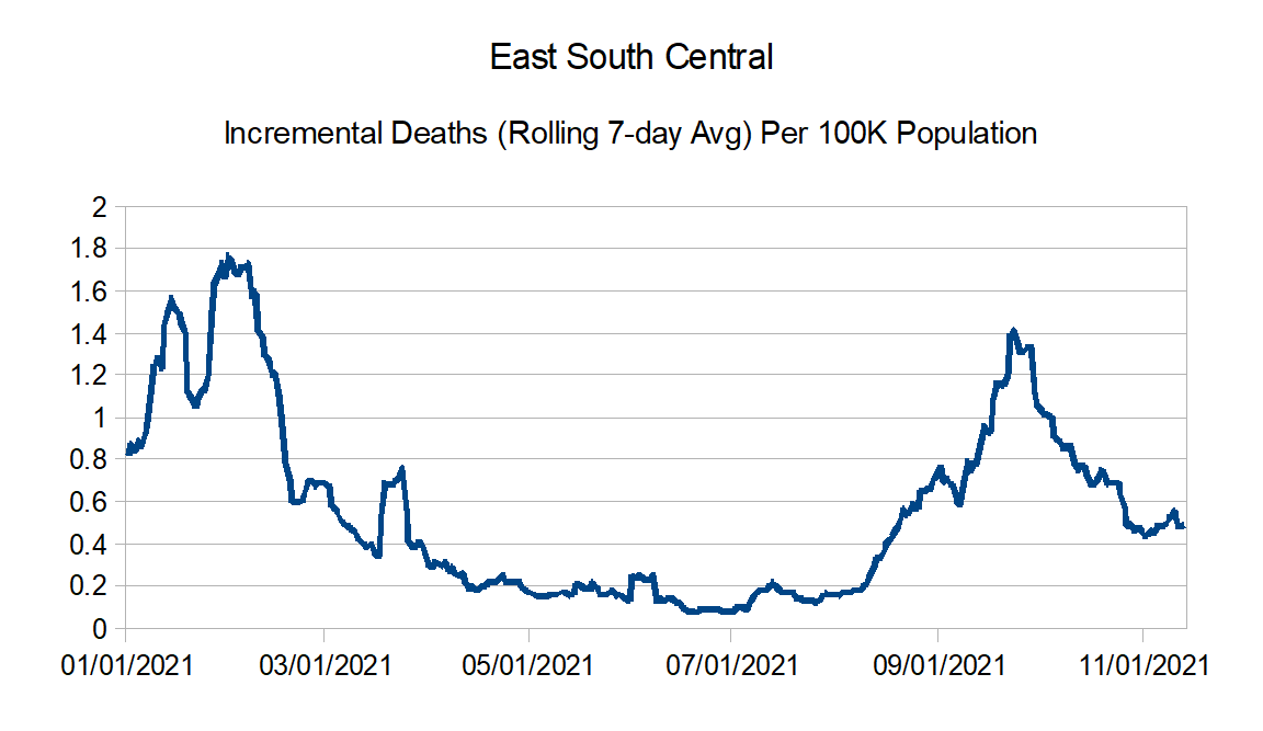
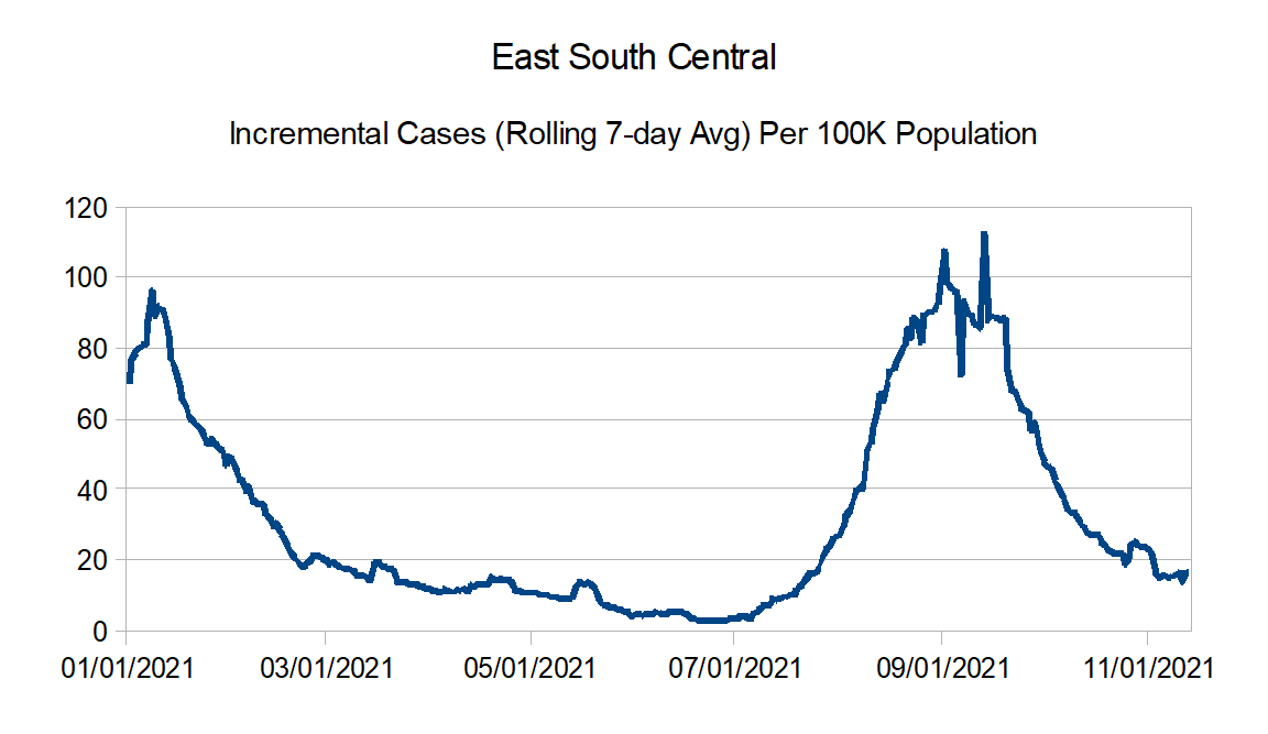
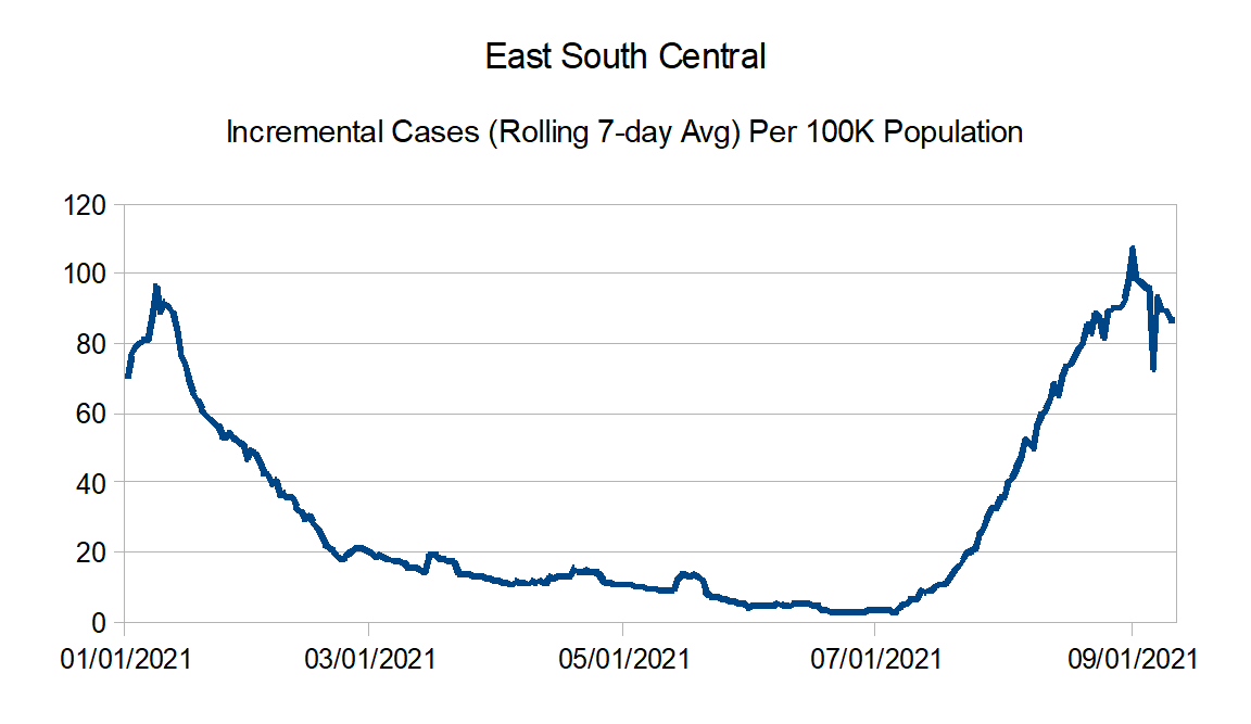
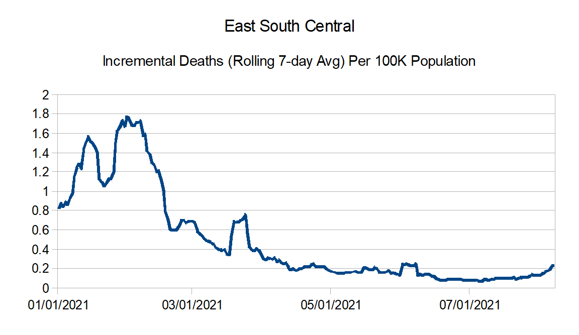
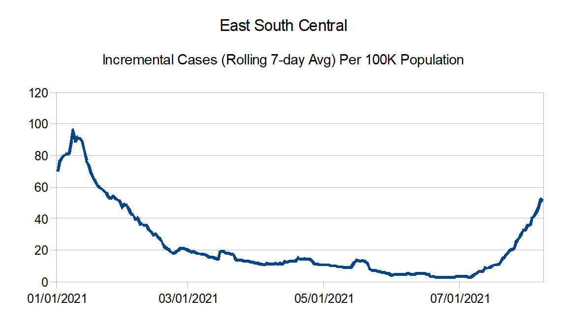
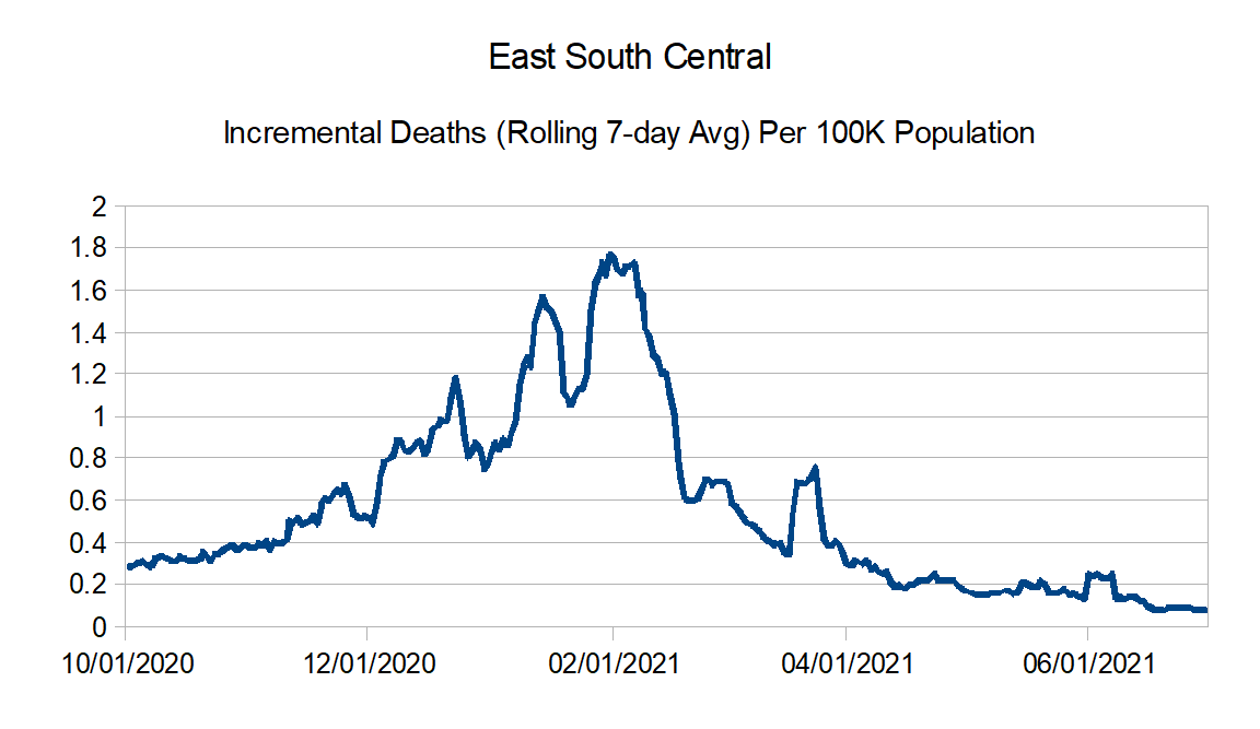
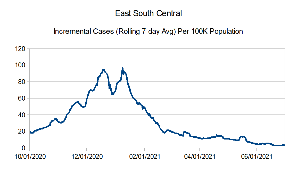
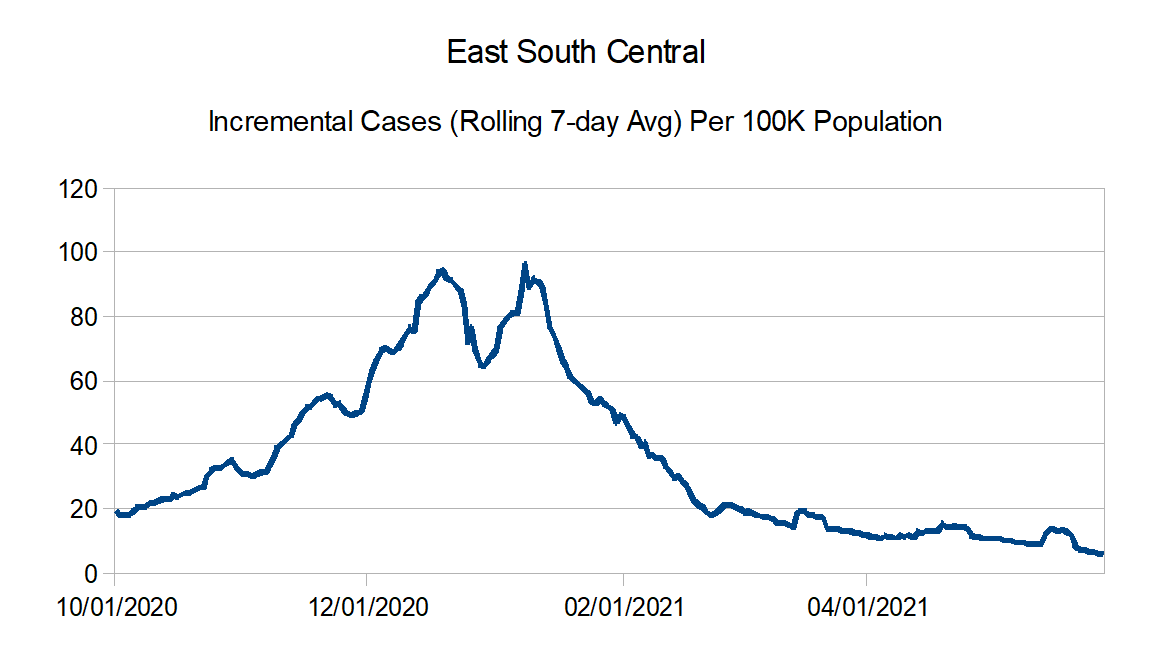
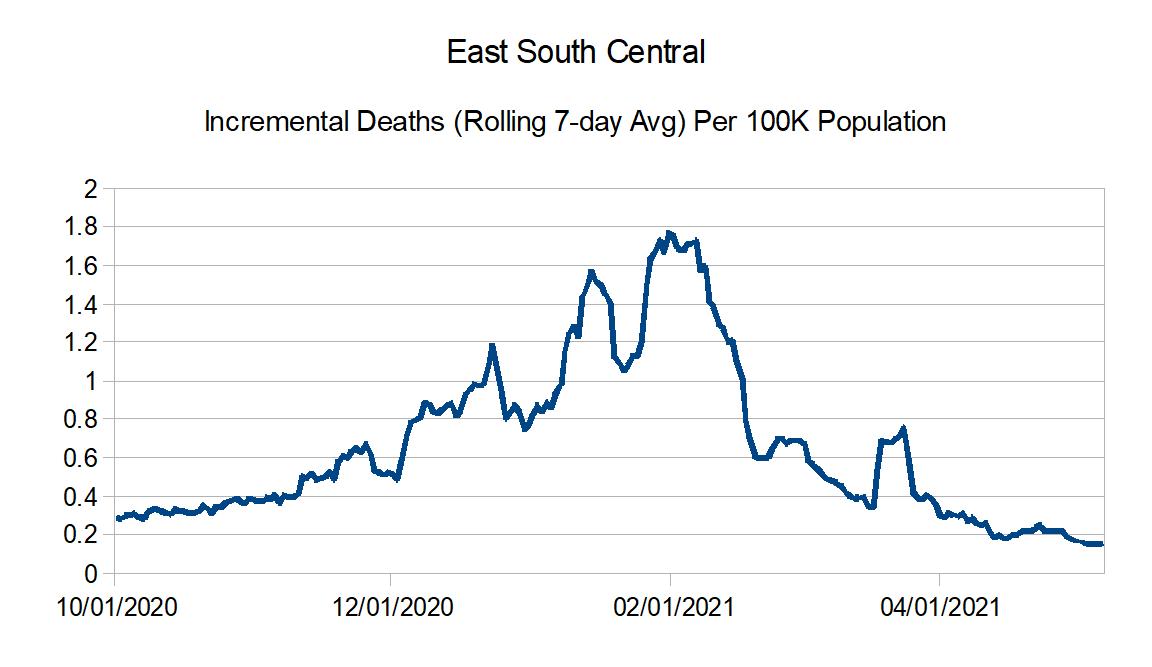
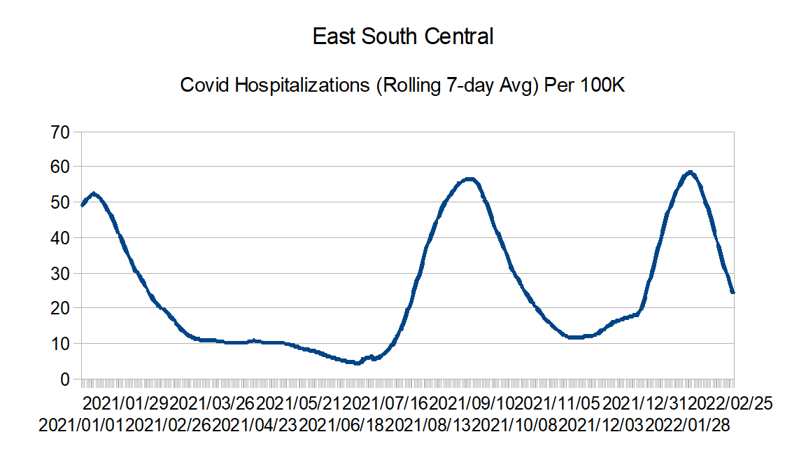
East South Central: Alabama, Kentucky, Mississippi, and Tennessee
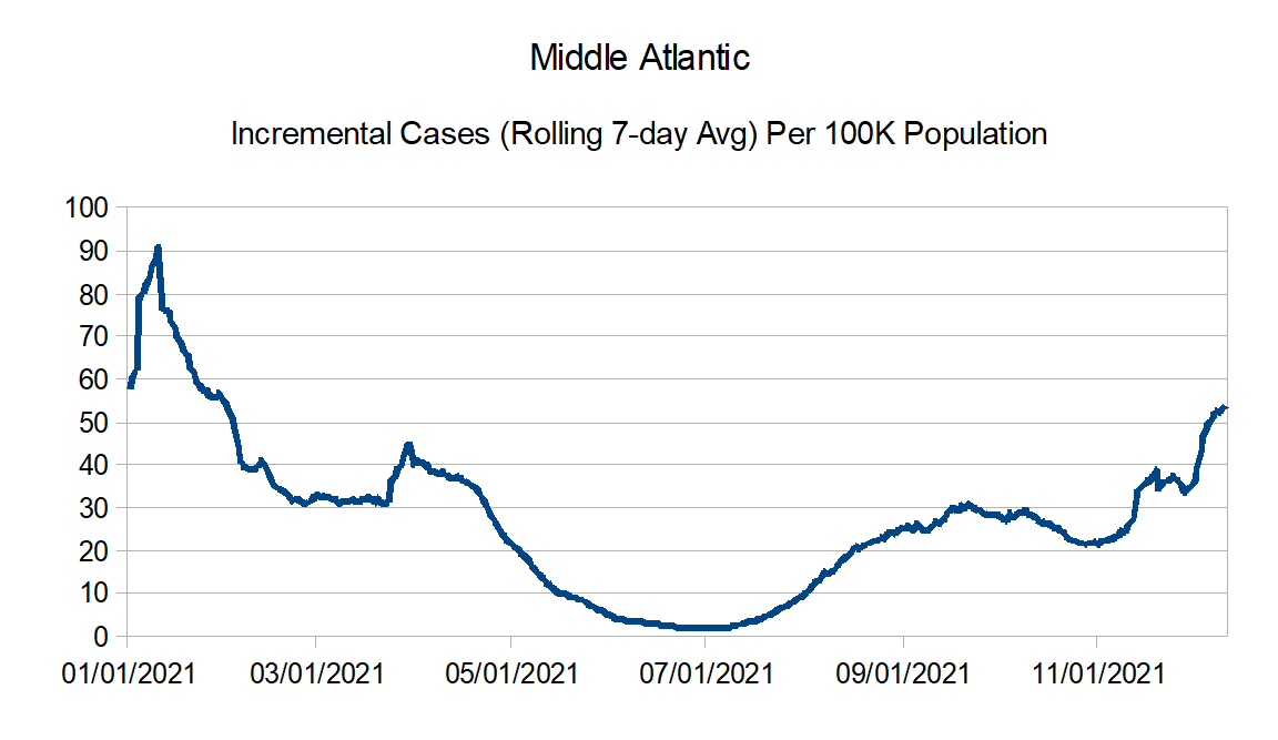
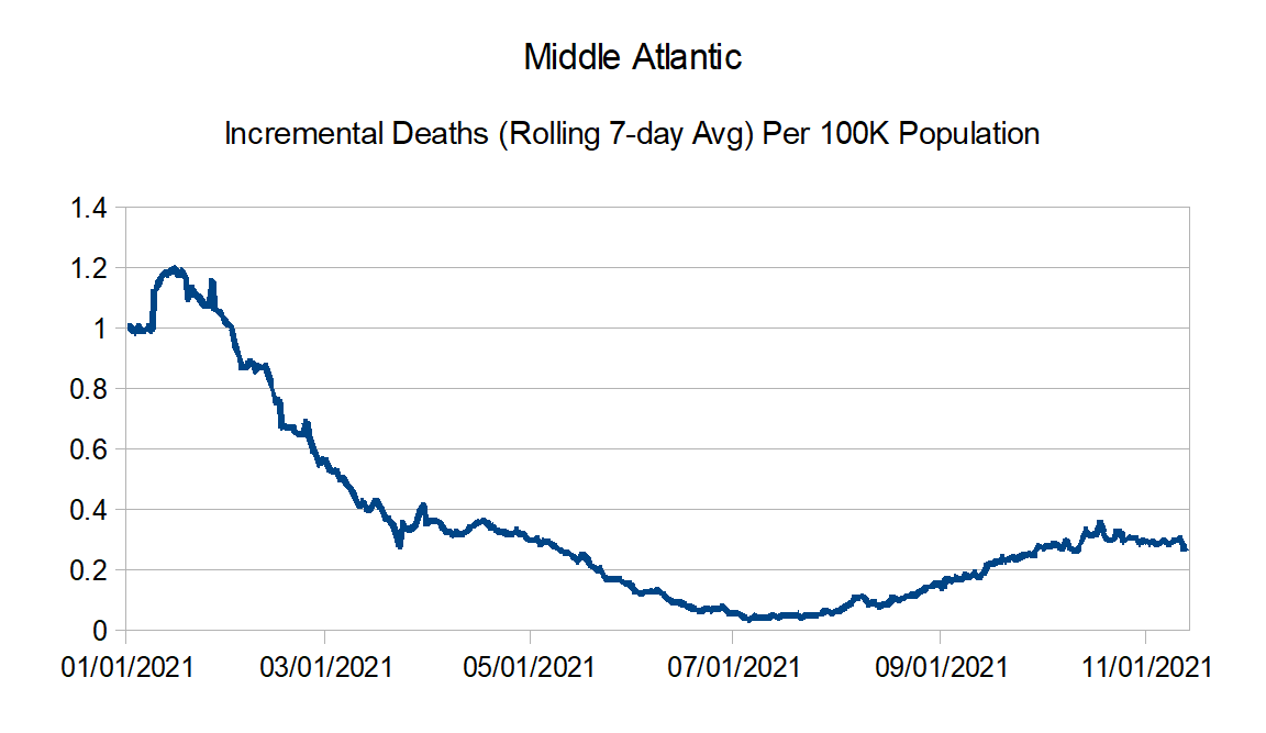
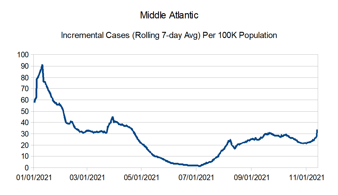
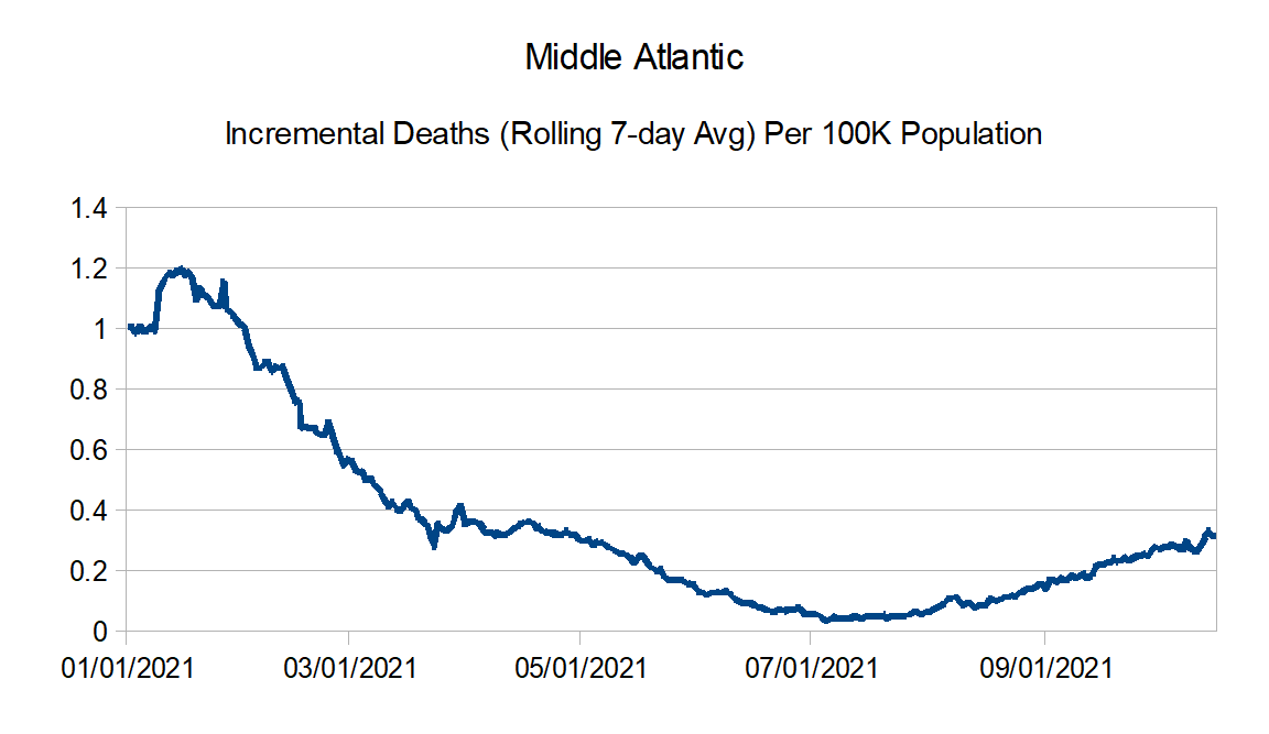
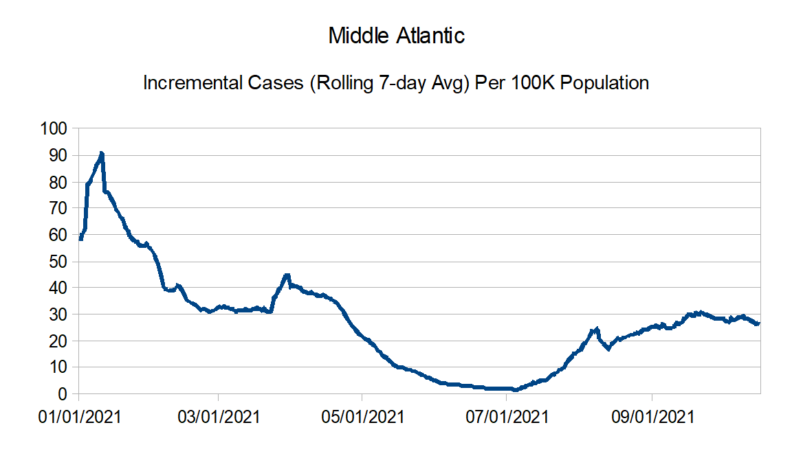
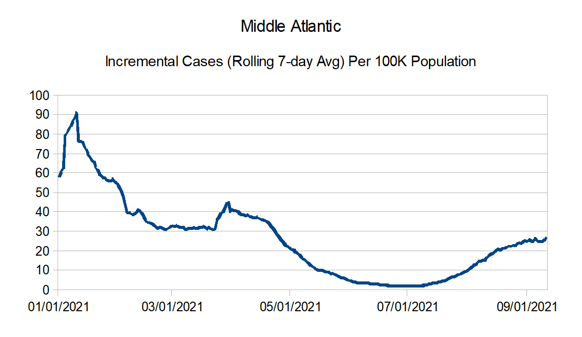
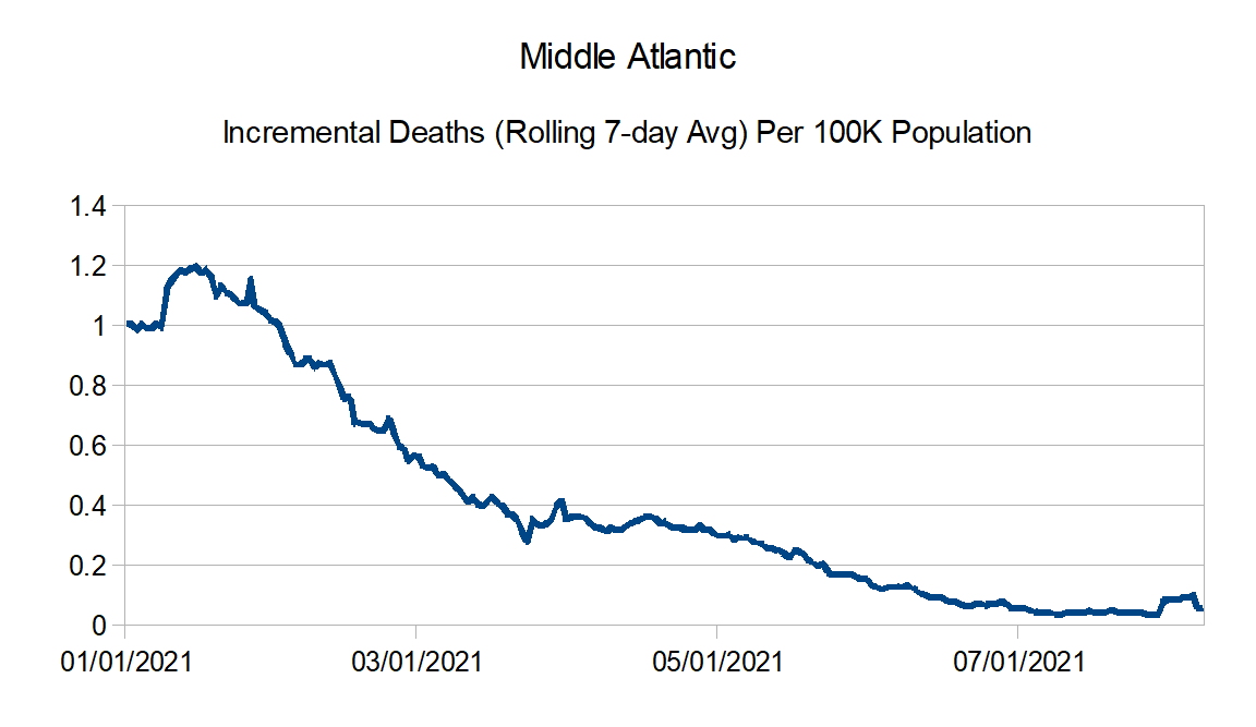
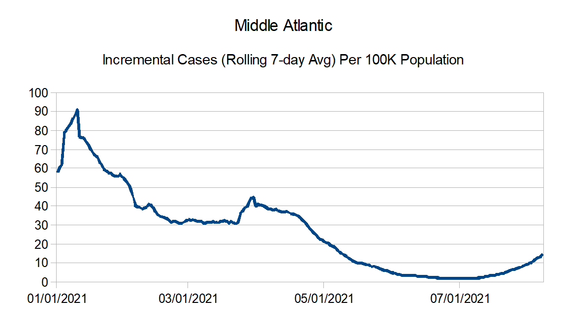
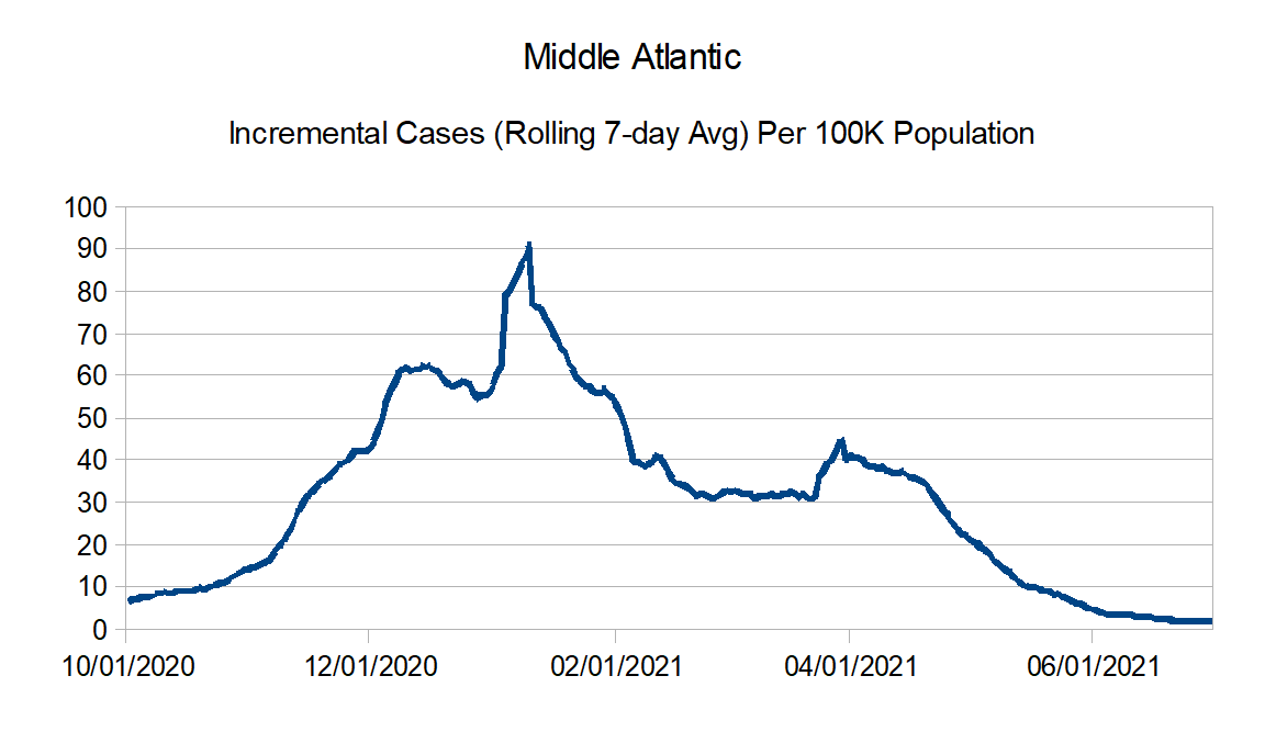
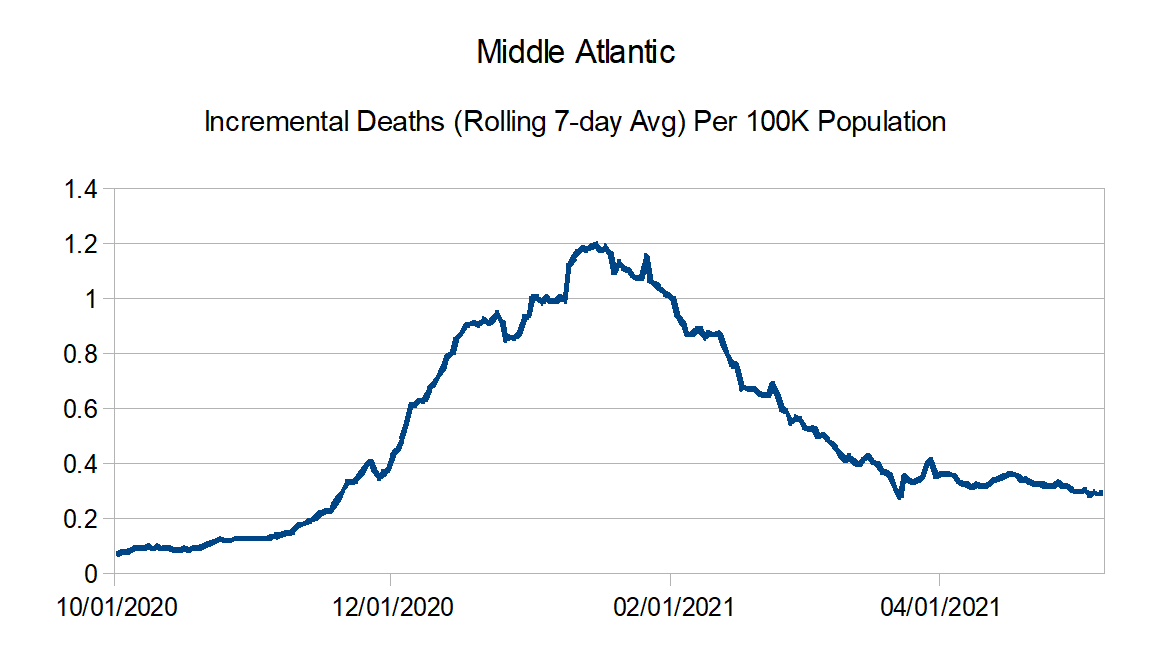
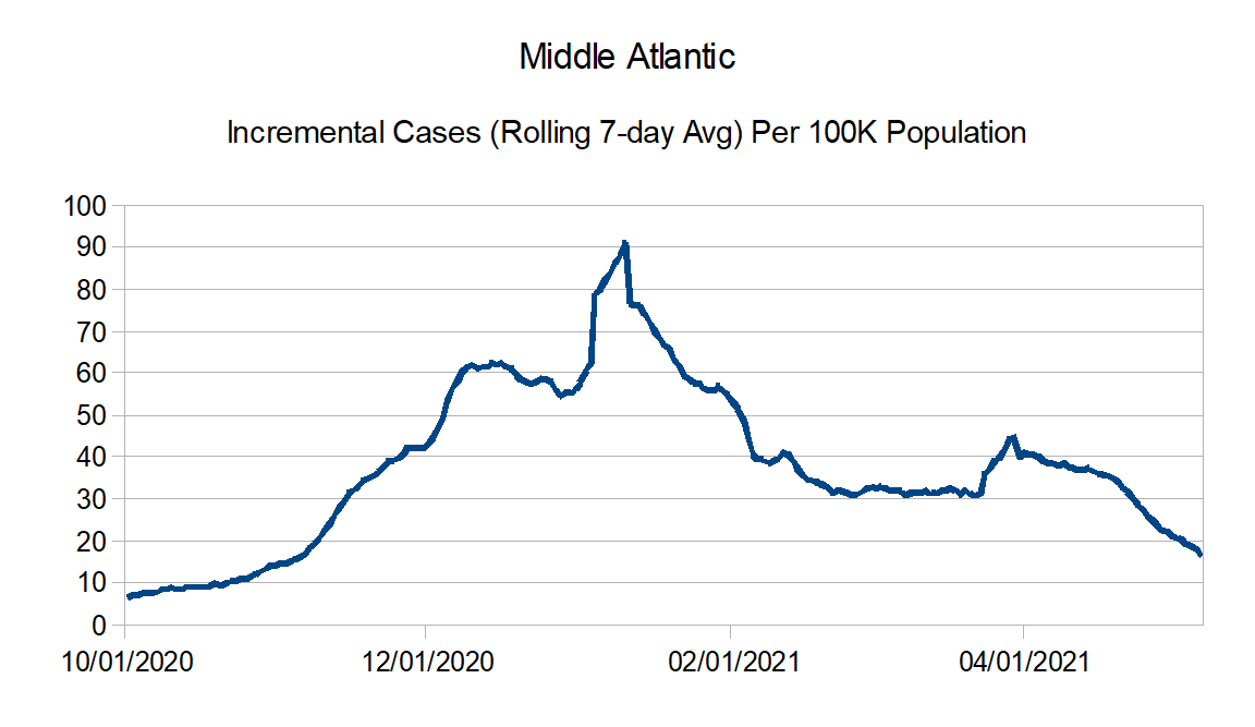
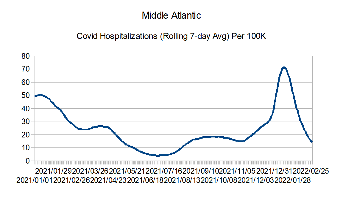
Middle Atlantic: Delaware, New Jersey, New York, and Pennsylvania
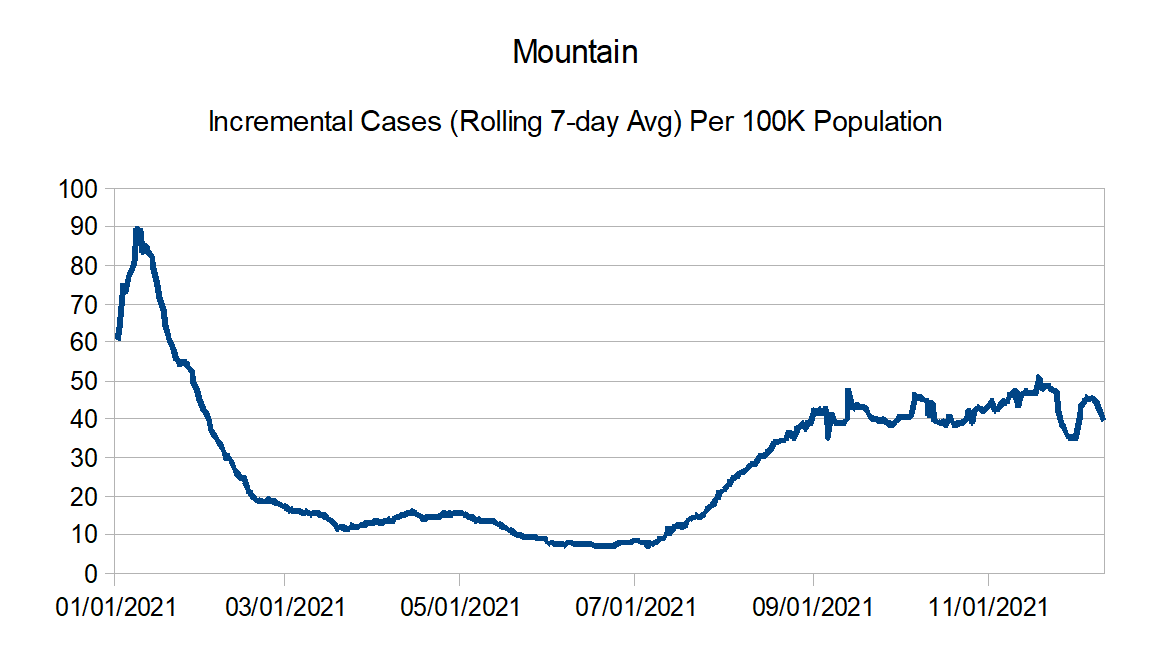
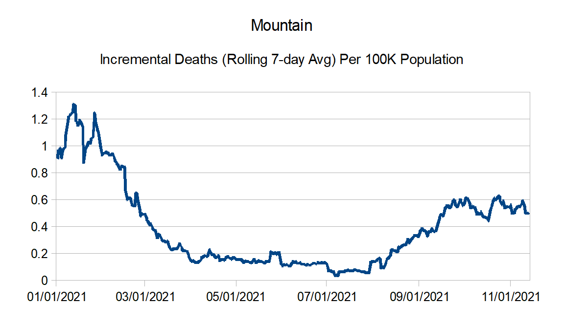
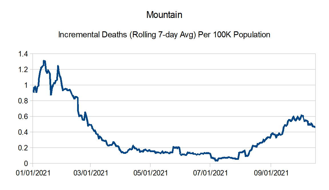
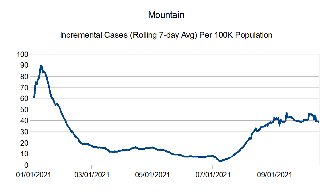
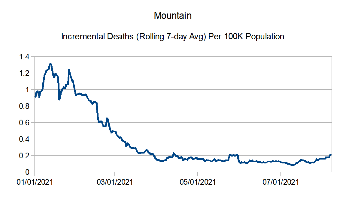
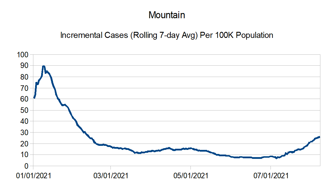
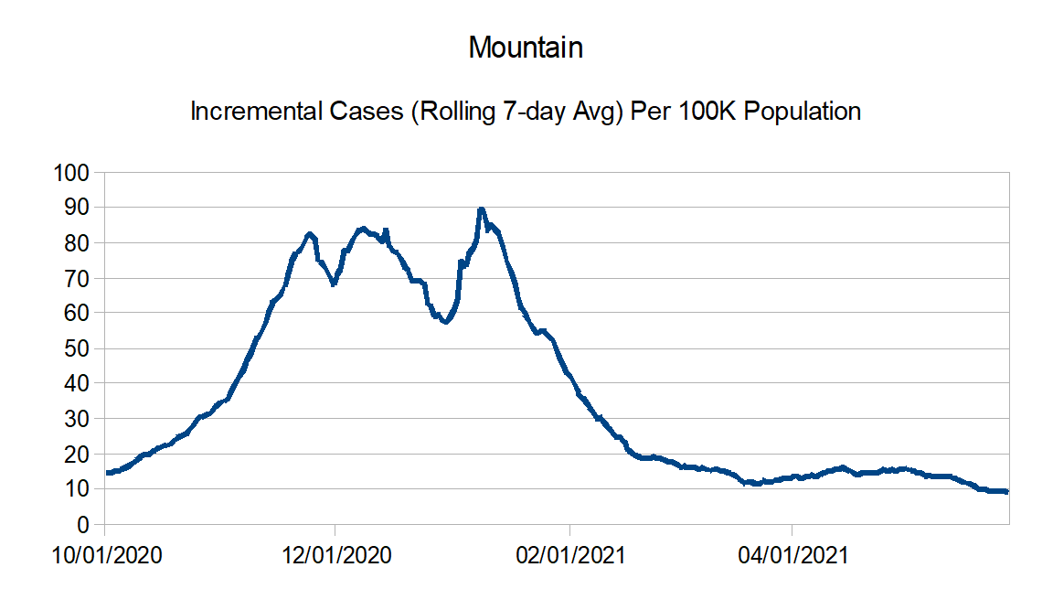
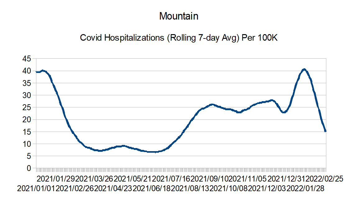
Mountain: Arizona, Colorado, Idaho, Montana, Nevada, New Mexico, Utah, and Wyoming
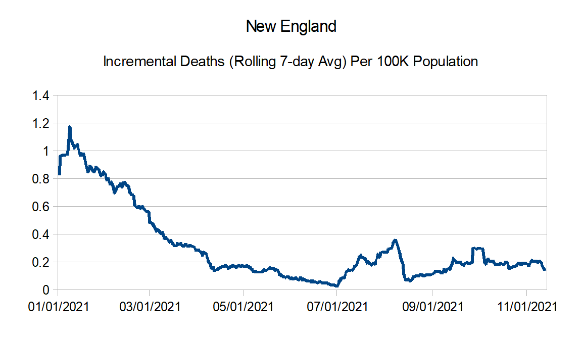
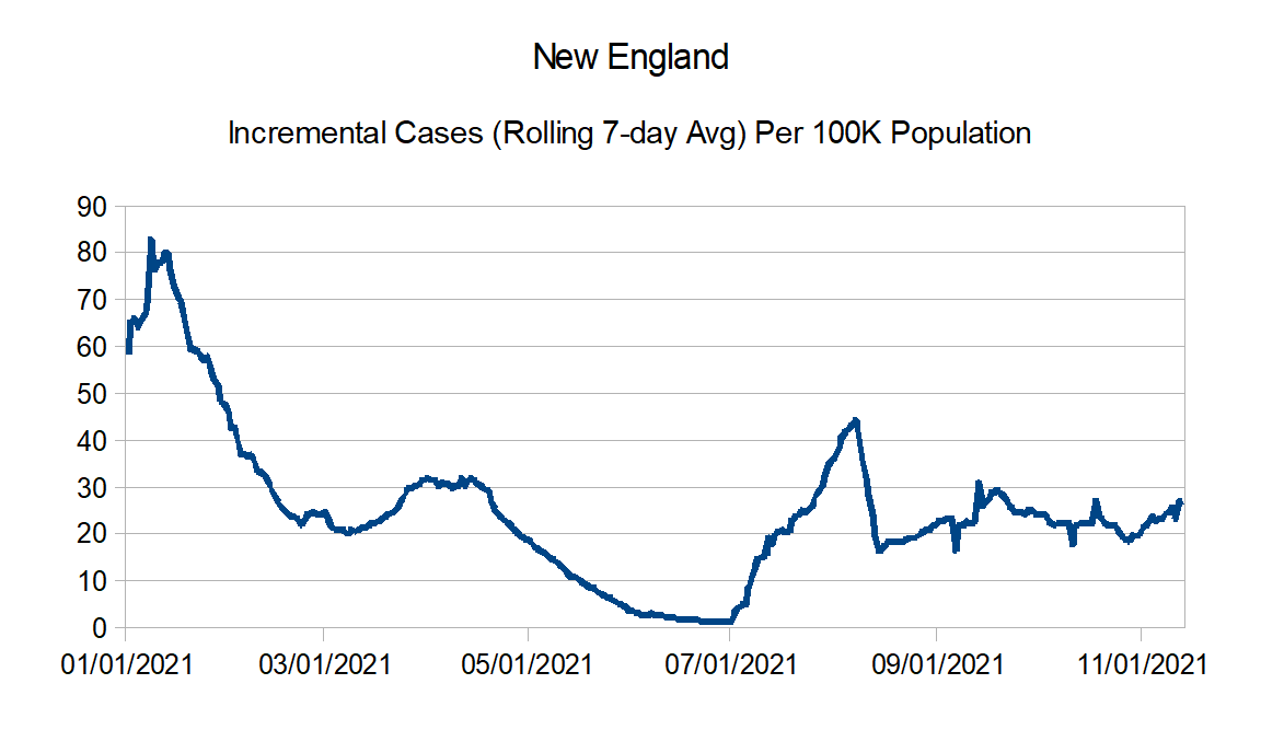
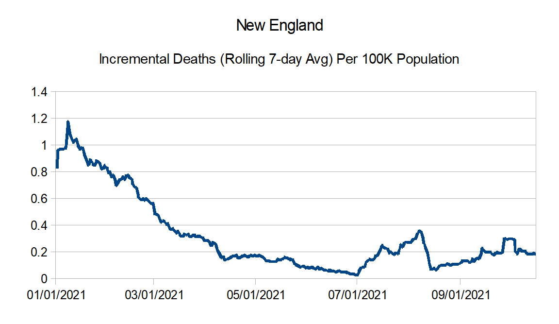
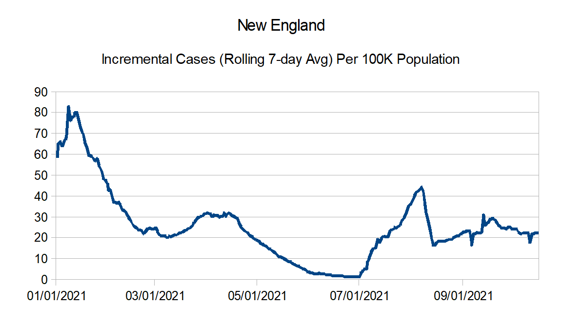
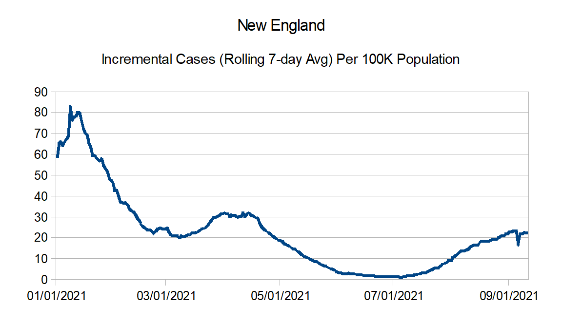
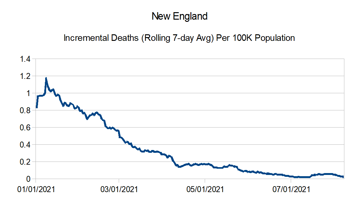
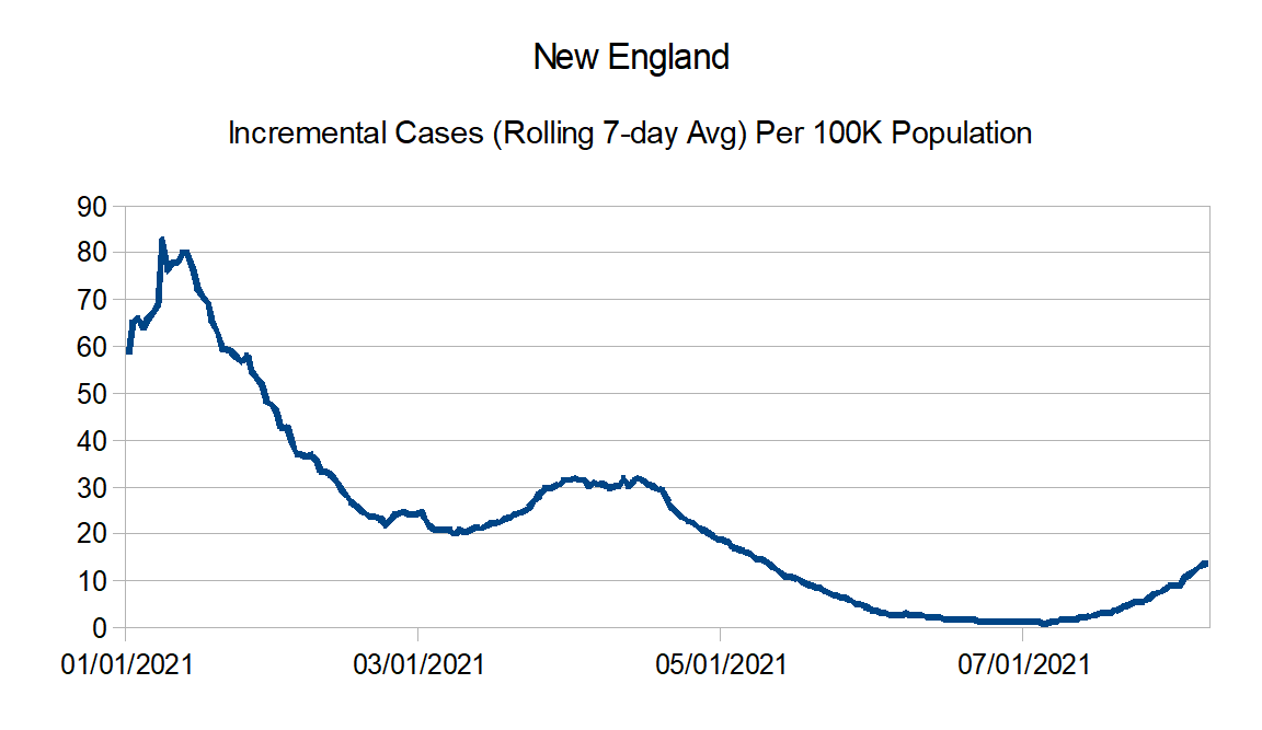
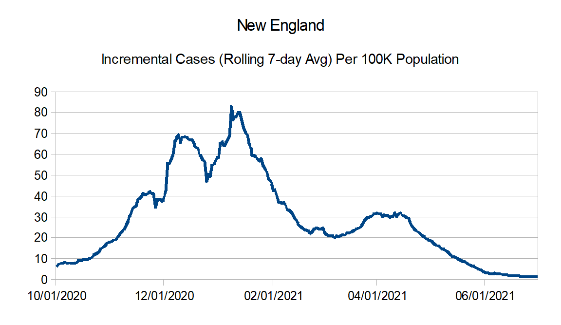
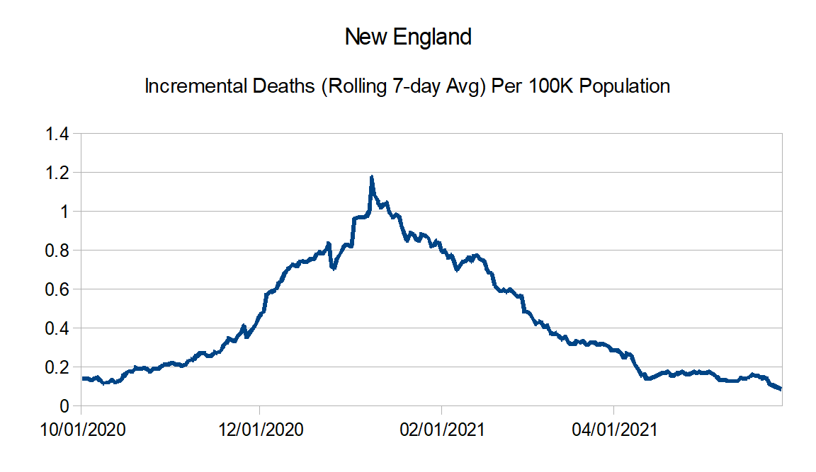
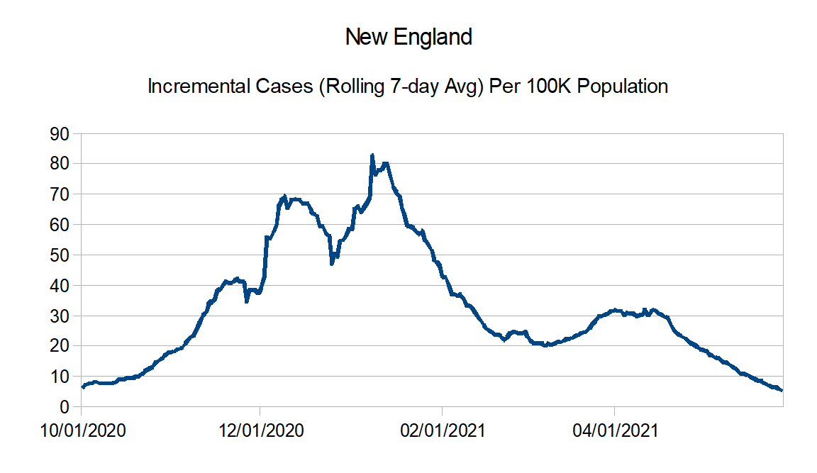
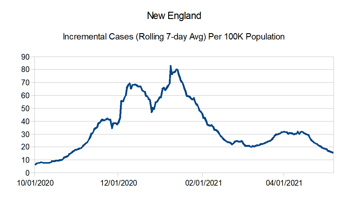
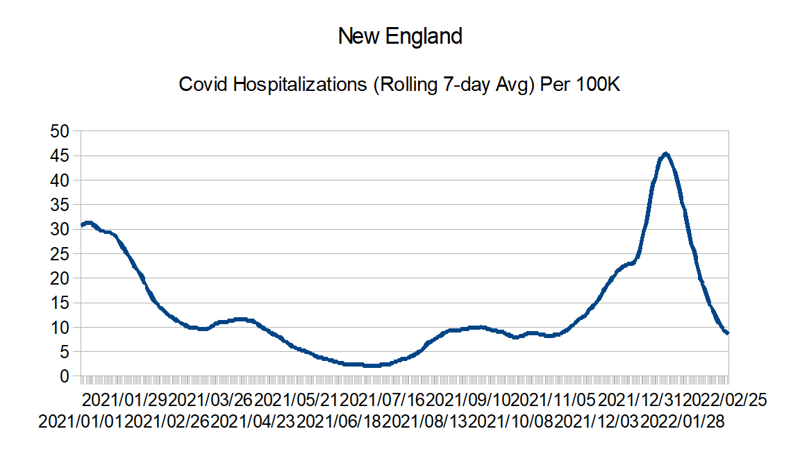
New England: Connecticut, Maine, Massachusetts, New Hampshire, Rhode Island, and Vermont
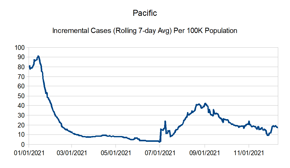
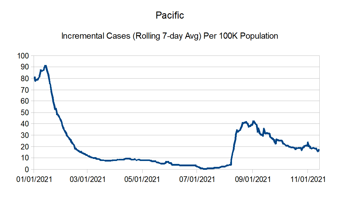
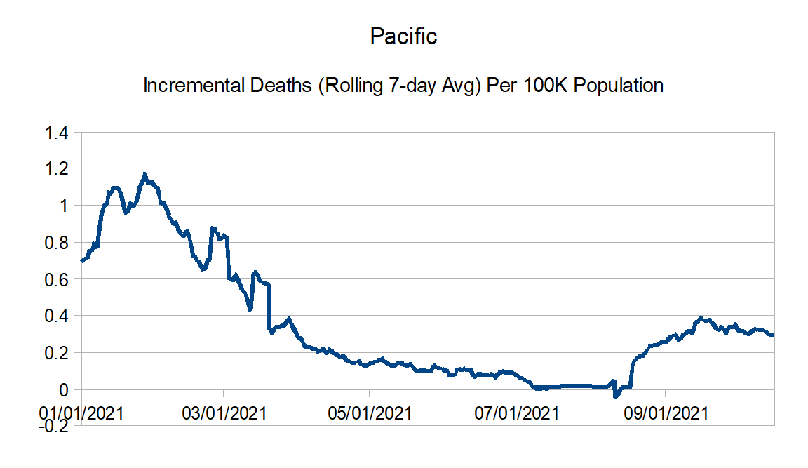
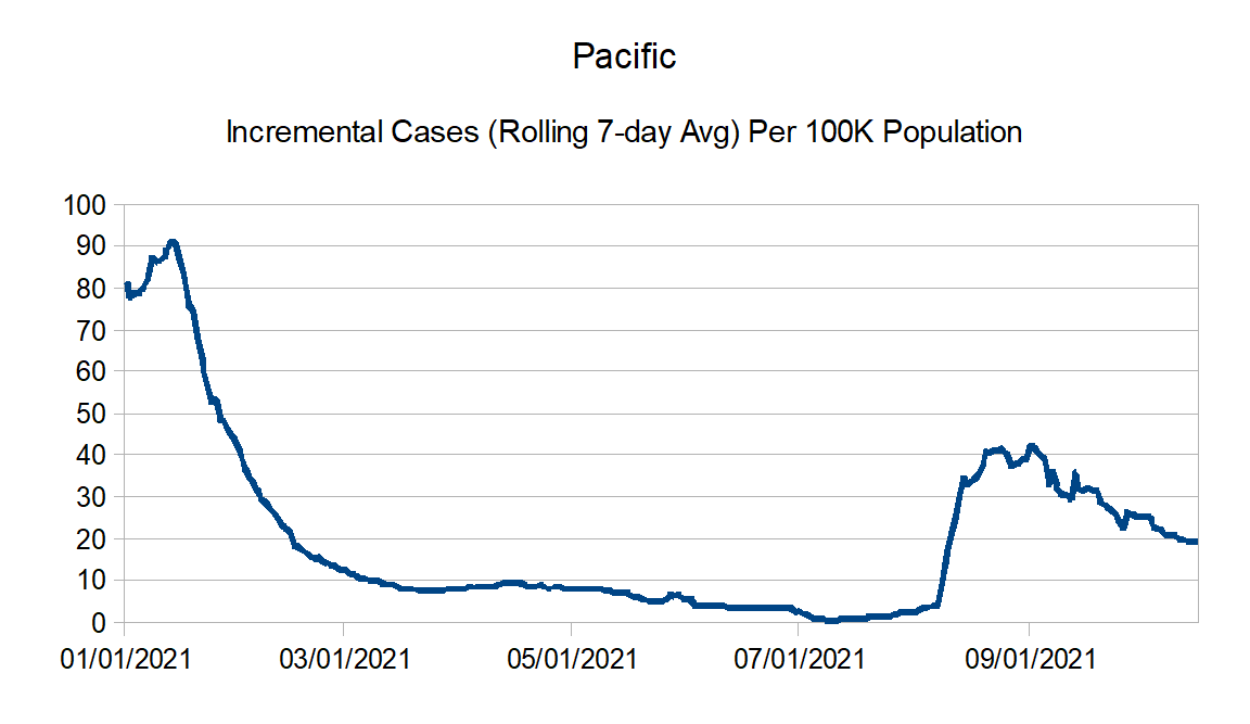
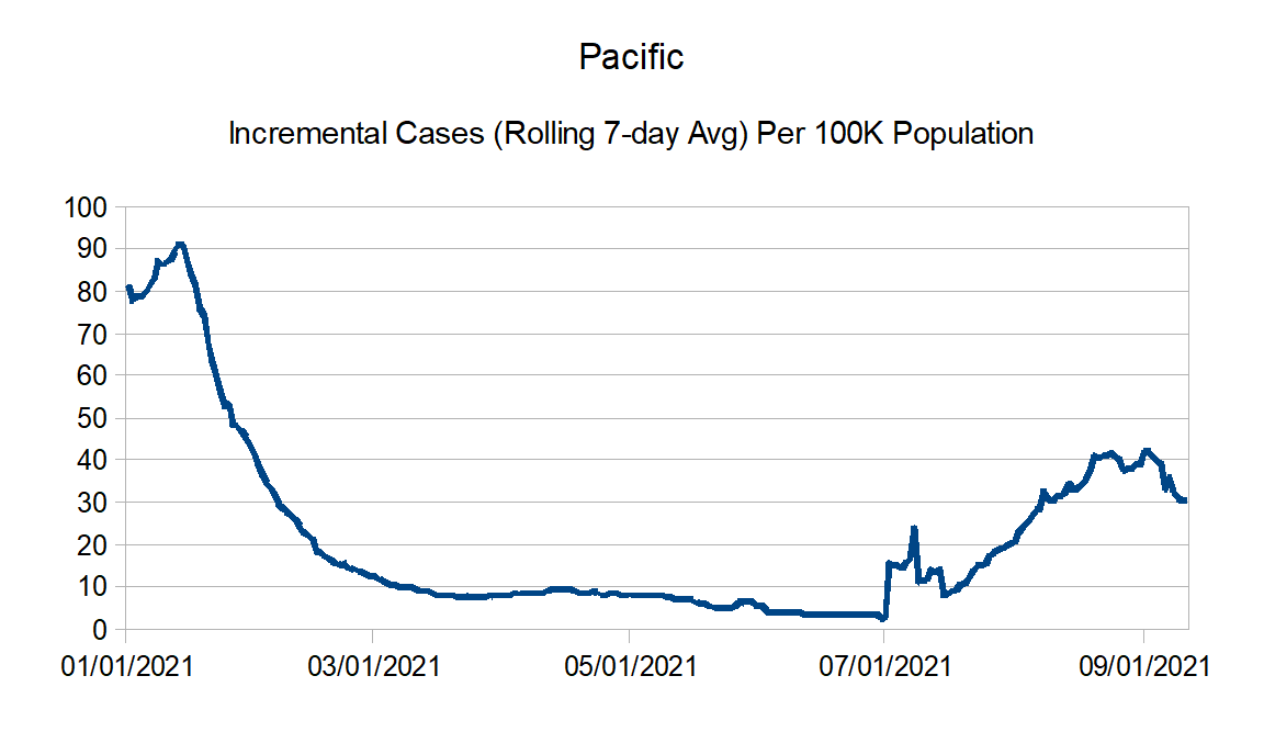
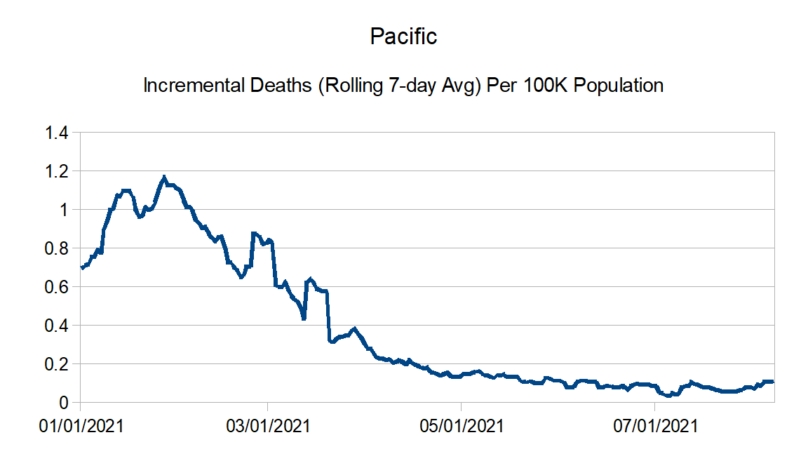
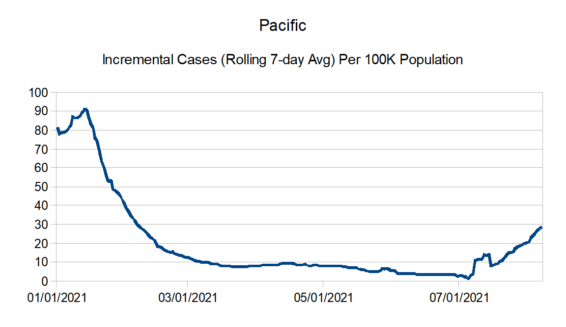
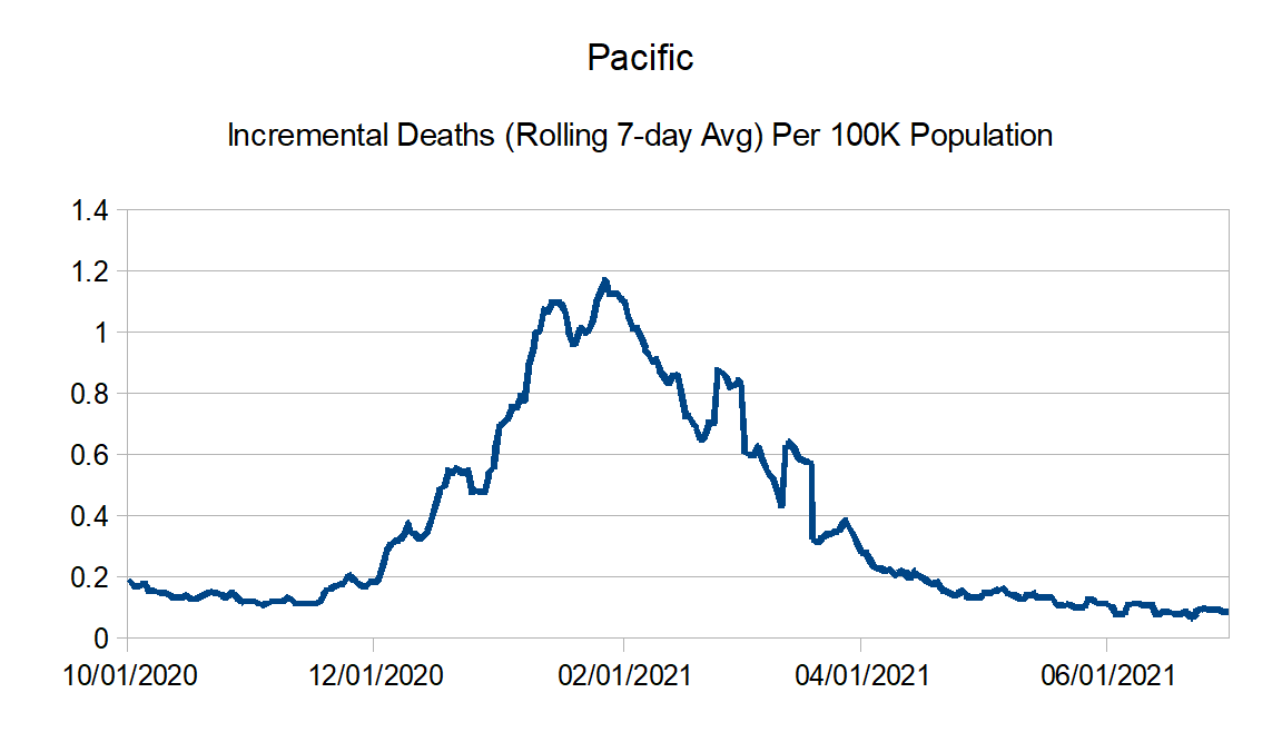
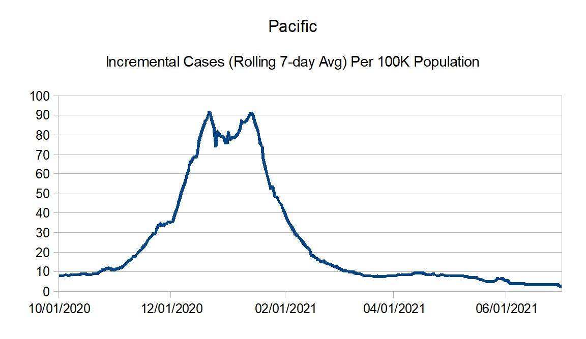
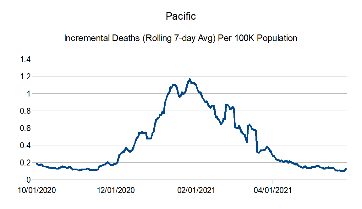
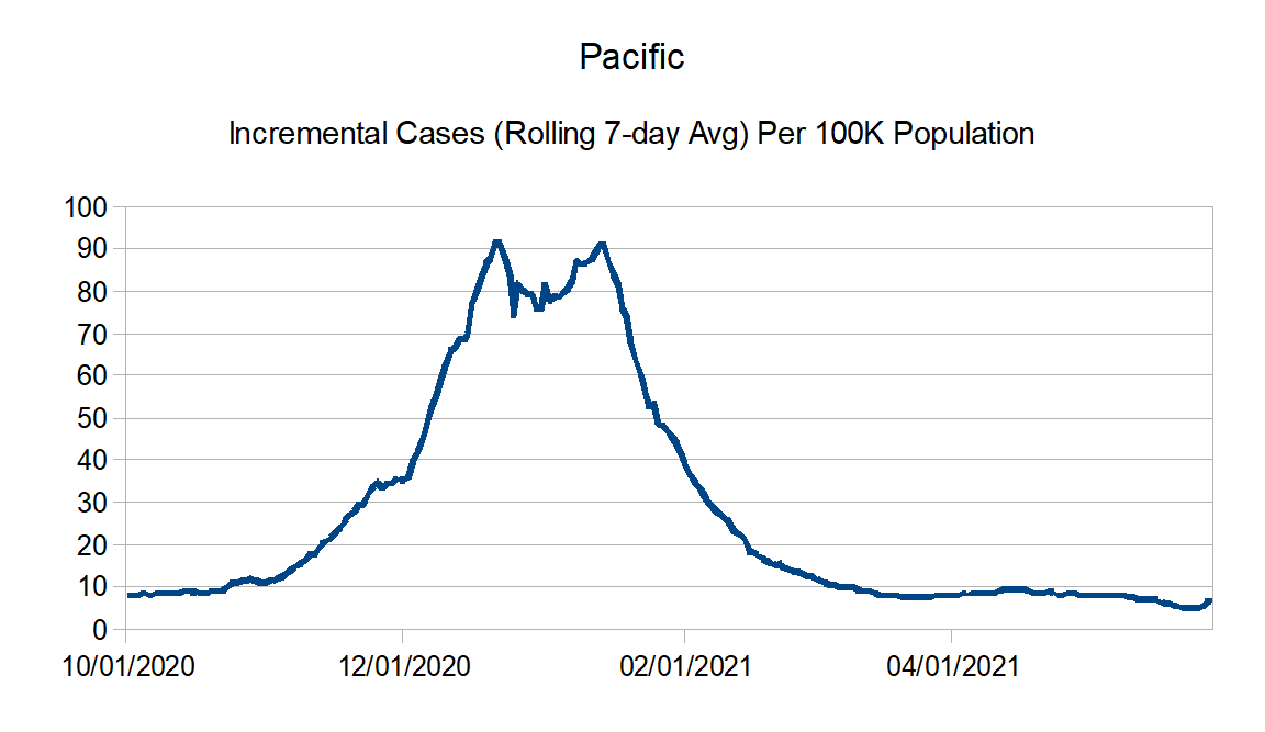
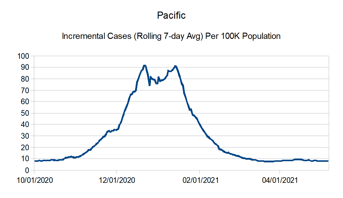
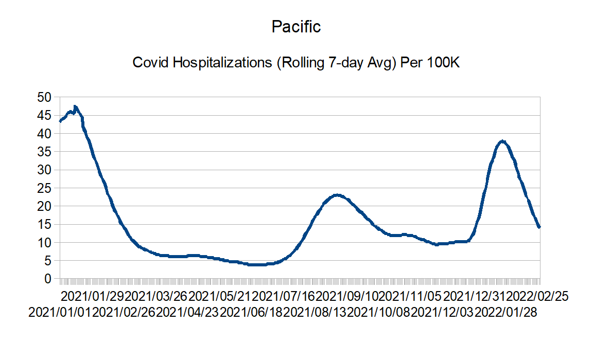
Pacific: Alaska, California, Hawaii, Oregon, and Washington
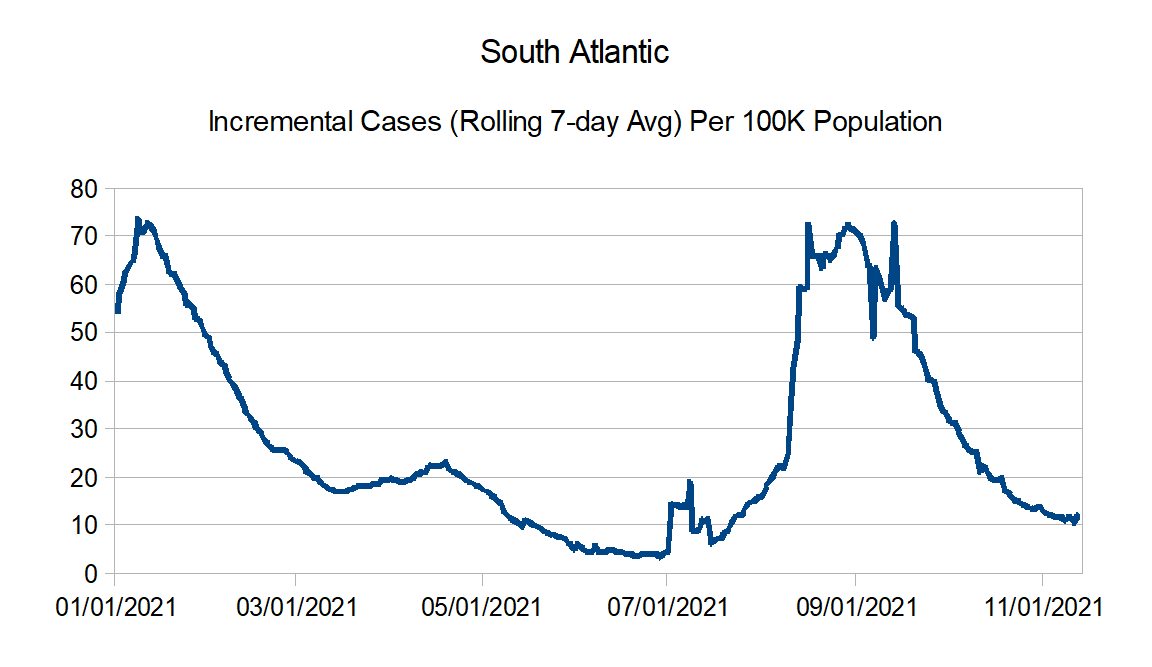
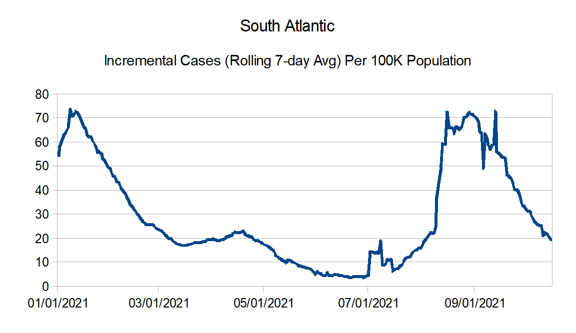
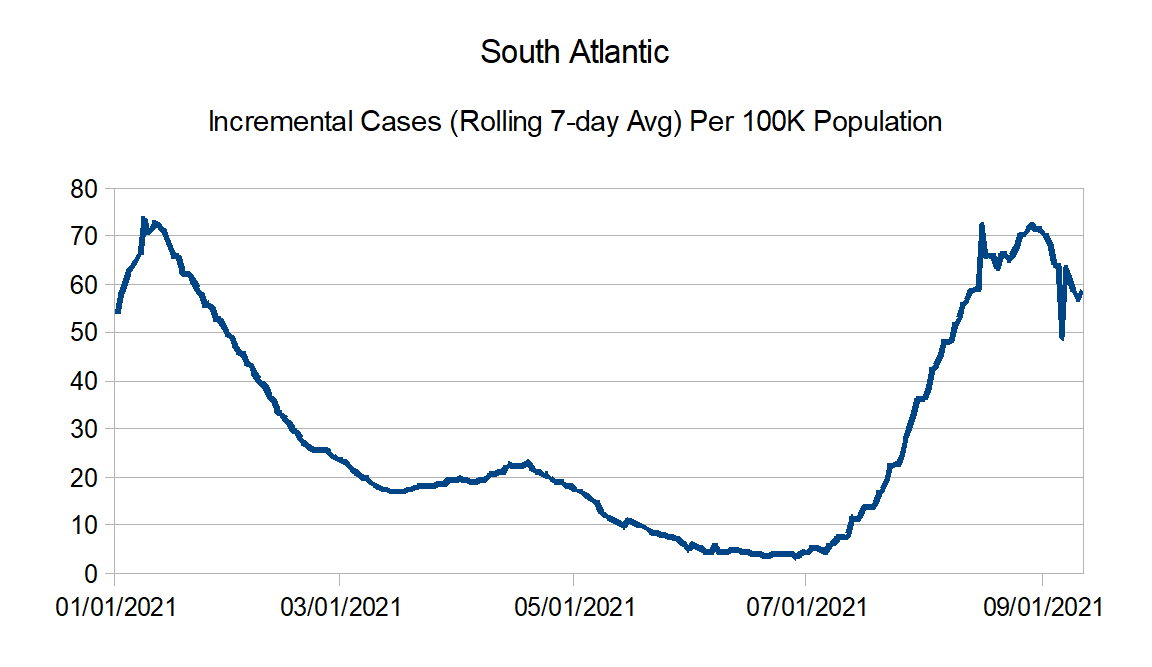
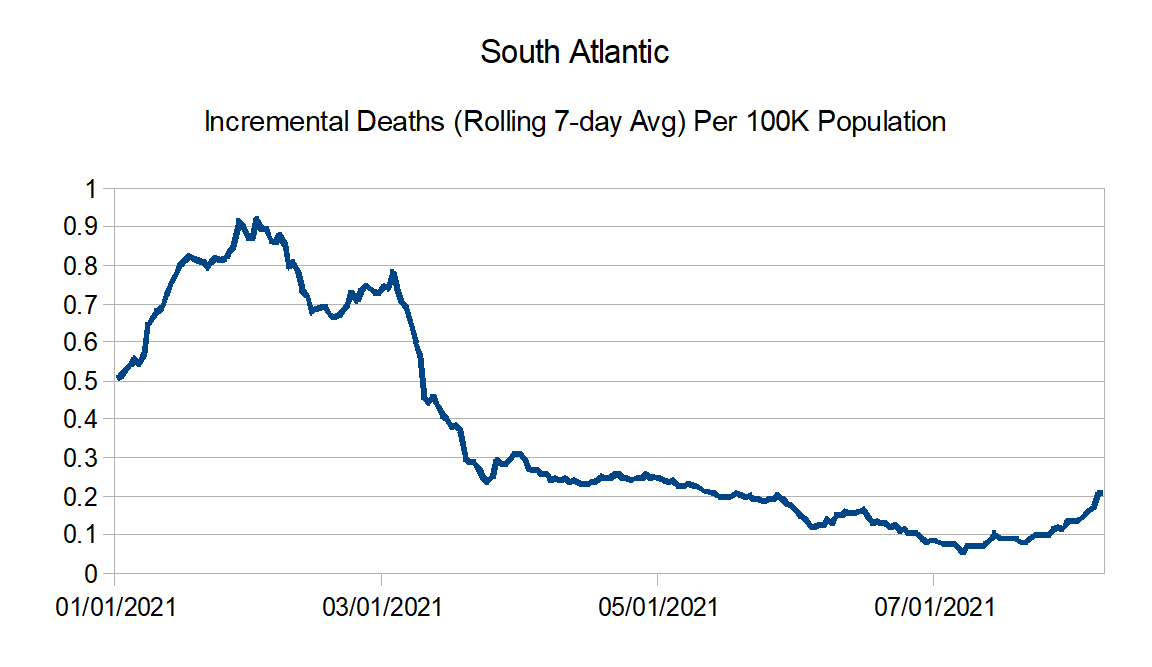
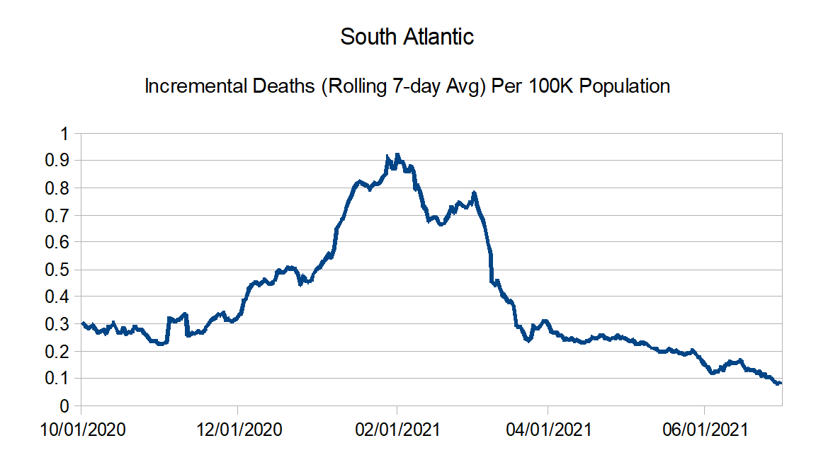
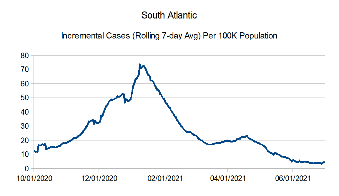
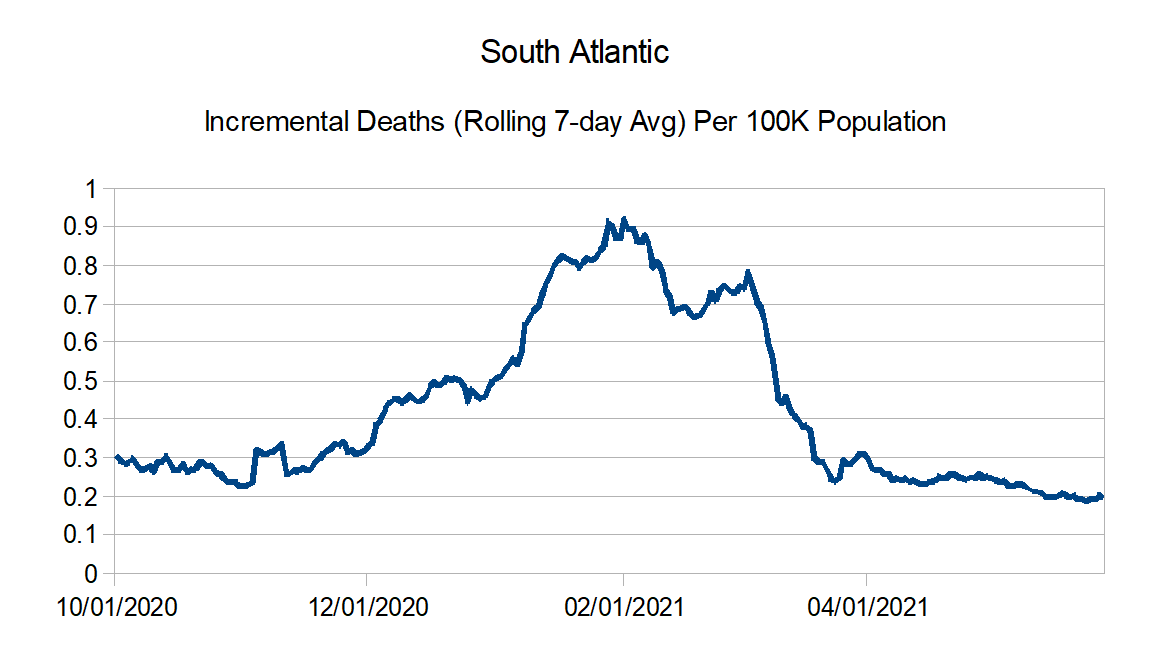
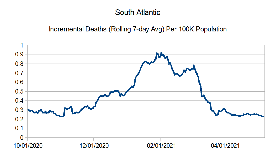
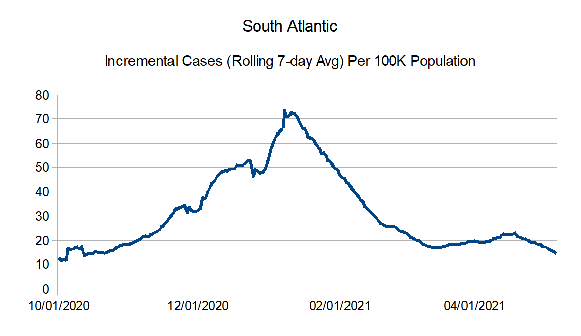
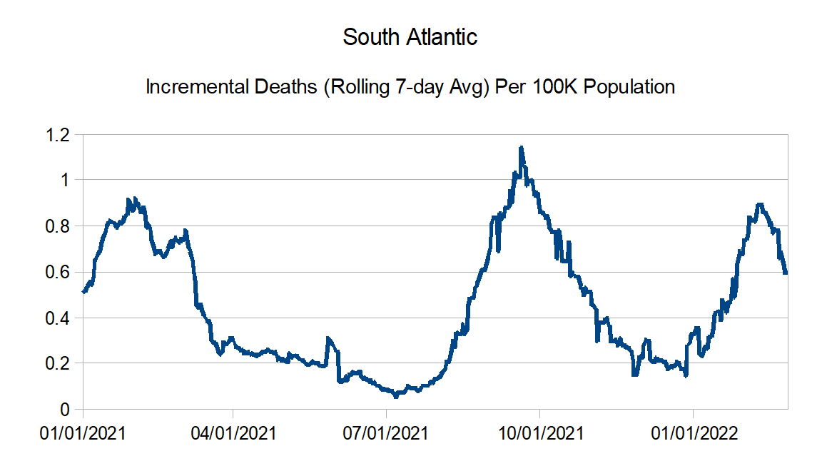
South Atlantic: Florida, Georgia, Maryland, North Carolina, South Carolina, Virginia, West Virginia, District of Columbia, Puerto Rico, Northern Mariana Islands, and Virgin Islands
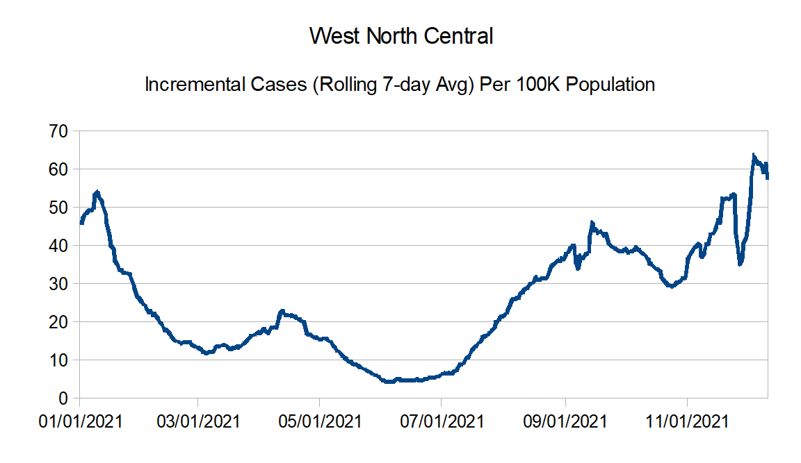
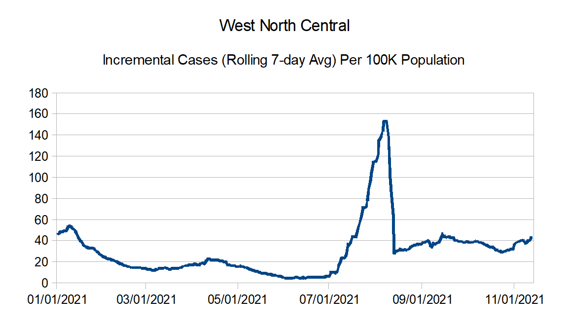
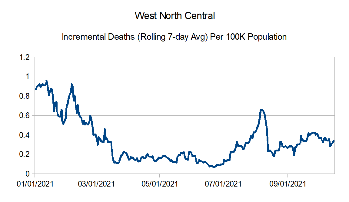
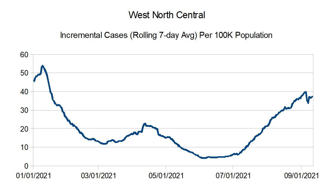
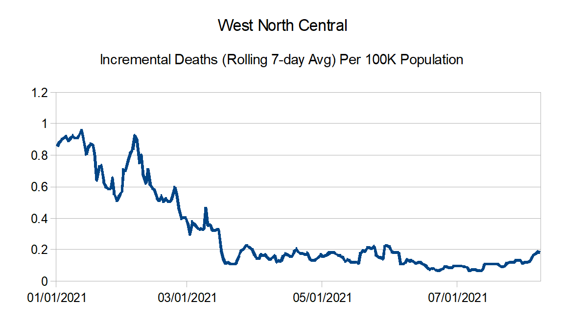
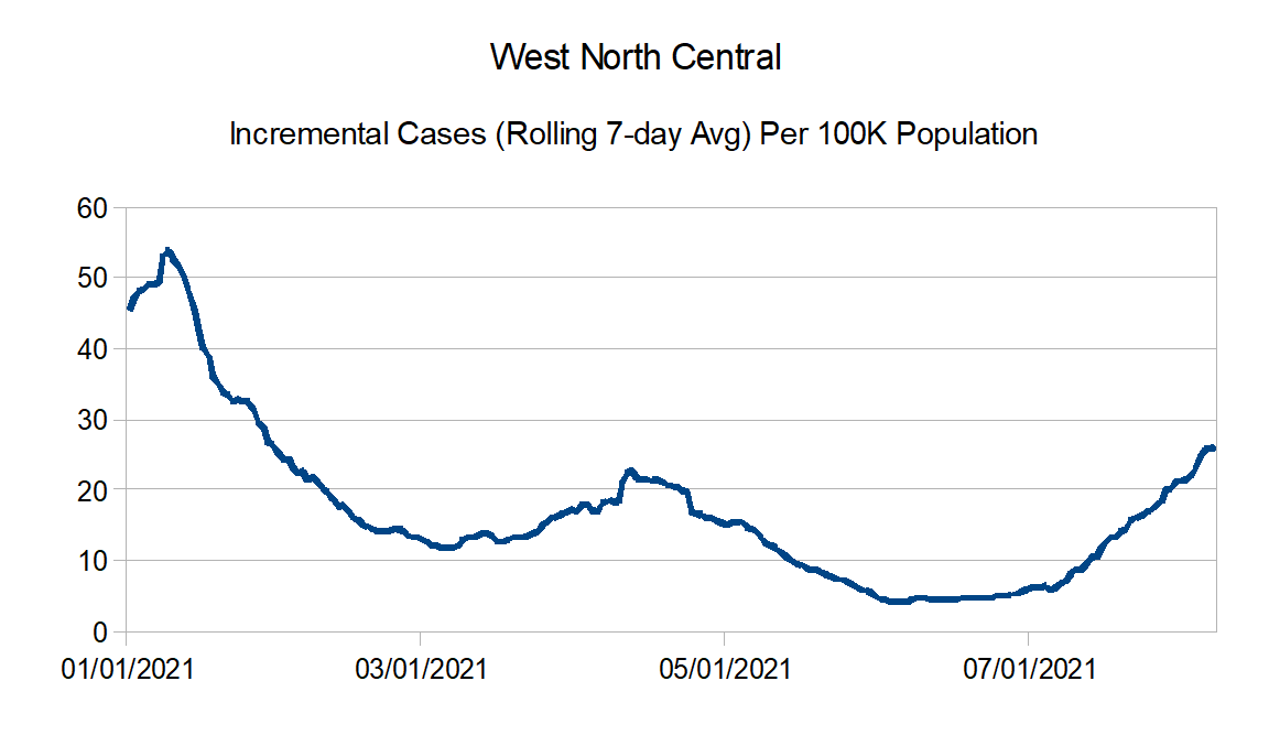
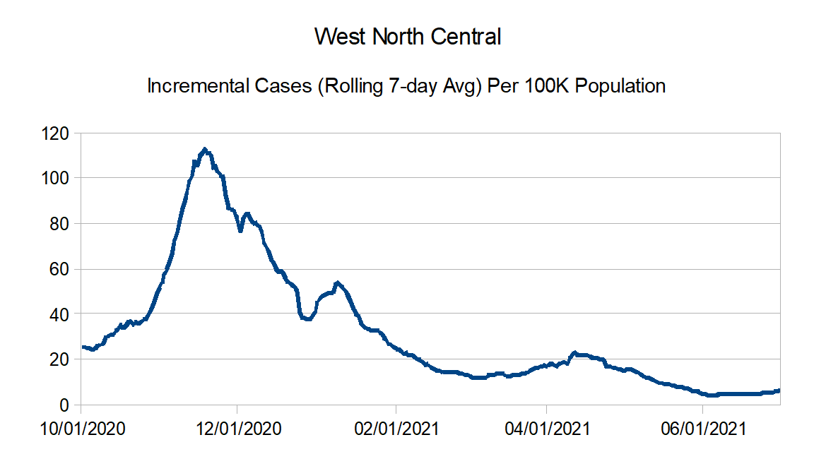
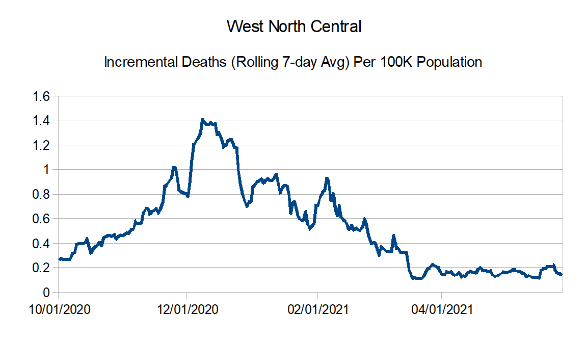
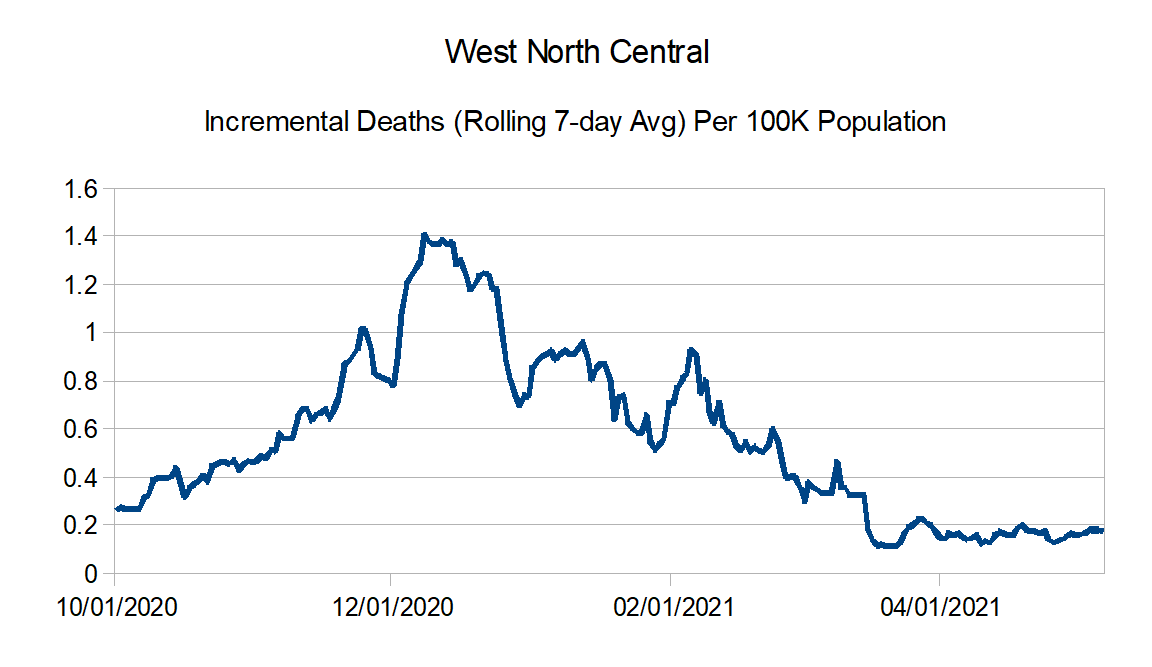
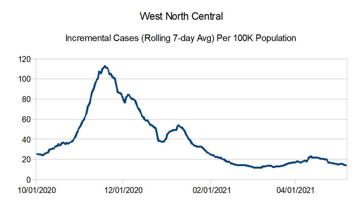
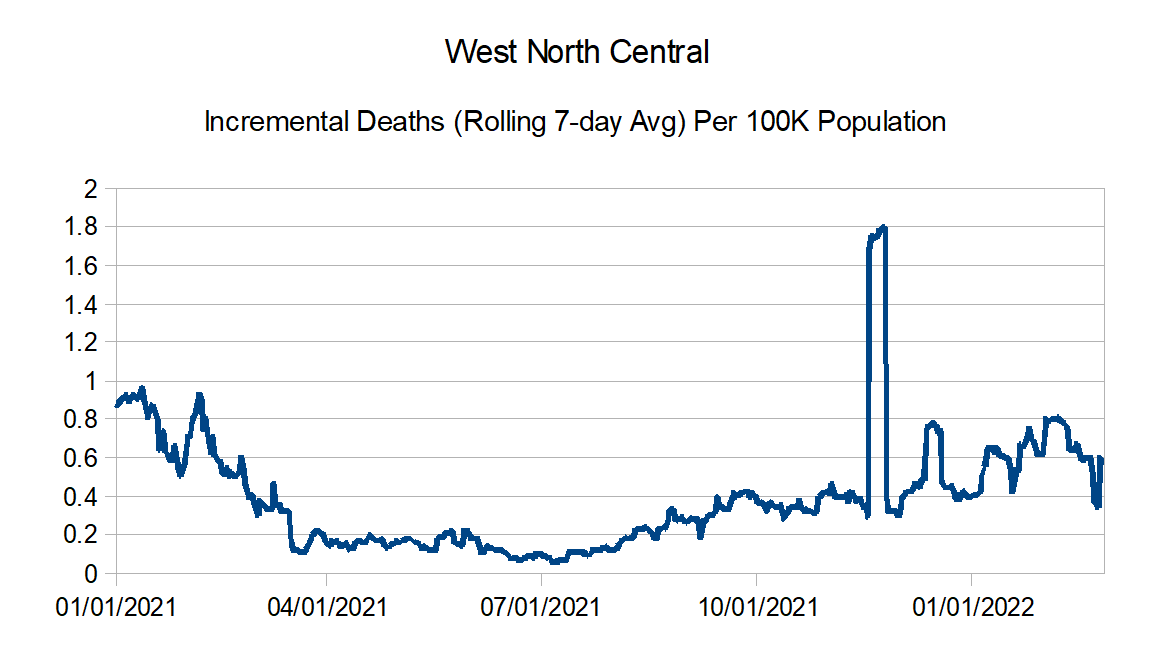
West North Central: Iowa, Kansas, Minnesota, Missouri, Nebraska, North Dakota, and South Dakota
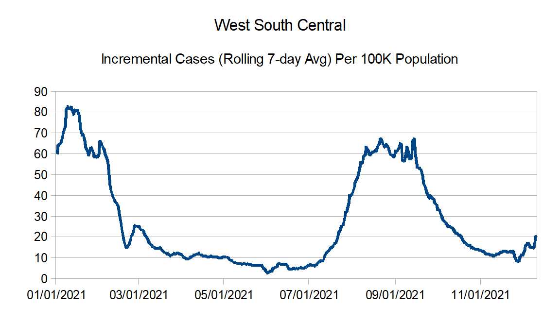
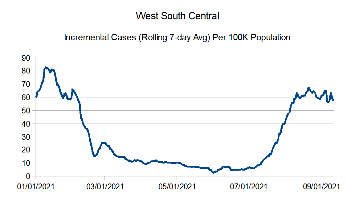
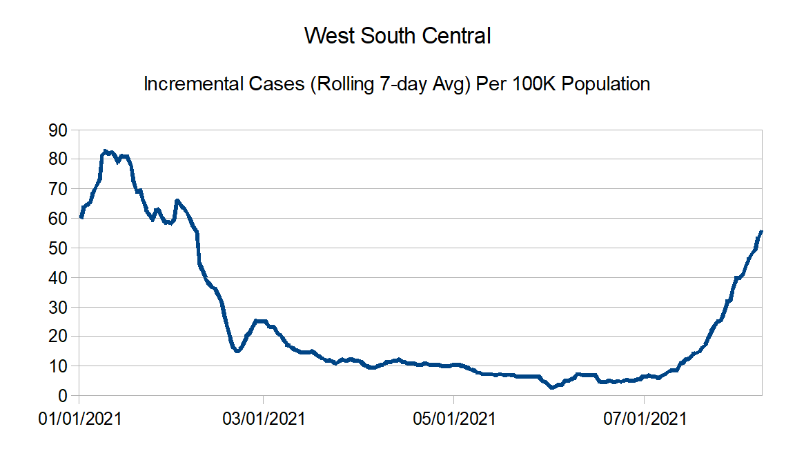
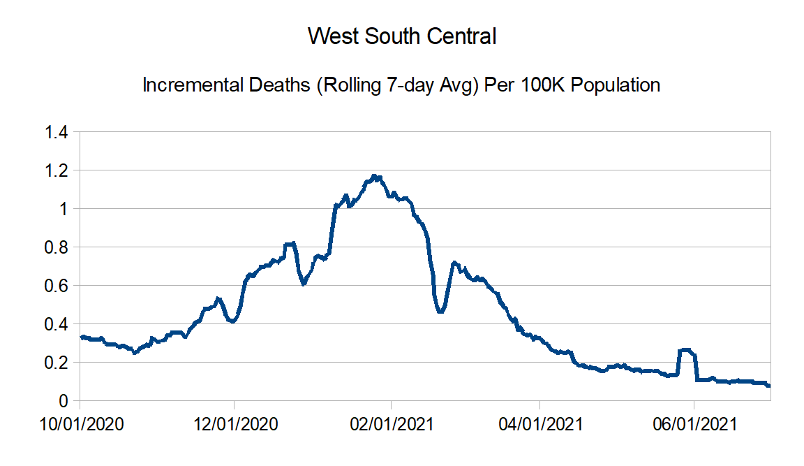
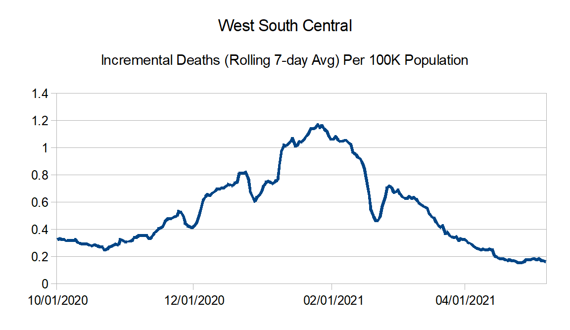
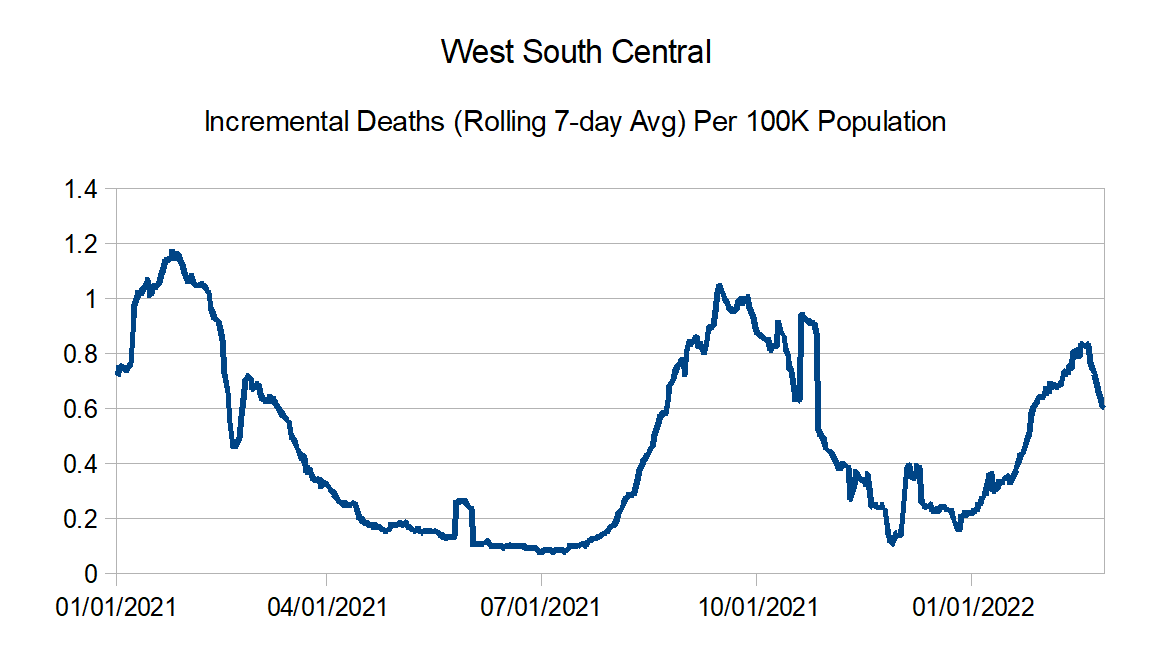
West South Central: Arkansas, Louisiana, Oklahoma, and Texas
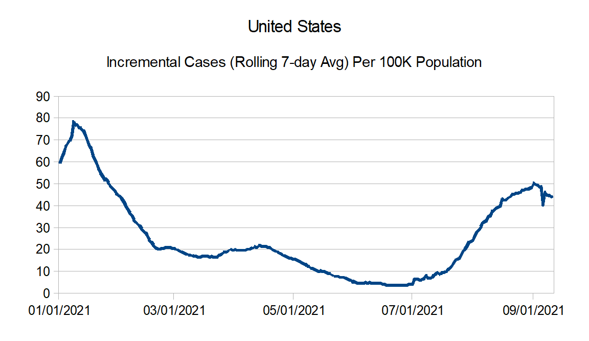
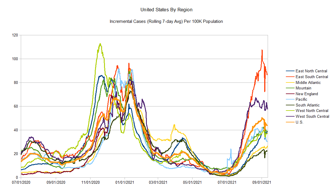
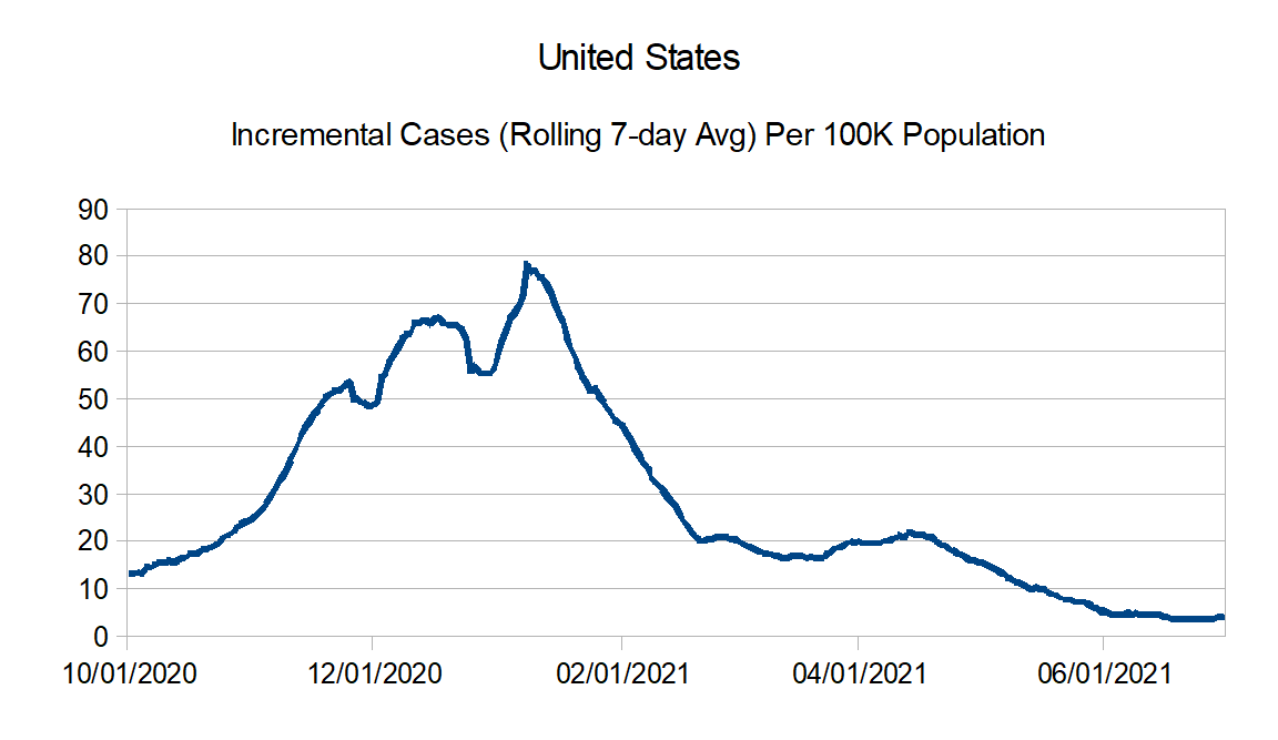
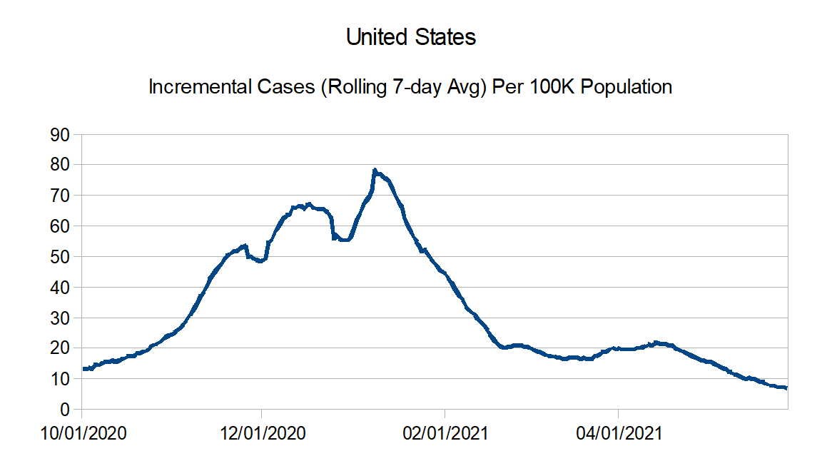
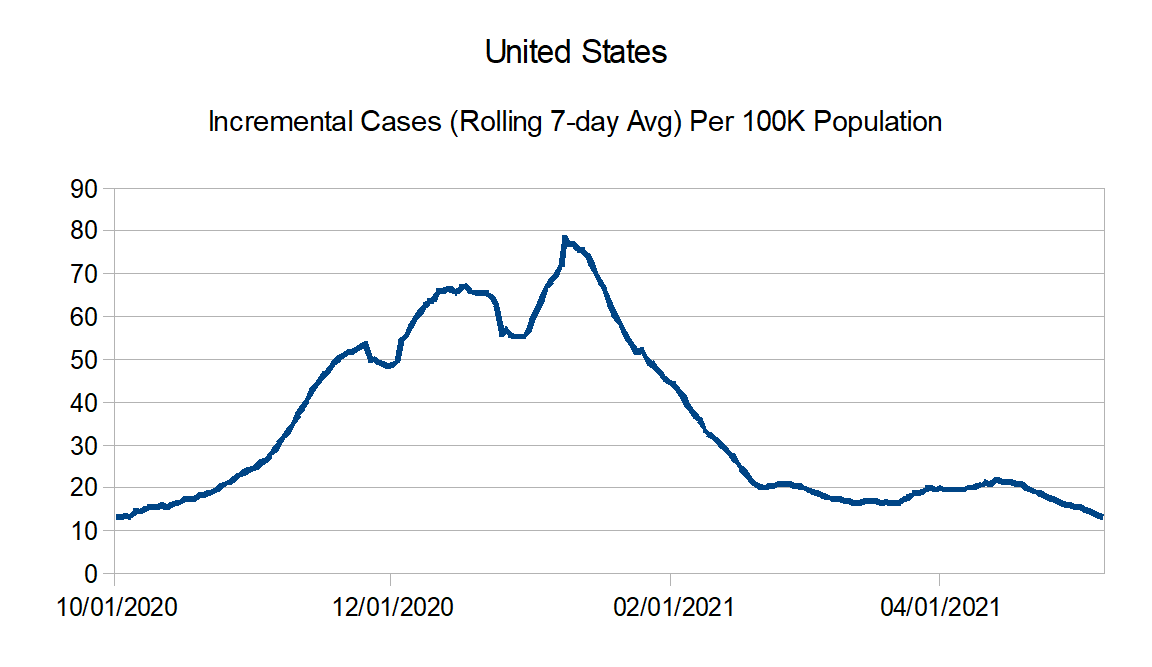
United States graphs:
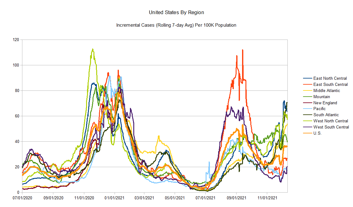
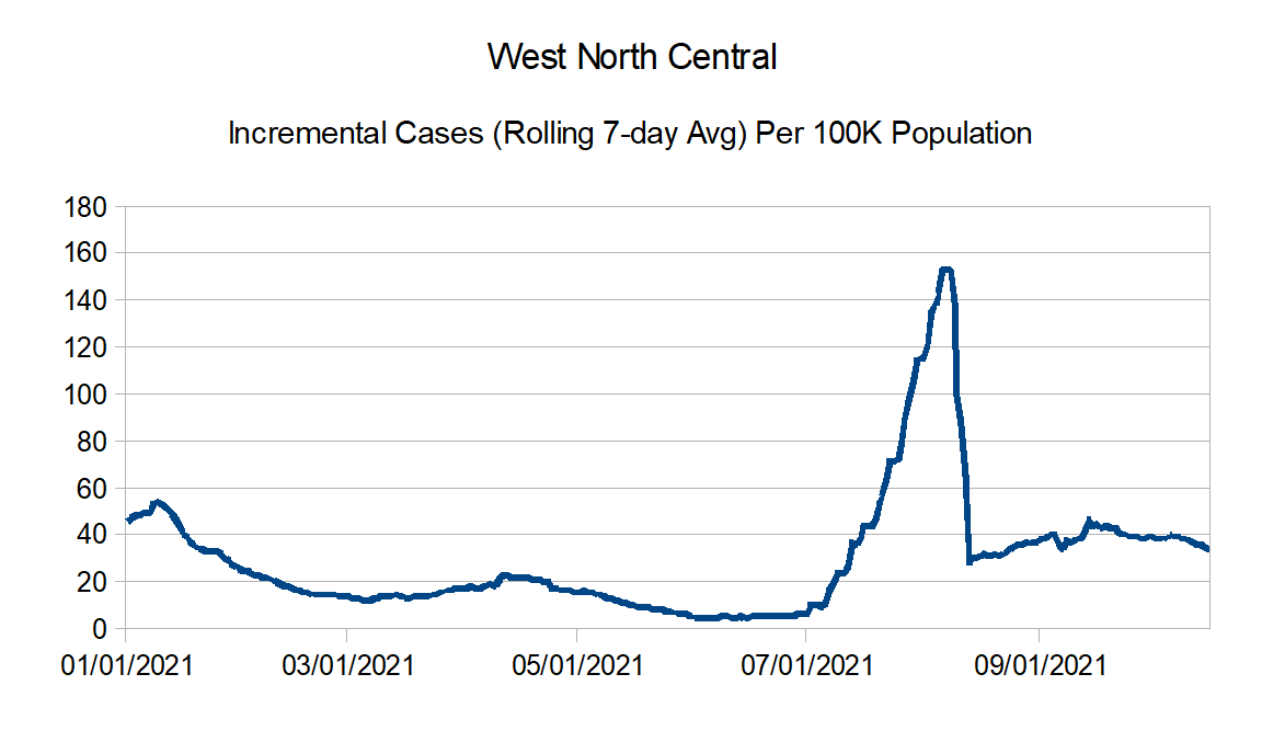
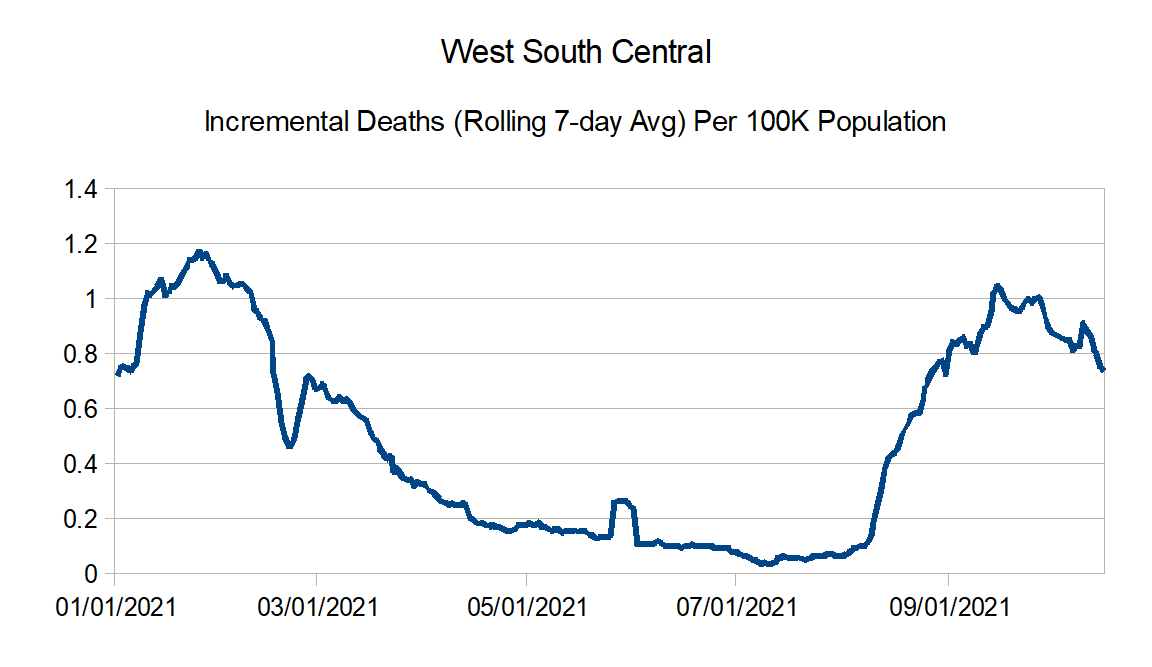
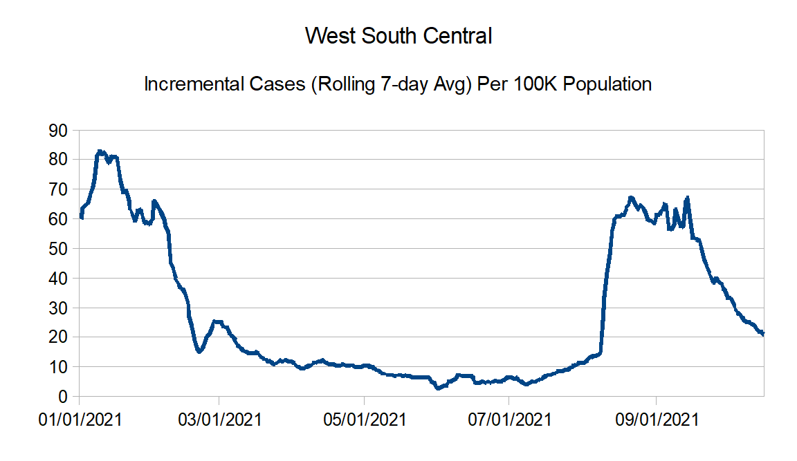
Regional charts:


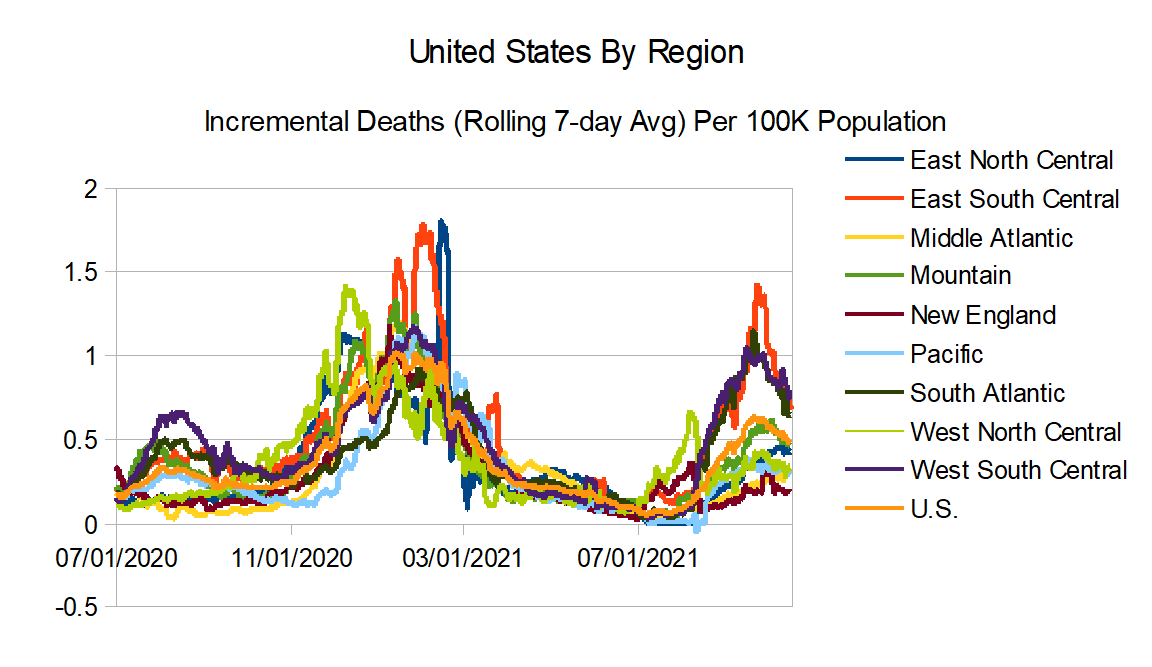
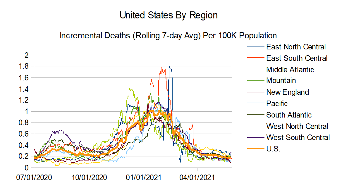
And finally the regional comparison chart:
Seems like there is some optimism that at least the worst is over with the vaccines, better treatments, combined with natural immunity. As far as updates, I will say they are going to be infrequent now, basically when I feel like doing it (which will be if I think there is anything interesting to find).
Until next time.